Main Screen Logo Needed
-
@LaFayette haha never looked at it that big on a pure white background before loks like my outer glow effect could use some cleaning up.

-
It's twice the size I was expecting! (TWSS
 )
)Thank you for working on an updated logo, looking forward.
-
@LaFayette for whenever we support HDPI
I'll try to clean that up a little more in the near future but it should be good for now @ half size. ")
-
@LaFayette
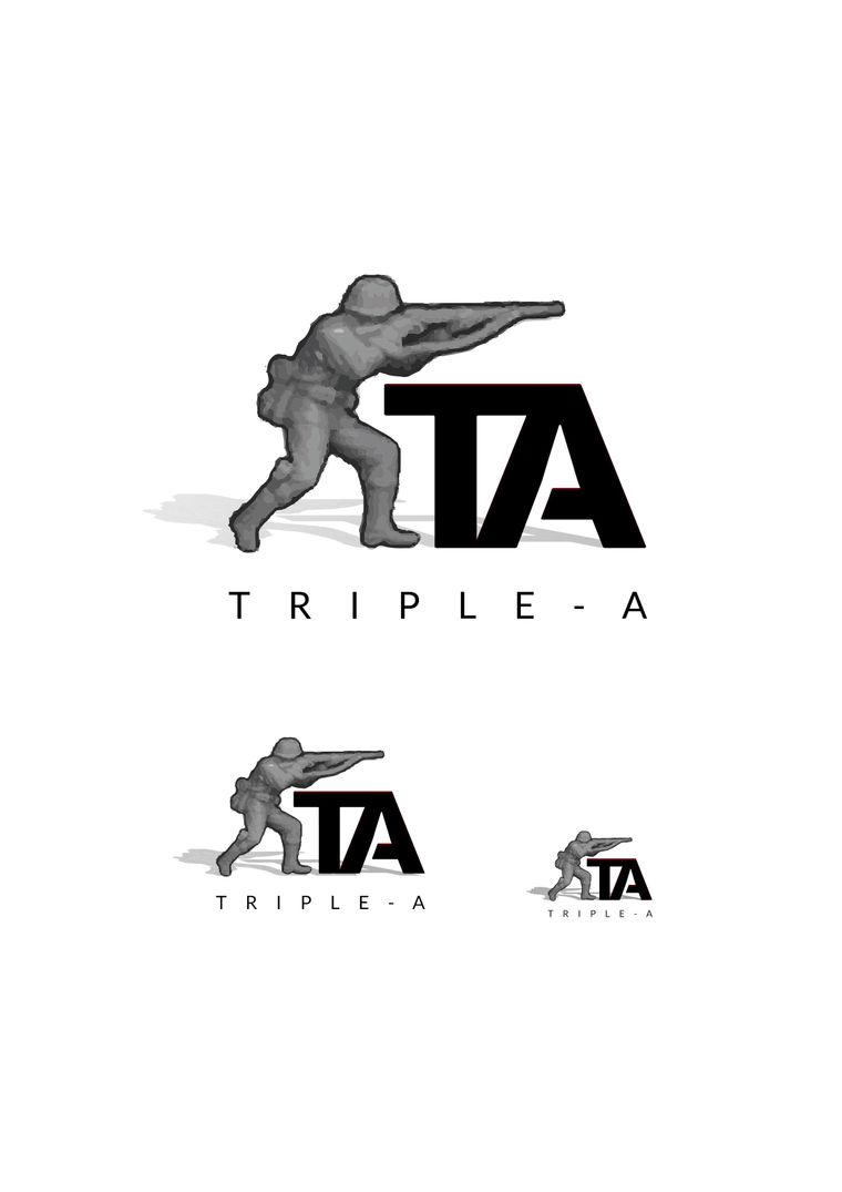
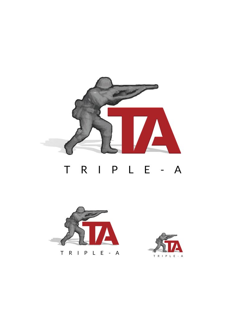
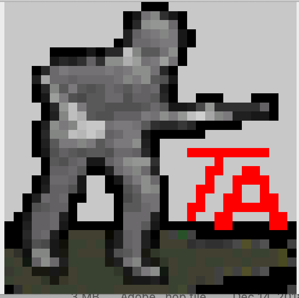
I don't have a Transparent PNG or a large image of the Soldier. I have "vectorised" an image i have found over the internet. If you have a better one please send it over.
This is what I have done. Once I have a good image of the infantry man i will try the logo in red on dark background and the white logo on black background.
Regards,
ps. let me know the exact dimensions of the final image to be implemented in the main screen. So that I can go through some trials and errors. Cheers.
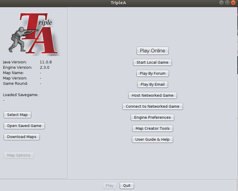
Here the logo put on the main screen as an example, both in dark and white background.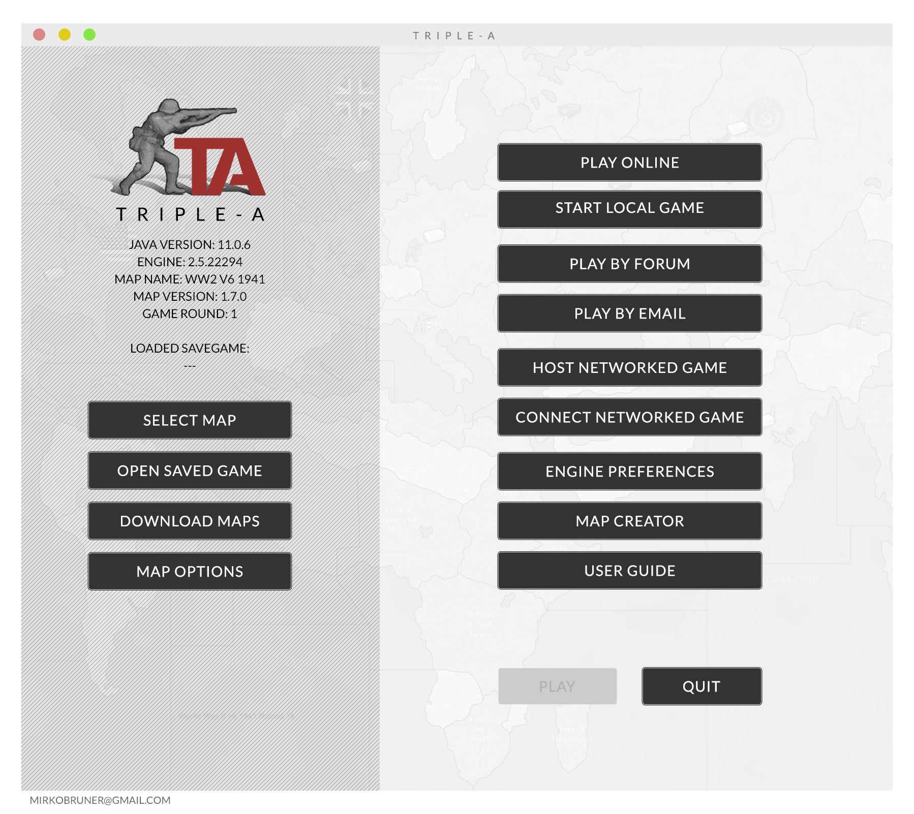
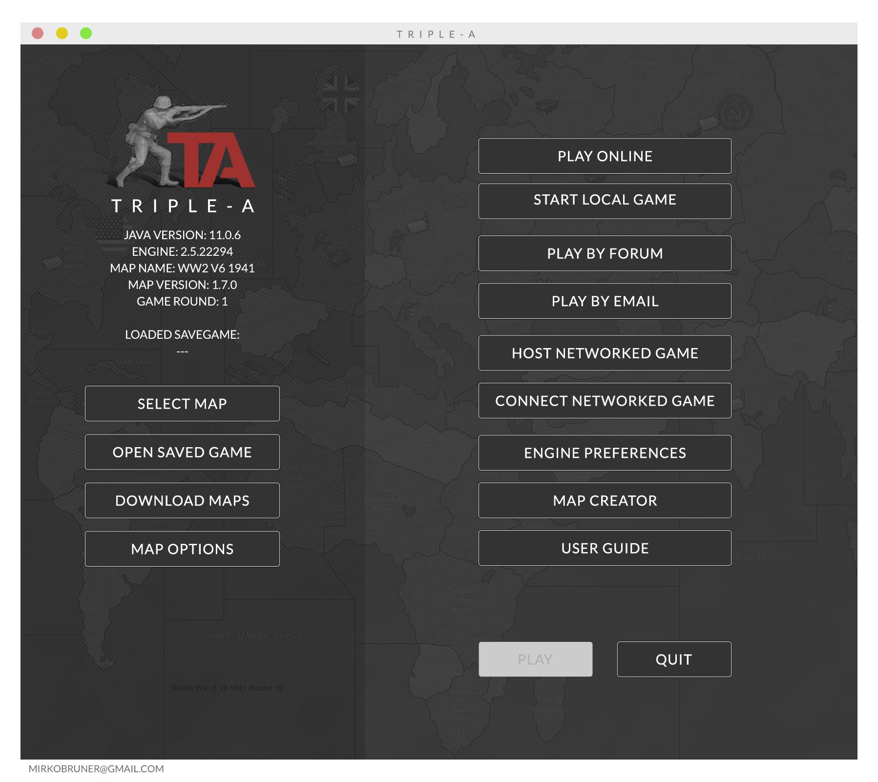
++Mi®koBruner
-
I would definitely want the alternate dark main screen if I had a separate game that totally dedicated to only one map. Gives professionalism and video game vibe.
-
@Schulz I am pretty new to the Platform and the game, but I think that those colours are completely customisable via the preferences settings of the platform.
Here i have just shown the two extremes of the spectrum and how Same Width Buttons and more spaces between them can contribute to have a better tidy welcome screen. If anyone wants to collaborate I am here waiting for instructions.
Regards, -
@MirkoBruner Do you know how to make relief tiles? Which programs are you using?
-
@MirkoBruner i think the darker background one looks better as well.
-
@ff03k64 I like it indeed. But I guess colours depends on the Engine Settings. I was just showing here only the two extremes of the spectrum! I will try to show the main screen according to all the Choices you have on the settings. Regards.
-
@MirkoBruner not a fan of that font its too modern. FYI the existing font was made to match the original icon from ages ago.
-
@ubernaut This one?
-
@MirkoBruner yes read this thread from the start it's only two pages
-
@ubernaut said in Main Screen Logo Needed:
e start it's only t
Ok. Done Read.
So basically @LaFayette is asking for a new logo and I get it.
You didd't propose a new one but just put a random warfare image in the background.
I kinda like it, but as someone stated is too realistic and almost completely unreadable. Too much information there in the dust and rubble of the ruins.Seems to me a new logo has not been presented apart from the one I did the other day and which I really like.
The Font is No Sans and easy readable even in smaller dimensions (website and Icons), I kept the Classic Red of Triple-A, the Soldier is still the main character of the logo and again the no sans font projects the platform towards the future.
The skewed back shadow gives it a touch of three-dimensionality which is cool.But again happy to try again and change font
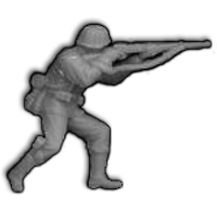
The only problem is to retrive a good Image of the Infantryman shooting with the rifle.
Anyone can help?@ubernaut let me know if you have got anything and how you would like to proceed if you have ideas.
Regards,++Mi®koBruner
-
@MirkoBruner said in Main Screen Logo Needed:
I kinda like it, but as someone stated is too realistic and almost completely unreadable. Too much information there in the dust and rubble of the ruins.
yeah it was just a quick mockup to get the idea across if you saw my other replies i mention that.
Seems to me a new logo has not been presented apart from the one I did the other day and which I really like.
well the original need wasn't for something necessarily "new" the title was simply title screen logo needed i think there is value to retaining style unless there is a benefit to changing it brand recognition is important. at any rate we should try to avoid a "modern" look for this game it roots are ww2. i didn't really mock it up but if we did want to get fanciermy idea was to do old school electronics switch soemhtign like this:

"You should never have told me horses sleep standing up, it gave me a mental block." - Mister Ed
-
@MirkoBruner said in Main Screen Logo Needed:
The only problem is to retrive a good Image of the Infantryman shooting with the rifle.
Anyone can help?regarding fritz i did not make it but here is the version I found when I did the new icon ages ago.
-
@ubernaut it seems to me that @LaFayette asked for a new logo if new isn't new then I don't understand. I think it is pretty obvious what he wanted.
Please state what a New Logo means.
The Brand Recognition is recognised, the infantryman is still there and that is the main character of the logo. Infantryman + TA.
What do you want recognise more than that?
A further Logotype has been introduced to give even better clarity for "Brand Recognition", so you have eventually the Infantryman, the TA and the Triple-A label.Again, what I did is neat, clean and cool, recognisable readable and not futuristic at all. Just a font with no sans.
I don't get the image of the old electronic and how you would implement that with Brand Recognition in mind.
And mostly, you... what have you got so far?Regards,
-
@MirkoBruner said in Main Screen Logo Needed:
@ubernaut it seems to me that @LaFayette asked for a new logo if new isn't new then I don't understand. I think it is pretty obvious what he wanted.
you are inserting the term "new" the title of this thread is "logo needed" the post is:
We could use volunteers to clean up & improve the upper left logo.
he was using a "new" logo bc he didn't have the high res version I had and didn't realize I had it or probably would have asked me for it earlier.
I'm not against something new but I think the existing typeface is more true to the original branding and I'm kind of if it ain't broke don't fix it kind of guy in general.
the panel is for if we want to go fancier with the start screen in general, not in regards to the logo itself and again just my idea.
"You should never have told me horses sleep standing up, it gave me a mental block." - Mister Ed
-
@ubernaut but the one that is up now is completely new or not? Who made it? You?
-
@MirkoBruner idk which one is in 2.5 in 2.4 they were still using the placeholder one.
-
@ubernaut said in Main Screen Logo Needed:
branding and I'm kind of if it a
Again, then. What is your proposal?
Hello! It looks like you're interested in this conversation, but you don't have an account yet.
Getting fed up of having to scroll through the same posts each visit? When you register for an account, you'll always come back to exactly where you were before, and choose to be notified of new replies (either via email, or push notification). You'll also be able to save bookmarks and upvote posts to show your appreciation to other community members.
With your input, this post could be even better 💗
Register Login