AFTERMATH STATISTICS WITH GAME INFO/ACHIEVEMENTS
-
Thanks everyone for the feedback!
- I switched out the "fixed" color palette to one from https://colorbrewer2.org/
- I changed the random assignment to be a fixed brightness
- I realized map designers can assign an alliance color in
map.propertiesso I don't think we need to get fancy- map makers can pick a color for the alliance if they don't like the auto assigned one (which should be more distinguishable and aesthetic now) - Data loads off the UI so you can interact with the UI while it's loading
- You can toggle players, alliances, or both and both is split between 2 axes
- The window itself is no longer a
JOptionPanebut a normalJFramethat can be resized - I took it out of beta in the menu
My progress is here:
https://github.com/jdimeo/triplea/tree/game-stats-rework
Still have to clean up checkstyle stuff before I can open the PRLoading off UI thread:
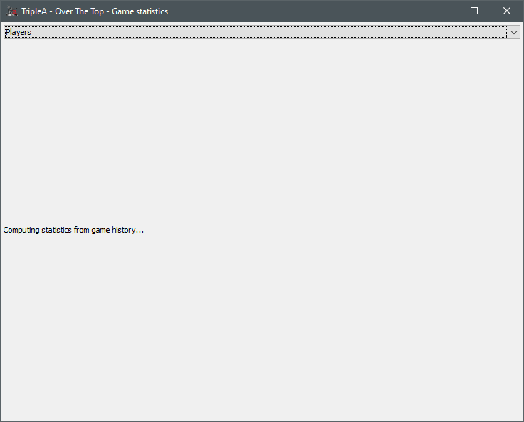
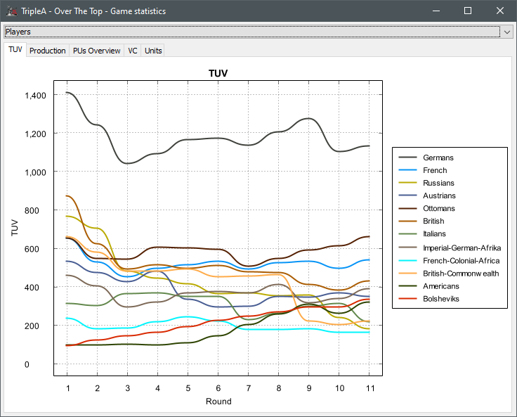
Players TUV:
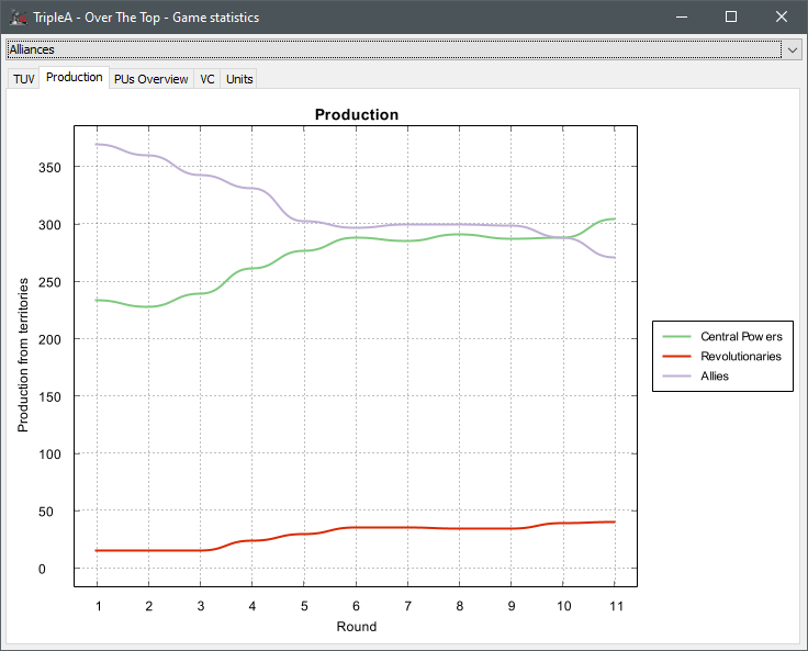
Alliances Production: Revolutionaries came from map.properties whereas the other two were auto-assigned.
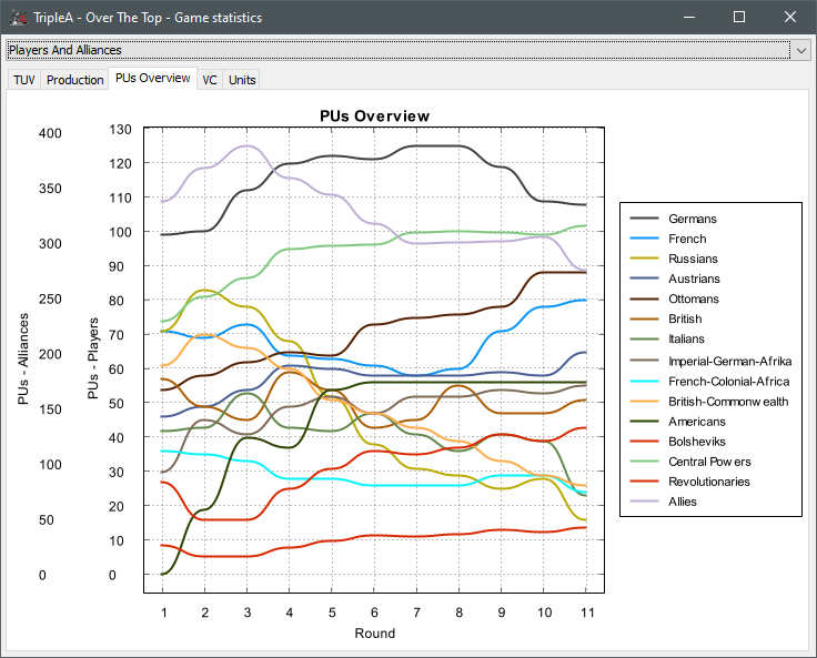
PUs for both: Kinda a mess, but if you don't have two y axes the lines of the players will always get smashed by the alliances
-
@Cernel I'm not sure if x = 1 means "start of game" or means "after the first round". I'm focusing on the charting aspect and not the data collection. Maybe someone else can weigh in on that. I'm pretty sure it's what we want though b/c I see that USA has 0 PUs which is true at the start of the game, so I think 1 does really mean 0 in the sense that you were thinking. I did force Y to zero though for all charts.
-
More generally though, I would love to pop this up at the end of each round and also work it into a more "newspaper" format with notable battles, or objectives achieved, or VCs captured, etc. that round as a recap and a way to celebrate achievements. So I also propose we rename this to "Round Summary" or something to start going in that general direction instead of a more "Game Statistics" direction (though I love the current charting and it should definitely be a part of this long term!)
-
@djabwana Yes: I'm pretty sure the "1" on the Axis means the start of the first round. To make it clearer, I suggest either moving the numbers on the centre of the periods (so, for example, the "1" would be in the middle of where now there are the "1" and the "2") or move to an actual continuous enumeration, in which case the current "1" should be "0", the current "2" should be "1" and so on.
Either can be used. For example, I believe we use continuous for persons years (so I have 1 year 1 year after I was born, not in the moment I was born) and discrete for history years (so it has been 2,000 years when the year turns 2001, not when the year turns 2000, so one which was born in the year 2000 is not a so-called "millenial", for example, because the year 2000 is the last year of the past millenium).
-
@djabwana FWIW a joy of Swing is in theory it's bad practice to use multiple JFrames. In particular and in practice we saw problems in TripleA where on some systems and some JDK versions new Jframes appeared behind the game JFrame. That behavior was not consistent, but on those systems it typically was and certainly generated a number of bug reports.
-
@LaFayette Off-topic, but the problem has never gone away. Currently, if you open the Notes or Unit Help window, it will be instantly hidden behind the map as soon as the focus get to it (typically, for someone else starting a battle). Normal users will likely just think that it has disappeared so will proceed opening a second one and so on.
Reference:
https://github.com/triplea-game/triplea/issues/8607 -
@Cernel The cause is likely the same. There are several windows created as new frames still.
-
My 2 cents, having the 'x' axis start as '1' is nice to avoid the gap on the left hand side. Games do start at round 1, just my 2 cents.
Nice work otherwise, the progress looks good.
-
@djabwana said in AFTERMATH STATISTICS WITH GAME INFO/ACHIEVEMENTS:
Thanks everyone for the feedback!
- I switched out the "fixed" color palette to one from https://colorbrewer2.org/
- I changed the random assignment to be a fixed brightness
- I realized map designers can assign an alliance color in
map.propertiesso I don't think we need to get fancy- map makers can pick a color for the alliance if they don't like the auto assigned one (which should be more distinguishable and aesthetic now) - Data loads off the UI so you can interact with the UI while it's loading
- You can toggle players, alliances, or both and both is split between 2 axes
- The window itself is no longer a
JOptionPanebut a normalJFramethat can be resized - I took it out of beta in the menu
My progress is here:
https://github.com/jdimeo/triplea/tree/game-stats-rework
Still have to clean up checkstyle stuff before I can open the PRLoading off UI thread:

Players TUV:

Alliances Production: Revolutionaries came from map.properties whereas the other two were auto-assigned.

PUs for both: Kinda a mess, but if you don't have two y axes the lines of the players will always get smashed by the alliances

I don't understand how the Germans can have more PUs than the Central Powers. Aren't the Central Powers an alliance comprising the Germans?
If not taking my suggestion of using the Impassable colour as background, I think it would be usually better having a black background, turning white the Axis, the number and everything else that is black now, as I think it is more unlikely to have a black or almost black ownership colour than a white or almost white one (for example, Italians are pure white in New World Order). Of course, there can easily be maps for which a white background would be better, instead. I guess one could have the program choosing one or the other depending on what colours come the closest to pure white and pure black and which one of the two is the absolute closest (of course, this won't work for a map that have a player having a pure white colour code and another player having a pure black colour code).
Can you please let me know what is the current use of assigning a colour code to the Alliances if I'm understanding correctly it is already something one could define in the "map" properties? I'm not sure of any case in which this colour would currently display anywhere.
-
@LaFayette Well yes, that's another change I would like to make- if I only had a week to devote to this! I would like to get rid of almost every single modal and popup window in the game. Like we do with the stats and info on the right side panel, but even more/better. It certainly should not be a JOptionPane though, but I can look into making the settings better with force to top, correct modality, etc.
-
@Cernel It's not that I'm not taking your suggestion r.e. background color- I just have limited time to implement some of my/our ideas... what you're bringing up here seems like very low priority compared to other things
Not sure what the current use of assigning a color to an Alliance beyond the fact that I use it here. Not sure where else that does or doesn't happen elsewhere in the game.
Oh and yes- Germans are part of Central Powers. There are two different Y axes when you plot them all together which is why it can appear to be less (which is why I don't think it's very useful to put players and alliances on the same chart)
-
@djabwana Would it be possible to have a toggle feature to see:
-
just the players' stats,
-
just the factions' stats,
-
the current 'see everything'?
Alternatively, allow the user to click on each item in the legend to toggle it on or off (default to 'all on'). That way, each user can custom-view whatever they want on the fly, without the dev having to predict what they will want.
I find the graph very odd on the Feudal Japan map in particular, as the graph is dominated by a single non-playable faction. Having the simple choice to turn that one off with a click would make the rest much more visible, if the scale re-sets itself for the re-draw.
-
-
Great to see so much response and action on this topic! thank you Triple Code Wizards
-
Different scales on the left is a bit overwhelming. A toggle between alliance and player seems natural or just have one scale.
-
@djabwana i think the colors and patterns should be made to reflect the actual team colors and the style (solid versus dashes) should represent factions/alliances.