Achievable improvements to the Triplea User Interface
-
So, how about my suggestion of having the scroll wheel default zooming?
It can be Alt+Wheel to move the map up and down and Alt+Shift+Wheel to move it left and right. Mouses having bi-axis wheels would scroll the map with Alt+Wheel only.
Then, clicking the scroll wheel may reset the zoom at 100%.
-
The solution is ultimately to have customizable hotkeys.
Alt+Shift+Wheel doesn't seem practical unless you have a side-scrolling mouse, (Shift+Wheel is the key combination produced by a side-scrolling mouse).
It does require significant modifications to the code, and may be more difficult to achieve for the mouse than for the keyboard.
The objective is to have a file with definition such as:
Hotkey.ZOOM_IN1 = Ctrl+mouse_wheel_forward
Hotkey.ZOOM_OUT1 = Ctrl+mouse_wheel_backwardEDIT: CTRL + mouse_wheel is the standard hotkey for zooming if the display is scrollable (ex: web browser).
-
Help > About... Dialog (work in progress)
- We can move some of the links from the current help menu to this html dialog.
- It gives the version info in the main game interface.
- I'm probably going to add Dpi scaling info (ex: 100%).
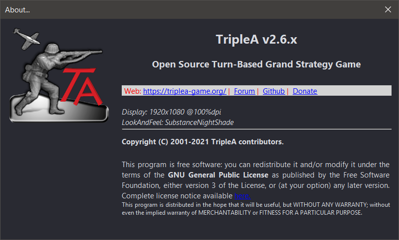
EDIT 1: This JOptionPane.showOptionDialog based version does some kind of glow effect after the dialog loads (could also be a bug as it wasn't intended
 )
) -
The Animation effect is done by Substance.
Does anyone use a look and feel other than Substance or Nimbus ?
-
@butterw There are a couple built in look and feels, notably the 'metal' (which seemingly is just 'default OS'). I presume it is pretty heavily used.
-
@lafayette
I hope nobody is using the java default look and feel "Metal" as it looks very ugly. I would encourage anybody still using it to move to "Nimbus" or to try a Substance look and feel.The only valid reason to use Metal is that it does allow to specify the font from command-line (but the font isn't applied to triplea JEditorPane displays without a code fix).
-
Unofficial v2.5-bu test build
--Experimental build for cross-platform feedback, was tested on Win10 local play.
- unzip to your triplea folder run from command-line in triplea folder:
java -jar bin/triplea-game-headed-2.5-bu.jar
On windows you can use the provided shortcut, but you'll likely need to correct the path for javaw.
Please upvote features you would like to see it included in a future official Triplea release.
Conversely, if you think a feature should NOT be included, please post your reasons. Bear in mind this is a work in progress and not all features are finished.-
Fix for Hi-Dpi display issues (Blurry images OR text too small issues with 125% dpi system setting).
https://forums.triplea-game.org/topic/2810/fontsize-and-dpi-scaling
+Engine Settings > UI >Custom Font and Image Scaling.
Changes are applied when triplea is restarted. -
Fixed html (JEditorPane) display issues in Triplea with Dark Background Look&Feel.
-
Modified Help Menu (merged with Web Menu, new About Triplea dialog with links and info relative to current dpi scaling, look&feel and font, +browse Games Notes).
-
+Map unit count display option (1: normal count, 2 AI has fog, 3 All players have fog). View menu > Unit Size to refresh.
https://forums.triplea-game.org/post/50575 -
Right Sidebar
Renamed Actions tab (CTRL-C) to:
*Command*The goal was to have a easier to find Tab with a consistent hotkey.
-
Added a zoom display (ex: 80%) to the status bar. It gets displayed when a zoom hotkey/command is used, until cleared or overwritten.
-
The Move UnitScroller starts collapsed.
Work in progress:
-
"Produce" Dialog enforces MaxBuiltPerPlayer, shows currently owned unit count in tooltip and displays Factory production capacity.
-
When you quit a game in triplea, the current players are remembered. They will only be reset to map defaults when the map is changed.
-
Debug Menu renamed Tools.
-
Modified Export.
-
+Keyboard Hotkeys Numpad +/- for zoom
-
+Hotkey: Game Menu > Hide/unhide Right Sidebar (Ctrl-X)
-
Removed buttons CTRL-B, CTRL+F from Territory Panel.
-
Some panels/dialogs are named for dev purposes, this would be hidden with a dev option in future updates.
- unzip to your triplea folder run from command-line in triplea folder:
-
v2.5.3-bu available here:
https://github.com/butterw/ui/releases/download/v2.5.3-bu/TripleA_v2.5-bu.zip -
@butterw
Here is what I didCopied all of TripleA version 2.5.22294 folder to TripleA folder (as I donrt have one)
Copied your .jar file to C:\Program Files\TripleA\bin
Renamed triplea-game-headed-2.5.22294.jar to triplea-game-headed-2.5.22294.jar-org (to be able to return to the original if I need to)
Renamed your triplea-game-headed-2.5-bu.jar to triplea-game-headed-2.5.22294.jar
Ran TripleA.exe from C:\Program Files\TripleA
Loaded a map/scenario
I get [Play2] [ MainPanel Quit 2] buttons so I know its your changes.
Will it work with 2.6.246 ?
https://forums.triplea-game.org/tags/thedog
https://forums.triplea-game.org/topic/3741/curated-best-top-maps-triplea-guides -
@thedog said in Achievable improvements to the Triplea User Interface:
@butterw
Here is what I didCopied all of TripleA version 2.5.22294 folder to TripleA folder (as I donrt have one)
Copied your .jar file to C:\Program Files\TripleA\bin
Renamed triplea-game-headed-2.5.22294.jar to triplea-game-headed-2.5.22294.jar-org (to be able to return to the original if I need to)
Renamed your triplea-game-headed-2.5-bu.jar to triplea-game-headed-2.5.22294.jar
Ran TripleA.exe from C:\Program Files\TripleA
Loaded a map/scenario
I get [Play2] [ MainPanel Quit 2] buttons so I know its your changes.
Good point. You need to have an existing 2.5 or 2.6 installation/triplea folder to be able to use a .jar file (as it requires java11 and an assets folder).
On Windows, if you have used the exe installer it creates an exe launcher, in which case you can rename the jar file to match the installed version. Otherwise you can modify the provided shortcut to use your javaw.exe path (ex: "C:\Program Files\Triplea\jre\bin\javaw.exe").
There is a single html file to be added to assets to demo the "Help > browse Game Notes" command, as embedded Game Notes from v2.5 cannot be viewed in browser.
Will it work with 2.6.246 ?
Yes your method should also works with a 2.6 installation.
-
10. Production
The < should really be ≤
Oooh and its a counter, it counts down if you bought that unit in previous turns.
Liking the Factory production capacity.The Construction tab, could be renamed as Place Anywhere ?
5. Right Sidebar
The ideal size of the mini map/smallMap.jpg is 240 x 240 pixels or less.
See here.
https://forums.triplea-game.org/topic/2637/standard-image-sizesSo to that end the Command/Action, Players, Resources, Territory menu bar should also be 240 pixels or less so that it stays in just one level and does not double up, as it does now. (I know we will lose the Notes and the ** of the command).
6. Map Zoom another ++Good function.
New
Can the File, View, Game, Export, Tools, Help menu fit in to the right hand panel of 240-ish pixels and its space be freed up so the main map can replace the space freed up by the File ... menu bar?https://forums.triplea-game.org/tags/thedog
https://forums.triplea-game.org/topic/3741/curated-best-top-maps-triplea-guides -
@butterw
A quick test on 2.6.246, your file does load/work and the Zoom works, I shall test further. -
I will try ≤ for the Production panel and will use it, if it works. Thanks For the suggestion. I used < because it is a standard character (always available and typically more readable).
@thedog said in Achievable improvements to the Triplea User Interface:
New
Can the File, View, Game, Export, Tools, Help menu fit in to the right hand panel of 240-ish pixels and its space be freed up so the main map can replace the space freed up by the File ... menu bar?Seems doubtful. Different look&feels/fonts/font sizes can be used, so what you see on your screen may not be the same as what others see (ex: with HiDPi Font scaling or on a different OS).
Beyond that, putting the main toolbar in a side panel instead of the main frame is non standard, and would require extensive code modifications. So it's not just a question of whether it fits or looks OK.EDIT: Adding an option to shorten some text displays in the interface is something I will consider.
I will try out displaying abbreviated names ex: player "BRI" instead of "British". But, maybe this simplification should be done at the map xml level instead. -
@butterw
As an aside I thought your UI was running faster than my usual 2.6.246.So I did my standard test, see here;
https://github.com/triplea-game/triplea/issues/9001
and I got 41 secondsI thought fluke 39s
and 39sSadly not many people will appreciate what you have done as its about the same speed as v2.5 so they will not see the massive speed difference.
-
@thedog My code isn't optimized.
If your results are correct it would suggest there is a performance issue with v2.6. -
A minor formatting problem.
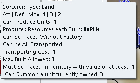
Above the "-Can Summon a unit" is a tooltip comes from the file tooltips.properties.
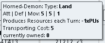
Above the unit without a tool tip.
So "currently owned:" needs a capital C ?
And catering for tool tips. -

For me its CTRL (not ALT) while Scrolling the Mouse Wheel.
-

17 this is fantastic and correct, 7 Factories that can produce 2 units each and 3 Sorcerers that can produce 1 unit each, total 17.
.
A feature request.
The ability to cycle round "Production" capable Units with a CTRL+P or similar, in any phase of the game.
This would be "isFactory" units but might also include "canProduceUnits"? -
Improved Production Panel
-
Does adding <br> to the last entry of your tooltips.properties solve the issue (also check, if you get an empty line with regular triplea) ?
-
"currently owned" isn't capitalized because it's helpful for dev to know it was added to the tooltip.
-
The MoveHelpMenu ui was added to v2.6-pre. I need to backport my latest version to this build.
-
≤ looks OK.
-
There is currently no check on placement restriction (if applicable), so that aspect could still be improved.
-
Tabs of the Right-Hand side Panel could fit in a single line if the title is shortened (with the full text in the tooltip).
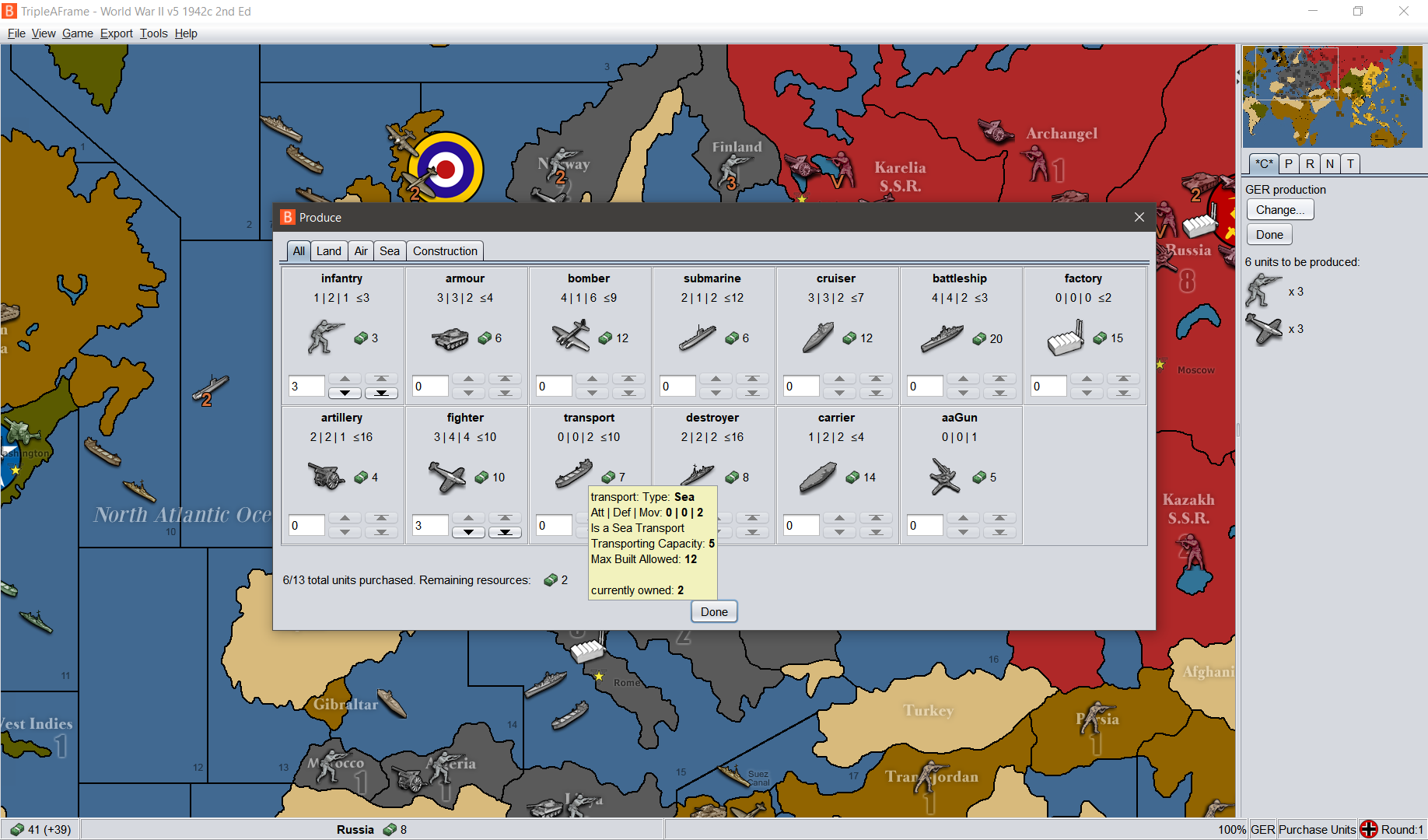
v2.5.31-bu patch with Win10 @100%dpi (custom scaling with font scaling%: 125)
L&F: Nimbus (Font: sansserif-15).
I've shortened the player name from Germans to GER in the map and I'm using a 24x24 pixel player flag -
-
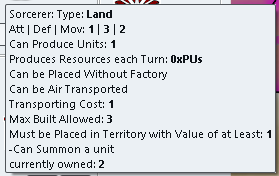
Putting <br> at the end of the tooltip works, but its not common practice, so all maps with tooltips will need this adding.
Can the currently owned be placed before the tooltips?
https://forums.triplea-game.org/tags/thedog
https://forums.triplea-game.org/topic/3741/curated-best-top-maps-triplea-guides
Hello! It looks like you're interested in this conversation, but you don't have an account yet.
Getting fed up of having to scroll through the same posts each visit? When you register for an account, you'll always come back to exactly where you were before, and choose to be notified of new replies (either via email, or push notification). You'll also be able to save bookmarks and upvote posts to show your appreciation to other community members.
With your input, this post could be even better 💗
Register Login