Proposed Map: Domination 1941
-
Here are the baselines with the marshes fixed. I added another sz division for the Soviet arctic sea zones. Ebbe pointed out that they were kinda massive compared to the others haha, so I tried to fix that right quick, along with an island that got blacked out up there somehow. I'm not sure what else to do with it really in terms of the SZ subdivisions. I think what we have already is probably sufficient to get something interesting going there.
https://www.dropbox.com/s/xnvwl23sf092dia/Domination_1941_baseline.png?dl=0
https://www.dropbox.com/s/4740bj0l87sbb57/World_War_II_Global_1940_baseline.png?dl=0
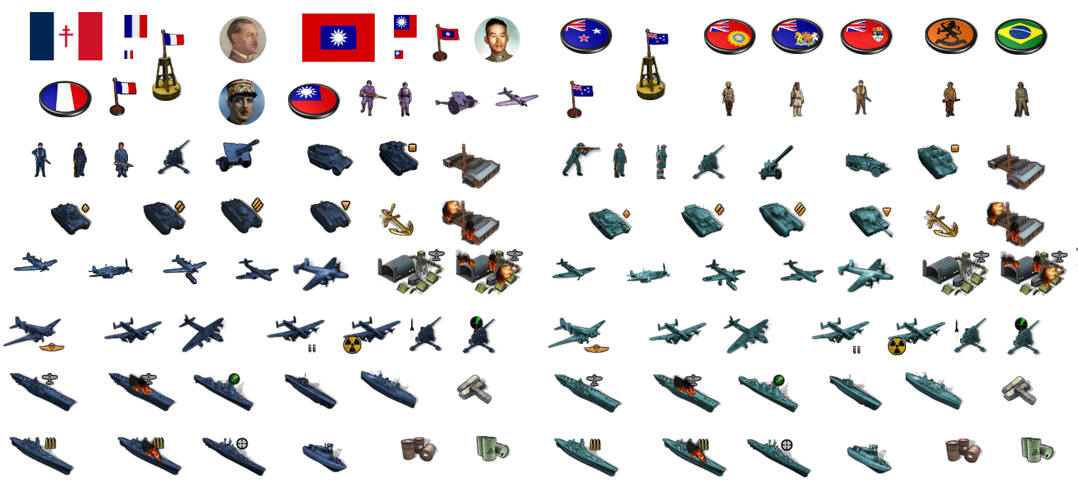
Haha yeah I guess the French do sorta look surrender mode, compared to all the rest of the Infantry being attack stances now. I'll have to make a new Inf unit for them too, and China and Anzac I guess. The latter has a few dudes in Egypt, but I just clipped the detail there, cause I didn't get that far along with the units yet heheh. I still need to remove the roundels in the sticker set for those last few Nations.
I'll try to get that wrapped up tomorrow and then put a folder on dropbox at the end of the week, so we can start playing around with them.
Unlike the map, which still needs to be run through the utilities and built out, the units can be ported into the current build and used with Bung's map. The units will be rather smaller in the display with a map at 16816px compared to how they'd look on Bungs at like 7500px. Basically they'd appear twice as large on Bung's. The centers on the current G40 map at 48px too, so they probably look a little tight and may clip or have some foregrounding issues, but should still work for a preview. Like I've been using Frostion's with the roundels in my G40 folder and they still look pretty decent, even with the centers being a bit out of whack. It'll be nice to see some revamped centers on the new map though, with more room to groove hehe
For the Territory labels and production values, I'd like to just use the stuff that Veq and Bung put together for G40, since it's already done and looks pretty nice. But I think they will be too small with a map at 16816px, so I'll probably have to redo them all. It's sorta the same issue with the label graphics as it is with the units, the enlarged map means that the labels end up displaying smaller. Text that reads at like 36pt on Bung's map at 7500px, is going to look more like 14pt on a map at 16916px. I'm not sure, perhaps it's better to just avoid the labels and only show the PU values?
Text doesn't scale particularly well, and can quickly become illegible, unless the font is very clean and simple. For example it's easier to read the numbers next to the units when the map is at like 60%, than it is to read the labelling graphics. Since most people will probably play with adjustments to the mapview zoomed in/out, it seems like one of those things that might just end up being an eyesore and not really worth the effort. In the current map, the labels remain even with the map details turned off, since they're treated more like flags I think, with their own centers, not part of the relief. I'm not sure what the best approach is. I mean I'd like to have the labels, but only if it's going to look good hehe.
For the Domination map, I think we'd be better off not showing TT labels, but just the PU value graphics. Basically leaving the TT names for the hover-over w/ cursor. Otherwise I think the labels will just take up too much space and there'll be too much text everywhere. Instead of showing all the TT names individually, there might just be some larger regional labels so as not to have it too busy visually.
-
@black_elk said in Proposed Map: Domination 1941:
Instead of showing all the TT names individually, there might just be some larger regional labels so as not to have it too busy visually.
yea that seems a good idea

-
You'd have the color for the owner I guess but a Faction type logo thingy maybe ? So one would no original ?
-
OK cool
If anything I'd like to try and use tripleA's built in "View Map Font and Color" feature for the labelling.
The main problem with including labels as graphics, is that it makes that "View Font and Color" tab way less useful. Cause otherwise tripleA can just write all the TT names and PU values onto the map, and scale to player's preferred size. I think the default is 18pt, but you can set that and the color of the font. But if there are already graphics in place then you'll see weird stuff like the same name displaying twice or overlapping letters or just excess visual clutter.
It's sort of like "View Display Flags" vs the drawn on Roundel for the units dilemma. The drawn on roundel may look better at 100%, but it makes the show flags view function useless.
If anything we should try to improve the flag icons to make the "Flag Display: size small/large" look clean.
For the labelling text in general I think it's better to keep that simple, since simple text is designed for scaling. Like it's going to look better if the font is straightforward and in a single color and handled by tripleA right? The look at 100% scale takes a back seat to legibility at all other scales I would think, so it's going to be better as actual Text rather than as a Text Graphic for that, pretty much always, right? That's my thought anyway. If I don't have to redo all the labels I can focus on other stuff like making the units cooler or fixing shadows lol
Ps. For flags roundels, I think we should do an oval, but instead of a puck in perspective, just like a regular oval. The oval is a better shape I think than a circle, because you can show more of the flag, and somewhat cleaner than a rectangle if it has to stand by itself.
Do we know what the limits are on flag sizes?
Bung and Frostion had flags at 32px and 12px for the small size (the one that shows in the stats tabs). Something between those two size would be nice. Say something at 18-24 px? That would be ideal for unit flags. The 32 px flag (the one that shows at the bottom righthand corner for current player) is a little too large with a lot of overlap into the units, and the 12px flag is too small, like just not enough pixels there to create a visual that's pleasing to the eye. Basically we need a goldilocks flag size somewhere in the middle hehe.
-
@black_elk said in Proposed Map: Domination 1941:
Bung and Frostion had flags at 32px and 12px for the small size (the one that shows in the stats tabs). Something between those two size would be nice. Say something at 18-24 px? That would be ideal for a unit flags.
There is no max size for Flag_large.png
These are for ww2 global
For normal flag 32x32 or 32x48 (real world ratio) is good for 4K screens
For ww2 Flag_small.png the optimal size is 12x12, the reason is the Tech table needs this for all the nations to squeeze in. -
@black_elk said in Proposed Map: Domination 1941:
I added another sz division for the Soviet arctic sea zones.
Remember they should be massive compared to other SZ, the closer to the poles the bigger the areas should be. Remember this.
Here are real world flying distances found using
https://www.distancecalculator.net/From To km miles New York in USA to Murmansk in Russia 6456 4012 New York in USA to Liverpool in UK 5325 3309 Natal in Brazil to Dakar in Sengal 3005 1867 Puerto Williams in Argentina to Cape Town in South Africa 6746 4192 Cape Town in South Africa to Perth in Australia 8697 5404 Tokyo in Japan to San Francisco in USA 8266 5136 Brisbane in Australia to Puerto Williams in Argentina 10067 6255Also the Russian tundra TT should be bigger horizontally than the forest TT that are below them.
https://forums.triplea-game.org/tags/thedog
https://forums.triplea-game.org/topic/3741/curated-best-top-maps-triplea-guides -
Re TT names, personally I would not put the TT name on the reliefTiles, as you say let TripleA display them or better yet just show them on the status bar.
-
I think they're still the largest SZ on the map, well other than those giant G40 squares off South America hehe.
I figure those might have a mapkey or compass or something so the space doesn't feel as dead. Basically the bottom lefthand corner of the map. That's the place to stick a big graphic or mapkey if we want one.
OK so Medium flag can be 32x48? That's good to know.
They will look much better if we can go wide like that.
Large Flag I think is almost useless as a graphic, as it's too big to display on the map really. On the current G40 map that's a least 4 centers out of commission just to show those giant ass capital Roundels right? hehe Same deal with the labels, if the units have to dance around those. I think it'd be better to have that one be more the size of a regular unit, say a flag at 68px tall I guess. Cause at least then you can have it displayed without taking up miles and miles heheh.
For flags I would feature request a few more sizes for that, then change the Flag labels to accord. Maybe something like...
Huge 100px
Large 68px
Medium 32px
Small 24px
Tiny 12pxThen at a higher resolution display, you could just bump of the values. So tiny becomes small, large becomes huge etc.
That would be clutch
Then we could use size small at 24px for the units and it would probably look sweet.
-
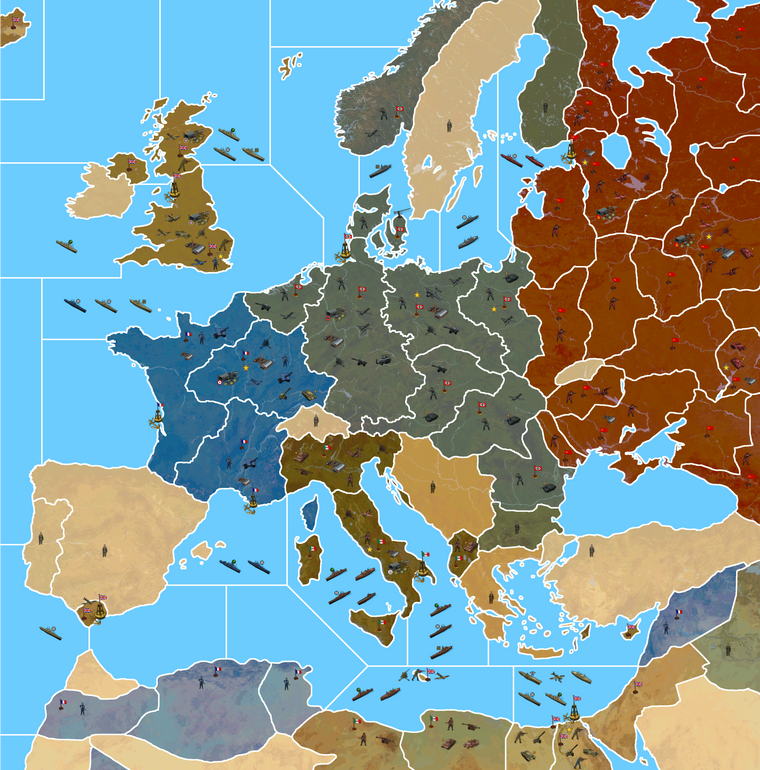
Ok here's a quick tint for the little guys... and then a detail of Europe showing the units at 125%. The French dude is only like half surrendering now lol
Again with the image indexed to save on space for the boards.
I didn't include the roundel pucks this time, but just the flags and an upscaled V star for the Victory cities. I'll make a better one for the VCs at 54px when I get a minute. Overall I think it looks pretty good with units at 125%. They're still large enough for the map at 50% zoom out I think, though I don't know about panning out much more.
I do worry a bit that players may grumble though, like "Honey I shrunk the units" lol, but not sure if there's much to be done for that with the ceiling at 68px. Only thing I can think of is to have some kind of SD/HD package as an alternative to the 4K one, where the map isn't quite as large. I would think that most Global players would use smaller units in their display anyway, but they probably also don't really need the map at 100%, which is a pretty close-in zoom for the actual gameplay. I'd think most would downscale the map to at least 80% or something like that, so 16816px might just be overkill for the G40 playscale. Like if it's a ultra high def in the res, but for lo-fi upscaled units, not sure if it'd be worth the tradeoff there for most?
Reducing the map scale by 25% so the units can be at 100% by default, instead of 125% and still look like the below might be better. Because then at least players could upscale the units to 110% or 125% from there, instead of starting out at the upper limit on unit sizes. I also like the option for players to revert to current standard units if they wanted to, but at 48px they'd be way too small for the 16816px map. Even though I think these units look a lot better, some people are resistant to change, so I'd be nice to have something that could do double duty hehe. Not sure what approach is best. What do you guys think?
I might be overthinking it, perhaps it'll look fine, but it's hard to know hehe. Like my laptop is 1080p, so it's hard to gauge hehe. For me the below looks pretty good at around 75%, which is how I imagine players would want to game. Like pan out to 50% for the quick survey but making the moves at like 75%-80% or something in that range.
-
@black_elk
For Global the TT are very big and the unit default will probably be 125%, so 68px high, the place.txt will have to match the 68px, so could be anywhere from 70px upwards to say 80px depending on whoever picks up the Global batton to code it.For comparison The Shogun & The Shogun Advanced with 68px high units, I play at 60%-ish zoom.
For my 1941 Command Decision the one with lots more TT, I am hoping to use 100%, so 54px high, with the place.txt at around 56px-ish+.
Both versions will still have the same overflow issues for Gibraltar and Malta and the Pacific islands.
ps.
I also like the option for players to revert to current standard units if they wanted to, but at 48px
We will have to ask the Devs to add two more unit sizes 137% and 150% and then map makers can use the standard 48px units on your map.
pps.
Im really liking the relief layer especially the grey rivers and lakes. -
@black_elk said in Proposed Map: Domination 1941:
I kinda pause the work on the map to just try to get a handle on the unit stuff, but we can tweak it for the marshes or make it as large or small as one wanted, or eliminate it entirely as Cernel suggested. But maybe something like this where we just pull a bit to the left and a little taller. Basically trying to keep as much room for Belarus and Bryansk and Ukraine for stacking.
https://www.dropbox.com/s/4740bj0l87sbb57/World_War_II_Global_1940_baseline.png?dl=0
Fidelity to the OOB game board is the only reason it's there. The thought being that players familiar with OOB G40 or Bung's current G40 map in tripleA, should be able to open this one, parse it relatively quickly to see how it's the same, without being too disoriented. OOB the Marshes tile is quite large both on the board and in Bung's, like it's bigger than Morocco lol, even though it doesn't need to house any units lol, and it extends to cover basically the whole border between 'Western Ukraine' and Belarus, which is maybe not aces for the labelling but is nevertheless what the game board does. I'd ditch it with a 4 point but then worried that might just confuse people. Like they'd see it's gone and think hmmm. I mean I did ditch Yukon but that was more cause I didn't like the grayed out look from the tile that only exists in 1st ed. People would just go by the Second Ed board by now, so didn't really seem needed, though you could add it back like in the earlier draft if one wanted I guess. To me the above felt (as many things do) like a sensible enough compromise for the marshes. Like if you wanted to have it just big enough to fit a few unit types you could maybe still squeeze em in there, but it didn't seem like a huge priority for the G40 scale game hehe.
Not sure if the topography is a good call. Looks cool but it has some big drawbacks.
Definitely the marshes should not be there if you have topography: that would mean at least half of Kiev is in the marshes!
And Moscow is seemingly in Belarus and actually about at the tripoint of Novgorod, Archangel and Belarus, whereas it is actually in no one of these territories and not even in any territories adjacent to any one of them!
About this, what I believe is your Russia territory is adjacent to Archangel in your drawing, whereas it has not to be (Smolensk or Vologda in between).
Besides, topography is unfortunately a poor choice even in a consistently drawn map unless you can get a good topographical period map. It looks like you are using the contemporary topography, instead. For example, the Rybinsk Reservoir didn't even exist in 1940.
I'm not saying you should fix any of these, as that would imply some very weird and cramped drawing.
-
@cernel has made some good points.
The Domination 1941 map and topography layer could be paired, as long as territoryEffect are not used, bearing in mind Cernels comments?
As for my 1941 Command Decision map, the one with lots more TT, it has territoryEffect (Tundra, Forest, Desert, Urban etc) , so I will not be using the topography layer. However the relief layer with the excellent grey rivers and lakes, plus some graphics to represent Tundra, Forest etc will be used

-
Good eye! I must have erased a line or just never had one down in the first place. I guess we'll have to contort a few of those TTs so it matches the global.
I mean it seems to me that it's always pretty much the same issue there, where the OOB board and TT connections have Moscow/Russia pretty far out of position. Like to make it work, I'm just going to have to carve into the Russian TT even more with Moscow creeping east I guess lol.
Yeah the terrain is a bind, if you take close look, esp in the areas where there's a lot of warp on the map, it's probably not going to match up exactly with the reality. And certainly it's a modern terrain, like it's literally just the one from the wiki that I warped into shape hehe.
I don't mind so much when the terrain is knocked back and painted over, because then it just becomes more ambient, like wallpaper or something. Like I'm sure we could just erase whatever river fork or stretch of forest or misplaced tiny body of water that's throwing it off, and by the time it's painted over and crowded out with units, I'd think people would be less inclined to scrutinize what's happening underneath with the terrain peeking through. I'd say a little hammering with the eraser and some dodging with the clone stamp, or just crank up the opacity with the paint layer and we could probably get away with whatever. Less being more on that one probably.
Anyhow, here's a quick paintjob for the Dom one with the units at 100%.
Not suggesting this as a distribution of forces or anything. Just a visual example. My paintover had 1940 from one of the earlier paintjob, so for 41 it would look rather different, France having already fallen and such. I'd think for Italy to collapse a few of those lines as discussed on previous pages, to house more units and fit the vibe better. I just dropped a few infantry around to ballpark the centers, and to help see which TTs would need the beef up depending on how many starting units you want to see on the board, or how heavy you want to stack with different unit types at the outset hehe. But gives a sense for the unit display at that scale. Again indexed for the space saver.
Ps. Just looking at the current G40 map. On that one with the details on there is a repeating pattern of what looks like a roadmap or areal survey view, but it definitely has a tight repeat. Like you can see the same dark shape again and again in virtually every territory in Asia. I think if we can get a ballpark terrain that works well enough in relief, that'd still look a lot sweeter than what's available right now hehe. If anyone has a kickass terrain map from the 1940s, we could maybe just insert a regional vignette where it makes sense. Like once it's painted over, we could probably get that to blend alright. Any of the Soviet TT borders could be reshaped too, I was hammering pretty fast there. The stuff Cernel mentioned, I'll try to knock out this week, so at least it's less distracting in that area of Russia hehe.
Catch ya in a few!
-
@black_elk I think Luxembourg can be part of Belgium rather than Alsace-Lorraine.
-
@black_elk I wonder for the G 40 map if Gibralter could be a bit bigger ? Or maybe it already is ? Could take the adjacent TTy and go halfway to a third at center than halfway. So not a true arc.
Obviously a distortion but for game play would be a plus. Just a thought
")
-
Makes sense, like big enough for the airbase at least right hehe.
I'll bang it out tomorrow along with Luxembourg and the Smolensk/Vologda connect.
I'm not entirely sure what the best way to handle Russia is. I mean OOB has that tile and everything around it much further east/right than it would be. To have Moscow roughly above the sea of the Azov and not too much further right than that would be nice, but OOB it's like almost at the Caspian, or else North is at 45% angle there, or something's going down there hehe. I'd think the simplest is to just blob it a bit, and erase a few rivers or redraw the bounderies over them or something like that to play it down a bit.
Right now the relief is just a combination of the Terrain map and a layer painted on top of it at 75% opacity. I used my simple paintjob draft for that to give an example, though in game you'd just have a transparency layer at 75% on top of the terrain, which tripleA would then paint over to provide the displayed ownership color. Turning off map details would then remove the terrain and the transparency layer to show the titles with the HEX color at 100% opacity. I'm not sure, but I think we're limited to just 1 layer in relief right? My thought would be to keep it relatively simple so it looks clean, and so the relief isn't changing too much of the hue/value from the assigned HEXs. I was pretty happy with how it help up doing the terrain underneath thus far, like it gives a little bit of variety to break things up visually, but not as stark or abstract as a repeated pattern or tessellation fill like we have going on in the current G40 map. I figure we'll just keep chipping away at it, till the oddball elements are dialed back, and it feels good enough for government work lol
-
@black_elk said in Proposed Map: Domination 1941:
but I think we're limited to just 1 layer in relief right?
Well ...
Some clever soul thought of doing this;
Create another layer of relief tiles that match/overlay the relief tiles.
This is achieved by the coordinates being in the decorations.txt
Clever huh.See the Total World War: December 1941 3.0 map
It has baseTiles, reliefTiles and misc folder full of tiles. -
Right on!
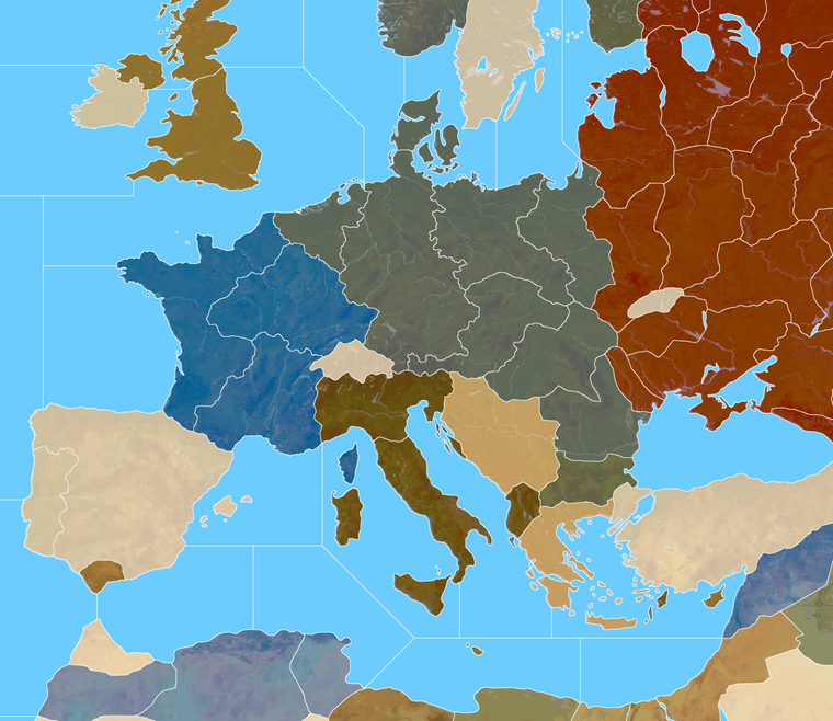
I was playing with the border feathers and beefed up Gibraltar a bit to fit another center big enough for that AB. I guess it could be even larger, just like monster mode hehe. I figured units could also spill into Spain if players start stacking super heavy there. Also shifted the TT called Urals OOB right quick, so that it would include at least a portion of the range at the top heheh. I'll tweak the Dom map so it follows when I get a minute. I also want to ditch some of the drawn on lakes and such, since they're not really necessary anymore. They were more to help me ballpark the under relief. Got pretty close, but now I think they can get nixed so as not to distract.
https://www.dropbox.com/s/4740bj0l87sbb57/World_War_II_Global_1940_baseline.png?dl=0
Here's a quick relief.
https://www.dropbox.com/s/nqanzab6s6zssl9/World War II Global 1940 feathered borders.png?dl=0
I was thinking borders at around that width looked pretty good. What do you think?
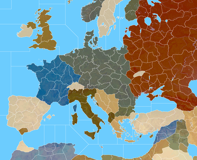
Here's the Domination baseline with those corrections. My approach to the Russia TT was to just try to make it kinda stretch armstrong in a few directions, but I think it'll probably have to do. We can just noodle what's underneath to make it feel more dialed.
Domination Baseline
https://www.dropbox.com/s/khxkql58g73q1n3/Domination_1940_baseline.png?dl=0
Here is painted at 75% opacity with the feathered borders
https://www.dropbox.com/s/30n486kglekoo4x/Domination painted feathered opacity 75.png?dl=0
And here's a quick detail of that on Europe. I thought Italy into 4 tiles might be kind of interesting. What do you think?
-
@black_elk
So players can see the borders at 25% zoom, that looks good.Mainland Italy with 4 TT looks good.
-
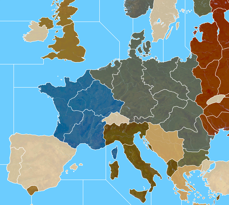
It's interesting with the thinner line, if I do noise reduction/anti aliasing, then zoomed out the white takes on the some color information. So like some of the lines in Russia appear a bit orange, when at max zoom. At closer zooms the effect goes away. By going up an extra pixel that's tamped down a bit.
I didn't notice it at scale, but the preview on the boards is showing it for me in the images in the post above.
Here it is bumped up 1px with a similar view to that G40 above. I think it might register cleaner at 25% that way.
Hello! It looks like you're interested in this conversation, but you don't have an account yet.
Getting fed up of having to scroll through the same posts each visit? When you register for an account, you'll always come back to exactly where you were before, and choose to be notified of new replies (either via email, or push notification). You'll also be able to save bookmarks and upvote posts to show your appreciation to other community members.
With your input, this post could be even better 💗
Register Login