Proposed Map: Domination 1941
-
@black_elk I wonder for the G 40 map if Gibralter could be a bit bigger ? Or maybe it already is ? Could take the adjacent TTy and go halfway to a third at center than halfway. So not a true arc.
Obviously a distortion but for game play would be a plus. Just a thought

-
Makes sense, like big enough for the airbase at least right hehe.
I'll bang it out tomorrow along with Luxembourg and the Smolensk/Vologda connect.
I'm not entirely sure what the best way to handle Russia is. I mean OOB has that tile and everything around it much further east/right than it would be. To have Moscow roughly above the sea of the Azov and not too much further right than that would be nice, but OOB it's like almost at the Caspian, or else North is at 45% angle there, or something's going down there hehe. I'd think the simplest is to just blob it a bit, and erase a few rivers or redraw the bounderies over them or something like that to play it down a bit.
Right now the relief is just a combination of the Terrain map and a layer painted on top of it at 75% opacity. I used my simple paintjob draft for that to give an example, though in game you'd just have a transparency layer at 75% on top of the terrain, which tripleA would then paint over to provide the displayed ownership color. Turning off map details would then remove the terrain and the transparency layer to show the titles with the HEX color at 100% opacity. I'm not sure, but I think we're limited to just 1 layer in relief right? My thought would be to keep it relatively simple so it looks clean, and so the relief isn't changing too much of the hue/value from the assigned HEXs. I was pretty happy with how it help up doing the terrain underneath thus far, like it gives a little bit of variety to break things up visually, but not as stark or abstract as a repeated pattern or tessellation fill like we have going on in the current G40 map. I figure we'll just keep chipping away at it, till the oddball elements are dialed back, and it feels good enough for government work lol
-
@black_elk said in Proposed Map: Domination 1941:
but I think we're limited to just 1 layer in relief right?
Well ...
Some clever soul thought of doing this;
Create another layer of relief tiles that match/overlay the relief tiles.
This is achieved by the coordinates being in the decorations.txt
Clever huh.See the Total World War: December 1941 3.0 map
It has baseTiles, reliefTiles and misc folder full of tiles. -
Right on!
I was playing with the border feathers and beefed up Gibraltar a bit to fit another center big enough for that AB. I guess it could be even larger, just like monster mode hehe. I figured units could also spill into Spain if players start stacking super heavy there. Also shifted the TT called Urals OOB right quick, so that it would include at least a portion of the range at the top heheh. I'll tweak the Dom map so it follows when I get a minute. I also want to ditch some of the drawn on lakes and such, since they're not really necessary anymore. They were more to help me ballpark the under relief. Got pretty close, but now I think they can get nixed so as not to distract.
https://www.dropbox.com/s/4740bj0l87sbb57/World_War_II_Global_1940_baseline.png?dl=0
Here's a quick relief.
https://www.dropbox.com/s/nqanzab6s6zssl9/World War II Global 1940 feathered borders.png?dl=0
I was thinking borders at around that width looked pretty good. What do you think?
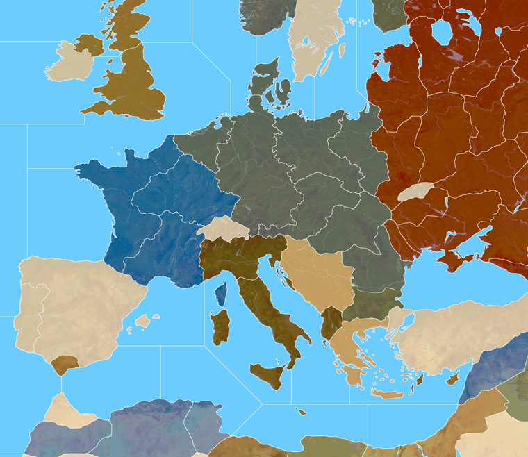
Here's the Domination baseline with those corrections. My approach to the Russia TT was to just try to make it kinda stretch armstrong in a few directions, but I think it'll probably have to do. We can just noodle what's underneath to make it feel more dialed.
Domination Baseline
https://www.dropbox.com/s/khxkql58g73q1n3/Domination_1940_baseline.png?dl=0
Here is painted at 75% opacity with the feathered borders
https://www.dropbox.com/s/30n486kglekoo4x/Domination painted feathered opacity 75.png?dl=0
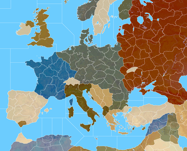
And here's a quick detail of that on Europe. I thought Italy into 4 tiles might be kind of interesting. What do you think?
-
@black_elk
So players can see the borders at 25% zoom, that looks good.Mainland Italy with 4 TT looks good.
-
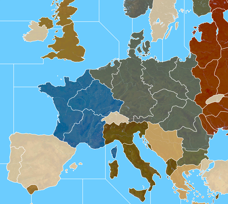
It's interesting with the thinner line, if I do noise reduction/anti aliasing, then zoomed out the white takes on the some color information. So like some of the lines in Russia appear a bit orange, when at max zoom. At closer zooms the effect goes away. By going up an extra pixel that's tamped down a bit.
I didn't notice it at scale, but the preview on the boards is showing it for me in the images in the post above.
Here it is bumped up 1px with a similar view to that G40 above. I think it might register cleaner at 25% that way.
-
@black_elk
Yes interesting, now looking even better.Can you still see the white lines at 10% Zoom?
The above, how many px wide are the white lines? -
Yeah so I took the 1px baseline, grew selection by +2 px, to create a 5px white line. Then I did noise reduction strength 4 to soften the edges.
Doing it that way I can still see the border lines down to 6%.
Here's a quick example of the Dom Europe that way. Basically the lines a bit beefier at 100% but I think it's probably worth the trade off for the max zoom out.
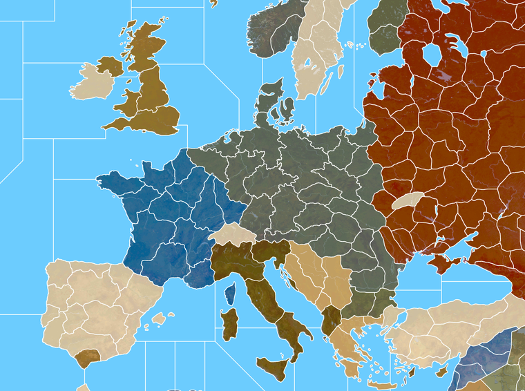
Here's the big one in case you want to double check the zoom out at 10%. I think it should hold. Like in GIMP I can see the lines down to 3.6% before they disappear.
https://www.dropbox.com/s/153e600c5768y3x/Domination_1940_painted_terrain_feathered 5px.png?dl=0
-
@black_elk
All good.
100% zoom will be for 4K screen
Us mere mortals will be using zoom 60% or less.So the above will fit both types of users.

-
Ok sounds good. Here are the tinted units...
If you guys are cool with that for a look, I'll start breaking it apart and assembling the images into unit folders.
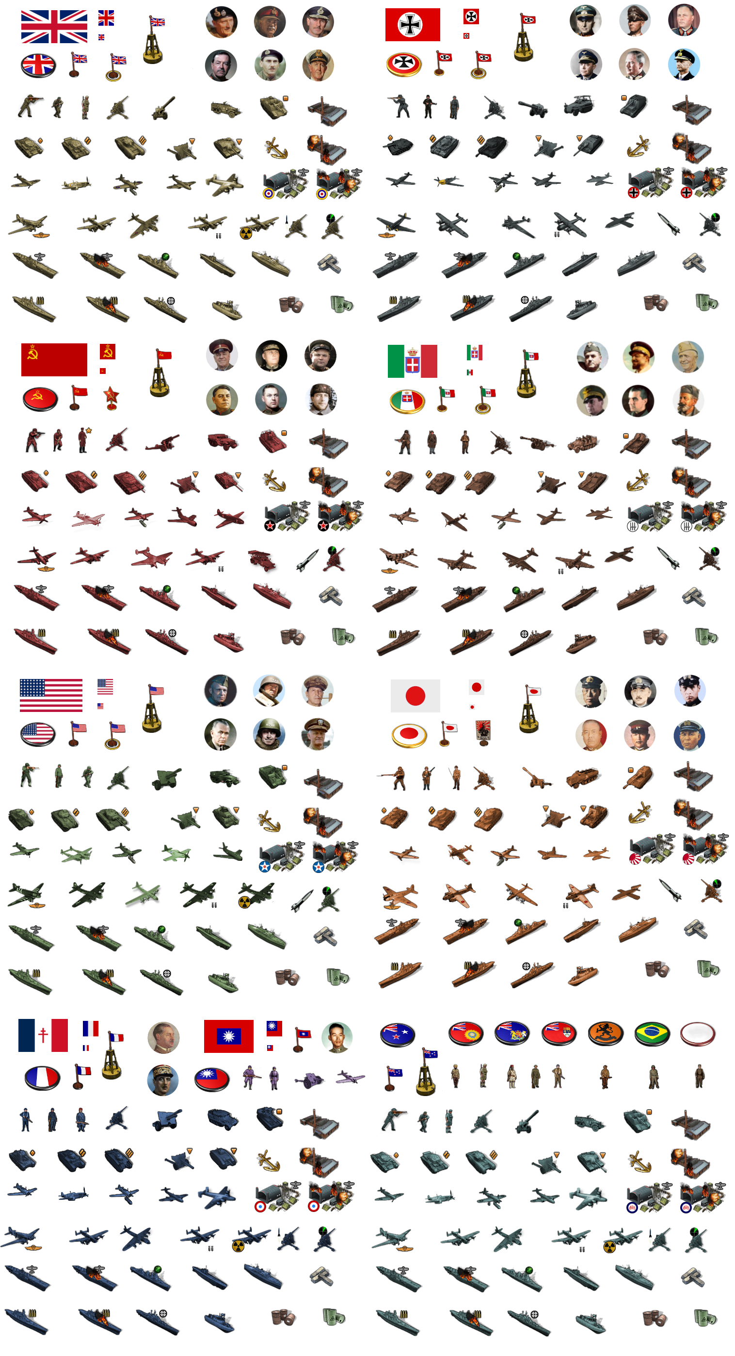
There's more material there than would be strictly necessary for G40, but I figured we could just past a sticker image with everything together into the main units folder as well, in case people want to modify it or add stuff G40 expansion type stuff. Also since it's pretty handy for colorizing.
-
@black_elk
A request, 1941 Command Decision has "Anti-Tank" units, please could you had them in for tinting?Allies

.
Axis

If not these then something similar.
-
Sure, do you want me to add the inverted triangle? That was Frostion's anti-tank first strike icon. He has it above for his tank destroyers.
He used the tiny square for SP Artillery, I was thinking about adding it to the standard art for all nations to help identify the units.
Another option might be a dude with a bazooka or anti-tank rifle, if you wanted it to have more of that sort of flare. I do feel like our plastic army is kinda missing that dude, since he's such a classic lol.
Here give me a few minutes, I'll do a quick tink for the anti-tank gun for everybody.
ps. Ok I updated the image above. Let me know if that works for ya
-
@black_elk said in Proposed Map: Domination 1941:
Sure, do you want me to add the inverted triangle?
No thanks, as long as the Anti-Tank guns point left-down & right-down and the artillery points up thats good for me.
I do have Artillery-Hvy and Artillery-Lgt, but you could leave that for later? The Artillery-Hvy could do with an extra icon, maybe 3 explosions a bit like the Armor-Hvy.
Also, Industry-Hvy, Industry-Med, Industry-Lgt and Bunkers are you thinking they should all be a concrete colour, that is the same for all nations?
ps. The bazooka or anti-tank rifle and mortars, I think is more for tactical games, like in the Russo-Finish war/Winter War.
pps. Re the triangles leave them in for consistency, then they all look like a set.

-
Sounds good. The little icons are pretty easy to erase or switch if we can come up with something better. For G40 I wasn't going to use them for the ground, cause there's only 1 type of armor there anyway hehe, but they did seem kinda handy for distinguishing between light medium and heavy types in Frostion's game, or if people want to do expansion type stuff for G40. I do like his symbols for the naval units though, since it makes the ship types a bit easier to pick out at a glance.
Haha right on! If I get a wild urge I might do a bazooka dude or a guy tossing a grenade or revive the old dude with the pistol, just to round out the plastic army men vibe, even if they don't get used lol, but I think we got enough to handle the standard game hopefully
-
@black_elk said in Proposed Map: Domination 1941:
The little icons are pretty easy to erase
Agreed.
.
I do like his symbols for the naval units though
I do as well.
-
Hehe I forgot how many misc/redundant units graphics there were in the G40 folder. Also how mildly annoying the radar and rocket techs are for grinding out the AB/NB/Factory units. I just spent like 30 minutes making all those lol. There's at least a couple dozen graphics for each nation just down to those two techs, but I mean more the stuff that's just labelled "old" or "alt" or not being used for anything in particular.
I don't want to break any popular mods, but don't those have their own map files typically? Like the BM mod or the G40 expansion, or do I have to keep all this stuff in here in the main map package?
My thought would be to archive everything into a "Old Unit Graphics" folder, and then make sure that the stuff in the G40 units folders is only the material that actually needs to be there. Just so people can tell which stuff is actually being used. "Unit Help" doesn't show all the images, for stuff like Tech advances or damaged/disabled facilities etc, so you'd have to turn to the unit folders to see all the assets, but then having a ton of misc unit stuff in there too makes it a little confusing. Or at least any misc or expansion type material can be separated into it's own folder within the main unit folders right, so it's easier to keep track of?
-
@black_elk
Im not sure what you are after, but below is how TripleA works.units folder
contains all the nation folders and can contain units that are used by all nations including neutral, so in my 1941 Command Decision folder I have all the 9 Industry units with variants and 2 Bunker units one with _hitNation-XXX folders (like USA, Britain etc)
contains only that nations unitsInside Nation-XXX folder you can have lots of other folders that are not read/seen by TripleA.
like Alt folder or NotUsed folder or AllUnits folder that belong to the higher folder etcHopefully the above makes sense and you can make it fit what you want.
-
@black_elk yea i think 2.6 has a fix for missing images. Gives a generic one.
It is a pita doing all the different tech damaged/hit units lol. Just naming them takes me awhile. I'd just copy the existing folder, then add your new stuff to the new folder. It should replace the current ones. Any others can just stay.
If somebody wants the old units, they'd have to switch unit folders before game start. Can be at any point in the game if it's saved.
-
Ok cool, that sounds easier. For stuff that had a ready image for substitution, I tried to include one that made sense. Like for Marines or whatever. I just made a generic lookin' dude for the British/Anzac right now. I followed the pose of the American Marine unit, but giving this one the green beret.

-
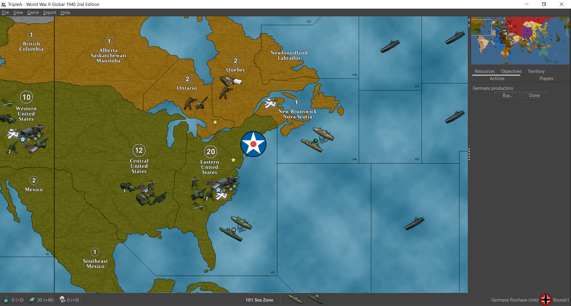
I'm about halfway through assembling the G40 folders. Looks pretty good so far. Obviously the centers on Bungs are pretty tight at 48px squares, so the new larger units will overlap and are somewhat oversized at 100% there, but they actually look pretty clean at 75% and under. These screens show units at 75% on Bung's map around Japan and North America. Basically at larger sizes they start to bump into each other and the labels, and get pretty crowded on the current G40 map, but they look pretty decent even with there when reduced in scale. I like 66% myself, but 75% works well enough. I thought it was kinda cool how the sprawling Frostion ABs made the pacific islands feel more important lol. I got Japan, USA and the Brit units done. I'll finish the others tomorrow.
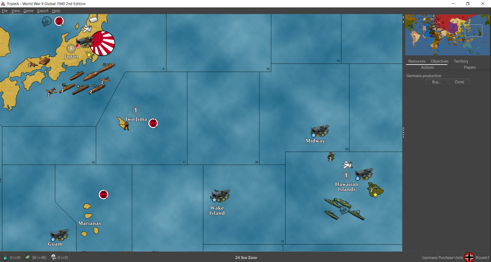
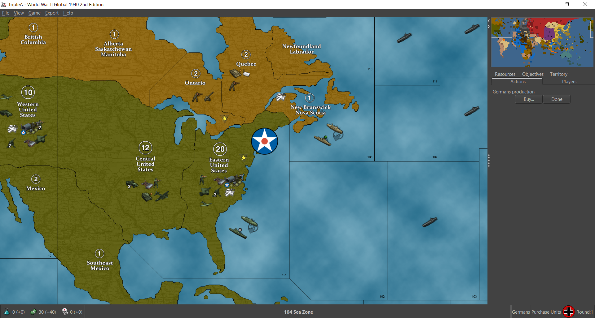
Then here they are at 100%
Showing the same set of views
So you can see how they get some foregrounding issue with the bumber cars there at 100% lol. When we do the new map we can make the centers wider so that'll be nice.

