Possible Game Interface suggestions
-
With a new stable lurking in the shadows somewhere... this is probably too ambitious a project for the new release. I will post it anyways.
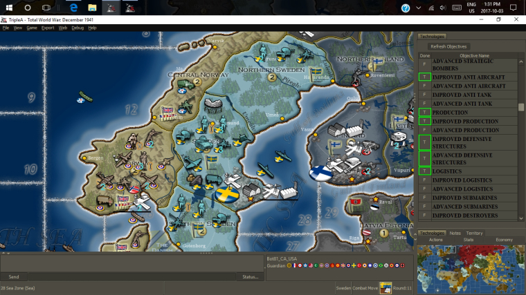
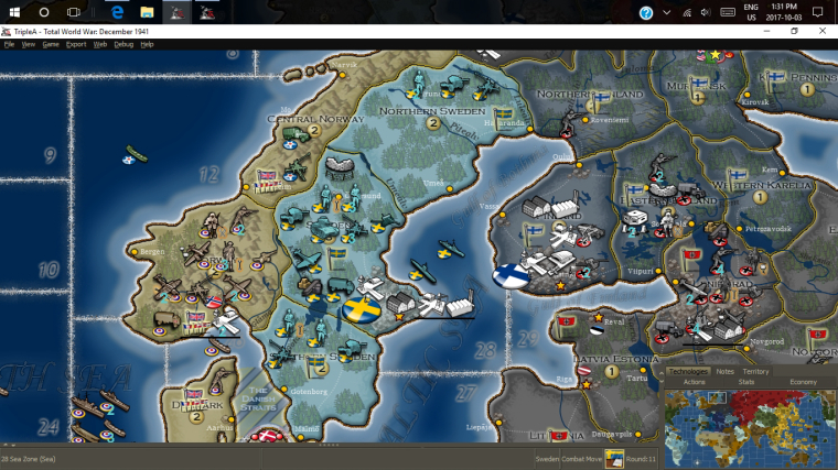
The idea is to rearrange some of the stuff on the in-game view. These proposed changes are really just meant to allow for more of the map to be visible while playing without completely minimizing all the tools. Here is my suggestion....
Just an old idea I thought I'd re-table.
-
As a follow up I also have spent some time looking at our battle window wishing it could be clearer.
Below are 2 examples of what I think would be a much improved display.
the first is Low Luck
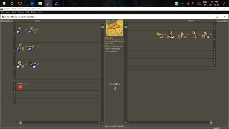
Second is Dice
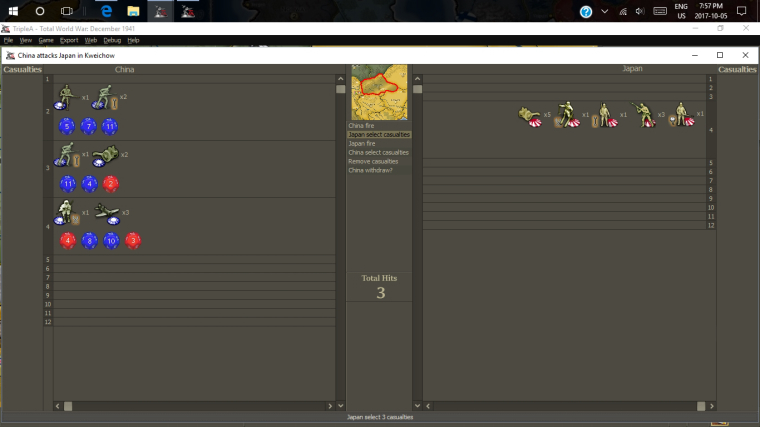
My final thought or question on this was pertaining to the tendency of the window to display all the numbers of dice sides (1-12 in this example) . I included the same display in my examples. My question though... is it really necessary for the game to display boxes for numbers that have no units? Wouldn't it make much more sense for the window only to generate slots where there are units or a roll?
Ie. in my first example for Low luck.... the are units in the 2,3 and 4 as well as the remainder roll of 7. Would it not make it cleaner if all the other values with no combat involvement were not displayed visually? I don't know whether this is possible. But I think it would make it cleaner if only values with units or rolls in the current round of combat were displayed.
Anyways.... just throwing idea's out there.
-
I like the dice under units thing. It would really give a good overview of what is going on.
But I do think full screen is maybe a bit too much. What about 75% windows in height and width? Then players can still, by looking at the background, see where in the world they are. I think players would really like to be able to move the window around a bit and maybe look at what threats are in the territory surroundings. Maybe they casualty-select on this basis.
Player would also still be able to see the right side of the map screen/the tabs with the list of battles to come. I think this is also important.
-
@frostion Size was just for the drawing. Don't imagine the normal window dimensions would need to change at all. I was just giving lots of room to see it.
-
Redesigning the battle screen is a necessity if anyone wants to use dice larger than d6 to d12. I have a mod where I'm experimenting with d18 and they seem to have some nice benefits and I would like to make them permanent. However the battle screen is a bit of an issue. There are 18 columns on each side albeit most empty, but they still occupy precious space. This causes unit images to be cutoff when the battle screen opens. The players can either manually drag the edge to expand the window, or use maximize button. But even if window is maximized it can't accommodate 36 images for d18 at the size they are currently displayed. Looks like even 24 images for a d12 wont fit without cutting off a couple. Anyways it would be rare to fill each numbers column but it should still accommodate them in chance it does fill up.
If the image size in battle screen was adjustable, it would offer a quick fix. Maybe in game menu or in map. properties file.
Another helpful feature would be an auto window sizer for the battle screen window itself, so it only opens as large as it needs to in order to accommodate all images at whatever size they are.
-
Just thought I would resurrect this thread in case it is relivant to some of the UI discussions.
-
@Hepps said in Possible Game Interface suggestions:
As a follow up I also have spent some time looking at our battle window wishing it could be clearer.
Below are 2 examples of what I think would be a much improved display.
the first is Low Luck
Second is Dice
My final thought or question on this was pertaining to the tendency of the window to display all the numbers of dice sides (1-12 in this example) . I included the same display in my examples. My question though... is it really necessary for the game to display boxes for numbers that have no units? Wouldn't it make much more sense for the window only to generate slots where there are units or a roll?
Ie. in my first example for Low luck.... the are units in the 2,3 and 4 as well as the remainder roll of 7. Would it not make it cleaner if all the other values with no combat involvement were not displayed visually? I don't know whether this is possible. But I think it would make it cleaner if only values with units or rolls in the current round of combat were displayed.
Anyways.... just throwing idea's out there.
I think this would be a huge improvement. If also allowing having a customized background (per map skin), it would start looking like an actual game.
-
@Cernel Also, a pet hate I have is the "fire" thing. I don't like it anyways, but it really makes no sense for maps before guns were invented, like 270BC.
I would change "fire" with "attack" (both for the offensive and the defensive units). Then, I would change the dichotomy attack/defence with offence/defence, instead.
-
really like both of these ideas.
") i also think even further simplifying the battle window by only showing the currently active odds groups could make the whole thing much more visually appealing and less cluttered.
i also think even further simplifying the battle window by only showing the currently active odds groups could make the whole thing much more visually appealing and less cluttered.here's another random thought, if we are taking a deep dive on the battle window another thing that might be interesting is an enhanced low luck view. Since so many people play with LL and the predictability often leads to much more precise odds calculations that must be made in real-time in tight/large battles there could be some added value to be had there.