UHD Map Should Replace Global one on Main Page
-
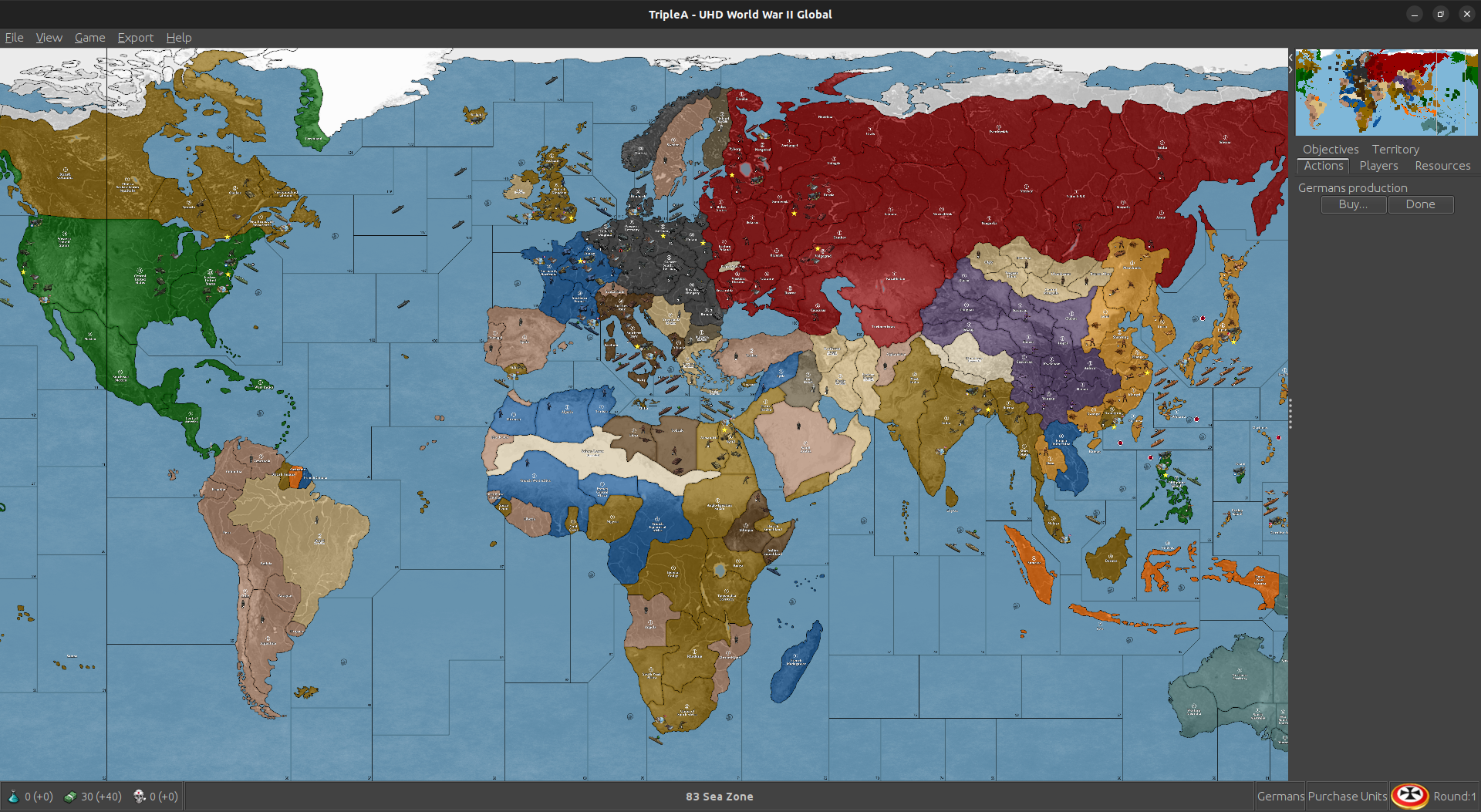
Think it's the Big World Map, which is cool, think UHD is better though.
-
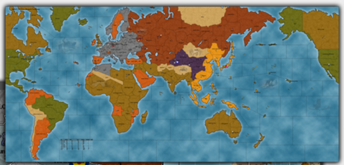
@beelee the top image is from Big World 1942 originally by Wandering Head. It's a screen one of the later iterations - I can tell cause of the relief and the HEX colors assignments, the little stats bar drawn on the map etc. It was likely revisited and redrafted after the Purple people eater color decision was made more generally, which wouldn't have happened until after 2008? China used to be green (USA player) since everything was hardcoded to the Big 5 back then.
So far as I know Big World was the first original baseline to be drawn for TripleA, way back in like 2003-5. Pact of Steel had used Logan's baseline for the Revised board (World War II v2 ruleset with modifications to the map), but Big World used an og tripleA baseline, which WH drew pixel for pixel. I playtested it with him. It was a pretty well balanced map under the v2 ruleset, later adjusted for v3. I think it was the first map to take LL play into consideration for the opener and to use a battle calculator for playtesting, as these features had only recently been added to tripleA at the time. It was also the first map to use the Mercator projection within tripleA.
For all these reasons I do think it makes sense to keep that one front lined. Global or any world war II map sans mods would assume that the player has a game manual to reference and has the board somewhere in their closet. I believe the stuff on the front page was meant to showcase TripleA as a general purpose game engine and highlight those maps that use a riff on the ruleset as opposed to like OOB stuff.
Ps. actually now that I think about it, the revision to Big World might actually be the reason that China is purple... It may have predated the later color conventions and formed the basis for them. For example the choice of that salmon hue for attackable neutrals, and Chinese units being purple but Italians still blue. Probably sometime in the later aughts maybe? It's hard to really remember. Very early though, like one of the very first TripleA games ever.
pps. this is amusing maybe. Total time warp! This is maybe my fav of all time honestly. Like I still think it's got charm
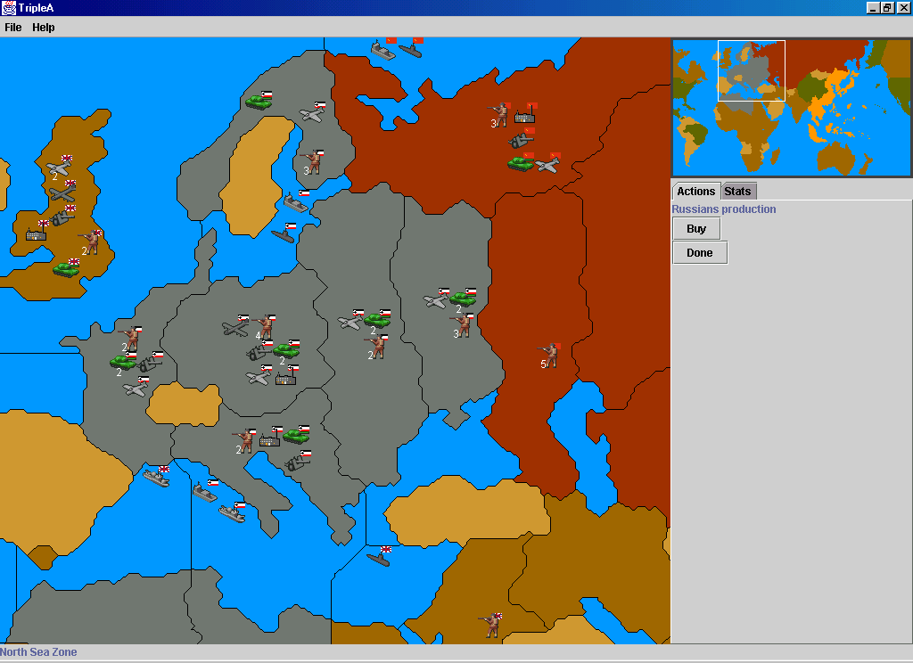

Anyway, glad you think the uhd looks cool. I think it can live on however, but I kinda like seeing the old Wandering Head and Napoleon games. Feels like classic TripleA to me somehow.
I kinda dig it how the front page is now, but then I'm weird sometimes. When the stuff changes on headers or front pages it just reminds me of how many variations there have been over time and I get kinda nostalgic heheh.
-
@black_elk heh heh them some old school maps

Was just thinking for a new player they might like the UHD appearance better.
Looks as if there's room to move Big World to lower left of map and UHD can join the party then


Think it's more eye catching though. We are a visual species lol
-
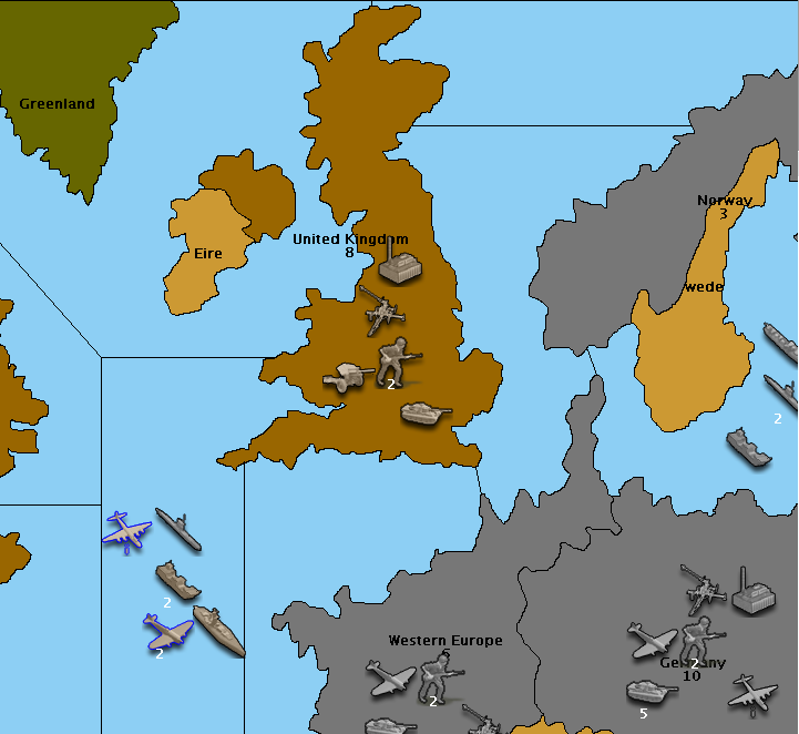
This was the visualization I remember as kinda the first I saw that was like oh man! I found it at last!
This was of course in the dark times when the old Iron Blitz CD become defunct for mp play, and kinda buggy anyway, like it just wouldn't even play on windows XP or whatever it was on back then. TripleA came in just at the right time for me (mostly cause I was recovering from like just outta school into a recession, breakdown and breakup, a move and a furlough and all the various factors that make one suddenly decided it might be a good time to play a game hehe), but then just that whole idea of a customizable board. Totally blew me away at the time. Pretty cool concept, like the little engine that could or something. I don't know, I kinda love it haha
-
@black_elk Totally ! First time i saw it was cartoon look too ! Was like F Yea !!!
Had never seen it on computer. I only accessed computer for a month or 2 every 2-3 years then.
Thought it was way cool seeing it

Edit
Played the Easy AI my first game and was likeF Yea I Won
Ha ha ha
-
@beelee I would read your feature request as wanting to update this image?
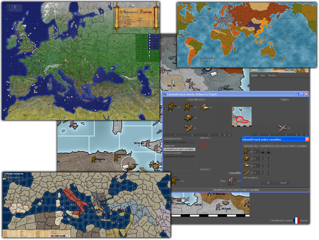
I don't know seems like a bit of effort. It's already got some sort of tile mosaic shadow thing going on there at the dimensions of each inset image, like with a shadowline added in at the boundary. You'd be better off just trying to create a new image altogether probably, but I'd suggest using a different presentation perhaps. Like wouldn't it be more interesting to see some vignettes more at the play-scale zoom rather than just the zoomed out maps?
To me the more interesting part of that image as a promo is the gameplay one, you know the background that everything else sits on top of. Where we can see the details and the dice and whatnot cause that shows more like what the play experience is. Or I guess one could just make another similar image to complement that one, but I don't have the energy. Someone else put that together a while back I'm sure. Maybe just a larger mosaic that shows more of the combat windows or different numbered dice? As a design maybe just some sort of slide reel thing would be better.
I honestly don't know, it's been a while since I even pulled up the main page. I just bookmark straight to the forums or the downloads or maps lol
What would probably be more useful is just a gallery view for the Maps section, which would accomplish a similar sort of mosaic image, but be more useful for browsing around the maps and such.
Currently you have to click-in individually to view, before you'll see any thumbnail images. Looks like this...
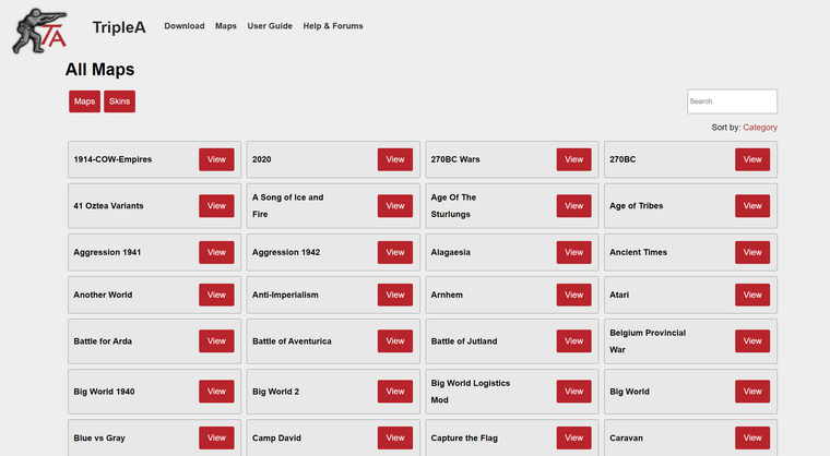
At least like if trying to check it out from a browser that's the read, but if there were more images - like say 1 map view, 1 battle view for each (or whatever number of thumbnails to give a sense), then it would probably give a similar vibe to the collaged image of several maps together. They'd be more in columns and rows I guess and alpha-numeric, but maybe it could be randomized? Not sure
Front page stuff would be for peeps who have more graphic design or web design chops than I do hehe. I think the current read is alright. I would just keep it to the tripleA custom scenarios if trying to highlight anything more recent than the last time we had a header revamp.
-
@beelee love it
-
It's not that bad to add the preview image, particularly now that it's standardized. This file:
https://github.com/triplea-game/triplea-game.github.io/blob/master/maps/maps.htmlWith the below modifications (note the new
imgblock):

Looks like this:

Is there anyone good with CSS that can style this up more nicely?
Hello! It looks like you're interested in this conversation, but you don't have an account yet.
Getting fed up of having to scroll through the same posts each visit? When you register for an account, you'll always come back to exactly where you were before, and choose to be notified of new replies (either via email, or push notification). You'll also be able to save bookmarks and upvote posts to show your appreciation to other community members.
With your input, this post could be even better 💗
Register Login