TripleA Design
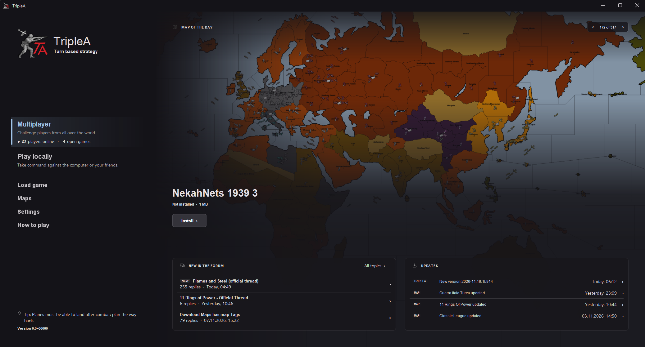
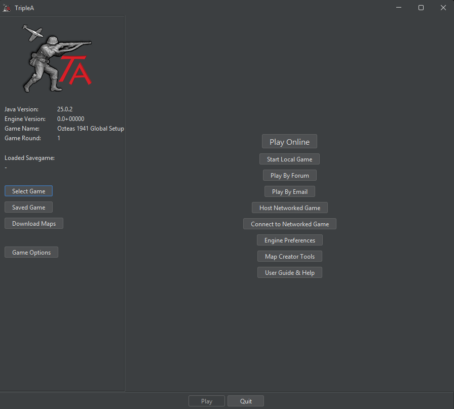
-
@pgsquig said:
We have 10.9k members (people subscribed to the sub). The displayed number of 'readers' fluctuates as it is a monthly average of subreddit visits. I expect the number to rise during the (Northern Hemisphere) winter as people will hopefully spend more time inside gaming.Phew that is good news.
 Im glad I did not understand the stats.

I am not your man to do what you suggest. My natural style is terse and some may interpret it as rude. So I pass the ball on this one.
-
What do you base this claim on?
Well we know how many people open the Game every day and that number is way higher then i see people in the Forum or in any Multiplayer lobbies.
But that’s also why I want to bring this discussion into the current UI. We’re discussing what players need while only hearing from the people who already participate here.
I think that should be tied to the game mode since folks typically will be playing one type of mode most of the time.
This is exactly one of the things I’d like to address. If everyone only sees their usual community, they keep seeing the same discussions and miss what’s happening elsewhere. New players also need an easy way to discover those communities in the first place.
Showing some shared news and discussions gives people a chance to find something they wouldn’t otherwise see. Mode-specific content can still exist, but I don’t see why everything should be separated by game mode.
The single/multi/AI player assignment happens in the team assignment screen, so presenting an incorrect multi/single player “choice” on the screen before that is contradictory.
That’s how the current interface works, but it isn’t a reason why it has to stay that way. The team assignment screen is a design decision too.
Why should every setup flow look the same? Depending on how you want to play, some information is relevant and some isn’t. Choosing that earlier gives us an opportunity to tailor the following steps instead of presenting the same setup to everyone.
We also can’t reliably tell how people are playing just from their human/AI assignments. Two people might play Axis together on one computer against the AI. To them, they’re playing together. They don’t care which technical category that fits into; they want to know where to click to set it up.
The labels “Multiplayer” and “Play locally” do overlap, and we should improve them. But that doesn’t invalidate the idea of asking people how they want to play before showing them the relevant settings.
And about the extra click: fewer clicks don’t automatically mean better UX. If someone has to stop and work out what several buttons mean and how they relate to each other, that’s effort too. We’re used to the current screen, so we don’t have to think about those things anymore. New players do. That’s why I tested with people who had never played TripleA.
I’d be interested in whether you see any pain points in the current design yourself. Which parts work well for you, and what would actually become harder with this approach? That would help me understand what needs to stay easy to reach.
This is a really good idea! I think it’s a better approach, and we should definitely look into it.
The map preview is only intended to be visible in the largest layout. If you prefer a smaller window, it disappears. I’m also open to a setting that disables it completely.
In general, I like giving people ways to tailor their experience. I know people who struggle with animations or bright colors, so being able to turn those off or adjust them would help too.
I would love that. Part of the proposal is making the game and its controls easier to understand.
I talked to some of the other devs, and this was definitely one of the points we discussed. Even having a visible settings page for key bindings would help people discover that those shortcuts exist, as well as letting them change them.
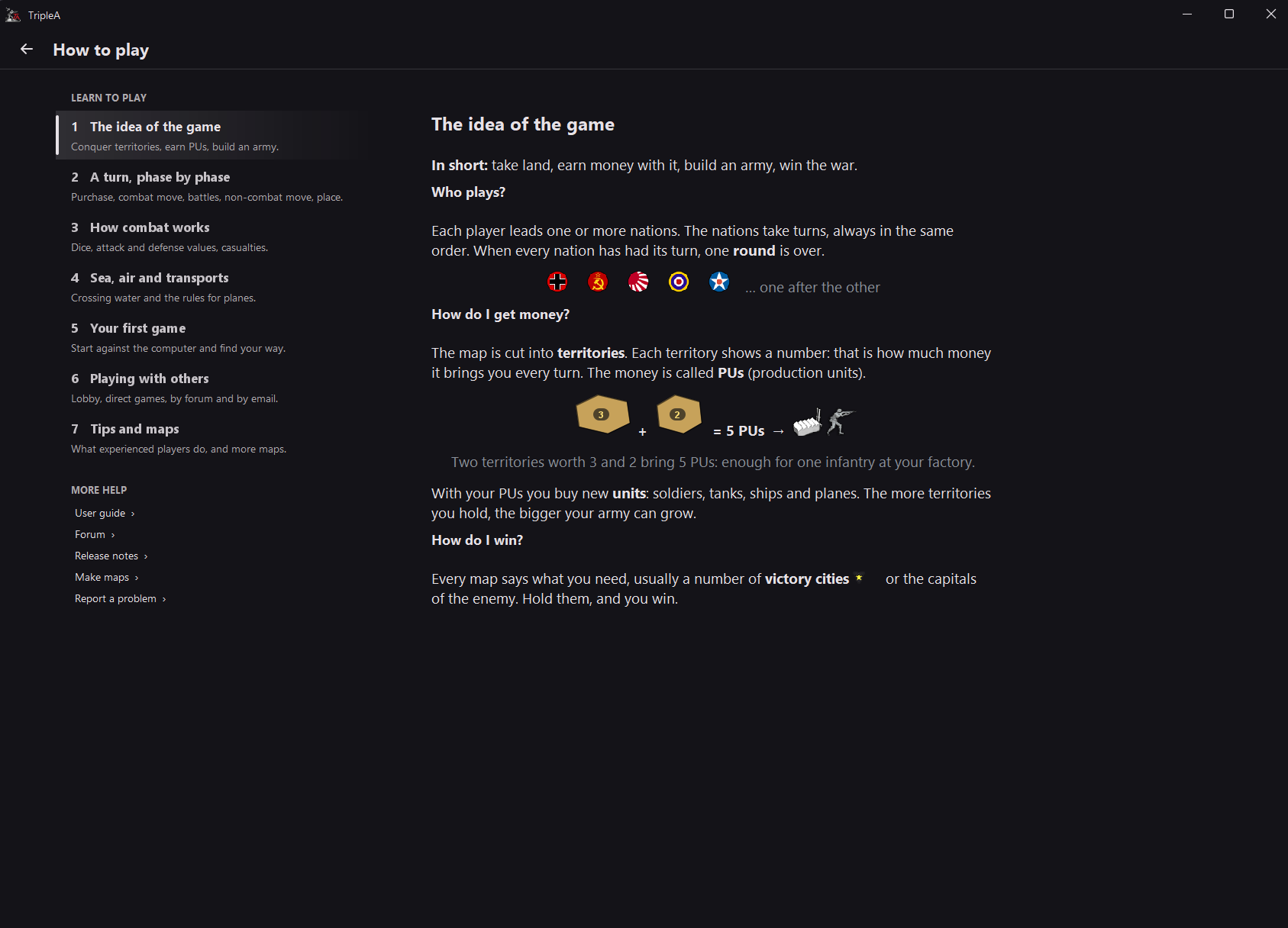
One of the highest wins in my opinion would be a better how to section here some sneakpeak i would propose(just a scrabble not finished by any means):
-
Well we know how many people open the Game every day
how do u know that? and even if u do wen i am playing the game i might open it dozens of times per day and im just one person
isn’t a reason why it has to stay that way.
without completely reworking the ux yes i dont see any problem or room for improvement on the player alignment screen in terms of ux
Why should every setup flow look the same?
not actually saying that. ux and ui are related subjects but they are not the same
-
how do u know that? and even if u do wen i am playing the game i might open it dozens of times per day and im just one person»
As far as I know, we only count unique devices, so it doesn’t matter how often you open the game.
without completely reworking the ux yes i dont see any problem or room for improvement on the player alignment screen in terms of ux»
There’s plenty of room for improvement on the player alignment screen and I will share those soon. In terms of main menu.
What would you improve to address the feedback we got on Reddit, as @pgsquig mentioned? I can confirm that feedback too, because I’ve seen the same issues myself and my testers told me the same.
-
we only count unique devices,
where are you getting these numbers? and again if i am playing against another person i will plan my turn out locally but the “game” is still a multiplayer game. i think most people play this way. i would need to see some kind of proof of this claim that the majority of games played are local human versus ai as i do not believe that is the case.
ubernaut said:
player alignment screen
assuming you mean player assignment here, but yeah im saying maybe we can improve the look of these screens but the logic and ux itself seems pretty solid as is. at any rate if the top home screen logic is incorrect as it is currently in your proposal any subscreens would be invalid to begin with
@lafayette @panther either of u care to chime in here?
-
we only count unique devices,
where are you getting these numbers? and again if i am playing against another person i will plan my turn out locally but the “game” is still a multiplayer game. i think most people play this way. i would need to see some kind of proof of this claim that the majority of games played are local human versus ai as i do not believe that is the case.
You mean Play-by-Forum/Email or hot-seat? I think (not sure) he/she has the former under the Multiplayer main selection (not the Play locally one).
-
Actually, maybe better showing the Tutorial (as a map to download) the first time TripleA is opened. However, I don't know if that is up to date: I've not tested it in years.
If the tutorial is working and up to date, I definitely think that should be offered as the first map to download for anyone who opens TripleA for the first time. @zjelcop did put some serious effort into making it. I'm going to play it a bit right now to see if this is the case.
Pact of Steel can be a good map offered for download after the Tutorial for new users.
EDIT: Nevermind, I've tested the Tutorial, and it is outdated. It refers to the Notes being in the right tab and 3 out of 5 tabs shown there (them all except "Action" and "Territory") are different or differently named. Unless someone is going to update the Tutorial soon, forget about my proposal to have it as the first suggested download, I guess. However, I played it a bit, and the rest seems OK for what little I've tried.
-
@Cernel i believe if we wer to bury the various network game options under a group button the correct terminology would be network or online game vs local game, not multiplayer vs local
his current layout would seem to have room for those additional buttons so i would argue no reason to bury them in the first place
-
@Cernel i believe if we wer to bury the various network game options under a group button the correct terminology would be network or online game vs local game, not multiplayer vs local
his current layout would seem to have room for those additional buttons so i would argue no reason to bury them in the first place
I assume under the understanding that Play-by-Email and Play-by-Forum are local game (not network / online game)?
Anyway, my suggestion remains having the trichotomy Play Online, Play by Message and Play Offline.
-
@Cernel i think you could make the argument either wae all im saying here is if there room for all of those primary options why bury any of them? they are distinct modes of play



Hello! It looks like you're interested in this conversation, but you don't have an account yet.
Getting fed up of having to scroll through the same posts each visit? When you register for an account, you'll always come back to exactly where you were before, and choose to be notified of new replies (either via email, or push notification). You'll also be able to save bookmarks and upvote posts to show your appreciation to other community members.
With your input, this post could be even better 💗
Register Login