Taking your suggestions for a new UI

-
Introduction
Hi everyone.
As some of you might know I'm silently working on a complete UI rework.
This UI rework will probably take at least half a year until it's completely usable (not final).
Because this is going to be a lot of work, I'm asking for your creative help.
This new UI comes with a completely changed core concept. Everything is going to be a in single window, to avoid small and frequent popups and to allow for a real fullscreen mode.
The new UI will also only support a single game instance at once. So in order to play multiple games at once you need to start TripleA multiple times. This makes the code less complex, and isn't going to be confusing, because there's just one window per application.
BIG and few Buttons. A big goal of this project is to avoid too much options per menu.
Also the new UI will support full localization, i.e. multiple languages.
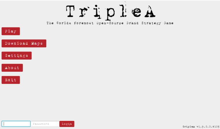
To get an idea of how the new UI looks in the current state you can check out 1.9.0.0.8105+ and go toEngine Preferences > Testing > Use JavaFX UIand set this option toTrue.
Not that you need to manually restart TripleA for this change to become active.Why I need your creativity
TripleA should be user friendly, not just "work for developers/power users".
I'm completely open for suggestions what the new UI should look like (as long as my requirements I mentioned before are met).
Colors, fonts and general layout are not final and can be changed if you think they're not intuitive to use.
Note I'm only accepting constructive feedback.
Don't tell me what not to do, tell me what to do!
Should there be sound on the start screen? Should there be Gameplay in the background of the start page? And similar questions, not "don't use this color".
I'm not going to promise anything, but if I believe your suggestion is good and is implementable in a short amount of time (less than a week). I'll try to bring it into the UI.Final Words
It's still a long road until we get to a polished UI.
In the meantime we try to simplify the current UI to "rewire" some of the current code to work with a new UI.
If you want to return to the normal UI, go toSettings>Testing>Use this experimental UIand switch off the toggle.Known Issues
The splash screen doesn't hide when the experimental UI pops up. This is an install4j issue, so it's up to them to fix it, but it shouldn't be too annoying.
Teaser:
-
@roiex Count me in.
-
") Knew you were brilliant!
Knew you were brilliant! -
@Roiex - excellent work. My #1 request above all others is a competitive module for the software. Your suggestions are certainly welcome, but a ranking system using ELO is sorely needed as our temporary website for doing so is quite sub-optimal, and in my years of experience in playing at Game Table Online, Daak, and AAMC, there are quite a few players which really like to play competitively. Kindly incorporate this into your development queue! Many thanks !!
-
@roiex said in Taking your suggestions for a new UI:
Should there be Gameplay in the background of the start page?
Show random screenshots from the player's recent games. And the player can manually take screenshots if he wants to see the best monents instead of random ones.
-
@Deltium Noted. Isn't directly related to the UI, but I'll keep that in mind.
The current problems with all kinds of lobby related interaction is that we're currently pretty much stuck with the current netcode. This means we can't really add something without breaking compatibility (which btw. I want to do for a long time, but I need to convince the others to break compatibility as well). Once we agreed on breaking compatibility, we are probably getting a new savegame format allowing us to make changes without breaking compatibility if @ssoloff kept his branch around and after that we should consider redoing the lobby network code. Once we have that we need to think of an ELO system and should make sure it can't be exploited by creating multiple accounts, including anonymous logins.
Then we also probably want to enhance some of the moderation tools, to make banning reasons and logs a thing, so the whole bunker posting becomes obsolete.
You see, it's a long road until we get there, but I agree with you that we should at least start to do it soon. -
@alkexr Good idea with random/picked Screenshots.
I'm probably going to blur them a little bit, but still a good suggestion.
Noted. -
@roiex Good action here. Your teaser shot looks as if it uses the triplea page. I can't remember who did it but they did a good job. One thing that was noted at the time though was the font was a little small right below the " TRIPLEA" headline. Might want to boost it a little if you end up using it
-
@beelee Font size etc. Is probably the easiest thing to fix ^^
-
This was originally talked about here:
link text but seems more appropriate here now.
Was thinking that you could have the games that someone is in and looking for players be as follows:
Using Global 40 colors
Canadian Red = Expert
screenshot in case you haven't seen it I'll post over at git as well
oops ! my screenshot didn't work. i'll try again
well said I didn't have privileges for that. basically it's just a little more Red than the Russia color
-
A small update for everyone interested:
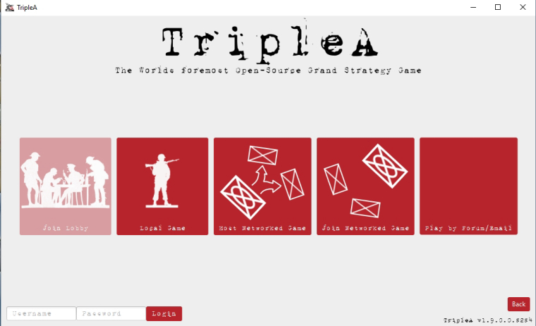
The latest pre-release introduced some icons for the game type selection screen.
We're not completely happy with them, and @redrum suggested we could ask for your help.
So if you're able to come up with a good lokkingand descriptive icon on your own, we'd be happy to use it in the new UI.
The preferred format is png, I'm not sure if uploading an image to the forum will preserve the quality, so having the icon stored on a cloud service of your choice is going to come in handy. -
@roiex
Been a while since I did a pre release. Know it's gotta be somewhere but can't find it. Tried relevant links, which btw takes me to the last post instead of the beginning, but no go. Can you dial me in on a link ? I assume you just open the bin and slam the new jar in still ?Anyway I'm sure I can track it down, come to think of it redrum had it in the AI thread. yep here it is:
Guess by icon you can use any triplea unit image ? Need to do the cloud thing too. Ok. I'll give it a shot and see what happens.
Good stuff you guys have been doing here. The site is picking up speed : )
-
-
Hi there, would love to see features such as Deltium posted. I feel that many of these games are competitive by nature and that's the allure that draws many players. Adding some features to cater to that would increase the quality of the experience here. I played on GTO for 3 or so years and two of the things I liked a lot were: Being able to see someones overall wins/losses on that particular game and when they implemented ELO. I consider myself a competitive and passionate Axis and Allies player. I was aware of TripleA when GTO shut down but the lack of those features stopped me from playing here. (I know that's my decision but it influenced me enough to not sign up, no offense :P) I decided to start playing here because I need to scratch that Axis and Allies itch again even if it isn't as competitive.
I know that what you guys do is basically volunteer work so no one is entitled to anything. I appreciate all the hard work that goes into making this service a reality. I plan to be active here and will also donate time to time to show my thanks.
Nice to meet you all!
-
Did a little work on this to make some icon for the game selection screen.
I haven't played around with the background or textures. But just started with some icons.
Will post more as I continue to make additions.
-
Did some fiddling around today experimenting with some ideas.
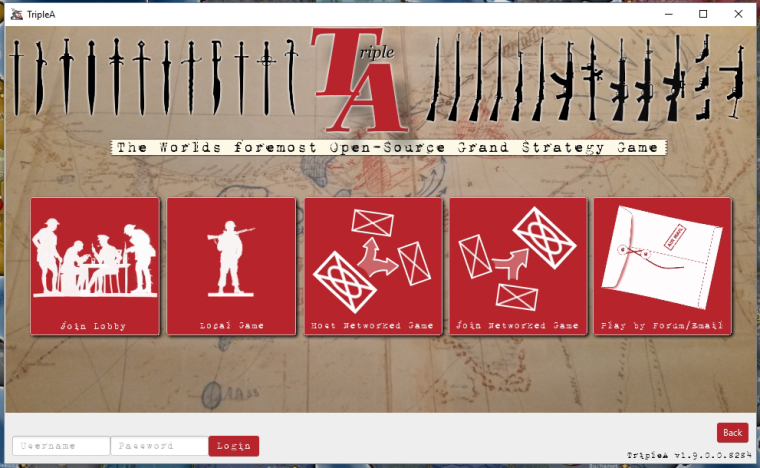
"A joyous heart sours with the burden of expectation"
Hepster -
@Hepps I'm actually stunned how amazing your "test screen" looks. You did a really good job there.
The only thing I dislike about it is how the letters on join networked game and host networked game look, I like the idea of it though.
If you keep it up, the difficult part for me is going to implement it in the engine without losing quality there
-
@roiex The lettering is the original Report font. I did not make any changes to that.
To be honest, I really like the idea of a typewriter font... but I am not really in love with this particular font with the shadowed double strike as it kind of blurs some of the smaller captions that are a smaller font size.
-
@Hepps I meant the "letter" in the Icon. (Or at least I assume it's a letter).
Yeah, I'm not too happy with this font either, it's too small for some labels and suffers in terms of readability in some points. -
@Hepps Also we probably want to be consistent with the icon art style.
So either all icons have this simplistic one color design, or all of them look "real"
Hello! It looks like you're interested in this conversation, but you don't have an account yet.
Getting fed up of having to scroll through the same posts each visit? When you register for an account, you'll always come back to exactly where you were before, and choose to be notified of new replies (either via email, or push notification). You'll also be able to save bookmarks and upvote posts to show your appreciation to other community members.
With your input, this post could be even better 💗
Register Login