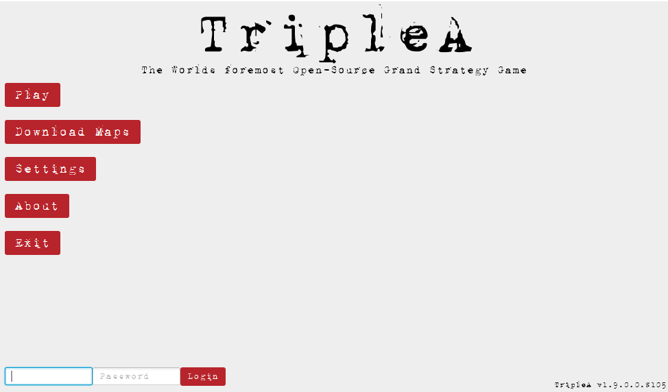
Taking your suggestions for a new UI
-
@hepps gigglez
")
-
@hepps said in Taking your suggestions for a new UI:
@roiex Well not to worry... you say your bored... I can keep you occupied for decades.
lol I can already thank you for a few years I'm sure : )
-
@alkexr I Added the D.S.S. just for some flavour... it is...
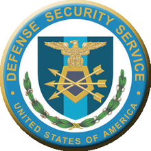
I was trying to bring som WWII flare to the design since it is the bread and butter of our community. The form is a nod to some of the real forms used during WWII.
-
@redrum said in Taking your suggestions for a new UI:
@hepps Oh and my dislike of the resource bar is more on how I've seen maps potentially use fuel. If its something that you have a set amount per turn then I think a bar makes sense (I believe this is actually what Frostion ended up doing in Iron Wars). He essentially zeroes out any extra and you spend whatever you produce each turn. But most other maps have used it where you can stockpile and having a resource bar then doesn't really make sense to me as you don't have an "amount per turn".
Yes which builds on my point that of the few maps we have... few legitimate attempts have been made to integrate it properly or do any significant testing and change the set up.
A bar could work well with the right amount of leg work done.
If forecast the starting reserves.... do some math on potential production capacities and expenditures... then you can create a scale that works for the individual map.
If the map properties file allowed the map maker to define the total scale of the bar... (ie. 200 is the max.) and then be able to set the increments (25).
map.useConsumableresource=True
map.ConsumableTotal=200
map.consumableIncrement=25I this would achieve a really beneficial system. If I have a surplus beyond what has been deemed more then the high end need within a game then I would not need to worry.... the bar would be at max anyway. But if I am in the middle of a campaign and I need to see where I am at while I move... the bar would allow me much better control and visualizing while I doing my moves.
-
I agree real time tracking of some type is probably the biggest missing element when it comes to fuel. At a very minimum it should be displayed in real time in the current economy tab.
But if we are really considering the re-design in game interface, why not give it a designated space somewhere even if its only a single number. Although the meter has it's appeal too.
I would prefer the territory tab use most of the space in at bottom of display since we need a lot of space to display units without making it hard on the eyes. Also all the pertinent territory information must be listed there. Basically everything else should accommodate that space and work around it.
One more suggestion, functionality and player ergonomics should take priority in the design and aesthetics secondary. But if you can do both, great!
-
I'm disappointed iron war has been changed, I'm trying to check out how it tracked fuel in original version.
Did it track fuel in real time or end of turn? Ah, I think remember now. The difficulties were in counting incoming fuel vs expenditures. Since incoming fuel updated at end of turn.
Just a last point on fuel thoughts, stockpiling of fuel is really the way the fuel should be handled if you want historically accuracy.
Axis Germany had to stockpile their fuel for a few years in order to launch ww2, and the field marshals knew they must take oilfields in process of war, to have realistic chance of success. Romania, Caucasus and middle east primarily. And the supplement with increased synthetic oil production in Germany, France and Poland since one of the processes relied on coal.
Italy was dead weight for Germany as fuel supplies went. Italy could just barely maneuver its own navy. Let alone supply North Africa campaign.
Japanese had tremendous shortage of fuel too. Until they conquered Sumatra, Java, and Borneo. But American submarines devastated their supply lines.
-
Have a self block option. 4,8,12 hr or w/e amount u want. More of a "not say stupid things" as opposed to Po'd. Actually the two are somewhat related. : )
It's mostly the "stupid thing" for me. : )
heppster could make a good button for it I'm sure : )
No dis on you hepps. Skill acknowledgement only : )
See I could use that button right now : )
-
I don't know if this has been suggested and/or discussed; but I think that the way battle is conducted needs to be changed.
I just started my first Play-by-Forum game and I can see it's going to take forever (except I'll probably concede here shortly).
Anyway, my suggestion is to limit the battle(s) to one round (each): You move in; attack; you choose what you hit; and then you choose whether to stay or withdraw.
Perhaps add some rules to this (and I have yet to think this all the way through, so I'm not sure exactly what those rules should be; but) such as attacking and withdrawing in the same round would be a "Raid" and there should be a limit on what units are allowed to "raid". If you include units which are not allowed to "raid" then you must remain until the next round.
As I suggested: in that attack you choose which units you hit and the computer randomly chooses which units you lose (if any).
If you remain: you're opponent now has the option to counter attack; simply remain to defend again next round; and/or withdraw any/all units. Counter attacking is not a raid and any units can be used in the counter attack. This time the (defending) Counter Attacker chooses which units he/she hits and the computer randomly chooses which of his/her units are lost. Units with only a single movement point cannot counter attack and withdraw too.
Needless to say, if the counter attacker remains the (original) attacker now becomes the counter-counter attacker... So on and so forth.
I truly believe that the game should've been done this way from the "get go"; but that's just my opinion.
I imagine that if armor/tanks are used then it's not a "raid". If more than a certain number of units are used then it's not a raid, etc.
Think on it. Discuss it and go from there.
It would definitely shorten the time it takes to resolve a battle and makes more sense (In my opinion). You don't have multiple research rounds, or any other multiple rounds. Why are there multiple combat rounds?
Anyway, the concept kept me awake; so I've posted it. I suppose it's more of a game change request than a User Interface one: but the UI would need to be designed with such a change in mind.
I hate to say this; but the UI should actually be more like that of Medieval II Total War; but then it wouldn't be TripleA it'd be TW.
-
@stohrm Yeah PBEM is for people who love the game but are not available to play live. But it's can be rough on the typical lobby gamer, since it requires a lot of patience.
There are some games that limit combat rounds, eg. "Age Of Tribes". It allows the player to choose between 1 and 5 combat rounds for land and naval combat (air is possible too). This can result in contested territories too. There are some pros and cons, to that aspect to consider.
To my knowledge those setting are not unit specific, so if you set it for land combat rounds = 2. Then all land units can battle up to 2 rounds max.
-
@Hepps
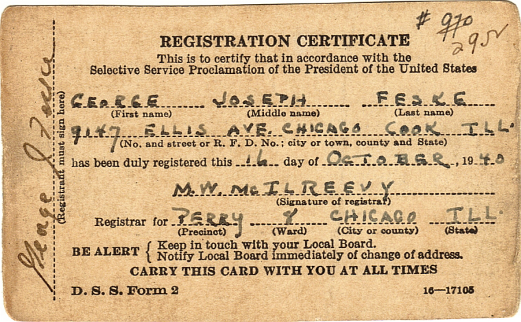
Ok so please don't laugh to hard. But here's my feeble attempt at graphics, to show you a component of what I was suggesting.The proportions are not right and maybe the minimap needs to be shifted else where or minimized so the entire bottom could serve as new territory tab. This is just to give you the feel of it.
Note, I also cut the top title bar and menu bar out as well as the bottom info section in attempt to gain more space. I guess menu could be a dropdown button somewhere?
Note: Just for reference, the map image is 1366x768 and unit images are 48x48. This should be close to what it would look like on a 15inch display, when this image is viewed at 100%.
-
@Hepps Btw, the national colors changes where just for my personal use, so I can see units a little better from zoomed at 50%. I'm not suggesting you change that.
I changed exiled just to not be to similar to Germans. And swapped Italians with neutrals.
-
@Hepps If the mini map stayed where it is, It might be enough space for most cases, any overflow can use a scroll bar, maybe? Also can jam a couple extra units in the rows.
Also, these 2 rows can be for any and all units, the suggestion to have specific rows for specific units isn't really practical.
-
@general_zod Personally I would prefer to keep all of the (more or less) fixed or permanently visible menu options in one area of the screen. Then have them reducible or expandable. Having the Chat/player turn box at the top then means it will always block yet another part of the screen while its open and visible (which would be pretty much always).
I also question the work-ability of being able to effectively present all of the written info in the Terr. window into a bar of text. I feel as though the the info currently displayed in the Terr. Tab would be better served being broken into 2 windows... One for Territory INFO. and one for UNITS.
Here is yet another version....
"A joyous heart sours with the burden of expectation"
Hepster -
@hepps looks great! Where is the National Objectives Tab
")
-
@hepps Yes, that sounds reasonable, looks great too!
I must admit, I was slacking on the territory information portion. I was thinking, more or less, an overview of that territory information, and then click for more details, kind of thing.
30 units displayed at once is awesome.
This is already a vast improvement. So I have no objections. I'd be thrilled to see this come to fruition as is.
-
The battle calculator itself needs an overhaul. I have a couple ideas for it. But maybe in a new topic?
-
@general_zod Probably best. Since there is a lot going through this thread already.
And since the BC is a much a question functionality as it is format... it probably justifies that we discuss that in detail in its own right.
-
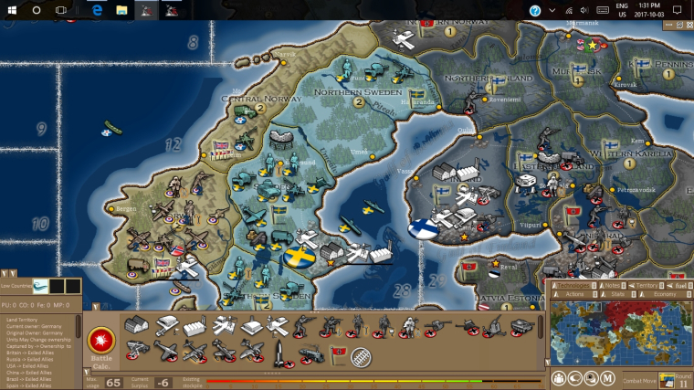
@hepps The territory info box is currently cluttered with
Units may change ownership
Captured by -> Ownership to
Britain -> Exiled Allies
Russia -> Exiled Allies
USA -> Exiled Allies
China -> Exiled Allies
Brazil -> Exiled Allies
Spain -> Exiled Allies
etc.Which is both an inefficient use of space and poor way of showing information to the player. Ideally you would want to say:
Exiled Allies take control of Allied units in this territory.
or (after elaborating in the game notes how Exiled Allies territories work) simply
Exiled Allies territory
Now this is a nice dream, but this is definitely not generalizable to all possible maps. That's why I'm arguing for per map html customizability. Something like
tooltip.territory.Low Countries = Owner: <b>$CURRENT_OWNER$</b><br/>Original Owner: Germany<br/>A territory of the Exiled AlliesNow there are several obvious problems with this exact syntax, but I would love to see something like this implemented.
-
@alkexr I agree. An improvement is certainly possible in terms of how the information is presented. Either way a box is still necessary for the information and that is what I am trying to cover in this thread.
The topic is certainly worthy of its own thread as a feature request.
-
We are starting to get a lot of different ideas floating around this thread outside of just the UI revamp that Roi/Hepps are working on. I'd suggest for any ideas folks feel strong about such as BC, territory info format, etc to create a separate thread articulating clearly what you'd propose as otherwise they will just get lost in this thread.
Hello! It looks like you're interested in this conversation, but you don't have an account yet.
Getting fed up of having to scroll through the same posts each visit? When you register for an account, you'll always come back to exactly where you were before, and choose to be notified of new replies (either via email, or push notification). You'll also be able to save bookmarks and upvote posts to show your appreciation to other community members.
With your input, this post could be even better 💗
Register Login