Taking your suggestions for a new UI
-
@frostion Latest pre-release then go to Engine Preferences > Testing > Use JavaFX UI.
-
@RoiEX OK. I tested out the very limited version of a new UI. Am I right that there is no new UI that changes what you see in game? Only the menu? Anyway, here are my first impressions and ideas for a better UI:
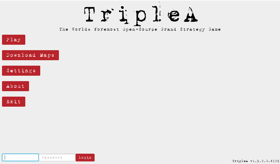
Window/Full screen - It is OK that the menu and game can be played in full screen, BUT there should be an option on screen to go window mode if the user wanted it. It should already be seen in the main menu. Perhaps the window control buttons could show some iconic Maximize / Minimize / Close icons. I bet some people it will be very frustrating if forced to play in full screen mode, especially if they are working or doing other stuff while plaing tripleA.
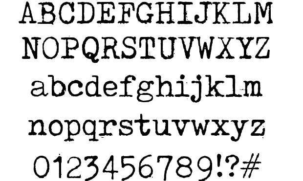
The Typewriter font – I agree with other feedback concerning the typewriter font. I am actually 100% for a typewriter style font, but the current one (also used at the website) is just too distorted and hard to read. It should be a bit cleaner, without being crystal clean of course. Maybe like this?:
The old folder graphics in the main menu – I like the idea of folders popping up or being highlighted when mouse-over, but it is strange that the green text-labels Play, Download Maps, Settings etc. do not follow the folder but stays put when the folder moves up and down. I would think the idea is that the labels are glued to the folder, right?
Maybe this could change for the better if everything over and under the mouse-overed folder got pushed away, like upwards and downwards? Then the folder the player is pointing on did not move. Just an idea.
The atmosphere of the main screen – I think there could be added a few things to enhance the atmosphere. I could imagine that the intire menu backbround was a brown wooden table. The menu folders were in the middle, and around it was maps, aerial spy photos, coffee cups and stains, guns and bullets, notebook and pencil etc.
Also there could be some menu ambient background sound (like office sounds or battlefield sounds) and there could be some sound effects when using the mouse in the menus. I found/edited some for you to try out: 0_1523117757571_NewUISounds.zip
Main menu and back button – When surfing around in the menus, especially the “back” button needs to be more intuitively found (right now it is in the bottom right corner). Maybe it just needs to be a part of the menu choices, like the last and bottom choice when inside a menu folder. If the back button is to continue in the bottom right corner of the screen, then it needs to be larger and more visible, but I think it is a better place to just display the TripleA version.
Logo at start menu – I like the big icons for join lobby, local game etc. But I am not a big fan of the red T&T logo (or what to call it). The idea of all the swords and rifle is interesting, but as the world war map background image and the ww icons all share a theme that does not include swords, rapiers, sabers etc. the logo should be pure World War. I would recommend just replacing the red T&T logo (not seen elsewhere with for example this logo until we have another:
https://forums.triplea-game.org/assets/uploads/files/1520009175366-4soldier_darkdropshad_text1.pngUI windows while playing - I would suggest that you keep the windows and popup in the game (this would also work fine along the option to resize the main menu and resize window while ingame). Also, keep the ability to close down/minimize windows temporary so that one might look at the map, evaluate what to do, and then return to the combat window, purchase screen etc. I think it will be very missed if one cannot look around the board while having to make important choices.
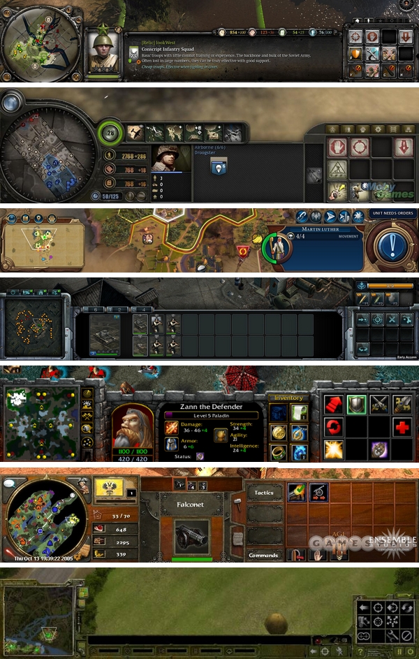
UI layout – I think that there are a lot of strategic and tactical games with good UI out there, and many have a lot in common. Note the placing of the minimap for example. I would think that there is a lot of knowledge and understanding that have lead to the designs of these UI, and that we should learn from them:
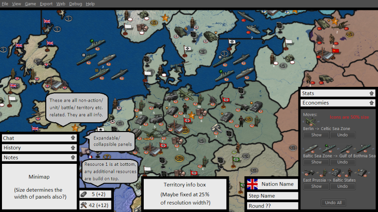
Sketch - I have done a sketch of what I invision the UI could be. It is not as pretty drawn as @Hepps, but I hope you get the picture. I hope that you will add my ideas to the tons of other ideas posted here
")
-
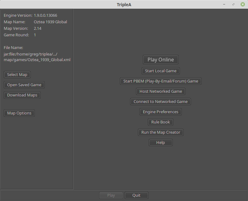
@Frostion Yes, the UI is still in a very early stage.
I'm planning to re-use the current game-UI to have at least a local Game working in a couple of weeks.
From there, we can improve the UI piece by piece to achieve something that doesn't look like it got a long legacy.
Thanks for your feedback, I agree
As a side note: I heard that JavaFX can be ported to mobile devices. (Can't make promises, but we want to keep that an option)
So we'd probably want to design the UI in a way that can be adobted by mobile devices with small screens as well.
So all the menus (not necessarily the way they are organised) should be easily downscalable. -
@RoiEX Sounds real nice!

Another suggestion: I don't know if anyone else has suggested it yet, but it would be sweet if the new UI could implement the much talked about and yet non-existing buttons for "Next unmoved unit", "Previous unmoved unit", "Alert" (sleep) etc.
I think an addition like that would bring the UI a step closer to the UIs of many commercial games, as well as bringing something new and useful to the new UI.
-
I know this has been discussed a lot before, and people have given their input for the graphics for these buttons, but are is my suggestions:
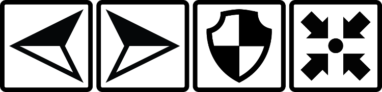
0_1524691875709_HiResGraphicsForButtons.zip
The buttons symbolize Previous unmoved unit / Next onmoved unit / Alert, sleep, dig in, skip or whatever / Center screen on the unit selected (if one has moved away on screen and want to find it again)
I think I have managed to make a universal look that would fit many kinds of maps. The buttons are kind of balanced in the way of being “filled” with equally same amount of black, so they feel like having the same “wheight”. I also think the symbols should be easily and intuitively understood. Anyone have thoughts on this?
-
@frostion I think we are probably discussing too many different things in this thread and much of it is going to get lost. I think we really have 3 separate topics:
- Current UI redesign primarily focused on main menu and setup screens
- UI improvements/layout of in-game window: https://forums.triplea-game.org/topic/689/in-game-ui-revamp
- Unmoved units functionality/buttons
I think the first one is good to keep here but the other 2 topics should have separate threads.
-
@I can't find the new redrum topic. I think Roiex started this a year or so ago ? sorry I can't remember.
Ok yep it's Roi
I wanna change my #3 vote on redrum's thing to having some color added to the lobby graphics.My apologies for the wrong place. : ) Idk why I cant find it : )
-
@beelee hmmm... i can't edit my post. well i found the right spot. usually happens right after i give up : )
-
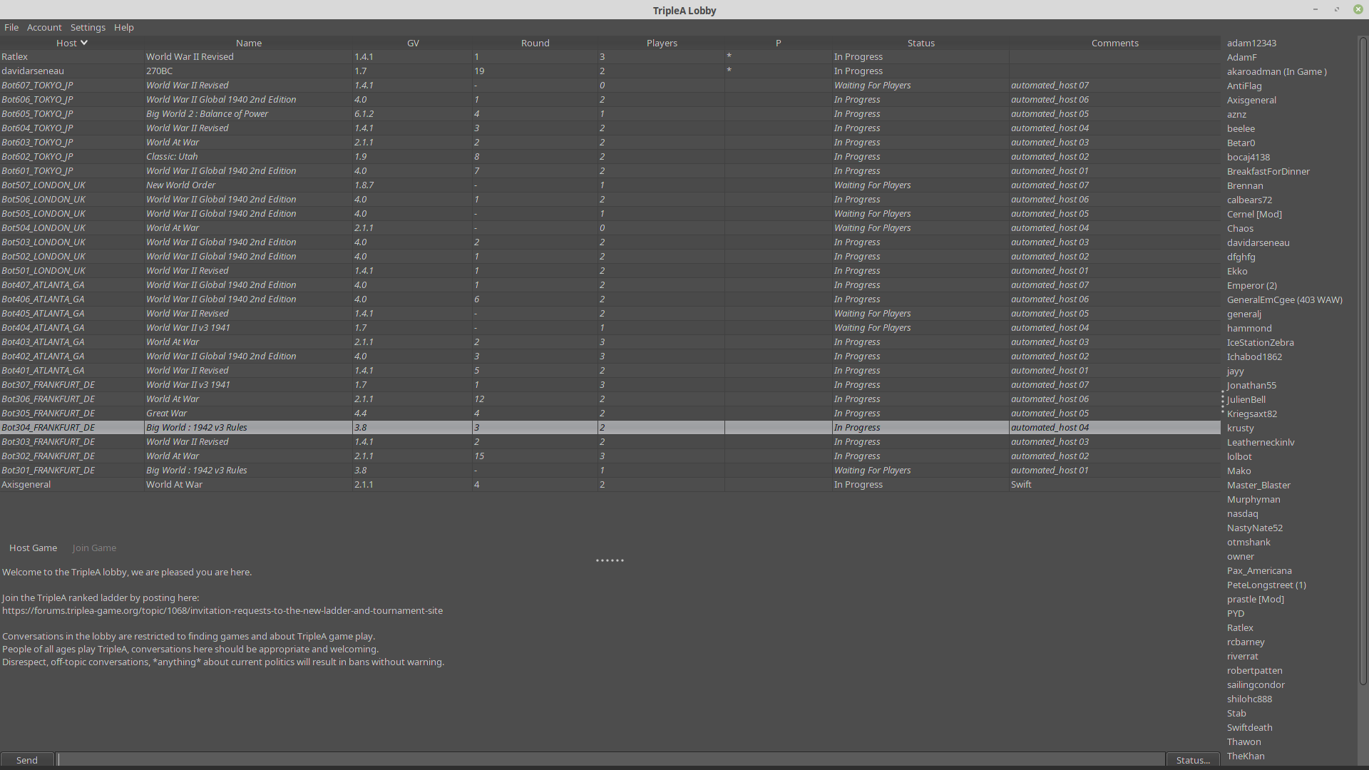
Seems as if the new stable is supposed to come out soon. I would highly suggest adding some color to the lobby. Maybe some other features as in rankings and well...it's all been brought up before.
Lobby currently looks like 1970s punch card mode. just saying
-
@beelee yeah, it could be modernized and the UX is not ideal. We're waiting for the JavaFX project to be completed which will update the launching screens.
-
I'm currently working on a new launch screen for local games, slow but steady, so if someone wants to give a lobby design a shot...
There's a WYSIWYG editor I'm using for this, so if someone wants to create a mockup using that tool and create a concept how different screens do what and what each button press does, that would help a lot already. -
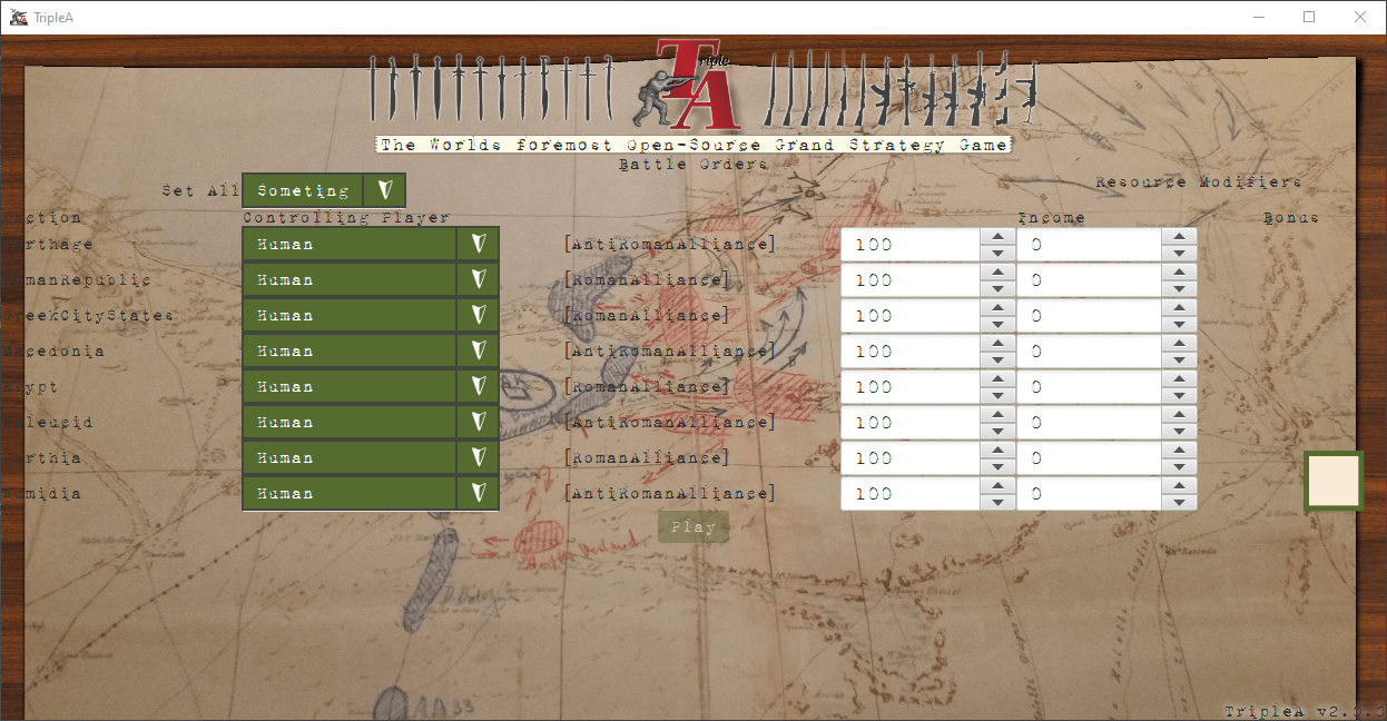
WIP
-
@RoiEX
The black print is very hard to read, and is impossible where it bleeds over into the brown border. You said you were using a WYSIWYG? Which one and is it a free download?Design is not my forte, but I could give it a try.
Cheers...
-
@wc_sumpton The Text colour etc. are obviously not final, just wanted to let you know that I started working on it again.
Also alignments are not correct yet, that needs to be fixed as well.However I'd appreciate if someone would try their skills to create a template: https://gluonhq.com/products/scene-builder/#download
It's not 100% WYSIWYG because styling is done via CSS, but almost everything else is.
If you want to give it a try, I can PM you the details on how to set yourself up. -
@RoiEX Yeah, of course, in the moment you give an artistic look, it is hard to keep it generic. I question the point of having swords on the left, in the moment the look is totally XX century, otherwise (contemporary style map and typewriting).
-
@RoiEX Maybe having the TripleA version on bottom right as "TripleA v2.0 (0)" instead of "TripleA v2.0.0", since the last digit is actually not really part of the version, but jus the development number (like, now it would be 17343, right?), that is not zeroed when the previous ones are increased (as it should happen with proper versioning)?
So, practically, I think it would make more sense as "2.0 (17343)" instead of "2.0.17343". -
@Cernel The version string is just pasted there, it's the same like everywhere else.
I mean we could change that, but it really would make stuff more confusing -
This is Awesome ! I remember when Roi said he was gonna start on it. Must be 2 years ago by now. I can only imagine all the work you've put in on this. Thanks for going Big
Having triplea look all bad ass with colors and stuff is probably 90% important at this point. Imo. That and advertising, which go hand in hand.
Always gotta keep cranking on the code and stuff obviously, but it's a visual world for most. The new 1942 game on steam is still in development and I wish them well, their stuff looks way cool. Triplea got the rules better but they got the looks : )Oh yea, bigger font in w/e is decided would be way cool. It all seems a bit small to me
The Homepage could use a boost too Thanks again Roi
-
-
I can only imagine all the work you've put in on this.
Unfortunately not that much, because this kind of work is really time consuming. It's mainly the christmas holidays that allowed me to work on this. A lot of "trying if this works" is involved.
However I think I found a way to keep me motivated to work on this for an hour a day, so I should be able to continue on this slowly but steadily after the holidays.
Maybe we'll be able to launch a local game using the "new" UI in a month already. Of course then we'd still need Lobby, Network Games, PbF, PbEM etc. but it's a start.
If you want you can check out the "new" map selection screen, just go into your engine preferences, enable the JavaFX UI in the testing section and navigate to "local game". Note that you'll have to restart your game for those changes to take effect.
In order to get back do the same thing, but inside the JavaFX client.
This is obviously still a prototype, but I think it looks better than the current one already.
Hello! It looks like you're interested in this conversation, but you don't have an account yet.
Getting fed up of having to scroll through the same posts each visit? When you register for an account, you'll always come back to exactly where you were before, and choose to be notified of new replies (either via email, or push notification). You'll also be able to save bookmarks and upvote posts to show your appreciation to other community members.
With your input, this post could be even better 💗
Register Login