Taking your suggestions for a new UI
-
Played around with the logo a little more trying to add some detail.
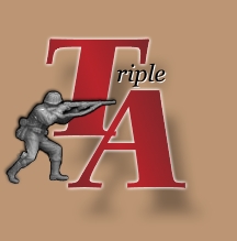
(Putting a little more of the old into it for those who can't handle change) -
@hepps love it
-
@hepps Nice : ) Looks like the Afrika Korps : )
-
It's nice. But, why not use a nice panzer instead? And maybe and opposing allied troop.
Or a variation, one allied, one axis, what ever they may be, but aimed at each other. The right side looks like it would fit a panzer nicely.
-
@general_zod Well the right side looks open because I simply did not recenter the image on the canvas.
I am certainly open to idea's but truthfully I am trying to keep the logo squarish and retain as much simplicity as possible so that it is scale-able for all of our purposes... ie. small link icon... medium Header... large launch icon.
-
@hepps Great looking mock-up, looking like a real game : )
Some quick comments:
-
guns seems a bit busy, but I still really like them, so I'm not sure if I would want them to be removed.
-
'urgent military intelligence' document is brilliant : ) Seriously it's a very nice way to introduce a block of text into a screen that otherwise would get overwhelmed with paragraph text. With that said, our fundraisers are relatively short, so we would probably only want to show that during fund drives. Having a different version for one-time users that could help them launch the tutorial would be slick. Might be a good place for us to display messages about latest events (could get tricky to render the UI text correctly, but it should be do-able).
-
There are a lot of 'Play' types, I'm curious what the screens behind that would look like, how those would be broken up.
-
Would the about button open a webpage, or would we have a pop-up with 'about' information?
Re: logo
I like it. To be honest I read it the first time as "Tee ripple", been a bit hard to shake that from my head")
I really like also that we could scale the 'T+A' letters down to very small, so we could use that for window icons - very versatile! -
-
@hepps Wow, that looks nice!
-
@lafayette heh heh T riple now you got me doing it : )
-
@LaFayette JavaFX has a built in chromium engine. So we could essentially reference a hidden Webpage on triplea-game.org containing the modt, including potential donation links
-
@Hepps About the guns:
I agree with @LaFayette that there's something not quite perfect with the guns/swords.
Maybe reducing the amount and making the remaining ones point towards the logo or something would help.
Not sure though -
oh I just remembered I had 1 annoying thing happen when I play this game ... I had to tinker with my monitor resolution only because the "options" window for this game was always too big and I couldn't click the "save options" button at the bottom of the window because the window was always too big unless I chose my very last highest resolution so I can then see the button to click and save ... so then I'd play this game on that high resolution which is ok but I was kind of having problems fitting this game perfectly for that game options window.
That's all but just remember the less need for clicking in this game is better because I love super fast games and less clutter but I'm not complaining because this game rocks!
-
@lafayette said in Taking your suggestions for a new UI:
@hepps Great looking mock-up, looking like a real game : )
Cool glad you like it.
Some quick comments:
- guns seems a bit busy, but I still really like them, so I'm not sure if I would want them to be removed.
As the first draft I made them black & white with no transparency... want to set them to a dark gray and white and make them a little transparent. Soften them up a little.
- 'urgent military intelligence' document is brilliant : ) Seriously it's a very nice way to introduce a block of text into a screen that otherwise would get overwhelmed with paragraph text. With that said, our fundraisers are relatively short, so we would probably only want to show that during fund drives. Having a different version for one-time users that could help them launch the tutorial would be slick. Might be a good place for us to display messages about latest events (could get tricky to render the UI text correctly, but it should be do-able).
My idea was to actually have that page flip to other pages while you are on that screen. So that as you are looking at it a new page would flip down over that one. If we had 5 or six of them I figured we could cover any number of current topics such as tutorials..... map releases... engine releases and the features.... etc. etc.
- There are a lot of 'Play' types, I'm curious what the screens behind that would look like, how those would be broken up.
You must have scrolled past it. The new play screen is already in this thread.
- Would the about button open a webpage, or would we have a pop-up with 'about' information?
No idea.
Re: logo
I like it. To be honest I read it the first time as "Tee ripple", been a bit hard to shake that from my head
I really like also that we could scale the 'T+A' letters down to very small, so we could use that for window icons - very versatile!Yup that's the idea.
thanks for the input!
-
Would the about button open a webpage, or would we have a pop-up with 'about' information?
Neither. Currently it just displays a different screen with a link to the rulebook, some text and another button.
Ideally this screen would be a credits section with a short version of the story of TripleA. -
I use multiple monitors and enjoy placing different windows on different screens.
However even with the 'lock map' and turning 'alerts' off, there are popups (and a panel) that I wish I could turn off or place on a different monitor without it moving on top of my main map.
I wish that I could save my map defaults such as victory conditions, so that I didn't have to set it up each time.
I wish that I could zoom in on a map location greater than 100%. -
@admiral-barca Probably should post this in the "feature request" or "help and questions" topics.
-
If you mean the panel on the right side, then that can be minimized by clicking the arrow located on its vertical border. As popups go there are the settings you already seem to have found, the rest probably need to be acknowledged.
-
You can save victory conditions and all the rest of game setup options with "make default" button located at bottom of the game options window.
-
You can place feature request in the topic of same name or up vote an existing request if it already exists, either as a request or officially accepted as a request.
-
-
@general_zod @Admiral-Barca I love his zoom +100% (since I am old and blind
") )
) -
@prastle The zoom beyond 100% is really more a function of how the initial map design is done.
Many maps suffer from poor designing. If a map is designed properly the 100% zoom setting should be ideal for even the most elderly.
-
@hepps k iw ill keep using my magnifying glass
-
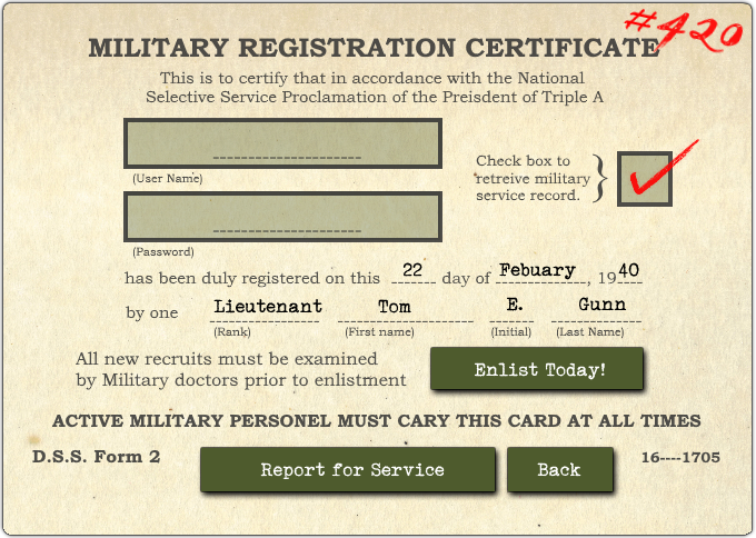
Work has now been progressing steadily on making Triple A sexy. Here is another snap shot of what we have been up to.
-
@hepps Nice job. I think it would be nice to keep the feel you have goin here. But it should also not be confusing. What are they registering for specifically? For lobby?