Image Icons


-
@redrum Ok, I would still remove the number after the "/" as well as the "/" itself and the eventual "+", as I don't think I've ever looked at them once (so you see I didn't even realize they already worked that way), but if you or most other people think otherwise, that's fine. I see your post is getting upvoted, not sure if that means your explanation is correct or the feature is appreciated.
-
@cernel For my part at least.... it was the later.
-
By the way, in case you have moved because of this matter, I believe it was better the territory name being lower left, as it is easier to find, and should really be the first thing you read.
So, I suggest bringing the territory name back in lower left, instead of current lower centre.Also, are you sure this should stay in Mapmaking? I guessed that section and Maps & Mods was for doing stuff to single maps, not to things that apply to several of them. I suggest moving this topic to Feature Requests.
-
@cernel I also grew very accustom to seeing territory name and info in the left. When I move battle calc windows around, it becomes bothersome since I usually place those under the chat bar, center/right orientated. And now can't see territory names.
Maybe someday, we will get a tab style method of minimizing, organizing and saving our various battle calc windows.
-
@general_zod Yah, it seems so obvious that the name and, then, the PUs value should be the very first things on the left (as it has always been), since this is how we read stuff, from left to right, that I can't believe the current disposition was wanted by anyone, but I guess it was.
-
@cernel @General_Zod This was an intentional change as from a UI perspective it makes more sense to anchor the resource amounts/income to the left than have it floating out in the middle. I understand that it may take some getting used to and that not all players will agree with the change but I do feel its a better overall UI layout. I do eventually want to take revamping the in-game UI much further and have most of the bottom bar information appear along a top bar as that is much more in-line with most other TBS games.
-
@redrum I agree with anchoring, and anything floating is bad, but why must it be two different things?
I would say nothing should float.
Just having the name, then the PUs, then the other resources from left to right, all "anchored".
Also having the other resources on the left then the name then the PUs I cannot get it.
Maybe what I'm saying is unfeasible for some reasons I can't see, but what seems natural to me is just having all anchored to the left. First the name, then the PUs, then the other resources.
Or you mean because the name can be long or short, so that means what is right to it then would be on different places? Well, I guess the space for the name can have a set minimum to be very unlikely to be exceeded by anything but overly long names.
Don't get me wrong, it was a nice surprise that now I see my silver ingot image instead of "PUs", but glancing at the name is much easier if it is in the corner.
Also, I strongly suggest avoiding displaying resources than no territories at all have. I've a bunch of utility resources, produced by no territories on the map, that would be better not having anywhere at bottom screen. I guess it should be easy to just check if a resource is present in no territory attachments and excluding it, if so. -
Or, if feasible, resources that are not part of the territory attachment are not displayed, while they are displayed, equal to "0 (+0)", if they are present in the territory attachment, but set equal to 0.
This way, the mapmaker can choose if having absent resources displayed equal to 0 or just skipped, by setting them equal to 0 in the territory attachment or not setting them at all.
How about this?
Really, it is not that strange that you may have a resouce that it is never produced by a territory (beside many strange ways to put resources in use, think also about the straight case of units that produce resources meant to be not primary), and that's just clutter, thus bad (it is sort of telling the player to expect to see that thing produced by some territory, while it is never so). -
@cernel So maybe anchoring wasn't the best term to use as I was more referring to conceptually not technically anchoring. The point I was trying to make is that you have to make the "name" box fairly wide to accommodate the longest territory name + potential resource income of territories. If you aren't hovered over a territory or have one with a small name then you end up with a bunch of space in between the end of the name and the player resources/income. This ends up looking strange especially for maps that only use PUs as they just have a little PUs icon and income sitting out in the middle of the bar (which makes it feel like its conceptually floating). It tends to work better to put territory name/income in the middle since it changes content as you hover over different territories where as the player resources/income is static in display except the amounts/income numbers updating.
Map makers control the ordering and which player resources are displayed on the bottom bar. Its based on the order in the XML and whether you set the isDisplayedFor property as described here: https://forums.triplea-game.org/topic/558/fuel-enhancements
-
@redrum Well, ok, I'll still confirm that I think the most important information you get in there is about the territory, and thus I would have in bottom left the territory name then PUs then other resources, and anything else like telling the stats I think is less important, as I see it. So this is my personal judgment.
Of course, if others prefer otherwies, I'm just confirming my preference.
And yes, if it is feasible to set the wideness equal to the longest territory name in the map, that would be my suggestion, as well, in having the territory name first on the left, so that the resources won't float at all (I don't believe I would be bothered by some useless spacing).I missed the fact you can hide resources. That's good. Sadly, I haven't got around reviewing the fuel stuff, sigh.

-
My late 2 cents:
Watching a game in the lobby and really dislike the new movement indicator mostly because it hides stuff on the map. Old one was fine, not blocking any views and not too apparent/present. Actually you only need it sometimes and then it is easy to find. All the other times it is easily ignored. Now the constant info that a unit will move 1 step annoys me.
Personally I do like the 2/4 movement info as it gives instant max movement info that i find useful with so many different maps and units around or especially when checking air movement possibilities. This is especially true when you already moved an air unit or say a land unit with movement 3. The info would let you know how much movement is left.
-
@zjelcop It takes a little getting used to but I do feel having a background on the movement indicator makes it much easier to read and look more professional. Many people either didn't notice or had a hard time reading the old movement indicator.
-
I am in the process of testing Iron War with the new movement indicator, fuel consumption indicator and bottom bar rearranged info with icons. (A test version of iron War will be available for everyone to test when I have made a roughly balanced and playable XLM) I have played a lot lately, and I must say that the new features collectively raise the play experience quite a bit.
Iron War uses multiple resources. With the added small icons my eyes and mind are now much more focused on the bottom bar counters. Before, I had a tendency to just ignore the resource info, maybe only thinking of PUs, and then just get annoyed at the purchase window when I realized that I did not have enough special resources to purchase what I wanted. Maybe it is because of the replacement of text with pictures, and that the mind does not have to read but just se and recognize stuff that makes it easier to think about. I dunno.
The above is also affected by the new fuel system, including the counter that really works great. The fuel consumption counter could not in any practical way work without the new movement indicator. One could say that the indicator should maybe be transparent, but I would argue against that. It’s pretty important info, and I guess that this was also why the old indicator was so large and in so sharp colors. Also the new indicator has been reduced in size to a minimum.
Regarding the bottom bar, because one’s eyes are focused a lot on the bottom bar, in maps like Iron War, it makes good sense and makes it easy to look when the info is fixed to the left. It’s just easier to find and read quickly than if it was somewhere near the center of the bar and the eyes had to scan and find its left starting point.
I would say that one should play quite a few games with the new features to get a better impression and feel in relation to pros and cons. It is still only in pre-release, so I guess it will be a long time before anything is final.
In regards to the 1 move info, if there is an actual demand from a larger audience, maybe there could be an UI option where players could opt out 1 move indicator information completely? Like “Show 1-move indicator information” or something like that?
-
@redrum In my opinion, the old one was unpolished and the new one is annoying. As I said, I would just let the players able to switch this feature on/off; how hard can that be? It would not be the most unpopular option we have on the menu, fairly sure of that.
Of course, once you have done the menu switch, you can also have a minimum distance setting, from 1 to, say, 99 (so, if you put it off, you never see it; if you put it on, you see it for distances equal or bigger than the setting, default at 1, which means all). -
@cernel Rather than spending time creating settings that <1% of people use, I'd rather figure out how to make it better so that the 99% that aren't ever going to change that setting get the benefit.
-
@redrum Well, wanting to keep it polished and well visible, the only way to do that is assuring it won't usually hover the target territory.
-
@redrum Also, instead of a straight on/off, the setting can be that it may be alternatively shown on the bottom bar only, if off; meaning in the same place when now you get the warnings like "Cannot blitz on that route".
-
First issue:
I am testing a lot right now, and looking a lot on the bottom bar. The fixed position of the overall recourse income works great IMO. There is still a minor issue with the fact that territory name flickers back and forth a bit. I would like to propose a fix:• If the resource icons were left aligned in a box set to perhaps 30% of the total bottom bar, then a new 30% box could start right of that. In this second box things could also be left aligned displaying first territory name, income and territory effects. After this, the box for “Warnings” could start, and would then be 60% in. This way the names would not flicker, instead it would only do as the resources now do, expand more or less towards the right.
• If you try to experiment with the above, then I would also call for the “Warnings box”, “Player/nation name box” and the “Step box” to get some margin space before/after text. Income text and the round counter text have space before/after, so I guess the other boxes could also haveit. Just for the looks and readability.
Second issue:
I hope that the Actions and Operations window will also get a facelift. There seems to be some issues atm. With this window. In the current example, I have just spent 20 PUs on supplies to Thailand. Problems:- The order of displaying resources in the Actions and Operations window is different.
- The Actions and Operations displays the CR (Colonial resource) even though Japan should not have it displayed. (Japan will generate a few of this recourse at the end of the round, but it will be removed again by triggers.)
- The Actions and Operations window does not display the Pilot resource like the bottom bar. (I guess because Japan in this round will not generate any “Pilot” resources.)
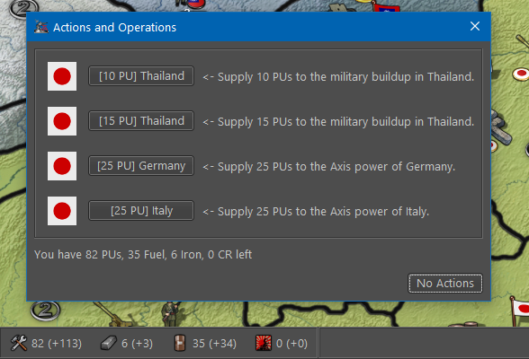
This is how resourses are listed in XML:
<resourceList>
<resource name="PUs"/>
<resource name="Iron"/>
<resource name="Fuel"/>
<resource name="CR" isDisplayedFor="France:British-Colonies:Italy:British-India:French-Colonies:KNIL"/>
<resource name="SS" isDisplayedFor="Germany"/>
<resource name="Pilot" isDisplayedFor="Japan"/>
<resource name="Officials" isDisplayedFor="USSR"/>
</resourceList>
-
@frostion Responses:
- There are a few cases it still flickers but given that I'm planning to move much of what's in the bottom bar to a top bar, I'm not planning to sink any more time into adjusting its layout.
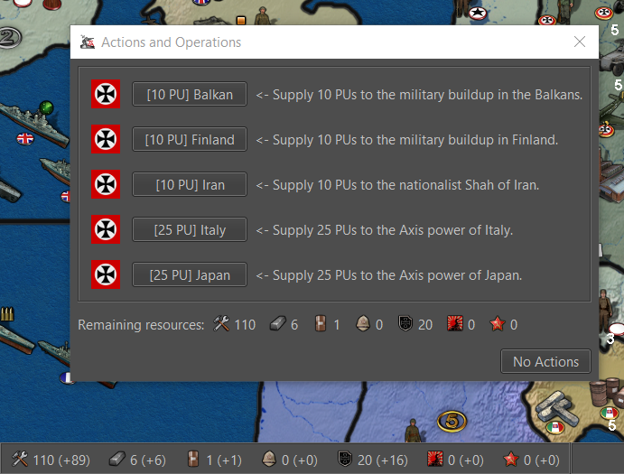
- Would it be better to just remove the resources left from the actions and operations window now that they are in the bottom bar? Otherwise if I fix it, its going to be the same information as the bottom bar minus the incomes. Here is what it looks like leaving it and enhancing it:
-
@redrum I would say that the Actions and Operations window, small as it is, could just have its resource display removed. No need to have the same info two places on the same screen. No reason I can think of.
Edit: On the other side, just like in the purchase screen, it is kind of convenient to have the information close by, not forcing the player to look elsewhere or a totally different place when evaluating if any actions are worth paying for.
Hello! It looks like you're interested in this conversation, but you don't have an account yet.
Getting fed up of having to scroll through the same posts each visit? When you register for an account, you'll always come back to exactly where you were before, and choose to be notified of new replies (either via email, or push notification). You'll also be able to save bookmarks and upvote posts to show your appreciation to other community members.
With your input, this post could be even better 💗
Register Login