Crazy Europe: House of Habsburg
-
@cernel
I thought about the cyclades. I mostly didn't include them because I'm artistly challenged. If Hepps wants to add them he can, I dare not ask him to volunteer more time -
@hepps The roundel isn't needed. The units are already color coded. Pu image is cool, the city is cool. Need a new village image imo, current ones look like tents when zoomed out. Which btw lets keep it zoom out friendly

btw, my definition of zoom friendly for this particular map is 50% zoom level. units 87%. Also I should add, that the images at this level only need to be identifiable not pretty.
-
@general_zod The roundel is designed for if you turn them on via the controls... not embedded into the unit image.
A new village image may have already been done.

-
@hepps ok cool
-
@Hepps The roundels look very nice. Maybe you should use the same graphics to make flags for all the nations? The current are of a pretty mixed quality

-
@frostion Could be rabbit.... could be.
 Might already be in the possession of one Crazy German.
-
@Hepps Yea, you might be right. He probably already has new flags of a quality equal to what you could make. Never mind then.

-
@frostion lol
-
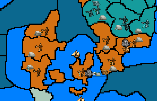
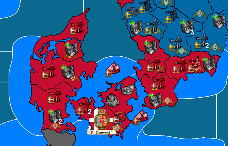
Work continues on the leviathan that is the HOH map. I am about 50% there.
Here is a sample of one small section with a before and after....


-
The new borders look great. Like a 1000% improvement.
The PU value markers are also very stylish and fitting for the era. I like that they are transparent looking, so that players do not confuse them with the units. It’s more background and secondary info.
I also like the shadow of the Danish soldier, but if one unit has it, all units should have shadows.
One thing I would change would be the unit flags. The look good, but I find them much too large. Maybe you could try to shrink them just a little bit?
A second thing that I would work on would be the city unit picture. It might be a good picture, but such a detailed picture gets blurry and unrecognizable when shirked. Either you could allow it to be a bit larger, or look for another city picture?
Question: What does the green + mean? If it is a symbol for a place where units spawn, then maybe the City should have a symbol that expresses something “better”. Maybe a ++ symbol, or the village could have a silver/cobber + and the city a golden +, or maybe the two factories could have a small green cross and a large green cross?
-
@frostion said in Crazy Europe: House of Habsburg:
The new borders look great. Like a 1000% improvement.
The PU value markers are also very stylish and fitting for the era. I like that they are transparent looking, so that players do not confuse them with the units. It’s more background and secondary info.
I also like the shadow of the Danish soldier, but if one unit has it, all units should have shadows.
I had only worked on the Pikeman during my experimentation. I just haven't even started dealing with the units as of yet... just a quick cut and past as an example.
One thing I would change would be the unit flags. The look good, but I find them much too large. Maybe you could try to shrink them just a little bit?
The Flag image is the 'large' version of the flag... there would still be a 'small' version as well. I just used the one I had designed initially.... and of course these would be able to be toggled on and off by the user.
A second thing that I would work on would be the city unit picture. It might be a good picture, but such a detailed picture gets blurry and unrecognizable when shirked. Either you could allow it to be a bit larger, or look for another city picture?
Is a first prototype. Just put it in as it is an improvement (IMHO) over the 270 BC image.
Question: What does the green + mean? If it is a symbol for a place where units spawn, then maybe the City should have a symbol that expresses something “better”. Maybe a ++ symbol, or the village could have a silver/cobber + and the city a golden +, or maybe the two factories could have a small green cross and a large green cross?
Just another prototype. the idea is that since the villages and the cities function in very different ways as it pertains to unit production, those differences should be underscored visually on the map since the current mechanics for the villages can be quite confusing to the player while purchasing units.
In the end I am at the disposal of the Holy Roman Emperor as to what he wants the finished images to include or not include.
-
If you need a PUs picture, you can use the new ones from Caribbean Trade War map. Maybe they would fit the style of Crazy Europe also:


-
@frostion "Crazy Europe" lol
Sorry : ) -
In the interlude a Thirty years' war was crazy!

-
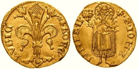
The prevailing currency at the time was the "Florin", under a series of different versions and names, ad imitation of the "Fiorino" of "Florence" (Firenze, Italy), but generally retaining the currency sign "ƒl.".

https://en.wikipedia.org/wiki/Guilder -
Dude, that map is looking awesome, your the man.

Wondering at what zoom settings are your new map images set at 75% zoom, 125% units?
-
@general_zod Well new look is everything at 100%. Because it is just a drawing. I just cropped a small portion of the map and them inserted the rest of the images to make it look like a screen shot of the game.
So once everything is put into the appropriate game folders there would be lots of room to play around with the settings.
-
I'm pushing a massive update today. Changelog
Updated a ton of images, credit to Hepps (base tiles still in progress)
Changed to 12 sided dice and updated unit stats accordingly
Castles now take two turns to build
Spain and France both start with a half castle
Removed a few Habsburg units
Added more Ottoman cities and navies
Added a couple Russian units
Denmark now starts with Holstein
Added clarifications and corrections to game notes -
@crazyg I thought Russia was holding it's own in our game. Sweden was buff only because Denmark got diced on key battles.
I was playing Poland-Lithunia +Sweden, so my perspective on that area was decent.
But lets try it.
Other changes sound cool, I can't wait for the new hepps map to be completed. I was jonesing for multi today. But slave driver president made me work, lol.
-
Its officially updated and can be downloaded. It will register as a new map as soon as a git admin approves me.
I have not updated any of the names because I wanted to get this up in time for the Sunday multiplayer. I do appreciate everyone who volunteered help for this, I certainly will implement that later.