In-Game UI Revamp
-
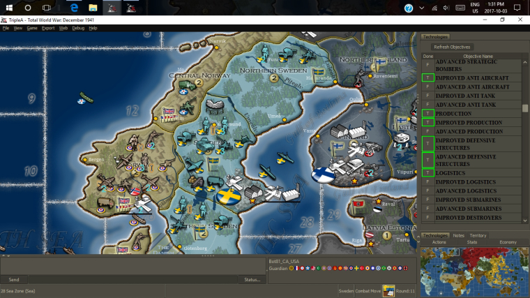
There are a number of current challenges with the in-game UI that could be improved by reworking things in a similar vain of how the resource changes were done. The goal is to make the UI be less 'in the way' while still providing players easy access to information they need and be more flexible to expand/collapse information. This has been discussed across a number of threads over the years but figured since I'm actually considering implementing at least some changes that it would be good to consolidate it.
Here is a general idea of what I think the initial changes would go towards (originally posted by @Hepps in another thread):

Idea is to flip the minimap to the bottom and not anchor the width of the right tabbed panel to it. Also allow showing no tab so more of the screen can be used for the map. All the tabs will have hotkeys to show/hide.
Once the general layout is reworked then each section/tab can be evaluated for improvements.
TripleA Developer with a Passion for AI: https://forums.triplea-game.org/topic/105/ai-development-discussion-and-feedback
-
@redrum I prefer the current visualization, I would just tweak it these ways:
-
Allow to shrink the right bar as much as you want, also below the wideness of the minimap (preferably, also the minimap should shrink).
-
Allow to freely move bars right to left, and vice versa, when not in history mode (so that you can have, for example, the "Territory" bar on the left and the "Actions" bar on the right, or all on one side or the other, as you prefer (default all of them to the right as now, and also when you are in history mode).
-
Split the Territory tab into two tabs: "Territory", having only the territory info you are pointing at, and "Units" having the units of the territory you are pointing at.
-
Split the Stats tab into two tabs: "Stats" and "Techs" (or "Statistics" and "Technologies").
-
Cut some of the most usless info related to territories:
a) "Current" instead of "Current Owner".
b) "Original" instad of "Original Owner".
c) Don't display "Original Owner" if it is set to "Neutral" in the XML (factually meaning no original owner).
d) Don't display "Base Unit Production:" if it is the same value as just "Production" (as almost always). -
Don't have the Economy tab if the game has only PUs or if all resources but PUs are not displayed (even in TWW that tab is redundant, as you already see PUs in Stats).
-
-
A couple related links.
This one has ideas and pics on a similar area of UI.
https://forums.triplea-game.org/topic/464/taking-your-suggestions-for-a-new-ui/135?page=7
This one related to other UI areas.
https://forums.triplea-game.org/topic/338/possible-game-interface-suggestions -
@general_zod While, on one hand, I don't like having a right bar without a left bar, as this deviates the true center of the monitor (it would feel more balanced to take the same amount of space left and right, but this would imply having two bars), taking space down or up, with any horizontal bar, or mostly so, has the huge problem that monitors have much more width than height, thus you are increasing an existent problem, in that you have more pixels on the X than on the Y, while there are no reasons why you would want to move more in one direction than the other, aside from the fact that most maps wrap on X only.
-
@general_zod Yeah, I knew we had a few threads that had touched on some different options. Figured it would be good to consolidate. I like the second image and it aligns fairly well if my vision. Horizontal units is probably better than the vertical ones I have.
-
@redrum It would be a better idea if the current monitors would have a smaller width to height ratio than they do, like back to "4:3" times. I'm not contesting that looking good in theory, but, with the current monitors, then you end up being able to see the bombers that are coming west and east, and not those combing north and south. You just can't afford having but the thinnest horizontal bars.
-
@cernel Fair point. Maybe having units as just an expand option on the right with the others is better especially since you still have chat at the bottom for lobby games. Like @Hepps suggestion here:

TripleA Developer with a Passion for AI: https://forums.triplea-game.org/topic/105/ai-development-discussion-and-feedback
-
@redrum Mostly, I don't like the asimmetry of the current disposition, when not in history mode, of having a big bar on the right and nothing on the left, as that changes the true centre of the screen. But I don't see any good solutions beside allowing users to move the bars left and right, as they wish, as I said.
Also being able to move the chat thing as a left bar may be interesting. Chat messages are actually often displayed vertically on a side, outside triplea. -
@cernel Meaning you can keep the "Send" chat thing as an horizontal bar, but move the display of sent messages as a left bar, visible only when not in history mode.
-
One of the nice features of either of 2 mockups that I reposted, are that the minimap is the central part of the UI.
From there the new "units tab" would expand/collapse to the left of it (ideally all the way to the left edge), while all other tabs would expand/collapse north of the minimap.
The space north of minmap would include all other existing tabs as well as room for new ones, and a proposed dedicated "territory tab" be displayed there as well, thus allowing maximum space for units in the "units tab".
So yes, chat would be best below the proposed "units tab" . (btw need a team chat feature).
Link to chat box dialogue lockout FR, since on chat topic.
https://forums.triplea-game.org/topic/644/chat-dialouge-lock-mechanismThe resource info bar should go to top of screen. The top right corner might be a suitable area for a future timer.
History can stay on left side but it should have default setting to stay closed unless opened. It's good on left because if one wants to do a post game assessment. He can have history on left, units on bottom and choice of other tabs on right. And view all at once as scrolling through history.
I propose we still go forward with the shortcut to open the units tab. Except I think I right mouse click is more convenient then ctrl+T.
Oh and we need to think on battle calculator overhaul and room for it in this UI proposal.
@cernel makes some good points on screen size. But I think if we are efficient and keep the UI footprint to a practical minimum. Then the game will still be improved from a playability standpoint. Since we have expandable/collapsible tabs. The key is easy to reach buttons or hotkeys.
-
Keep in mind there are maps without scroll wrapping and maps that do have important territories on the edges (such as NWO), so things like a square in the corner could be an issue there.
-
@crazyg None would be affected. The map would scroll to edge of tabs as it does now.
But it's a healthy discussion is needed, to catch an potential issues.
-
I can even envision a new action tab. Perhaps also expandable/collapsible to left of the minimap.
One where we can have that proposed checkbox to confirm end of phase action buttons and casualty selection button, retreat button and might be a couple other buttons that would qualify for a safety net.
Link to checkbox FR.
https://forums.triplea-game.org/topic/663/customizable-ui-mouse-clicks-spacebar-presses-for-action-buttons-game-engine-preference -
@general_zod
Sorry I looked at redrums initial suggestion and it looked like if I scroll to the bottom, either I have a box covering the territory, or a really big chunk of space is being wasted if looking at the bottom of the mapI prefer the current bar on the left or right rather than top/bottom. This comes back to zooming, if I lose even more top to bottom space I'm going to have to zoom out even more. Most monitors are more wide than tall like Cernel said
-
@crazyg The bottom units tab is collapsible. As any other tabs that might go there, should be. Including the the tabs in traditional right pane area. Also would propose the minmap be collapsible
Chat bar also collapsible. So there would be same amount of space once all tabs/bars are collapsed.
But I'm also open to a dedicated units tab in the right pane as well. If it means more flexibility and ease of play to a larger group of players
-
I don't like squares in corners, that's why I suggested keeping the current sidebar based setting, and tweaking it.
I'd rather suggest whatever you would want to put in an additional horizontal bar, instead, put it on a left bar, visible only when not in history mode, and keep the current right bar. But, then, give the option to freely shrink these bar also under the wideness of the minimap (I would also have both left and right always at the same wideness to each other, to keep symmetry).
-
@cernel I haven't proposed anything new be left side originating. Mockup pic 2 shows a territory tab on left, but I was initially against that as well. However I'm ok with info bars being on across whole top.
A left pane and a right pane would be acceptable if the footprint of both panes in open positions, is as small as possible. So that being said, a left pane for "units tab" might be cool. However 2 columns of units so scroll bar would only be used in extreme cases.
Also it would have to function well with existing multiple battle calc windows being open and moved around. Since the territory units lists would be critical in populating the bc.
-
@redrum Just a minor improvement: display resource income in addition to stockpiled resources on the
territoryeconomy tab, in the same format as on the new resource indicators.
(Edited) -
My 2 cents...
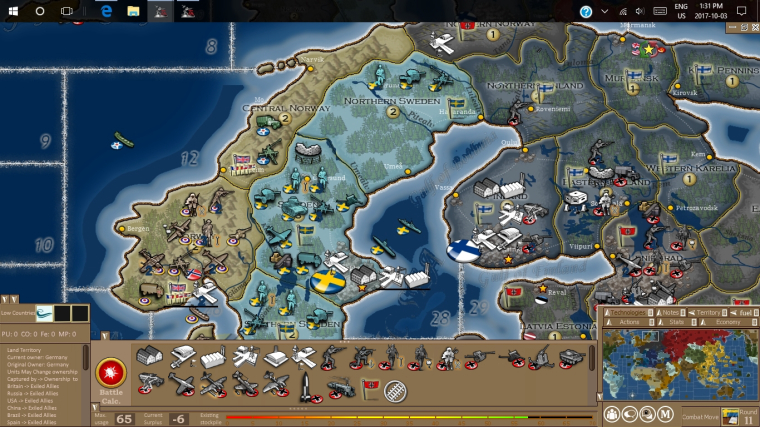
While playing, during movements I tend to hit the ">" at the top by the mini-map to reduce that area and allow full screen. I use the alt+mouse wheel to zoom in zoom out, and the BC to get area information and assess my movements. What I think would be nice is when I mouse over a territory the bottom bar showed the territory owner and status (Enemy/Allied/Neutral) along with the name and production.
Since both side displays allow for hiding/showing (the '<' and '>'), I would just rearrange the information displayed.
1- As stated above putting the territory owner and status in the bottom bar would allow the 'Territory' tab to display more of the units occupying that territory.
2- Combine Stat and Economy while removing the Technology (Some maps have a lot of Technology/Nations -TWW- and this display is quite useless. While others have not Technologies to list)
3- Create a technologies.properties file to format/display technologies (like TWW does with the objectives.properties file) if there is no file don't display Technology.
4- Some unit are very hard to distinguish, but when the 'I' key is hit it displays the whole unit information in a big gray box, when all I trying to figure out is what unit is it. Maybe the 'I' key could show just the unit name while ctrl+I would show complete unit information.
Cheers...
-
@wc_sumpton said in In-Game UI Revamp:
1- As stated above putting the territory owner and status in the bottom bar would allow the 'Territory' tab to display more of the units occupying that territory.
I believe the Territory tab is meant to give full needed info, and part of them are duplicated in the bottom bar too.
So, under the current practice, adding anything to the bottom bar would not remove them from the territory tab (and, if you change that practice, then I suppose you would remove territory effects from either the territory tab or the bottom bar, or anything else figuring in both).
Hello! It looks like you're interested in this conversation, but you don't have an account yet.
Getting fed up of having to scroll through the same posts each visit? When you register for an account, you'll always come back to exactly where you were before, and choose to be notified of new replies (either via email, or push notification). You'll also be able to save bookmarks and upvote posts to show your appreciation to other community members.
With your input, this post could be even better 💗
Register Login