Middle Earth: Battle For Arda - Official Thread
-
@Hepps I have always been a little sceptical about custom cursors. I find the standard white windows cursor most comfortable and easy to see and use. I think cursors are so important to a game playing experience that they should be "handled with care" if you know what I mean ... maybe just as important as many other aspects of the UI.
I bet games like Age of Empires and other strategy games where the mouse is used constantly, have really put a lot of effort in testing and evaluating the design of the in-game cursor.
I am not saying that LotR shouldn't have a custom cursor, but maybe the thin Sting cursor is not optimal and could be hard to spot and move quickly with precision on the map. Maybe take a look at what kind of designs has proven to work in other games, especially high quality commercial games.
LoL
 As you can see, cursors mean a lot to me...
-
@frostion Not getting that... you feel very laissez-faire about the entire thing...

What I will say is that as I designed it I made sure it functions the same as the normal arrow... pointing up to the left with the tip being the selection point. So other than looking like the worlds tiniest sword (even by Halfling standards) it is pretty damn near the exact same thing. the reason I wasn't to worried about how dramatic it was is because unlike other games... nothing is moving in Triple A other than the cursor or what you are moving with the cursor.
-
@frostion said in Large Middle Earth - official thread:
How compatible would you say the AI is with this map and its features? On a scale of 0-100% ???
AI doesn't understand the true value of unit abilities, only raw strength, and so tends to choose a favourite cheap thrash unit to spam while ignoring the rest. AI Gondor doesn't understand the strategic value of Osgiliath and fails to defend it, which is essentially #1 priority for Good. Finding the way leading out of Isengard without crossing mountains seems to be beyond the navigation skills of the AI.
I would say around 60-70% AI compatible (where 0% is chess and 100% is standard ww2 maps).
-
-
@alkexr Once a new beta version is released for the map, maybe I'll take a look at improving purchase logic to take into account more parameters like AA attacks. Mostly have been waiting for a high quality map that uses some advanced unit options that isn't quite as complex as TWW to take a run at improving the AI purchase logic.
-
-
@alkexr Going to put these out there on a hunch... not like we discussed it or anything.


-
Fortification / siege rework
It is very clearly stated that fortifications of Númenorian or Elven origin are completely impervious to any attempts to damage them by any means known in the Third Age. Even ents couldn't do a dent in the tower of Orthanc after razing the rest of Isengard to ground with ease.
To reflect this, two new units will be introduced: ancient walls and ancient towers. They are capturable infrastructure, and can't be targeted by siege units. Ancient walls give +1 bonus to 10 infantry, and -1 penalty to 10 non-flying attackers, respectively. For ancient towers, the bonus is doubled: +2 and -2, respectively.
Since all towers are presumably of ancient origin, the tower unit will be removed.
Fortresses are 2 hit units, which repair at the end of every battle round. They give similar amounts of bonuses as ancient walls/towers, and also have some defense value of their own. Walls are 2 hit units with similar fortification bonuses and some defense.
Siege units can target fortresses and walls, and scored hits kill instantly regardless of hitpoints left.
Walls are now buildable. You can only place a single wall per turn per territory. This is not going to cause over-fortification, since having many walls is not useful if you don't have massive armies (you need 60 infantry units to fully utilize 10 walls); also the buffed siege makes them easier to counter.
Fortresses will not be buildable by default, but there will be a game option that enables it. They can be built anywhere, but there can be only one fortress or tower present in a territory. They are obviously the most expensive units in the game. Fortresses and towers can produce 1 unit (if they are built outside of a settlement).
Fortresses and walls will get large bonuses from territory effects.
Ancient stuff is obviously not buildable. And walls won't turn into ancient walls by playing long enough.
-
@hepps the caves almost look like a person with a nose

-
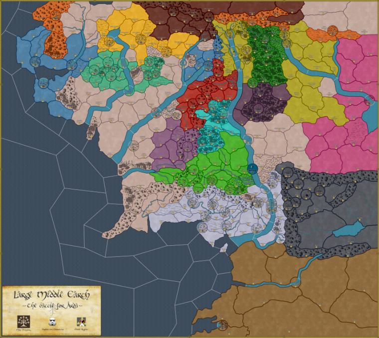
Tweaking colors...
-
@alkexr Most look good but 2 thoughts:
- The light blue nation in the NW is too close to the river color.
- The pink could be toned down a bit more so its less pepto bismal

-
@redrum said in Large Middle Earth - official thread:
The pink could be toned down a bit more
Why does everyone hate every color between blue and red?

-
@alkexr I love the pink! It is the old historical color of armour units and Panzerwaffe
 Before pink became girly, it was a manly symbol of power and passion

https://wikivisually.com/wiki/Panzerwaffe -
@redrum said in Large Middle Earth - official thread:
- The light blue nation in the NW is too close to the river color.
This. I suggest to have the river exactly the same colour as the sea, and some other way tell what is the border between the two (mostly are very intuitive anyways). Like, you can have some wave effect where the river ends.
-
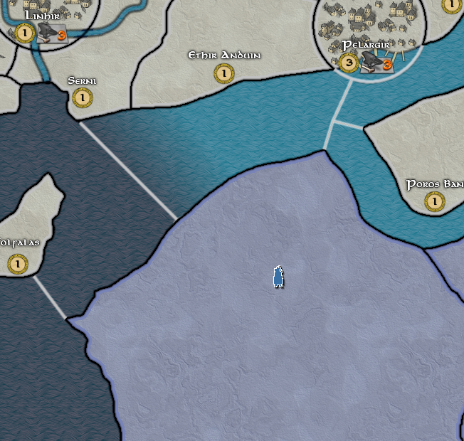
A much easier idea is to simply alter the colour of the high elves slightly...
7883B8
-
hey guys, i am sorry when i repeat a question bc i cant read the complete chat rigth now.
my 2 cantes:
1)again: great map!
2) i am using MAC and i have complete other design than the pictures here hepp is posting. i still like my mac design but hepps pictures looking ebven better
3) i guess it should be added what player is playing what nation (flaggs beside the players name). when you enter a bot you see names but you dont see who playing what nation
4) i am quite sure programm allows bltzing, as in my current game in the lobby around dol gondur and in my games with ai around rhun and dol gondur toothy, epi
-
@epinikion Yes epi... the new version has a full set of player flags.
-
@alkexr and anyone else who is familiar with the game.
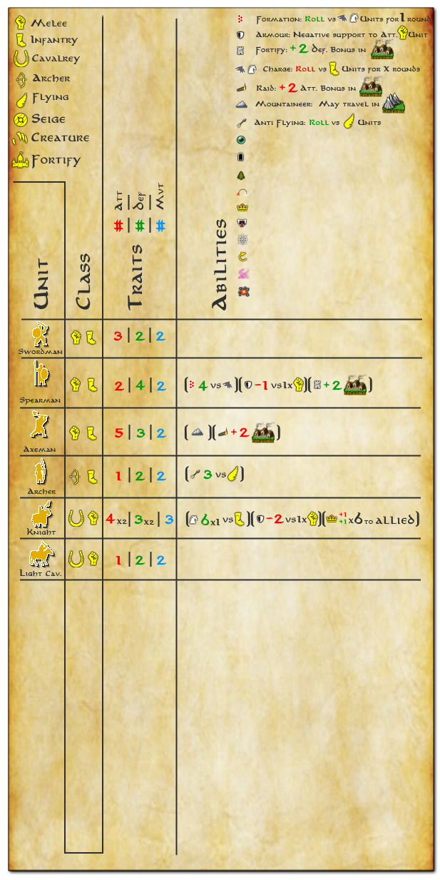
I started a little experiment to see if I could make the 2 different charts in the game notes into 1 hoping it would make things clearer.
Let me know whether this clarifies anything or if anyone has any idea how to make it any clearer with the myriad of units and attachments.
-
@hepps I think you have the right idea. Though it might be better to separate territory related abilities vs AA attack/support type abilities. Also some duplicate information so for example if fortify is always the same bonus amount and territory effect then probably just need the fortify icon in each unit row.
-
@redrum Well in the unit Class I wrote Fortify... however the class is actually Fortification so they are not the same ( I just wrote fortifiy because fortification would not fit and I did not want to re edit it all right now).
This chart only deals with abilities and support attachments... the actual terrain effects are not even handled yet. Those are an entirely different set of modifiers all together.
Hello! It looks like you're interested in this conversation, but you don't have an account yet.
Getting fed up of having to scroll through the same posts each visit? When you register for an account, you'll always come back to exactly where you were before, and choose to be notified of new replies (either via email, or push notification). You'll also be able to save bookmarks and upvote posts to show your appreciation to other community members.
With your input, this post could be even better 💗
Register Login