Global Dominance
-
Transferring to the new forum.
Old thread link... http://tripleadev.1671093.n2.nabble.com/Global-Dominance-tp6926896.html;cid=1497905598487-127

Been working away... here's a little teaser.

Sorry, trying to up-load an image of part of the map... but the server doesn't seem to like it.
-
@Hepps Nice pic. Might be a good idea to put a link to the original thread in your first post in case folks ever want to refer back.
-
@redrum Yah will do that as I have time.
-
That train is as sweet as it can get, but 3 suggestions:
- I suggest going for all images being 64x48 or more (I see that one is 52x48)
- Don't cut any transparency: I see that left and right the transparency is cut, and that is a bit visible and unpolished (I know it is very frequent, and sometimes I do it too, and I don't like it).
If cutting any transparency, I suggest to keep an uncut version in the folder, just in case. - I suggest providing an alternative "units" folder, with the units images without the flags, especially (but not only) if the flags are not the only way to tell them apart.
Ideally, the unit flag should not be part of the same image, but should be a different image, and the engine being able to associate them, so that you don't need to paste the flag into each single image; it would be cool if a developer can do that (the current Flag Display Mode is not good enough for that; so, I agree with having it in the image, as you did, with the current engine).
-
@Hepps anything missing in the allowed files?
https://forums.triplea-game.org/topic/89/allowed-file-uploadsalso here
-
@Cernel said in Global Dominance:
That train is as sweet as it can get, but 3 suggestions:
Thank you
- I suggest going for all images being 64x48 or more (I see that one is 52x48)
I am trying to use the exsisting repository of images I already have... so I am only creating those which I don't already have. Only those that require a space larger than 48 x 48 shall be done larger.
- Don't cut any transparency: I see that left and right the transparency is cut, and that is a bit visible and unpolished (I know it is very frequent, and sometimes I do it too, and I don't like it).
If cutting any transparency, I suggest to keep an uncut version in the folder, just in case.
Yes the train image still needs more work. I just created it yesterday.
- I suggest providing an alternative "units" folder, with the units images without the flags, especially (but not only) if the flags are not the only way to tell them apart.
I am not about to do this for 2 reasons. The first is explained below... the second is that I don't have the time to be doing back-up folders with 200 some odd unit images.
Ideally, the unit flag should not be part of the same image, but should be a different image, and the engine being able to associate them, so that you don't need to paste the flag into each single image; it would be cool if a developer can do that (the current Flag Display Mode is not good enough for that; so, I agree with having it in the image, as you did, with the current engine).
I am using the original units from TWW with the flags imbedded in the image as that option didn't exist when I first did this. Since all of the layered images with the roundels on their own layer are on my old broken computer, I will not be recreating all of them at this time.
-
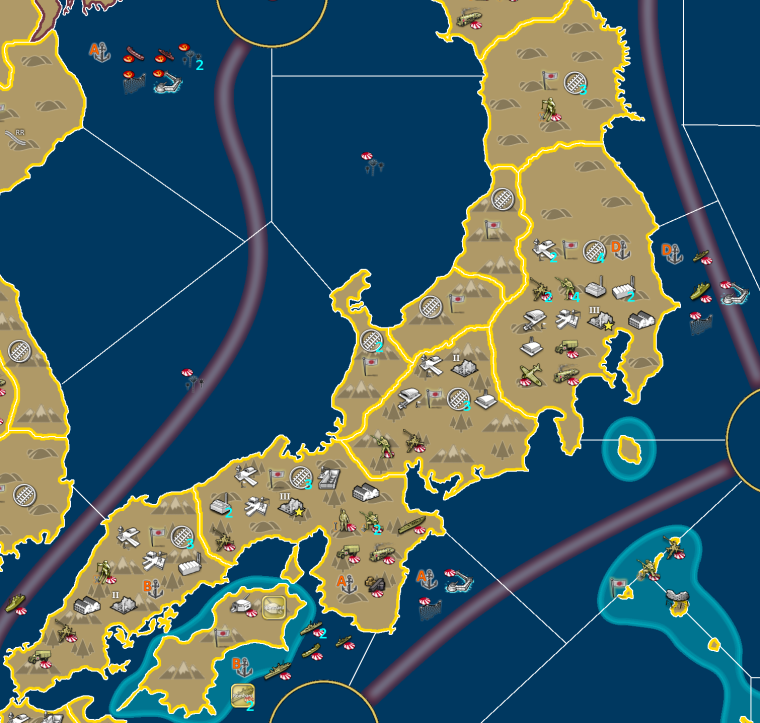
So here is a little peek at the Japanese home islands.

Just to build some suspense I will not try to explain any portion of the units or their function.
 Instead I will let your imagination fill in the gaps.
 -
@Hepps
I like the overall look and feel. I like the colors. I don’t know if it is intentional, but the map graphics makes it look kind of cartoonish, and that might be an interesting way to go. It seems to fit the way the units already look.Will you use terrain attachments and effects? Is that why there are mountains and hills drawn on the map?
I think these terrain symbols are sticking out too much and making the map a bit difficult to overview. The units blended with the terrain symbols seem to make the units stick out less then they should. Maybe you should try dimming the terrain symbols down a bit.
Are you planning to add some anti-aliasing / blur effects to the map graphics to smooth out jagged lines?
Even if you are going for cartoonish map graphics or something very similar to what you show here, maybe you should try to do some subtle “noise” effects to the now very clean and monotone colored map. Maybe it would look good. Or maybe you should think about adding some texture to the ocean and the land. Here is a link with free textures. http://spiralgraphics.biz/packs/terrain_desert_barren/index.htm
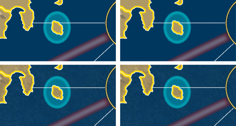
I used two of them to make some samples of how the map textures could maybe look like:

-
@Frostion said in Global Dominance:
@Hepps
I like the overall look and feel. I like the colors. I don’t know if it is intentional, but the map graphics makes it look kind of cartoonish, and that might be an interesting way to go. It seems to fit the way the units already look.**This was purely intended as a teaser. I have been using very simplified graphics to plan out unit placements, terrain effects and what not. The final product will more refined then this. **
Will you use terrain attachments and effects? Is that why there are mountains and hills drawn on the map?
**Yes there will be a full range of terrain effects similar to TWW. I have added a few new terrains and removed a few that proved problematic from a gameplay standpoint. **
I think these terrain symbols are sticking out too much and making the map a bit difficult to overview. The units blended with the terrain symbols seem to make the units stick out less then they should. Maybe you should try dimming the terrain symbols down a bit.
**Yes the final version of the terrain and map graphics will be last thing I will work on. The only thing I intend to retain is a mono-chromatic colouration for the bulk of the territorial space, but there will be some subtle texturing to both land territories and Sea zones. **
Are you planning to add some anti-aliasing / blur effects to the map graphics to smooth out jagged lines?
Yes. Again, I have just been trying to get the plan for the map done with a very simplified visualization. Details will be added after the entire game is completed.
Even if you are going for cartoonish map graphics or something very similar to what you show here, maybe you should try to do some subtle “noise” effects to the now very clean and monotone colored map. Maybe it would look good. Or maybe you should think about adding some texture to the ocean and the land. Here is a link with free textures. http://spiralgraphics.biz/packs/terrain_desert_barren/index.htm
I used two of them to make some samples of how the map textures could maybe look like:

Thanks for the helpful suggestions.
-
@Hepps my head is starting to hurt again....
 reminnds me of supremacy ....
great stuff as always
-
@Hepps Glorious! Legit sneak on Japan and I'm all intrigued by the train too. Look forward to checking it out
-
@Black_Elk Well given I have perked your interest.... here are a couple of the things I managed to get done tonight...


Working away furiously when I have the time. More to come in the near future.
-
@Hepps WTH IS THAT INF GUY? Ah hover works
 a general COOL!
 -
Badass! Looks way clean man
Can't wait -
@Black_Elk Just a couple more additions made today...
Russian Military Leadership....
 Major
Major
 Colonel
 General
 Major
Major Colonel
 General
A Tech released German menace...

More to come.
-
Very nice pictures … but before you make more of them, you should listen to Cernels advice about not cropping away to much of the transparent area around the unit pics. I can see that the German major, colonel and general all have a clean cut at the bottom. I can see that the colonel is 48 px in height, but you can let the pics be 50, 52 or 54 px in height with no problem.
Those officers are a nice idea. I don’t know what your plan is with them, but I can already imagine some sort of “command” point that can be used to purchase officers.

-
@Frostion Yup... again... just ripping out the concepts as they come to me...
I will go back and refine the edging as I the ideas out of my head and onto "paper" and then go back and finish the details.
-
@Frostion said in Global Dominance:
Those officers are a nice idea. I don’t know what your plan is with them, but I can already imagine some sort of “command” point that can be used to purchase officers.

There is another resource... but it is designed to be far more generalized. Intended to be used in multiple facets of national pursuits.
-
This project looks good. I see that you finally got your ships hulls to begin on land!
-
@CrazyG Not yet... but I have been told it is possible. Just never got the specifics on how to achieve it. But if it is possible then I am sure I will figure it out at some point.