Subcategories








Recent Posts
-
@Ondis said:
Gray is better, but white text doesnt work for it unless very dark and the dark default color for TripleA is already dark gray.I think that middle-way grey (meaning exactly in the middle between white and black) works with either black and white text. Example:
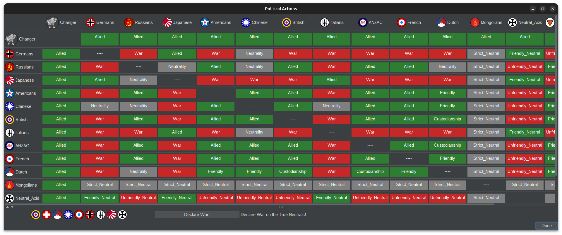
Neutral is basically the "nothing's happening here" state
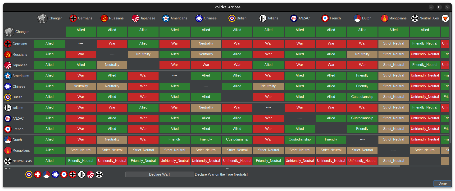
Then I would imagine you would suggest using exactly the same colour as the TripleA default colour for impassables, which is functionally the closest to neutrality.
This is that colour (according to 2.3.22161 https://triplea-game.org/release_notes/) but darkened in the middle of the values of Red and Green:
-
@Ondis
contrast isn't really just an accessibility niche thing. It helps way more people than you'd think. There are billions of people with some kind of vision impairment, and contrast sensitivity drops with age anyway. Add players on a dim laptop, a cheap monitor or a phone, and the small text in those cells gets hard to read for a lot of people. So I'd see it less as "accessibility design" and more as just making the panel readable. The WCAG gives good guidance here.the latest update actually added a colourblind setting, right next to the UI setting. So that part is already covered.
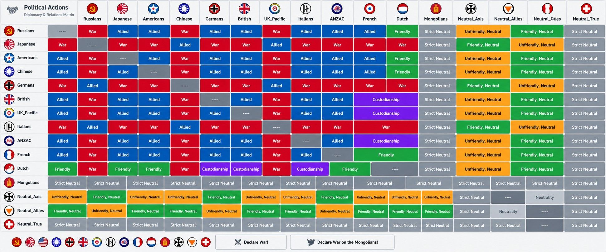
We also threw around ideas with more colours then 3. Blue would be an awesome colour same as purple.
-
@xxXEddieXxx I dont know if we are doing accessibility based design here

My thought was to use dark blue but it just wont look good enough.
For color blind people this design choice will be just as bad/good as we've all had it for 10 + years which means workable.But it would always be nice if there was a button for colorblindness that flips what ever colorsare necessary to something with more contrast.
If we want it accessible we should go with belees option though, black on yellow with small text just doesnt look good. But black on light gray can work.