Unit Tooltip Improvements & Poll
-
@frostion Good points. I'm planning to update the purchase screen to use | and I'll probably just have ArtyOld not be displayed since its an internal tag since isArtillery is converted to a support attachment.
-
@redrum pipe delimiters look almost like a 'one' to me, so I've a slight preference for unifying to:
10/10/10over10|10|10FWIW, experimenting around with other delimiter chars, like dash or dots, slash or pipe delimiter do seem to be the best two choices.
-
@lafayette My suggestion was to space it.
10 | 10 | 10
instead of
10|10|10 -
@lafayette So "/" conflicts with using that as the dice sides in some places "3/12" (3 attack roll on a 12 sided die) which made some of the tooltips hard to read.
@Cernel Yeah, I'm going to take a look at adding some spacing to see if that makes it a little easier to read.
-
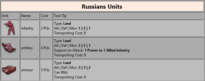
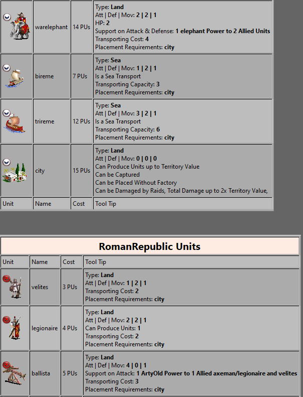
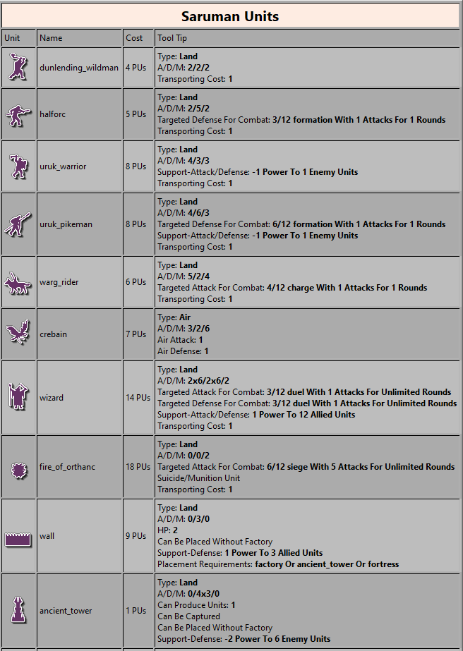
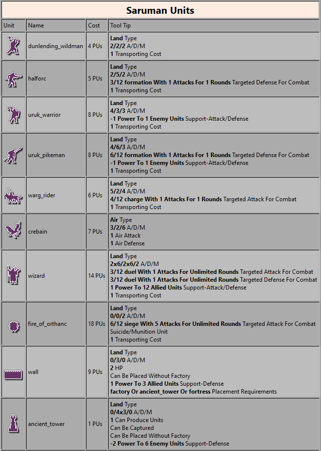
Updates format for tooltip and purchase screen to "A | D | M": https://github.com/triplea-game/triplea/pull/3641
-
@redrum I am looking forward to trying it out, but there seems to be something seriously wrong with the latest few re-releases. The map tiles seem to load very slow, sometimes they never load and just hang, so one cannot play the map. Do youknow what I mean? Is there an end to this problem?
-
@frostion Yeah, there were some map tiles changes that are problematic but its a known issue and reported here: https://github.com/triplea-game/triplea/issues/3539
Feel free to add any details/insights there.
-
@redrum said in Unit Tooltip Improvements & Poll:
@frostion Good points. I'm planning to update the purchase screen to use | and I'll probably just have ArtyOld not be displayed since its an internal tag since isArtillery is converted to a support attachment.
How about supporting the possibility of not having the label displayed without having to use the old unit options to obtain this result? Either:
- Wherever there is only 1 type of support, the default tooltips don't display the type.
- You can avoid having the type for the support and, in this case, it defaults to "ArtyOld" and it is not displayed; the same if the support is called exactly "ArtyOld".
- You can have the support called exactly "ArtyOld", to not have it displayed.
- Same as 3, but with something else than "ArtyOld"; and also changing "ArtyOld" to that for the deprecates.
I would strongly favour 1, as, in the moment you don't have a label for a support, you also get the info that in that specific map there is only 1 type of support.
-
@redrum Minor note: when Veqryn updated 270BC he added the special support of warelephant and kept the old unit attachment options supports. So, in that game, as well as in any games in which the mapmaker mixed up the old options with the new attachments, something, if not ArtyOld, should be probably displayed, since you have more than 1 support attachment. Going with the number 1 at my previous post would address this too. Anyways, I consider this a marginal matter, as I'm not so sure that the mix up of old and new support options/attachments in a same game should be supported, as it doesn't look like a very sound practice.
-
@cernel Agree, good idea. I like option #1 and agree ArtyOld should display if multiple support types so that those maps are clear even if it isn't the best name. Generally, I don't think they should be mixed but we have some maps that do. Here is the PR: https://github.com/triplea-game/triplea/pull/3646
Revised

270BC

-
@redrum Maybe have it as "artillery" instead of "ArtyOld", to make 270BC or such look not too strange (of course, easy to update), since the option is called "is artillery", after all. As long as pos2 tells you to not use both kind of support in the same game, the name doesn't need to be one that you would never actually use (that I guess it is the whole reason behind that naming).
-
@cernel Well "artillery" really isn't much better for 270BC as chariots having "artillery" doesn't really make any more sense than "ArtyOld". Maps could also use "artillery" as a separate support type (not sure if any do) but essentially any string but "ArtyOld" could be a different support type.
-
@redrum Let me point out that this is all a side note, as I'm not strong on any of this, as I consider this a marginal matter, except only that it is cool being able to not have the label (without having to resort to deprecates), if you are making a game with only 1 support, especially in the case, as you can see in 270BC, that it would be hard to find any good label at all for it.
I know the issue would be if anywhere there is a map that uses both the old options and having a supportattachment called "artillery", then it would be bugged off. I would be surprised it exists.
Actually, "artillery" would be at least better than "ArtyOld" on that map, as the support was mostly related to "ballista" and "onager" (that are artilleries). The support from chariots didn't exist previous to the Veqryn changes, as that was one of those changes, and, anyways, I could argue that chariots have archers on them and the early modern meaning of "artillery" used to comprise any kind of missile weapons (yep, archers were artillery too). In the old chariots were 1/4 without support. In my variant they are 2/4 without support. In the post-Veqryn 270BC they are 1/4 with support to axeman.
-
@cernel Also, in the moment in which the support is never displayed if only 1 type, it would feel strange to mandate the mapmakers to choose a label that will be never used. So I think it would make the most sense to also allow not having the type entry in the support attachment, defaulting to the default label ("ArtyOld" or "artillery" or whatever) if missing. This way, mapmakers that want only 1 support in their game and don't want it to have a label (maybe also because it is so abstract and generic that there cannot be a good label) will just make supportattachments lacking the "type" (like until now they would have probably used the unit options for support), and the engine will assing the default label for it, much in the same way it happens for the deprecates.
-
Love love love! the new tool tips. Looking smashing!
-
Mostly referring to the tooltips you get hovering the cursor over the units, I suggest:
- Removing the player name, showing between parentheses after the unit name, from the tooltips, leaving the unit name alone.
Reason: For decently made maps, this is redundant to see, as the ownership of the unit should be clear on the unit itself, so you should not need a tooltip telling you who the owner is. If the unit ownerships are confusing, there is already the option to turn on small flags. If even the flags are confusing, that's probably a bad enough map you don't want to play anyways. You may have long unit names and long player names, causing the tooltip to become very large, for no good reasons. In maps like TWW, you will see something like "GermanInfantry (Germany)", and, in general, you cannot exclude that the name of the unit itself might contain the information about who the player is. It is especially questionable since it is an element that you cannot customize, and I believe all not customizable parts should be kept to the minimum.
- Having the first letter of the unit, as well as whatever letters for it, displaying always in its own case, instead of always being upper case.
Reason: In the moment the mapmaker can choose whether to have "infantry" or "Infantry", I see no good reasons to force an uppercase in only some places. In some cases, like for example "aaGun", you will end up with oddities like "AaGun" (you can see this in all basic maps except v6).
-
@Cernel
I do not agree on removing player names from tooltips. I think it is a good "last resort" place to get info on a unit's ownership, if graphics of the map is for some reason is not giving this, complementing the visual ownership mini flag that is always shown in the territory tab.Difference being that the tabs flags are mostly (as I see it) for the sake convenience when actually using/looking in the tabs when wanting an overview of the territory. It is a much more lengthy process getting owner info from tabs, that should be complimented with easyer obtained ownership info, like in tooltips.
Lengthy, but giving a territory overview of all ownerships and much more info:
- Moving mouse from map to tabs.
- Pressing territory tab.
- Possibly moving mouse down to scroll within the tab.
- After seeing ownership info, perhaps resetting the tabs to what info the player was seeing before/preferring to see.
Short process, but also just giving the single unit info:
- Moving mouse from map to unit and wait a sec.
I agree that a map would be best of by allways showing ownership info graphically, via unit color, flag or some other characteristics. I have been playing Warcraft 3 lately and there is never any question of ownership of units and buildings. But it does not seem to be the case with many TripleA maps, and perhaps mapmakers should not be forced to always go for the unmistakable ownership look? If a mapmaker is going for a more realistic look, flags and colors are toned down. Like in Age of Empires the units are sometimes only marked with a very subtle thin colored stripe. If I am not mistaken, in Civilization the tooltips state ownership in the tooltips like this: "Greek Settler" and territories like this "Grasslands (line break) Ownership: Greece" And this is being displayed alongside colourful flags. But just like in TripleA, the number of players can be so large that colors start to look alike, just like in TripleA. So the need for more specific written ownership is also present in Civ.
-
@Cernel
On the unit name capital or small letter thing, I am split.I would prefer than any effort to better this aspect of the game, would go into allowing unit names split with space. So that names like "Heavy-Artillery", "GermanInfantry", "Sea_Mine" etc. could be avoided and replaced by more clean names.
Also, overall I tend to think that ALL units and unit names are also "definitions" and therefore should be written with a first letter capitalization. Just like all resources, territories, player names, bonus types, AA types and so on. So actually I would lean towards an engine-enforced capitalization of the first letter of any unit.
-
@Frostion said in Unit Tooltip Improvements & Poll:
@Cernel
I do not agree on removing player names from tooltips. I think it is a good "last resort" place to get info on a unit's ownership, if graphics of the map is for some reason is not giving this, complementing the visual ownership mini flag that is always shown in the territory tab.In that case, the ownership info should certainly be part of the customizable part of the tooltip, that is not obliging every maps having that display, as long as the tooltips for the units are fully customized.
Also displaying the units control between parentheses right to the unit name is visually lame. Rather better doing it on a second line with "owner", or whatever, and its name, like the rest of the unit info (and customizable!).
-
@Frostion Side note, for the tooltips on map, I would find more useful getting the info about the unit value (usually, cost), so I'm really not seeing why we are getting told who is the owner and not what is the value of that unit, from someone that would have neither of them.
Hello! It looks like you're interested in this conversation, but you don't have an account yet.
Getting fed up of having to scroll through the same posts each visit? When you register for an account, you'll always come back to exactly where you were before, and choose to be notified of new replies (either via email, or push notification). You'll also be able to save bookmarks and upvote posts to show your appreciation to other community members.
With your input, this post could be even better 💗
Register Login
