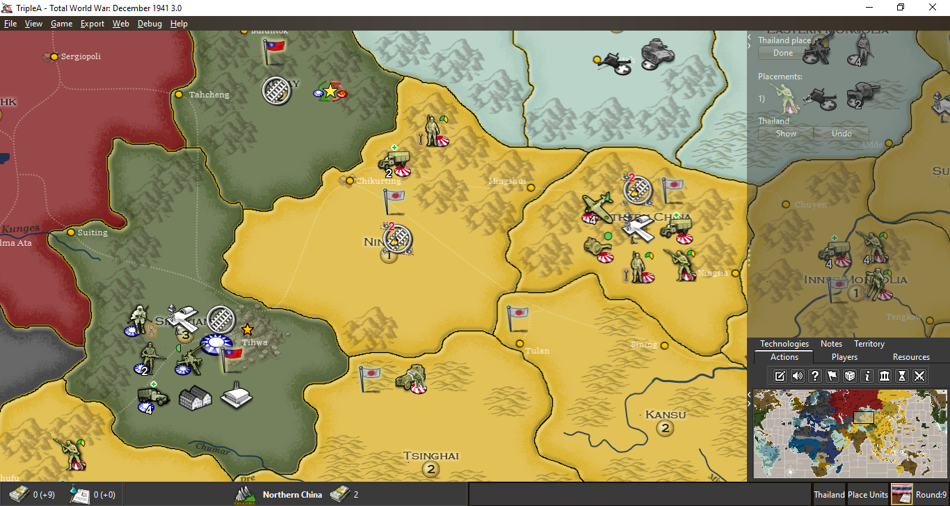
Moving MiniMap to bottom of Action Panel
-
@LaFayette i like that idea left is currently cheap real estate the right side already a bit jammed up even disregarding the map.

-
@LaFayette Honestly, not sure what you are planning. You don't have the left/history bar when you are playing, so I'm not sure if that would mean not having the minimap, as well, when you are not in history mode. On the other hand, if the minimap would be integrated in the left bar, like it is now in the right one, this would mean, especially if having wide minimaps, hugely increasing the minimum wideness of the history bar, taking out a lot of board view.
I also don't like the idea of showing the minimap somewhere without it being encompassed by a side bar, as I think the board view should always be rectangular.
-
- I'm not sure if the minimap really needs to move
- There seems to be some compelling reasons to have it not be bottom right.
- It's an open question on how we would place elements exactly.
- I don't think it'd be wise to ever have the minimap be hidden unless the user explicitly does so. I don't think I implied otherwise.
especially if having wide minimaps, hugely increasing the minimum wideness of the history bar, taking out a lot of board view.
It would probably make sense for us to have a max size of the minimap, and potentially a min size as well. A map maker could cause issues today with a minimap that is out of an expected range. I suspect this is just a UI bug that we don't have it, it's very common for programmers to not account for excessively short or excessively long text/images.
We still have options for how to deal with this, but arguably premature to jump into those details just yet without even deciding we want the minimap to move or where.
To check for 'greatly' increased, here is an example of what we would be looking at:
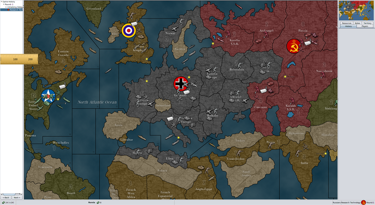
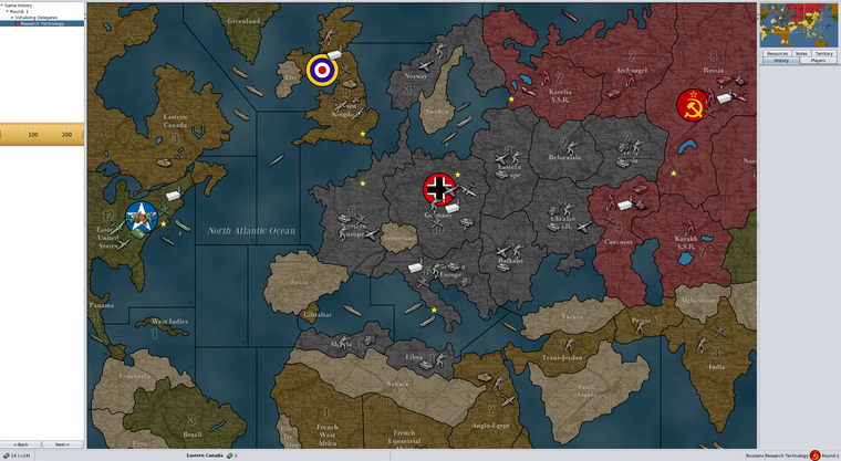
-
@LaFayette said in Moving MiniMap to bottom of Action Panel:
- I'm not sure if the minimap really needs to move
The more I think about it, the more I get convinced the current position is preferable.
- There seems to be some compelling reasons to have it not be bottom right.
I don't see any real benefits from having it bottom right instead of upper right, and, so far, unless I've missed something, the only argument in favour of that has been from @redrum said in Moving MiniMap to bottom of Action Panel:
I agree with moving the minimap to the bottom right. I think its more natural there and most other strategy games have it there so easier for players to get used to the TripleA UI.
So just a personal preference and personal opinion on what "most other strategy games" do.
- It's an open question on how we would place elements exactly.
Hard to have a clear opinion until all is exactly defined, as details can make a huge difference.
- I don't think it'd be wise to ever have the minimap be hidden unless the user explicitly does so. I don't think I implied otherwise.
Ok, if the minimap would be anywhere on the left side and always showing (at least as default) this would mean either the history always showing or the minimap showing alone, without being integrated inside a bar. I think the first case would cut out a whole bunch of board view with not much added value, but it has the benefit of compensating the presence of the right bar, having the centre of the board view closer (and possibly on) the centre of the screen, so here I'm fairly neutral, as I dislike reducing board view but I like the centre of the board view being closer to the centre of the screen (I'd prefer the two being the same). Regarding the second case, as I said, I "don't like the idea of showing the minimap somewhere without it being encompassed by a side bar, as I think the board view should always be rectangular".
-
@LaFayette said in Moving MiniMap to bottom of Action Panel:
It would probably make sense for us to have a max size of the minimap, and potentially a min size as well.
I would say that a sensible standard minimap size could be between 233-290 px. Most, if not all, maps live up to this criteria. But what exactly is it that a min/max size should achieve? Should player not be able to manually drag/expand the right sidebar to become larger than this max size? Why?
The size of history/left sidebar defiantly should open up larger than it does now (150 px). Maybe 200-230 px is not unreasonable. I can’t see a big problem with this, as this sidebar only opens up when the player is not having his turn, or it is deliberately called up.
I must say that I am (obviously) not fond on the Minimap moving anywhere. I think it works very well where it is now. But I think there UI could benefit from a bunch of small adjustments and alterations. Let me show how I imagine improvements:
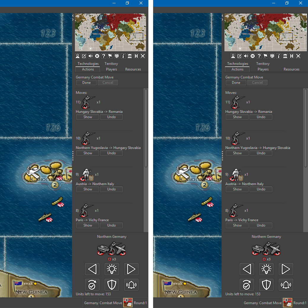
Notice that in this mockup…
• There is a 240 px Minimap example (10 or 11 buttons?)
• And a 287 px Minimap example.
• “Cancel” button is beside, not below “Done” button.
• Nice graphical lines below the Done/cancel button, encompassing the field containing the scroll up/down moves.
• The territory/unmoved unit scroller is here more compact than the current prerelease.
• “Notes” tab is missing as it has a button and would be a pop up window.
• Perhaps it would also be a good idea to remove and make buttons for the “Technologies”, “Resources” and maybe even “Players” tabs. The info in these tabs could (needs to?) be presented more nicely and clearly in a automatically sized window, just like the political information is presented. This would also free up space in the right side bar, ensuring one row tabs. -
@Frostion There is not a "Technologies" tab, beside the "Players" tab.
I maintain there shouldn't be max/min and mapmakers should rather be free to make games with whatever units dimensions etc. they want, as well as making minimaps as wide or as narrow as they prefer (with 64 pixels wide units, I would go for a 200 pixels wide minimap). I believe TripleA should go in the direction of removing limits to mapmaking (for example, currently there are some display issues for huge unit images), rather than adding more of them.
-
@Cernel ### But what exactly is it that a min/max size should achieve?
There are constraints needed for rendering. If we scale the side-bar to the size of the minimap, then we incur some problems:
- stats table becomes unusable
- buttons become cut-off, unit scroller and the 'undo' button
- unit images become cut-off
Sacrificing the usability of everything in the actions panel for the sake of seeing 30px more of map is pyrrhic victory.
If the map is too large, then too much of the map becomes covered.
For example, what stops someone from creating a 50x50 minimap, or a 400x400 minimap? Nothing, would the game look and work well with either of those? No, see problem statements above.
If a person wants to make the side-bar small enough where nothing on it is usable, then the controls to minimize the side-bar are here:
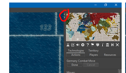
A min/max probably would just constraint/scale the minimap and so it'd be advisable to avoid this and create a minimap within the recommended range.
I agree there should be less rather than more constraints. I'd view it from the perspective as well that map-makers are constrained from making unit images too large because they would get cut-off from the move history. While we may want to be focused on visible size of the map, it's also completely wrong to ignore the functionality we do have in the actions panel. It's NOT acceptable to say the features in the action panel that we personally do not care for are okay to neuter by makign them unusable for the sake of something we care about. In other words, this is not okay "I do not use the stats table, ergo, I do not care if it's unusable, so give me 30px more of map, even if it makes the stats panel useless". We have to strike the right balances and/or be more strategic about how we display and render features.
A last comment about min/max size of minimap, the UI coding for it is not intentional. It was simply not handled for a too large or too small of minimap, and that the size of the action panel is controlled by the size of the minimap is not intentional. It's a bug that the UI becomes unusable when the minimap is smaller than expected.
-
@Frostion I like the ideas you've presented.
@all: I think there is some consensus that bottom right is not actually ideal. Are we in agreement? If so, that leaves 3 options, bottom left, top right, or top left. Top left seems to be a weak option. That then leaves 2 options, bottom left or top right. Are we in agreement that those are the two options we are considering, or should we still consider bottom right as an option? (cc:/ @redrum )
-
@LaFayette A 200 pixels wide minimap can actually allow fully displaying all statistics and even the full players names in the players tab, but I don't really care, as you can widen the right bar when you want to read stuff, then shrink it back, while you can never do the opposite (main example is Notes tab, that it is virtually assured to be too narrow at default). From my point of view, it would be good if you could shrink the right bar down as much as you want, like leaving it only at around 100 pixels to be able to click on Done and on the battles and such. In this case, the minimap should also shrink under its default dimensions.
I'm not actually sure "Notes" should really be a bar anyways. Maybe it would be good having it only as a menu option.
-
@Frostion Love the design. Looks great.
My only suggestion beyond hammering out some details for buttons and what not... would be to enable a player to minimize the tabs... so that (using your example) if a player were to click on the Action tab while it was open (like in your example) it would retract. That way you could see more of the map while doing your moves. Then if you clicked on it again (or any other tab for that matter) it would reopen.
-
@Hepps said in Moving MiniMap to bottom of Action Panel:
@Frostion Love the design. Looks great.
My only suggestion beyond hammering out some details for buttons and what not... would be to enable a player to minimize the tabs... so that (using your example) if a player were to click on the Action tab while it was open (like in your example) it would retract. That way you could see more of the map while doing your moves. Then if you clicked on it again (or any other tab for that matter) it would reopen.
Yes, I could imagine that also. I would think it would be a cool feature if, when player pressed end turn, then the tabs minimized as the other Players (or AI) began their turns and as the history left panel showed up. It would free up screen space and the player could always press a tab to let it drop-down, press it again to remove it. And when the player again had his turn, then the tabs would auto-reappear with the action panel chosen. @Hepps was this your vision also?
@LaFayette In regards to what icons/buttons to what features that should be displayed below the Minimap, there could in game settings be a made a window/tab with check-boxes where one could enable and disable the different icons?
-
@Frostion said in Moving MiniMap to bottom of Action Panel:
@LaFayette In regards to what icons/buttons to what features that should be displayed below the Minimap, there could in game settings be a made a window/tab with check-boxes where one could enable and disable the different icons?
Oomph, that could get a bit complex. I'd vote we keep the icons to be the universal/useful ones. The goal AFAIK is to get useful views out of the menus and out of the action tab.
I feel like we need a philosophy of what kinds of things should be in the menus, what in an action tab, and what should be on the icons.
I do really like the idea of reducing the number of action tabs. It was convenient to add those, and it was a bit over-used (on Mac, the many tabs is very hard to use as it does not display in multiple rows). IMO getting to around 3 or 4 tabs is ideal, less is arguably better.
-
@Frostion Yes, exactly what I had envisioned.
-
I like the buttons idea, but that is not on the table just yet. Are we deadlocked on minimap position?
-
@LaFayette create a vote for moving or same position that will solve ? fast
 Im ok either way just offered my work saving two cents
-
Ok, created a poll in the OP
-
@LaFayette My vote is meant to reflect that the discussions here proposed some good ideas that would allow the UI to remain roughly the same by simply adding in some better functionality.
This was also reinforced by @LaFayette use of "Pyrrhic victory" which got me a little hotter under the collar then any comment from a man should.

-
@Frostion Also in these examples you posted, all the games that have the minimap bottom-left (the most common position) appear having the stuff (how should I call it?) as a single lower bar, or partial bar, or not in any bars. On the other hand, all the 2 games featuring a right main bar have the minimap at the top of that bar and the 1 game featuring a left main bar has the minimap at the top of it, as well (I wonder if the main creator of Total Annihilation was left handed and using the mouse with its left hand, as I cannot think of another reason for having the main bar on the left). Each of those games having a main bar covering all or most of a side of the screen (6 having a bottom bar, 2 having a right bar, 1 having a left bar, and the other 4 having no bars (counting the two Axis & Allies screens as only one game)) have the minimap as part of it.
So a proposal like moving the minimap to top-left or bottom-left, while keeping the main bar on the right, would create an interface like nothing at all in the examples you made.
I'm guessing what @redrum was thinking about was rather the fact that most games have the stuff presented as a bottom bar (instead of as a right bar, as TripleA does), with the minimap at the bottom too, of course, in this case.
Personally I believe the biggest argument against having the main bar on the bottom (admittedly more fair with the personal choice of using the mouse with the right or left hand) is the fact that the screens are already mich wider than higher, so such an interface increases even more the view space you have left and right instead of up and down (for example, easier to spot the bombers that may get you from the left and right, but harder to spot the ones that may get you from up and down), that can be good if the game you are playing tends to have a prevalence of X axis dynamics over Y axis ones, which it is at least true to some extent for most TripleA games, also since they often wrap on the X axis but very rarely on the Y axis, or if you are presented with enough apparent perspective so that moving a same amount of pixels up and down brings you farther or closer than moving the same amount of pixels left and right at any point but at the very top of the screen itself (which might even be beyond the horizon). However, this is certainly not currently the case for TripleA, that doesn't support any true perspective simulation dynamics, though any mapmaker could make a map having an isometric, dimetric or trimetric projection, that are anyways just methods to abstract perspective, but not actually representations of real perspectives, and that actually would benefit from a much wider than higher board view only in the dimetric and trimetric cases, but I'm not aware of any TripleA maps ever made under such criteria.
Of course, if the TripleA user interface would be stable, mapmakers could tailor their skin choices to it (for example, if TripleA would have a huge bottom bar, instead of right and left bars, the mapmakers could make zones wider (or we could take any map and stretch it on the X axis), so that moving the view up and down you would navigate farther away than moving left and right).
-
I am a lefty but use the mouse with right hand.
IMHO, the minimap should stay in UR.
-
The mouse-move from main map to UR (and back) feels much more natural than to LR, as I seem to just pivot my elbow rather than strain my right hand/wrist muscles. This is likely my most common movement playing this game.
-
many of the 'list boxes' that currently appear under the minimap often extend down off the screen (unit placement, combat moves, combat on large maps). To me, it seems more intuitive for these to spill/scroll off the 'bottom' of the screen rather than 'into' another game area like the minimap.
-
-
@tinfoil666 I didn't think about your last point, but in 2.0 this is going to be only partially true, as now the actions will be cut by the presence of an unmoved unit scroller and units to place display on the bottom of the same bar. The "Units to Place" actually displays under whatever bars on the right, not only the action one (I still don't understand why is that).
Hello! It looks like you're interested in this conversation, but you don't have an account yet.
Getting fed up of having to scroll through the same posts each visit? When you register for an account, you'll always come back to exactly where you were before, and choose to be notified of new replies (either via email, or push notification). You'll also be able to save bookmarks and upvote posts to show your appreciation to other community members.
With your input, this post could be even better 💗
Register Login