TripleA Logo TripleA Forum
    • TripleA Website
    • Categories
    • Recent
    • Popular
    • Users
    • Groups
    • Tags
    • Register
    • Login

    Darken Moved Units

    Scheduled Pinned Locked Moved Feature Requests & Ideas
    75 Posts 8 Posters 22.5k Views 8 Watching
    Loading More Posts
    • Oldest to Newest
    • Newest to Oldest
    • Most Votes
    Reply
    • Reply as topic
    Log in to reply
    This topic has been deleted. Only users with topic management privileges can see it.
    • Greg AndersonG Offline
      Greg Anderson
      last edited by Greg Anderson

      I just wanted to note that from what I have seen the moderators and admins of the TripleA forum are very tolerant. I have been in communities where poking fun at a staff member's username once is grounds for a temporary ban.

      So congrats to the entire TripleA Forum staff for being patient.

      Now I think it is time to get the conversation back on topic. I really like the halos Hepps created and I think they would be very useful in-game. I had major problems with the Total World War map because I was playing a game with twice the normal units and I was getting lost with movements.

      HeppsH 1 Reply Last reply Reply Quote 2
      • HeppsH Offline
        Hepps Moderators @Greg Anderson
        last edited by Hepps

        @Greg-Anderson First, thanks for the compliment to the team. We really do try to be fair while maintaining a healthy environment.

        But, and more importantly, I am already working on some new high-light graphics as time permits.

        Stay tuned.

        "A joyous heart sours with the burden of expectation"
        Hepster

        1 Reply Last reply Reply Quote 0
        • LaFayetteL Online
          LaFayette Admin
          last edited by

          A really quick and dirty addition of the auro's looks like this:
          Screenshot from 2020-04-07 20-17-31.png

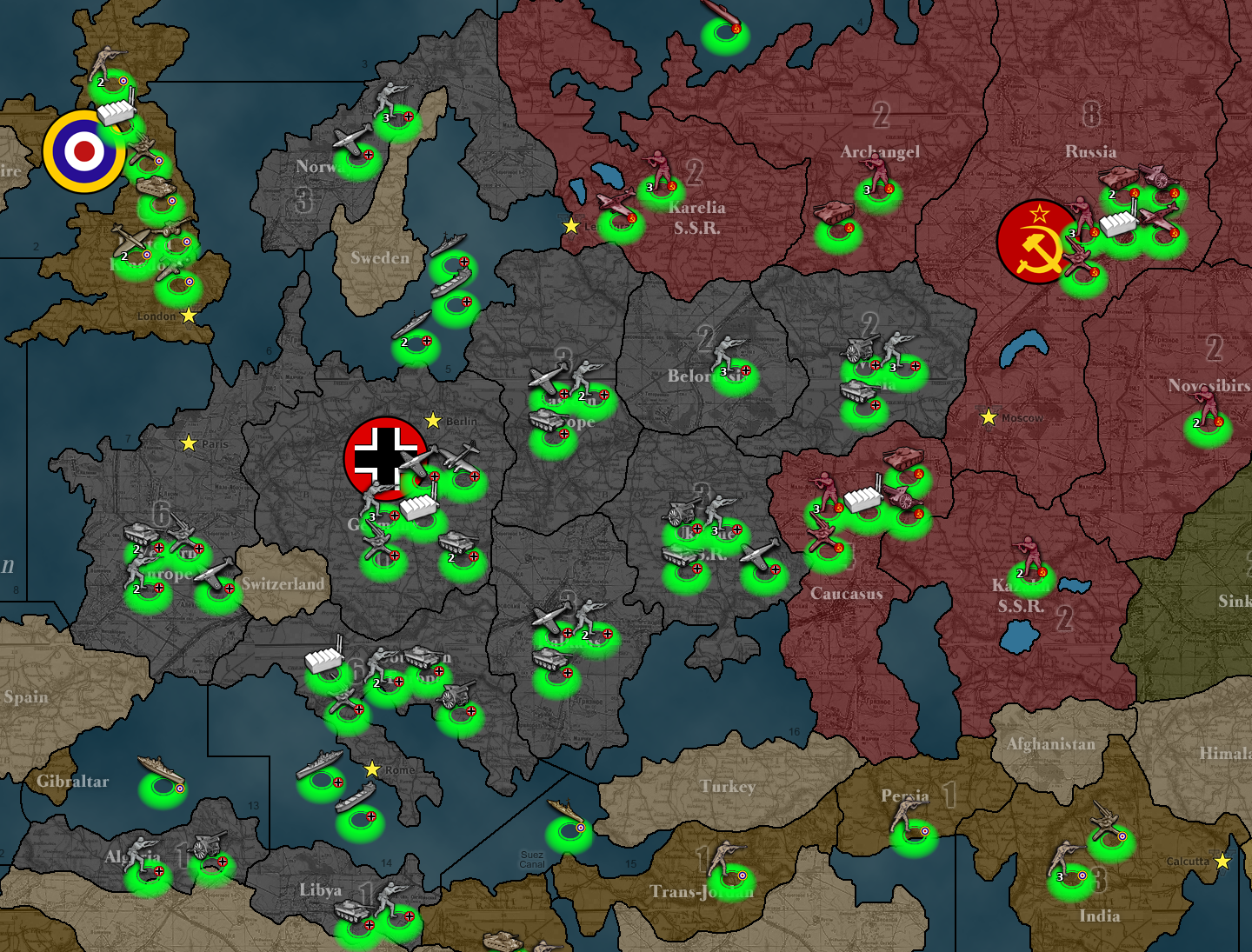
          It's a bit sad to see that the coordinates for units is not super consistent. The auro is nicely placed for most of the russian units, but really get skewed in the UK and for some of the navel. It might be something for the code to try and improve on, I think there might be a limit to how good it can get in terms of positioning. It's also noteworthy that a typical unit image is something like 42x42, but the actual unit image might be drawn at different locations or to different sizes within that box.

          I might be able to get this too look better by trying to get the aura to be drawn at the exact center of the unit image box. We'll see how that works..

          1 Reply Last reply Reply Quote 1
          • O Offline
            Ondis Moderators
            last edited by Ondis

            this is off-topic but I've never seen so dark of a map before hah!

            Looks a lil bit in your face but could still be good for massive maps with too many units to keep track of.

            How about slightly smaller glow?

            And if you could be bothered, can you post it with a screenie of either black or white circles, the one of the two you liked the most.

            HeppsH 1 Reply Last reply Reply Quote 0
            • HeppsH Offline
              Hepps Moderators @Ondis
              last edited by

              @Ondis Yes. The size and intensity of the marker is a little over powering.

              The spacing of the marker relative to the units should be ok with a slight re-design.

              I will produce a new marker asap.

              "A joyous heart sours with the burden of expectation"
              Hepster

              ubernautU 1 Reply Last reply Reply Quote 0
              • ubernautU Offline
                ubernaut Moderators @Hepps
                last edited by

                @Hepps @LaFayette maybe there needs to be a less highlighted version with the full highlight being reserved for a hover effect or something. 🙂

                "You should never have told me horses sleep standing up, it gave me a mental block." - Mister Ed

                HeppsH 1 Reply Last reply Reply Quote 1
                • HeppsH Offline
                  Hepps Moderators @ubernaut
                  last edited by

                  @ubernaut I am currently redesigning the highlight to be significantly less "in your face".

                  "A joyous heart sours with the burden of expectation"
                  Hepster

                  1 Reply Last reply Reply Quote 1
                  • HeppsH Offline
                    Hepps Moderators
                    last edited by

                    @LaFayette Question before I go too far in the design...

                    Is the GIF possible? Or should it just be a fixed image?

                    "A joyous heart sours with the burden of expectation"
                    Hepster

                    C 1 Reply Last reply Reply Quote 0
                    • HeppsH Offline
                      Hepps Moderators
                      last edited by

                      Here is a version 2 prototype...

                      Unit Highlight version 2.png

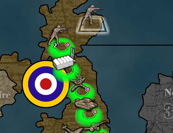
                      I think if we were to have the marker matched to the center of the vertical axis of the unit image... and the top of the marker image aligned to the center of the Horizontal axis of the unit image... it would be near perfect for almost every unit.

                      "A joyous heart sours with the burden of expectation"
                      Hepster

                      1 Reply Last reply Reply Quote 0
                      • C Offline
                        Cernel Moderators @Hepps
                        last edited by

                        @Hepps Since GIF allows only 0 or 1 on alpha, I think it would not be fit for the job, so it would be needed to support things like WebP or APNG (which would be great).

                        I still suggest not having a hue based system and, in this case, I would prefer if the aura have always the same hue defined for the player in map properties (the same hue as territory ownership) (kind of like Baldur's Gate Enhanced Edition).

                        HeppsH 1 Reply Last reply Reply Quote 0
                        • HeppsH Offline
                          Hepps Moderators @Cernel
                          last edited by

                          @Cernel Do you have a screen shot ?

                          "A joyous heart sours with the burden of expectation"
                          Hepster

                          C 1 Reply Last reply Reply Quote 0
                          • C Offline
                            Cernel Moderators @Hepps
                            last edited by

                            @Hepps Of Baldur's Gate Enhanced Edition? Well, I didn't mean to change like that, those are just simple circles, just was clarifying the same hue as the player (thus likely the units as well).

                            HeppsH 2 Replies Last reply Reply Quote 0
                            • HeppsH Offline
                              Hepps Moderators @Cernel
                              last edited by

                              @Cernel I just wanted to see an example of what you are talking about.

                              "A joyous heart sours with the burden of expectation"
                              Hepster

                              C 1 Reply Last reply Reply Quote 0
                              • C Offline
                                Cernel Moderators @Hepps
                                last edited by

                                @Hepps Ok, but I believe your aura are better, was just referring to same hue (and I don't think it is needed to have a specific hue to have those aura distinctive enough):
                                screen-1.jpg

                                HeppsH 1 Reply Last reply Reply Quote 0
                                • HeppsH Offline
                                  Hepps Moderators @Cernel
                                  last edited by

                                  @Cernel said in Darken Moved Units:

                                  @Hepps Of Baldur's Gate Enhanced Edition? Well, I didn't mean to change like that, those are just simple circles, just was clarifying the same hue as the player (thus likely the units as well).

                                  The main issue I see with that is that in Balf Gate... the map itself is composed of natural surroundings... while in Triple A most territories are the same hue as the units. Therefore if you make the marker the same hue as the player colour it is merely going to blend in to the point that it will be near impossible to see.

                                  "A joyous heart sours with the burden of expectation"
                                  Hepster

                                  C 1 Reply Last reply Reply Quote 0
                                  • C Offline
                                    Cernel Moderators @Hepps
                                    last edited by

                                    @Hepps Right, so it would need to have the same hue but being significantly different otherwise, like much brighter. Of course, if you have a very bright colour ownership and no relief, I realize that would be next to indistinctive (and totally indistinctive if the color is the brightest for the hue and there are no relief, but that would be extreme).

                                    1 Reply Last reply Reply Quote 0
                                    • HeppsH Offline
                                      Hepps Moderators @Cernel
                                      last edited by

                                      @Cernel This is a great example.
                                      Example.png

                                      "A joyous heart sours with the burden of expectation"
                                      Hepster

                                      C HeppsH 2 Replies Last reply Reply Quote 0
                                      • C Offline
                                        Cernel Moderators @Hepps
                                        last edited by

                                        @Hepps Right, that is why I said the same hue, not the same colour. Potentially, you could have a way to define the brightness and the saturation of the aura in map.properties for the specific map. Really the same argument could be made with pre-defined green (or whatever) aura if you just so happen to have a map that has exactly the same colour ownership for the player (you would not see those at all or almost so if the player has that exact green colour and no relief).

                                        1 Reply Last reply Reply Quote 1
                                        • HeppsH Offline
                                          Hepps Moderators @Hepps
                                          last edited by Hepps

                                          @Hepps Still think a robust unnatural colour or white would be best... for playing consistency... given that in all liklihood once this is actually operational I presume the only highlighted units would be those of the current player's turn and not every unit on the map as in the rough example.

                                          "A joyous heart sours with the burden of expectation"
                                          Hepster

                                          C 1 Reply Last reply Reply Quote 0
                                          • C Offline
                                            Cernel Moderators @Hepps
                                            last edited by

                                            @Hepps If so, I'd go with only white (and only unmoved vs moved having or not having the white aura). As I said, I don't like the idea of this being hue based at all. White is the colour traditionally used for Neutral, so that's kind the most neutral hue, from my point of view.

                                            1 Reply Last reply Reply Quote 0

                                            Hello! It looks like you're interested in this conversation, but you don't have an account yet.

                                            Getting fed up of having to scroll through the same posts each visit? When you register for an account, you'll always come back to exactly where you were before, and choose to be notified of new replies (either via email, or push notification). You'll also be able to save bookmarks and upvote posts to show your appreciation to other community members.

                                            With your input, this post could be even better 💗

                                            Register Login
                                            • 1
                                            • 2
                                            • 3
                                            • 4
                                            • 3 / 4
                                            • First post
                                              Last post
                                            Copyright © 2016-2018 TripleA-Devs | Powered by NodeBB Forums