Improvements to combat UI
-
Hello!
I've been working on some improvements to the combat UI, specifically:
- Making long lists of dice wrap
- Adding a scroll bar when necessary
- Moving Total Hits to the top in larger text
- Showing number of hits for each dice roll
- Showing hits text in red
- Moving casualties panel in a fixed area at the bottom
- Choosing a bigger window size by default on larger screens
The PR is ready to submit on github but wanted to post here to give an opportunity to raise any concerns. We can also discuss ideas for future improvements (this doesn't have to be the final version), but would like to focus on the proposed changes in the PR so it can hopefully be landed soon. Thanks!
Before (Combat)

After (Combat)

Note: The dice icons are the same size but the window in the second screenshot is larger. The forum shrinks the image so it looks like the dice are smaller.
-
@Alexei-Svitkine Nice work so far.
I know one thing that has come up a lot over the years is trying to allow better display along the top when you have more than 6 dice sides or use unit images that are a bit larger. It would be good to show some examples of maps with say 10 or 12 sided dice as well.
-
@redrum said in Improvements to combat UI:
@Alexei-Svitkine Nice work so far.
I know one thing that has come up a lot over the years is trying to allow better display along the top when you have more than 6 dice sides or use unit images that are a bit larger. It would be good to show some examples of maps with say 10 or 12 sided dice as well.
Happy to provide some screenshots if you tell me which maps to try.
-
@Alexei-Svitkine Here was my take on the subject...
https://forums.triplea-game.org/topic/338/possible-game-interface-suggestions?_=1589601411310
-
Thanks!
I agree that a bigger re-design may be in order. This change is more incremental.
It would probably be helpful to refactor the class so that the business logic and UI are more separated so we can experiment with different UIs like that without forking the whole class.
-
@Alexei-Svitkine the battle logic could use quite a bit of refactoring love. Very low test coverage and has some of the highest technical debt scores of any class. I'd agree it's a clear target for a number of improvements.
-
@Alexei-Svitkine 2 maps off the top my of head would be Iron War (10-sided dice) and Total World War (12-sided dice).
TripleA Developer with a Passion for AI: https://forums.triplea-game.org/topic/105/ai-development-discussion-and-feedback
-
@all
When improving the battle window, is it in any way possible to make the step descriptions clickable? So they be like horisontal tabs.
Like if during (casualty selection) and at the end of combat round (at the point where retreat is possible) players would be allowed to click “Germans fire”, “French select casualties”, French fire” and so on.
This info is actually available when going into history mode, but this takes some time/clicks. -
@redrum said in Improvements to combat UI:
@Alexei-Svitkine 2 maps off the top my of head would be Iron War (10-sided dice) and Total World War (12-sided dice).
Thanks!
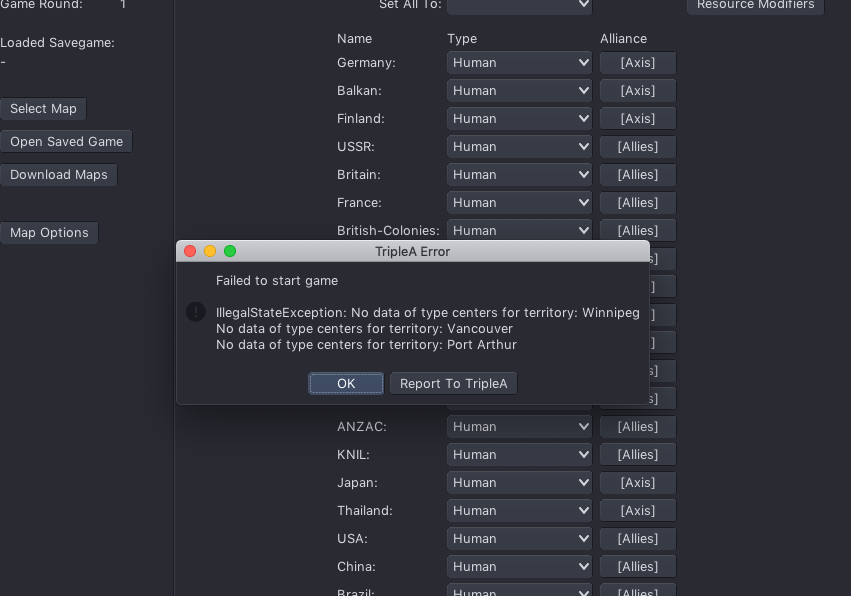
I got an unrelated error loading Iron War:
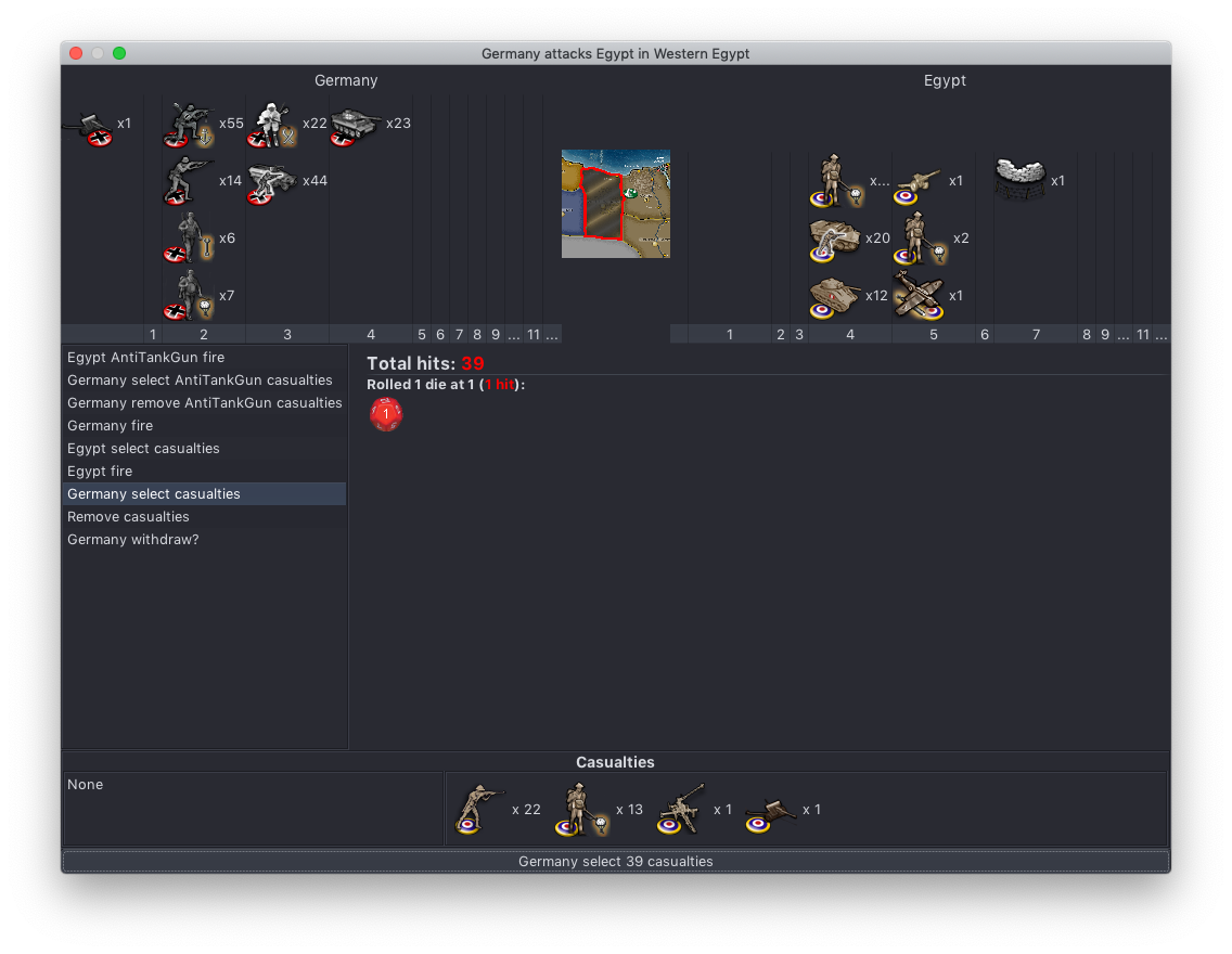
Here's a screenshot from Total War after I added a lot of units, however it uses Low Luck so there's just one die roll - so my change doesn't change much:
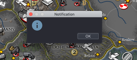
There was also some unrelated empty notifications in other phases while I was trying to get to combat, not sure if it's a known issue:
-
@Alexei-Svitkine In TWW you can choose either Dice or Low Luck before you launch the game.
Not sure what the missing notification is about. I have never seen it. Are you using the 2.0 pre release.
-
@Hepps said in Improvements to combat UI:
@Alexei-Svitkine In TWW you can choose either Dice or Low Luck before you launch the game.
Not sure what the missing notification is about. I have never seen it. Are you using the 2.0 pre release.
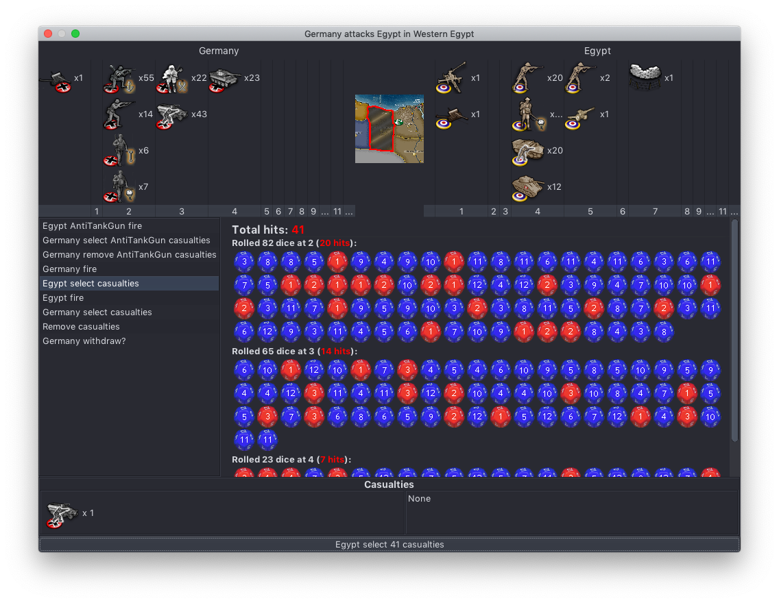
Yes, it's with the 2.0 prerelease since I'm testing my changes to it. OK, turned off low luck. Here's how it looks with a ton of units added in edit mode:
-
@Alexei-Svitkine My biggest question is how Germany managed to get 55 marines to Western Egypt!
")
")
Looks good.
-
I like the changes. i thought I saw somewhere else that the color might be changed to more of a blood red look ? So not so bright ? Idk if it'd work or not but the red seems a little too bright to me.
My other critique is I prefer the (parentheses) to have a space ( parentheses ) before their content. It makes it easier for me to read, but that just might be a personable problem of my own that I need to learn to live with
")
Great work. I like it. Thank You
Hello! It looks like you're interested in this conversation, but you don't have an account yet.
Getting fed up of having to scroll through the same posts each visit? When you register for an account, you'll always come back to exactly where you were before, and choose to be notified of new replies (either via email, or push notification). You'll also be able to save bookmarks and upvote posts to show your appreciation to other community members.
With your input, this post could be even better 💗
Register Login