TripleA Design
-
Hey guys,
I hope you’re doing well!
I’d like to use this post as a little introduction and the starting point for a feedback series about TripleA’s current design and how it could develop in the future.
Some of you may know me from my mobile port or my small contributions to the desktop version. I’m a full-stack software developer with some design knowledge. TripleA has given me a lot of enjoyment over the years, and this is my way of giving something back.
I know TripleA has grown over a long time, and its history helps explain why things work the way they do. The codebase isn’t always easy to work with either I ported it to mobile
 , so I’ve had my fair share of experience with that . I also know redesigns have been attempted before without really taking off.
Still, being used to something doesn’t necessarily mean there isn’t room to improve it.
One of my biggest concerns is how accessible TripleA is to someone who hasn’t used it before. By accessibility, I mean both accessibility for people with disabilities and making the software understandable for people with different levels of knowledge and experience.
The current interface assumes quite a bit of prior knowledge. At the same time, experienced players have built up habits and knowledge that we should respect. A redesign should make getting started easier while keeping familiar features easy to reach.
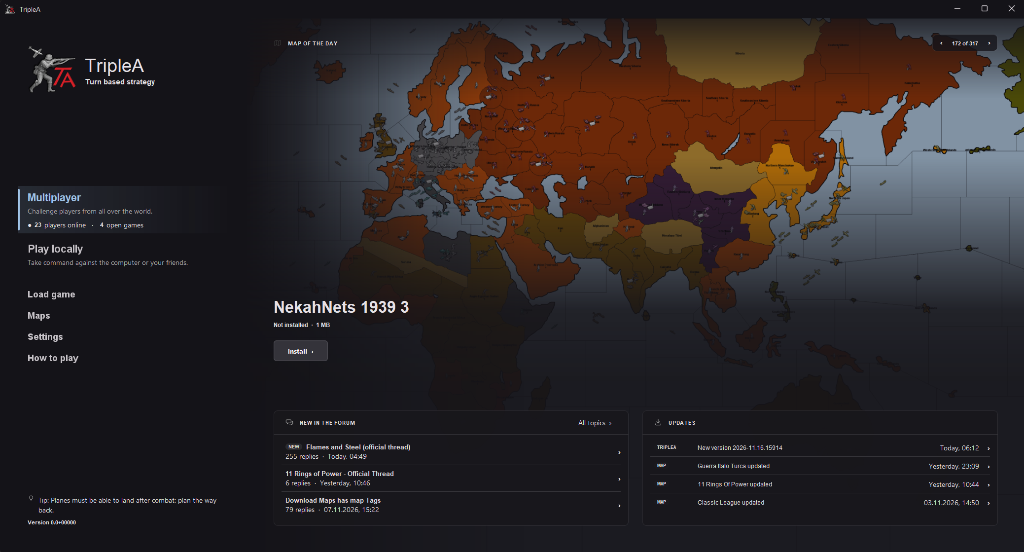
The first thing I’d like to discuss is a possible new main menu.
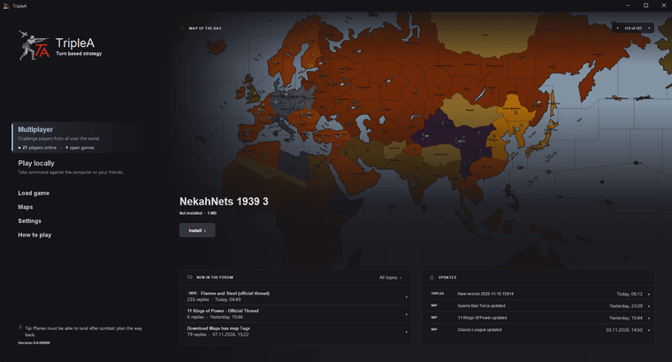
PROPOSAL:
OLD:
What should the main screen do for a first-time player? I think it should help them understand what they can do and give them a clear next step without requiring them to understand every feature immediately.
Here’s why I think this proposal could improve that experience, for both new and experienced players.
1. Clearer choices about where to start
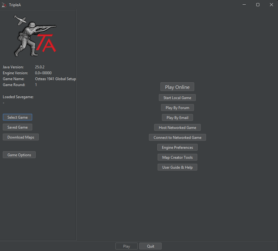
The current screen gives “Play Online,” “Start Local Game,” “Play By Forum,” “Play By Email,” and the network hosting and connection options similar visual weight. Each serves a purpose, but a new player has to interpret several different ways of playing before knowing which one to choose.
The proposal gives “Multiplayer” and “Play locally” greater prominence, with short descriptions explaining them. In particular, mentioning the computer under local play helps someone looking for a single-player game understand where to go.
For experienced players, the main actions are easy to spot in a consistent navigation area. However, grouping options only works if the next step is clear: forum, email, and direct network play would still need predictable places, without making frequent tasks unnecessarily longer.
2. A more organized reading order
In the current design, game selection and setup controls sit on the left, play modes sit in the center, and another “Play” button sits at the bottom. A newcomer has to work out how those areas relate to each other.
The proposal gives each area a clearer purpose: navigation on the left, a featured map in the main area, and community activity and updates below.
Different text sizes, spacing, and emphasis help distinguish primary actions from supporting information. “Load game,” “Maps,” “Settings,” and “How to play” remain clearly visible without competing equally with the main play options.
This should make the screen easier to scan, although the full setup flow still needs to make the relationship between choosing a map and starting a game clear.
3. Information that matches the task
The current menu immediately displays details such as the Java version, engine version, game round, and loaded savegame status. These can be useful, but several are more relevant to troubleshooting or game setup than to deciding what to do first.
The proposal keeps the application version available while giving more space to actions and game content. Other technical details could remain accessible through an About or troubleshooting view.
For newcomers, this means fewer unfamiliar details to interpret. For experienced players, it should mean a more focused starting screen as long as selected-map, savegame, and configuration details remain easy to check during setup.
4. Maps become something players can discover visually
The current “Download Maps” button provides access to content, but the main screen doesn’t show what that content looks like.
The proposed featured map shows an actual map preview alongside its name, installation status, download size, and an install button. This provides more context before a player decides to download it.
For new players, it introduces what a TripleA map looks like. For returning players, it creates an opportunity to discover something beyond the maps they already know.
A featured map is not automatically suitable for beginners, though. A complexity indicator or beginner recommendation could help people choose a manageable first game.
5. Useful context before entering multiplayer
The proposed multiplayer entry shows how many players are online and how many games are open.
That gives new players an indication of online activity before entering the lobby. Regular players could use it as a quick check when deciding whether to play online.
It doesn’t guarantee that an open game is suitable or ready to join, but it provides more information than a “Play Online” button alone. The implementation would also need to distinguish between no activity and an unavailable connection.
6. Better visibility for the community
The forum and update panels bring community discussions, application releases, and map updates into the main screen.
New players get a visible route into the community. Experienced players can notice updates or discussions without separately checking the forum every time.
Keeping these panels below the main actions gives them a supporting role. They should be useful to browse without becoming something players have to deal with before starting a game.
What should we preserve from the current design?
The current menu has strengths: it’s compact, exposes many functions directly, and is familiar to existing players. Those are qualities worth keeping.
The proposal retains TripleA’s logo, maps, and core activities, but familiarity also depends on behavior. Loading a save, choosing a map, configuring a game, or accessing creator tools should remain straightforward. A cleaner first screen would be a poor tradeoff if it made those tasks harder.
There are also things a screenshot can’t demonstrate: keyboard navigation, visible focus, text scaling, screen-reader support, or usability in smaller windows. Those need to be considered and tested as part of the implementation.
My goal is to make TripleA easier to approach while preserving the depth and flexibility that people already enjoy. This design is a starting point for that discussion, and the benefits need to hold up when people actually use it.
I’d especially like to hear:
- When you first started TripleA, what was confusing?
- As a regular player, which actions do you need to reach quickly?
- Looking at this proposal, what feels clearer, and what seems missing or harder to find?
Thanks for reading! I’d love to develop this further with your feedback.

Hello! It looks like you're interested in this conversation, but you don't have an account yet.
Getting fed up of having to scroll through the same posts each visit? When you register for an account, you'll always come back to exactly where you were before, and choose to be notified of new replies (either via email, or push notification). You'll also be able to save bookmarks and upvote posts to show your appreciation to other community members.
With your input, this post could be even better 💗
Register Login