Proposal: Always-shown "Purchased Units" panel
-
@Cernel gd point cer
-
Let's put a hold on the naming discussion, there are more important elements to consider for right now. Keep the big picture in mind guys.
-
We need feedback if this feature is ready to go out from behind the 'beta' testing flag and if there are any other mechanical problems that should be fixed. I suspect this is ready for prime time and then we can discuss the finer details.
-
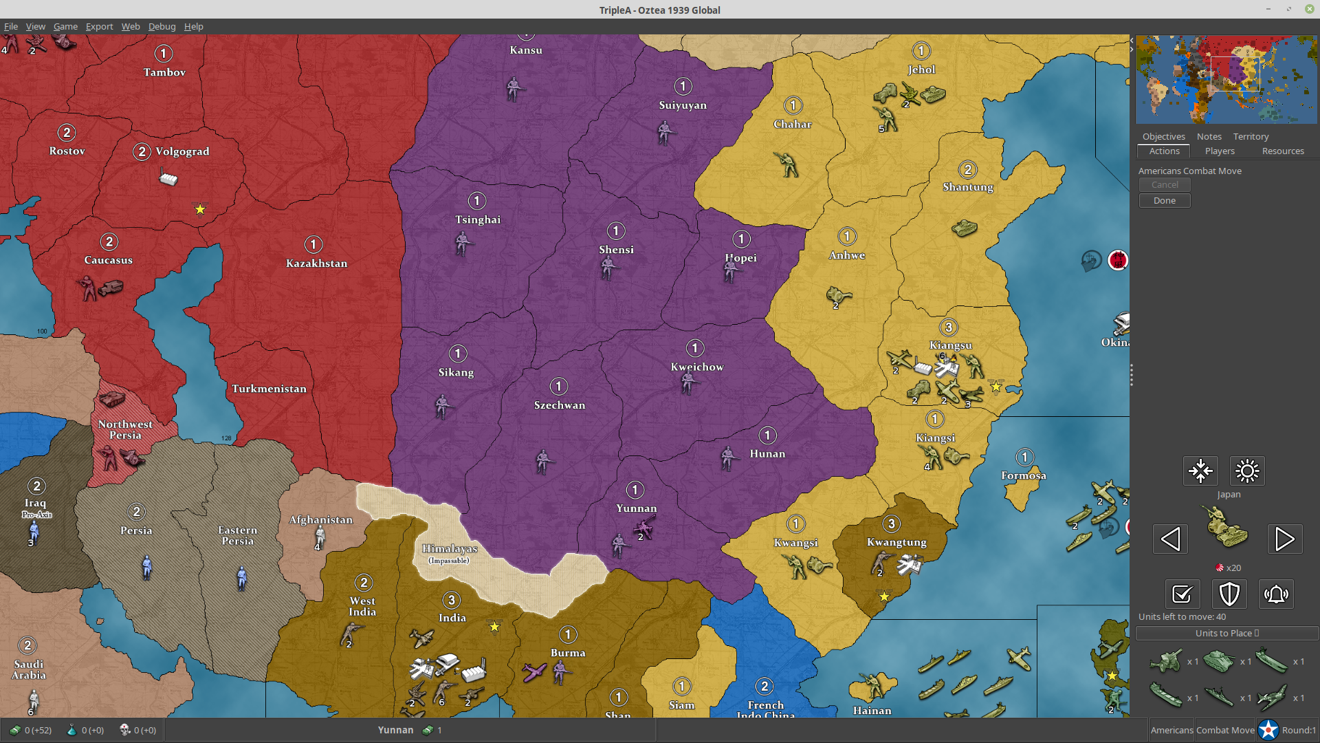
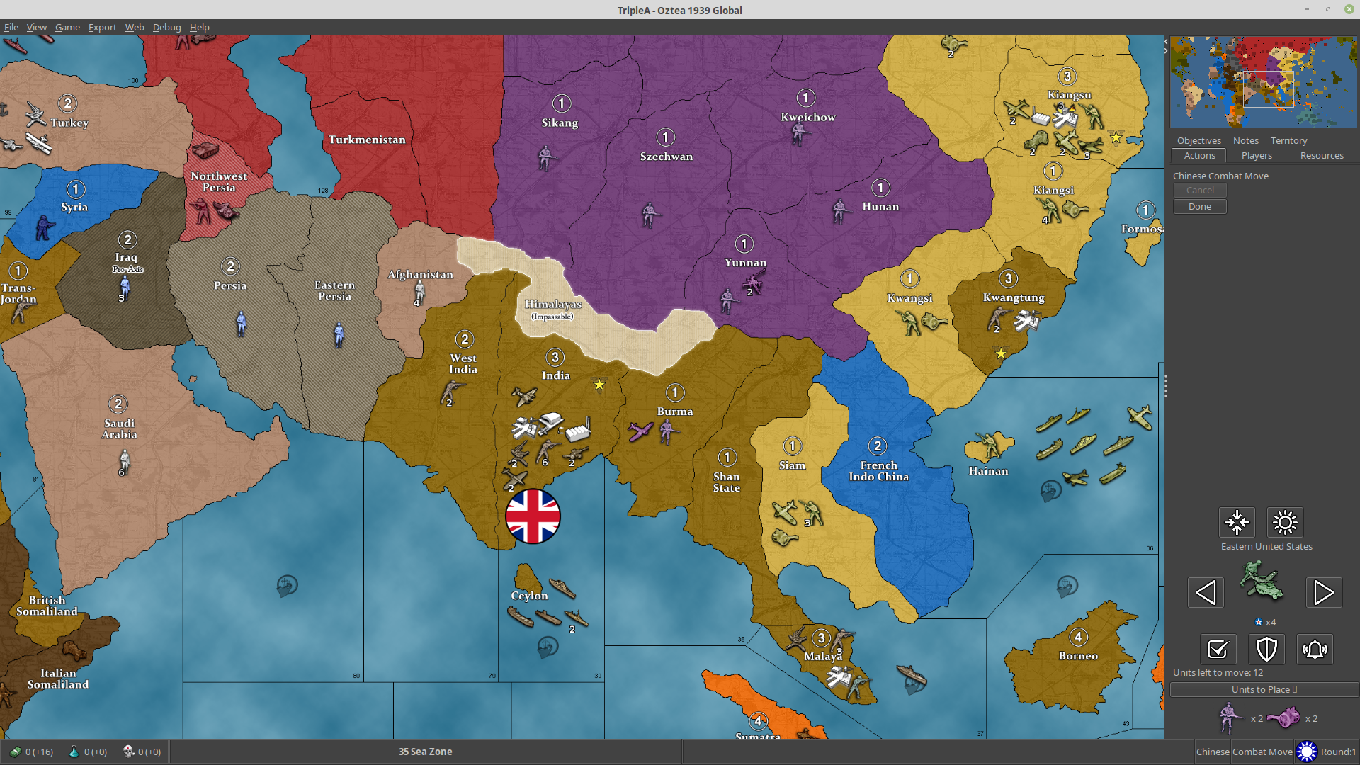
I'm playing with the new stuff, and, sorry, but, maybe it's the abit, but I'm so irritated by the fact that the "Units to Place" during placement now is at the bottom. Previously, you would have seen the units left to place right at the top, and this felt much better. Now, each time I go to placement I feel like I have no units to place (and sometimes for a moment I wonder I didn't purchase anything), then I recall that now I have to look at the bottom, and then again upwards as the actions are made.
Though the fact that I have been used to see them there may be the main reason why I feel I need them there. Not sure if I can get eventually used to this new disposition and I'm curious if anybody else is bothered.
Also, I have to say I virtually never look at this panel, but, right now, I'm playtesting a 270BC mod against myself, so it's not a very busy game.
-
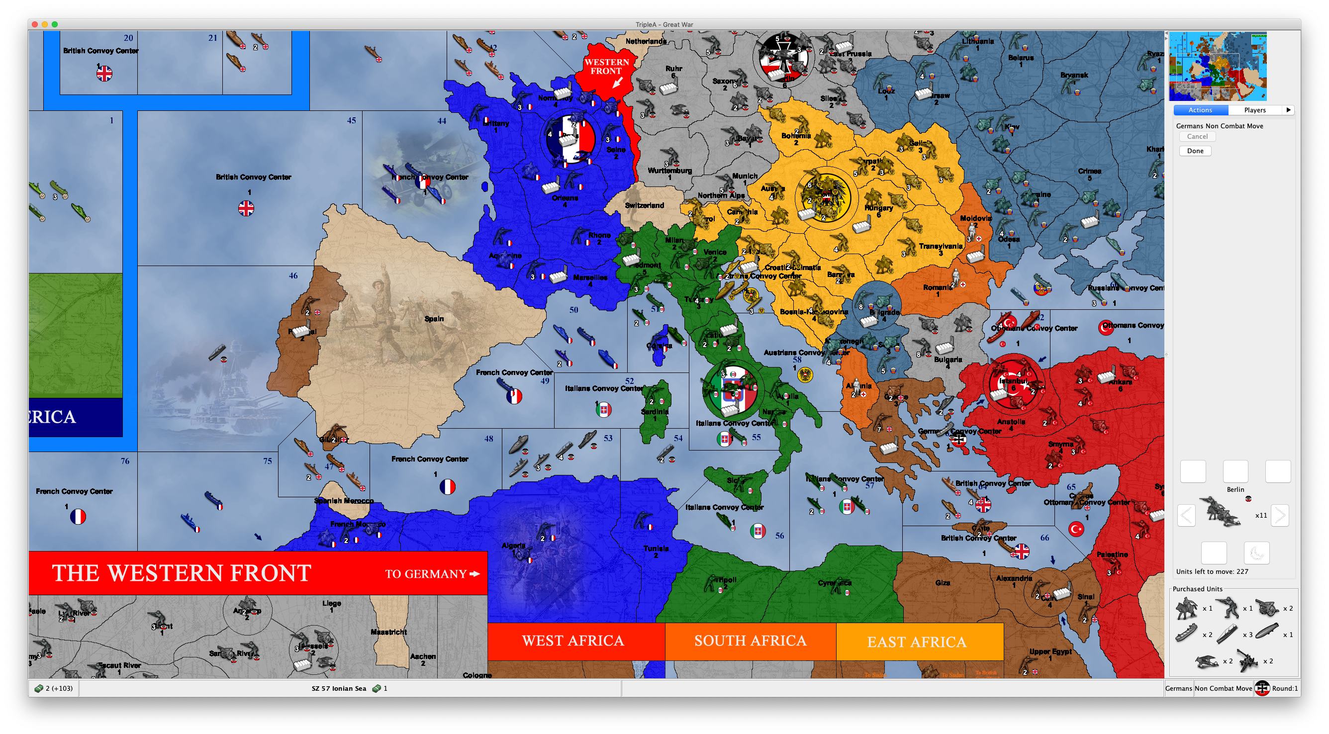
@Cernel Looks as though you bought 8 and had placed 4 so far.
As long as the count goes down while you are actually placing units during the placement the name seems fine.
-
I have tested out this feature and here are my thoughts (copied over from another thread
 )
)It it OK if this unplaced unit information is shown throughout the players steps and other phases than placement. But when the player has his placement phase, I feel very annoyed having to look down in the buttom right corner of the screen to see what I still need to place. On this tab/during this step I would prefer unplaced unit be displayed where it used to, above already finished placements. The reason is, that unplaced units are during this step the most important info and player eyes would like it to be near minimap, "done" buttons. Anyone else have experiences, feelings and opinions on this?
I think @Cernel feels the same.

-
Bump on this topic:
- consideration to move this to the top of the action bar during place units
- consideration to rename the text 'placements'. I know it does not 100% match, but IMO it's better to have something that 95% matches and uses words that people would want to use. I certainly call this panel the "placements panel", and not the "units to place panel", which strikes me as very annoyingly wordy
-
@LaFayette said in Proposal: Always-shown "Purchased Units" panel:
consideration to rename the text 'placements'. I know it does not 100% match, but IMO it's better to have something that 95% matches and uses words that people would want to use. I certainly call this panel the "placements panel", and not the "units to place panel", which strikes me as very annoyingly wordy
I don't like "placements", as that is already used to define the "place on gameboard" actions you made. I gave a set of alternatives to "units to place", despite the fact that I believe that name is good:
@Cernel said in Proposal: Always-shown "Purchased Units" panel:
Some decent options, from my point of view, with what is in between parentheses meant to be present during placement, but not otherwise:
"Units (left) to place"
"Units waiting for placement"
"Units in inventory"
"Held units"
"Units held in inventory"
"Units (left) to mobilize"
"Unplaced units"
"Units under production"Of course, the "units" part can be omitted. For example, the box can be just called "Under Production".
-
In 1.9 it has "Units left to place:". Seems fine to me. Clear and unambiguous. I never thought it was annoyingly wordy. I suppose above that it has "Italians place" as a heading. Done button is between.
If it isn't broke...
-
I will be pretty strange if it is to shuffle between top and buttom, depending on if it is placement phase or not. I hope this is not the case.
If this is the case, I would suggest an alternative solution. Have the current display method in right sidebar only show during the player's purchase/place phase (at top ofcours). Pursue the mini-icons implementation bellow the mini map and have one of them be "Unplaced Units" (I can make the icon) This icon could open up an informing window containing unplaced units, if there are any and the player wants to look at them out of the purchase/placement phase. It could be greyed out, blank or something if there are no units. Or a pop-up saying this.
BTW: I think the terms "Unplaced Units" is the most precise and short, if there is a need to change the term. I feel that the word "Placements" more refers to the acts done when placing or the areas/points where placements have already been done.
-
@simon33 Don't you think that "Units left to place" is really a good definition only when you are in the placement phase itself, as it implies you are doing what is left to do? Wouldn't it sound strange to be, for example, in the Combat Move phase and have a panel called "Units left to place", like if you were right in the process of doing that (placing units)? That is why, in my suggestions, I pointed out that, if so, the name would have to be "Units left to place" during the placement phase and "Units to place" in any other moments, during your turn, instead.
@Frostion "Unplaced Units" has maybe the mild issue that units thus called in TripleA are usually only those that you have in your inventory because you didn't place them during a previous placement phase (but having any such units should be very rare, legally, as before v3 they were always lost, while from v4 onwards they are supposed to be refunded, thus v3 is the only ruleset that allows retaining unplaced units, but overpurchase is virtually impossible, since TripleA gives you warning, and you are obliged to always place anything you can, so that can only happen if you purchased more than you can possibly place, and I've never seen this actually happening, in a rules compliant way, in even a single one of all WWIIv3 games I played (it might very rarely happen that you would want not to place something you purchased, because of dice results or previous miscalculations, but the rules (albeit not the program itself) oblige you to do so, anyways)).
In particular, we have this property, that can be offered as editable settings to the user:
Unplaced units live when not placedHowever the "unplaced" part here is completely redundant, as that property could have been just "Units live when not placed", and the "live" part is a weird way to say that they are kept in inventory.
Of course, as being one of my suggestions, I'm fine with "Unplaced Units", but I think "Units (Left) to Place" is clearer and unambiguous, especially for people new to the game.
-
IMO needs to be 2 words, more than that and we are almost certainly describing and not naming. @Cernel I feel like your proposals fall under the description category, it's not really a name when we have a noun+verb.
"Unplaced Units" or "Purchased Units" so far are the best names IMO. Yes, "purchased units" does not work for 100% of maps, though it's probably good enough until we wire a configuration to allow it to be a map-override if desired.
The placements panel shifting from bottom to top I agree is perhaps not going to be ideal. Do we think everyone will simply get used to it? It does seem odd that units that are placed flow up from the placement panel to a placement history. Maybe if the placements panel were below the minimap to begin with?
Part of the point of the panel is that it's visible all the time. Perhaps we can move the panel to be below minimap and revisit the assertion it needs to be visible all the time.
@redrum please watch this discussion, if we can't come to a concensus in a few days please make an executive decision on final naming (hopefully not something that is 3 words including a verb, but whatever, we are failing to agree here), and also on what you think of the UX, whether it should be altered or if you think people will get used to the new placements mechanism.
-
@Cernel, yeah ok.
-
Looks to me that "Unplaced Units" is the solution that it is at least acceptable to everyone so far. And I suppose "unplaced" means either units that you didn't have yet a chance to place or units that you didn't place, which, in turn, is supposed to happen only in case you cannot place them or you have to decide what you are not placing, when not all can be placed (TripleA gives you freedom not to place what you like, but this is wrong).
Side note, in the originals that panel would be called "mobilization zone", but this is against the TripleA naming, as the program generally uses the Classic term "place" (on gameboard), not the Revised and later term "mobilize".
-
@Cernel Also, in case of adding a tooltip or something, this is my suggestion:
Unplaced Units: This panel displays all the units that are owned by the current turn player, but held in its inventory, waiting to be placed on the gameboard.
By testing, I see that "Unplaced Units" not owned by the current turn player (that could happen only in v3, but TripleA allows it happening for whatever ruleset from v3 onwards, and, of course, any custom games picking this behaviour) are not displayed (you can test it on a v3 map, by purchasing, but not placing, units, then skipping until the turn of the following player, seeing the "Units to Place" panel is now empty, then skipping till the next round, see those units reappearing in the "Units to Place" panel, at the first phase of their owner). Hence, the term "Unplaced Units" would be not fully correct, as the program is not actually showing all the unplaced units in the game, but only those of the turn player (very marginal and minor thing). On this regard "Units to Place" feels more correct to me, as it sounds like implying they have to be only the unplaced units owned by the current turn player (since you can only place your own units).
-
Impending Placements
-
I wonder if we should go further.
Specifically, can we allow a button to purchase (or perhaps the combined purchase&place) units on the combat movement phase? Potentially, this affects plane movement if it relies on a CV to be placed, although I think that's the only impact.
This was the first thing we house ruled when playing the board game. Be really nice if it could be supported. Then you wouldn't need maps like v3-Move-Buy-Move.
Thanks.
-
Not sure if this the thread for feedback on the new buttons that says place for your dudes or not. I'm sure it'll get moved if in wrong place. At any rate, I don't like it having the guys to place show up when it's not the "Place" phase.
Also when it says "Move" dudes or w/e it's showing units from a previous Players turn.
That doesn't seem correct. Here's a save:
hmm...doesn't show on the save history. Well anyway...some feedback
-
@beelee this is the thread about the units-to-place, I moved your post here.
-
FYI: There's an update in-flight for the collapsible placements panel: https://github.com/triplea-game/triplea/pull/6155
- Changes place panel to be rendered as it was in 1.9 (collapsible panel disappears for the placements phase).
- Updates placement collapsible panel to show placement unit count
- Removes "None" label from collapsible panel when zero units are purchased
- Swaps location of the unit scroller with placements collapsible panel
Hello! It looks like you're interested in this conversation, but you don't have an account yet.
Getting fed up of having to scroll through the same posts each visit? When you register for an account, you'll always come back to exactly where you were before, and choose to be notified of new replies (either via email, or push notification). You'll also be able to save bookmarks and upvote posts to show your appreciation to other community members.
With your input, this post could be even better 💗
Register Login