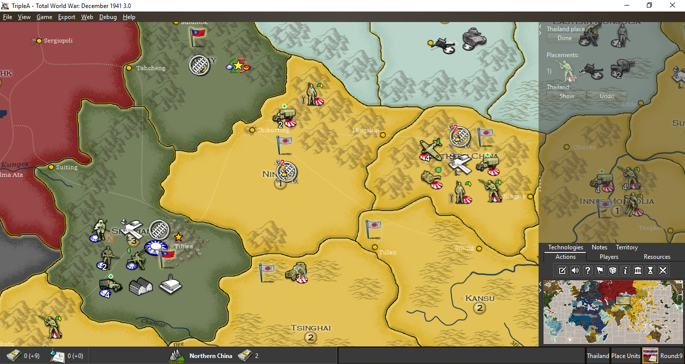
Moving MiniMap to bottom of Action Panel
-
Sorry I haven't had a chance to reply to this. For TripleA, I think it probably belongs on the right side either top or bottom given that we have the main action panel on the right (unless we were going to consider a much larger UI change).
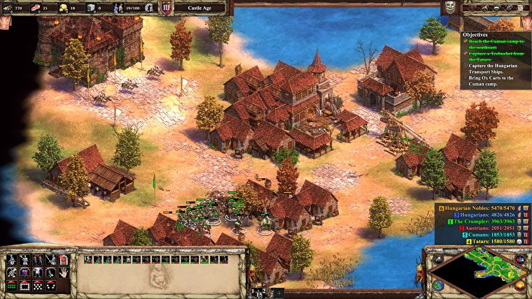
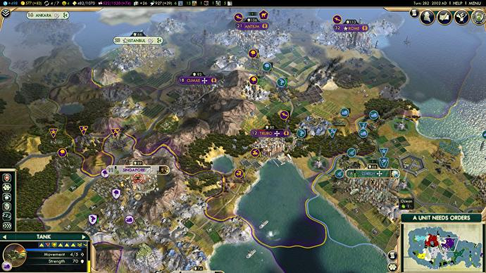
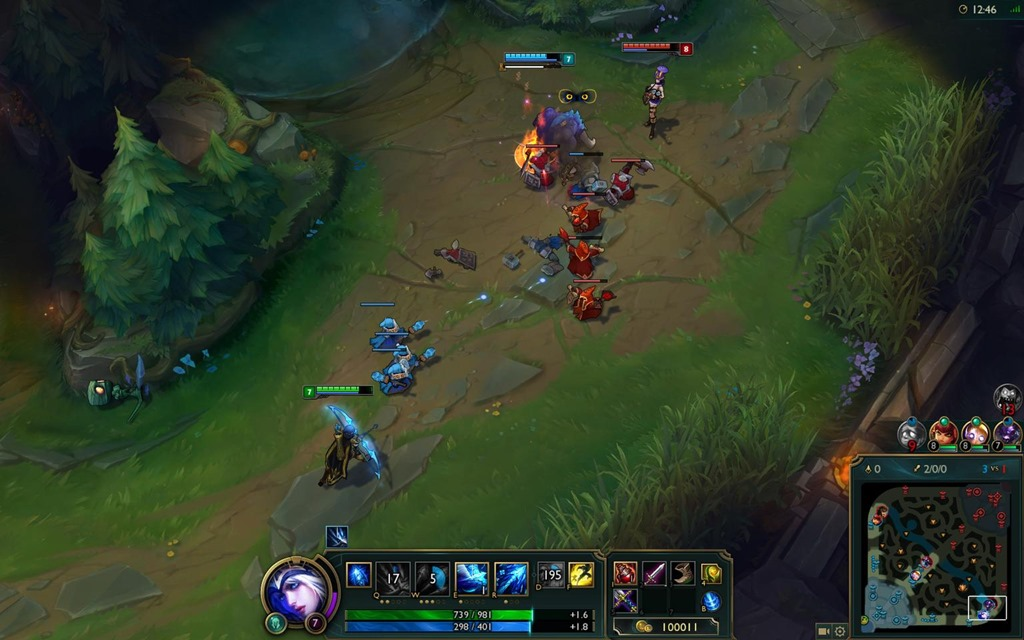
Here are some examples that I've played of very popular strategy games that have it in the bottom right:
Age of Empires 2
Civilization 5
League of Legends
EU4
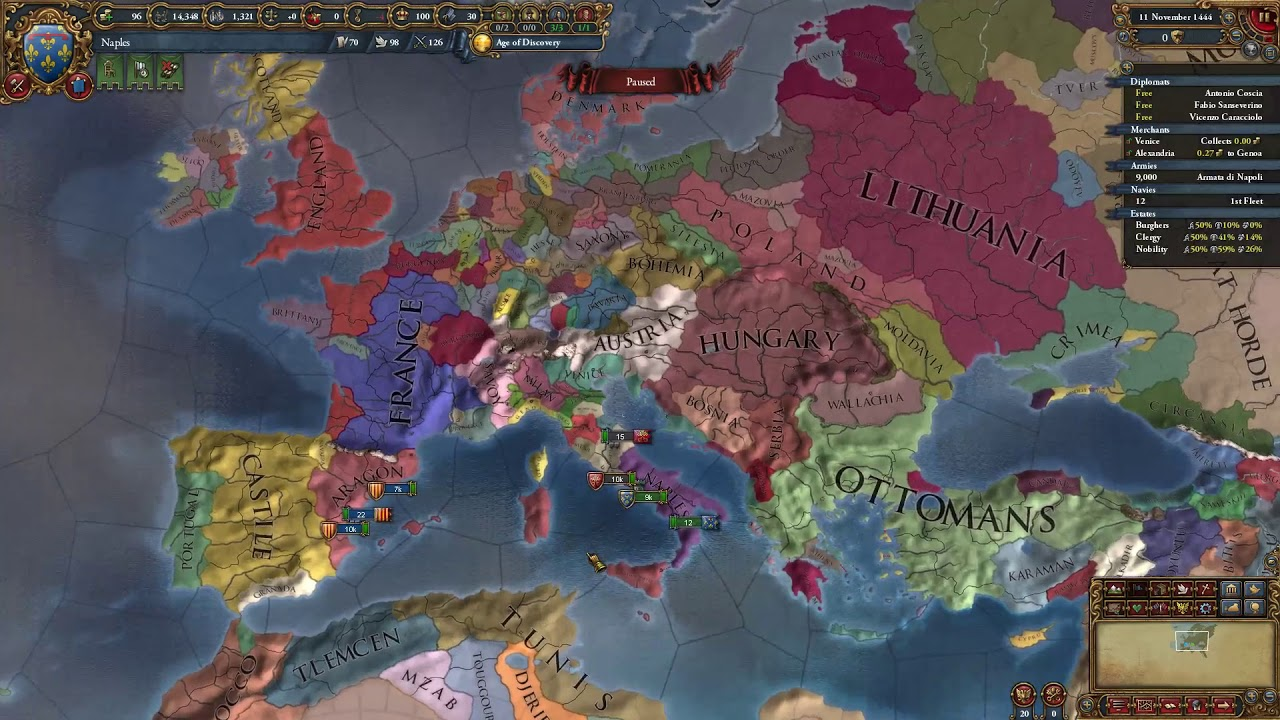
Most games I've played have moved towards the following:
- Info panel along the top (resources, etc)
- Actions along bottom or right
- Additional info pull outs and pop ups on the left
- Minimap in the bottom right anchoring the actions which appear either along the right side or the bottom
I mostly wanted to start a conversation and it seems there isn't a strong consensus to move it which I'm fine with leaving it in the top right then and instead just focus on improvements like some buttons.
-
@redrum I dislike when games cut partial sections of the board view, as I don't feel I'm really getting that view in the moment I have to wonder if there is something I should see under this or that display. I definitely much prefer having just straight bars covering a whole border of the screen, with constant wideness, so that the board view is perfectly rectangular (like currently in TripleA). All those games might look cooler, but I'd pick the TripleA display over any of them.
-
@Cernel I think you would be in the minority as most of the examples that both myself and @Frostion posted don't have a completely straight bar and mostly the ones that do are older games. The idea is to make the UI more dynamic and only take up the space it needs based on the information currently presenting so its more almost dashboard/widget like than pure bars/panels. As well as try to concentrate it more into the corners which act as sort of anchors so you have more visible screen area from a circular standpoint.
-
This post is deleted!
Hello! It looks like you're interested in this conversation, but you don't have an account yet.
Getting fed up of having to scroll through the same posts each visit? When you register for an account, you'll always come back to exactly where you were before, and choose to be notified of new replies (either via email, or push notification). You'll also be able to save bookmarks and upvote posts to show your appreciation to other community members.
With your input, this post could be even better 💗
Register Login