Moving MiniMap to bottom of Action Panel
-
Opening a dedicated thread to discuss these ideas.
From: https://forums.triplea-game.org/post/29462
@Hepps created this mockup: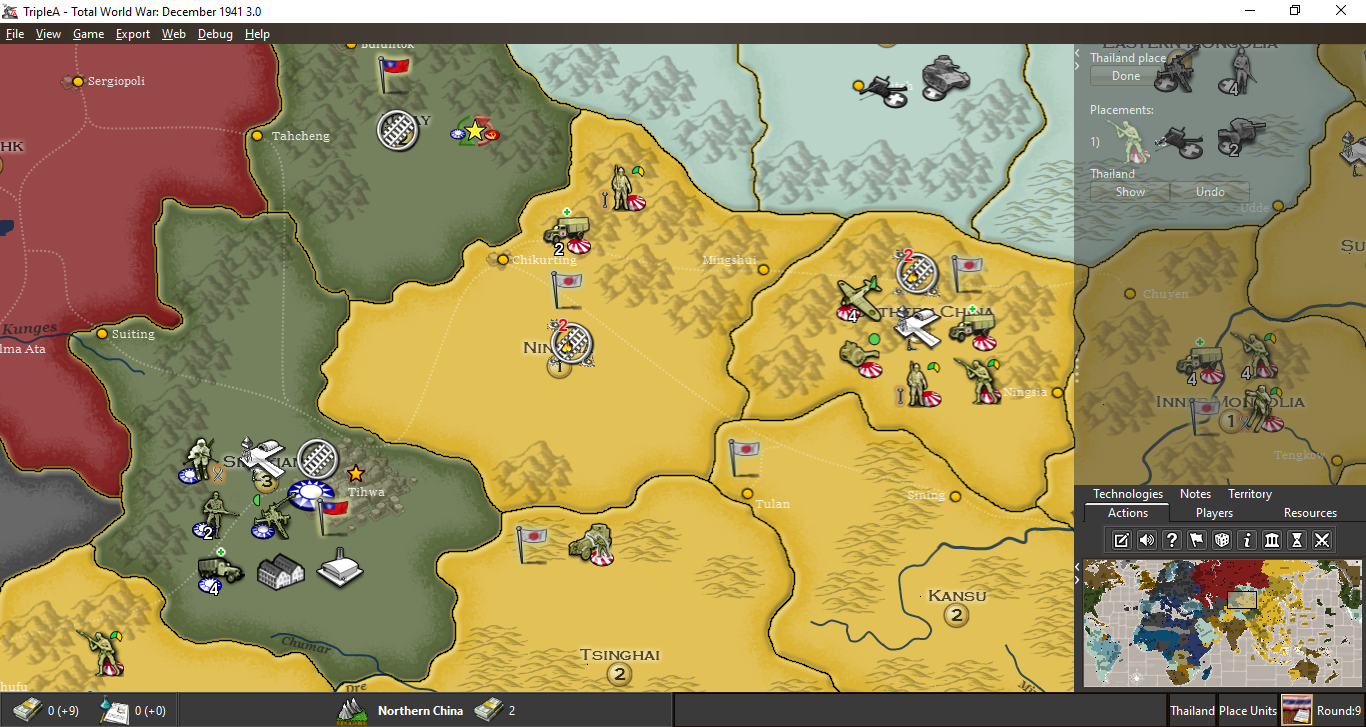
I like the idea of action buttons, but I don't think we'll be able to agree just yet which ones should be on the game screen and which ones accessible in menus.
Let's focus here then on the minimap. Moving the tabs and map to bottom probably won't be that difficult. The translucent background might take a bit more work, but could be possible. It probably would make sense to make that a setting so that users can control translucent vs not.
Please add in any extra 2 cents, or thoughts on this topic.
-
yea I'd like the translucent option on/off. Lower right seems fine. Probably better than current, although I don't have any trouble with it as is
-
@LaFayette To be honest the semi transparent portion was really meant to show the extra space on the main map view that would be visible if you moved the mini map to the bottom right corner then had the ability to minimize the tabs that currently occupy the entire right side of the screen continually under all circumstances. The idea being that I do not necessessarily need to see those tabs (like moved units) unless I want to undo or review a move.
That being said... the ability to have those tabs be at least semi transparent would be a neat feature, provided that could be a controllable feature. Though again, this was not the intention of my suggestion.
-
@LaFayette Thank you for segregating this from the other conversation. I hadn't really wanted to post it there but it seemed like the conversation was starting to encompass a great number of things. And as I like the direction the unit scroll idea is heading... my intention was never to derail it.
Appreciate the redirect.
")
-
@Hepps Totally, it's good conversation there, so was relunctant to split it off sooner. I'm chuckling a bit that the semi-transparent was a demonstration and not a mock-up

-
What is the motivation behind moving the Minimap down to the buttom right? Why not keep it in the upper right corner and make the tabs clickable drop-down tabs, if this is really wanted? I think there are some serious issues with moving the Minimap. But I will stick to 1 issue (for now), probably the one that I have the most trouble with:
The Minimap is probably the most used part of the screen and the player’s mouse hand/cursor spends a lot of time there. So moving the Minimap to a less optimal location will have a huge impact on the playing experience … particularly in regards to the physical ergonomics of the mouse hand.
My hand is normally placed on the mouse with the wrist bones resting, more or less permanent, on the mouse mat/table, only occasionally being lifted up off the table. I move the mouse around in a way that can be described as a mix of 2 things: 1. inside the palm of my hand, without lifting the hand or moving the arm around + 2. In front of my permanent on-table resting wrist, within the limited movement and reach the hand has.
When I want to navigate to the Minimap during play, I still keep my wrist in place resting on the mat and then I just gently, with my thumb and palm, pres the mouse forward-right/up-right/away from me until the cursor ends up on the Minimap. When done using the Minimap, I move the cursor back to the screen center and do what I got to do (like move units or fine-tune screen location).
The point is, that as of now, this movement of the mouse, back and forth from center screen to Minimap has been smooth and convenient for my mouse hand. No uncomfortable mouse hand twisting, stretch or cramp grip on the mouse. When I imaging the minimap being in the buttom right, moving my cursor back and forth from center of screen to buttom right, I immediately feel that this is NOT an improvement.
Try it yourself.
Move the mouse back and forth from the upper-right to center of screen, quickly and many times …. Then compare to button-right to center quickly and many times.
I am curious if I am the only one that feels this strain on the palm and wrist? -
@Frostion I don't really see a difference as when you move to the edge of the screen one of the 2 directions is always pulling backwards... whether that is on the way to the mini map or on the back from the minimap seems fairly inconsequential. The movements would simply become reversed.
The reason I have suggested moving it was based on conversations I have had with other people as an idea to move as much of the visual information grouped together into one area. That is... having all of the UI related stuff all together in one location. ie. tabs, buttons, minimap, turn info, player info.
But it would be equally effective to have the tabs drop down rather than pop up if moving the mini map proves disagreeable to the community.
-
FYI, this is fairly related to this discussion: https://forums.triplea-game.org/topic/338/possible-game-interface-suggestions
I agree with moving the minimap to the bottom right. I think its more natural there and most other strategy games have it there so easier for players to get used to the TripleA UI.
TripleA Developer with a Passion for AI: https://forums.triplea-game.org/topic/105/ai-development-discussion-and-feedback
-
Interesting point regarding range of motion and arcing of the wrist @Frostion
I wonder if someone were left handed if bottom right would be more ideal.One thing I'm wondering about now though is how to have the stats table to render well. If it's top right, I wonder if that would be too much of a gap and it'll be 'orphaned' in the top right corner.
Also would need to collectively consider where the 'units to place panel' (I hope we can call that something else soon, like 'placements panel') will be rendered.
-
@redrum said in Moving MiniMap to bottom of Action Panel:
(...) moving the minimap to the bottom right. I think its more natural there and most other strategy games have it there so easier for players to get used to the TripleA UI.
A majority of the most common games have the minimap in every other corner than bottom right. I would think this is not coincidental, but instead decisions based on game play experience and testing.
Any other corner than bottom right is OK with me, but the upper right still seems to be the most convenient.
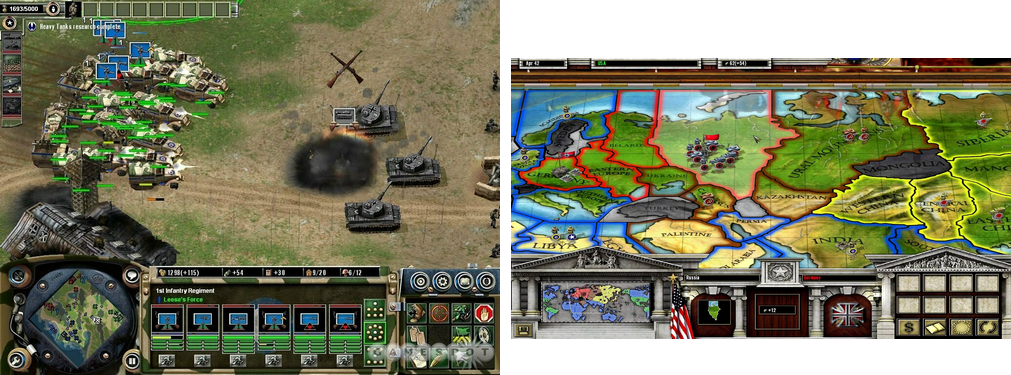
Here are mix examples of popular games I can think of and have played: Age of Empire 3, Civilization 6, Company of Heroes, Starcraft 2, Warcraft 3 (The new official “reforged”), World in Conflict, Dota 2, Total Annihilation, Supreme Commander, Warhammer Armageddon, Command & Conquer / Red Alert series.
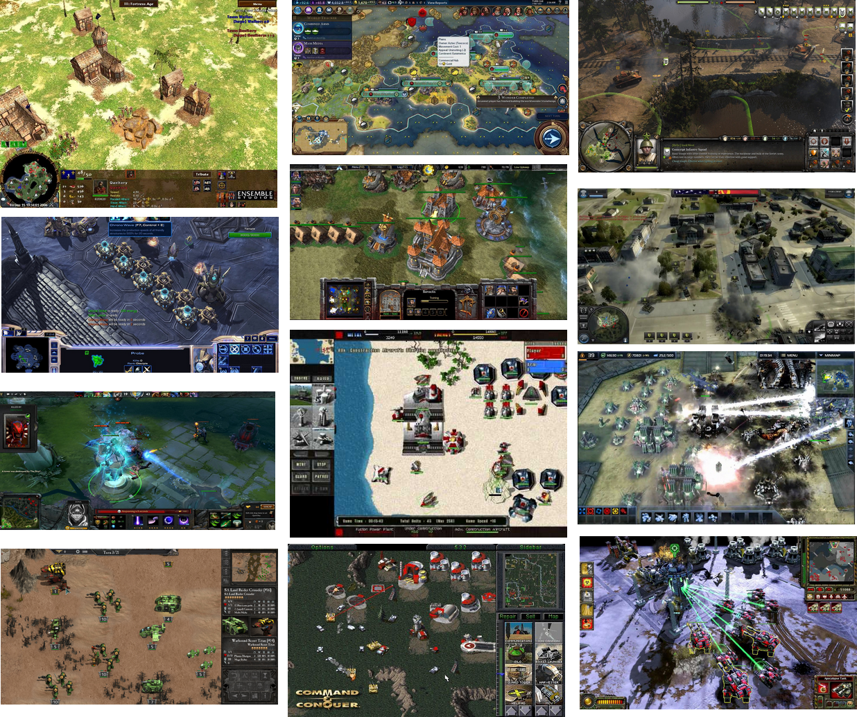
Even Axis and Allies PC games do NOT have the Minimap in bottom right corner:
-
So, the examples that you posted sum as the following numbers:
Top-Right: 4
Bottom-Right: 0
Bottom-Left: 9
Top-Left: 1I'm surprised you didn't consider the actual Axis & Allies PC game (meaning the third edition, as that one you have shown, instead, is a "spin off" and not purely a strategic game, either, but actually a strategic and tactic one, albeit you can play it as purely strategic, by auto-resolving battles).
I wonder if you left it out on purpose, as that one (or those ones, if we consider Iron Blitz separately) doesn't have a minimap (it has a "world map" mode). That is to say, also not having a minimap is an option. Not like having the minimap is necessary.
I'm personally just fine where the smallMap is now, but, if someone wants to change its position, it may be good opening a poll about it.
-
My opinion, bottom-left is the best position for looking at it and top-right is the best position for interacting with it (changing view position fast around the map by clicking on the minimap).
Also, I'm a straight right-handed guy. I wonder how many left-handed we have around here, instead, and if they use the right hand anyways for the mouse or the left one.
-
@LaFayette I think the translucent background is the key! Moving the minimap is not a big important thing. Top Right = The current position works ok. Thus I don't think you need to create more work. Just my two cents.
-
@prastle said in Moving MiniMap to bottom of Action Panel:
I think the translucent background is the key
As long as it's optional. I fear it might make me have a flashback lol
Re the mini map. Would the extra work required be worth it to make it configurable by the player ? Same as using flags, font size, etc..
-
I am surprised at the sheer volume of responses... I love it when people get excited over such things!!
I will summarize my position on the matter as this...
The location is completely arbitrary to me... left- right- top-bottom... doesn't matter. If someone has some empirical evidence that points to some ergonomic benefit of one over the others then GREAT... go with the science!
The real key is trying to make all movements instinctive... and logical... if you are going to present information... put all of the ones that need player input in the same place! If you need to edit... you go to the same area on the screen as you would to draw up the placed units... or history of moves... or whatever.
By having players know where to get all the tools they need to play the game makes it an easier and more enjoyable experience.
All the other tacit info that is there for the players benefit can be located where ever so long as it is consistent and in fixed locations across games.
-
@Hepps well i do know that adobe puts all of their navigator panels at the top right. i would think if anyone has done research into which corner is best it would probably have been them.
i also know that higher is typically better it terms of attention priority since we tend to scan down with our eyes.
-
@beelee the translucent would be optional like showing full screen current game
-
could be the biggest nerd convo ever but its funny cuz all things should be ergonomic!!
Carpal tunnel 2 lose!
-
yea im having trouble following. i had to look up "ergonomic"
")
-
What are people's thoughts of moving to bottom left?
We would gain more space for unit-scroller, unit move history, and placements panel. Action tabs remaining at top-right solves the problem of stats table vertical alignment.
Biggest downside is perhaps the history panel getting less space. IMO it's probably okay as it does not really need to be full-height.
Hello! It looks like you're interested in this conversation, but you don't have an account yet.
Getting fed up of having to scroll through the same posts each visit? When you register for an account, you'll always come back to exactly where you were before, and choose to be notified of new replies (either via email, or push notification). You'll also be able to save bookmarks and upvote posts to show your appreciation to other community members.
With your input, this post could be even better 💗
Register Login