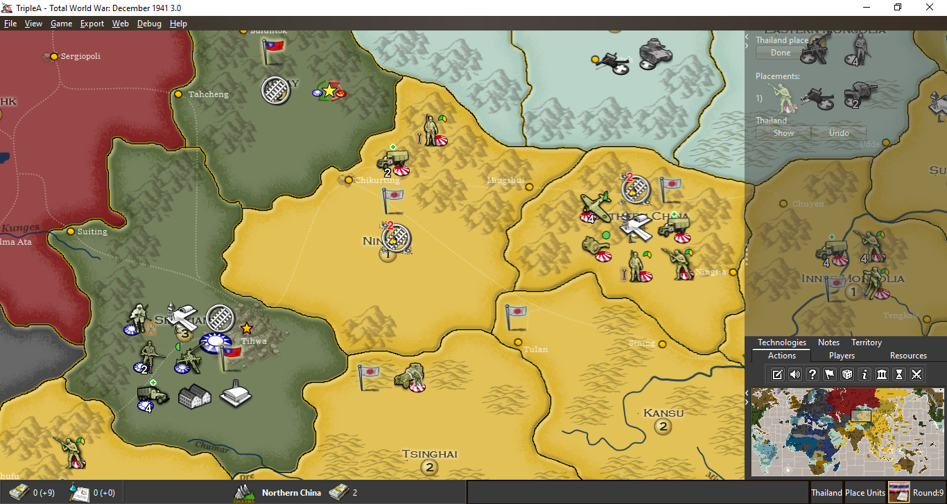
Moving MiniMap to bottom of Action Panel
-
@Frostion Love the design. Looks great.
My only suggestion beyond hammering out some details for buttons and what not... would be to enable a player to minimize the tabs... so that (using your example) if a player were to click on the Action tab while it was open (like in your example) it would retract. That way you could see more of the map while doing your moves. Then if you clicked on it again (or any other tab for that matter) it would reopen.
-
@Hepps said in Moving MiniMap to bottom of Action Panel:
@Frostion Love the design. Looks great.
My only suggestion beyond hammering out some details for buttons and what not... would be to enable a player to minimize the tabs... so that (using your example) if a player were to click on the Action tab while it was open (like in your example) it would retract. That way you could see more of the map while doing your moves. Then if you clicked on it again (or any other tab for that matter) it would reopen.
Yes, I could imagine that also. I would think it would be a cool feature if, when player pressed end turn, then the tabs minimized as the other Players (or AI) began their turns and as the history left panel showed up. It would free up screen space and the player could always press a tab to let it drop-down, press it again to remove it. And when the player again had his turn, then the tabs would auto-reappear with the action panel chosen. @Hepps was this your vision also?
@LaFayette In regards to what icons/buttons to what features that should be displayed below the Minimap, there could in game settings be a made a window/tab with check-boxes where one could enable and disable the different icons?
Map maker of: Star Wars: Galactic War + Star Wars: Tatooine War + Caribbean Trade War + Dragon War + Age of Tribes + Star Trek: Dilithium War + Iron War + Iron War: Europe + Warcraft: War Heroes
-
@Frostion said in Moving MiniMap to bottom of Action Panel:
@LaFayette In regards to what icons/buttons to what features that should be displayed below the Minimap, there could in game settings be a made a window/tab with check-boxes where one could enable and disable the different icons?
Oomph, that could get a bit complex. I'd vote we keep the icons to be the universal/useful ones. The goal AFAIK is to get useful views out of the menus and out of the action tab.
I feel like we need a philosophy of what kinds of things should be in the menus, what in an action tab, and what should be on the icons.
I do really like the idea of reducing the number of action tabs. It was convenient to add those, and it was a bit over-used (on Mac, the many tabs is very hard to use as it does not display in multiple rows). IMO getting to around 3 or 4 tabs is ideal, less is arguably better.
-
@Frostion Yes, exactly what I had envisioned.
-
I like the buttons idea, but that is not on the table just yet. Are we deadlocked on minimap position?
-
@LaFayette create a vote for moving or same position that will solve ? fast
") Im ok either way just offered my work saving two cents
Im ok either way just offered my work saving two cents -
Ok, created a poll in the OP
-
@LaFayette My vote is meant to reflect that the discussions here proposed some good ideas that would allow the UI to remain roughly the same by simply adding in some better functionality.
This was also reinforced by @LaFayette use of "Pyrrhic victory" which got me a little hotter under the collar then any comment from a man should.
")
-
@Frostion Also in these examples you posted, all the games that have the minimap bottom-left (the most common position) appear having the stuff (how should I call it?) as a single lower bar, or partial bar, or not in any bars. On the other hand, all the 2 games featuring a right main bar have the minimap at the top of that bar and the 1 game featuring a left main bar has the minimap at the top of it, as well (I wonder if the main creator of Total Annihilation was left handed and using the mouse with its left hand, as I cannot think of another reason for having the main bar on the left). Each of those games having a main bar covering all or most of a side of the screen (6 having a bottom bar, 2 having a right bar, 1 having a left bar, and the other 4 having no bars (counting the two Axis & Allies screens as only one game)) have the minimap as part of it.
So a proposal like moving the minimap to top-left or bottom-left, while keeping the main bar on the right, would create an interface like nothing at all in the examples you made.
I'm guessing what @redrum was thinking about was rather the fact that most games have the stuff presented as a bottom bar (instead of as a right bar, as TripleA does), with the minimap at the bottom too, of course, in this case.
Personally I believe the biggest argument against having the main bar on the bottom (admittedly more fair with the personal choice of using the mouse with the right or left hand) is the fact that the screens are already mich wider than higher, so such an interface increases even more the view space you have left and right instead of up and down (for example, easier to spot the bombers that may get you from the left and right, but harder to spot the ones that may get you from up and down), that can be good if the game you are playing tends to have a prevalence of X axis dynamics over Y axis ones, which it is at least true to some extent for most TripleA games, also since they often wrap on the X axis but very rarely on the Y axis, or if you are presented with enough apparent perspective so that moving a same amount of pixels up and down brings you farther or closer than moving the same amount of pixels left and right at any point but at the very top of the screen itself (which might even be beyond the horizon). However, this is certainly not currently the case for TripleA, that doesn't support any true perspective simulation dynamics, though any mapmaker could make a map having an isometric, dimetric or trimetric projection, that are anyways just methods to abstract perspective, but not actually representations of real perspectives, and that actually would benefit from a much wider than higher board view only in the dimetric and trimetric cases, but I'm not aware of any TripleA maps ever made under such criteria.
Of course, if the TripleA user interface would be stable, mapmakers could tailor their skin choices to it (for example, if TripleA would have a huge bottom bar, instead of right and left bars, the mapmakers could make zones wider (or we could take any map and stretch it on the X axis), so that moving the view up and down you would navigate farther away than moving left and right).
-
I am a lefty but use the mouse with right hand.
IMHO, the minimap should stay in UR.
-
The mouse-move from main map to UR (and back) feels much more natural than to LR, as I seem to just pivot my elbow rather than strain my right hand/wrist muscles. This is likely my most common movement playing this game.
-
many of the 'list boxes' that currently appear under the minimap often extend down off the screen (unit placement, combat moves, combat on large maps). To me, it seems more intuitive for these to spill/scroll off the 'bottom' of the screen rather than 'into' another game area like the minimap.
-
-
@tinfoil666 I didn't think about your last point, but in 2.0 this is going to be only partially true, as now the actions will be cut by the presence of an unmoved unit scroller and units to place display on the bottom of the same bar. The "Units to Place" actually displays under whatever bars on the right, not only the action one (I still don't understand why is that).
-
Sorry I haven't had a chance to reply to this. For TripleA, I think it probably belongs on the right side either top or bottom given that we have the main action panel on the right (unless we were going to consider a much larger UI change).
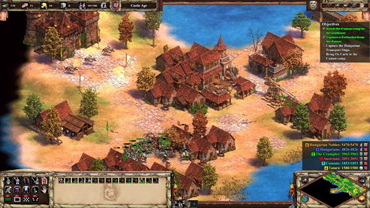
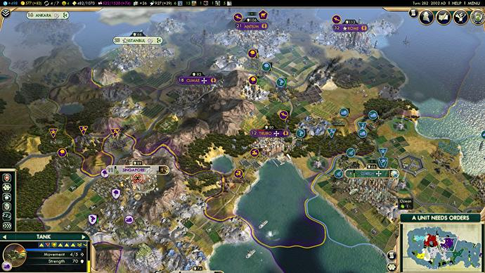
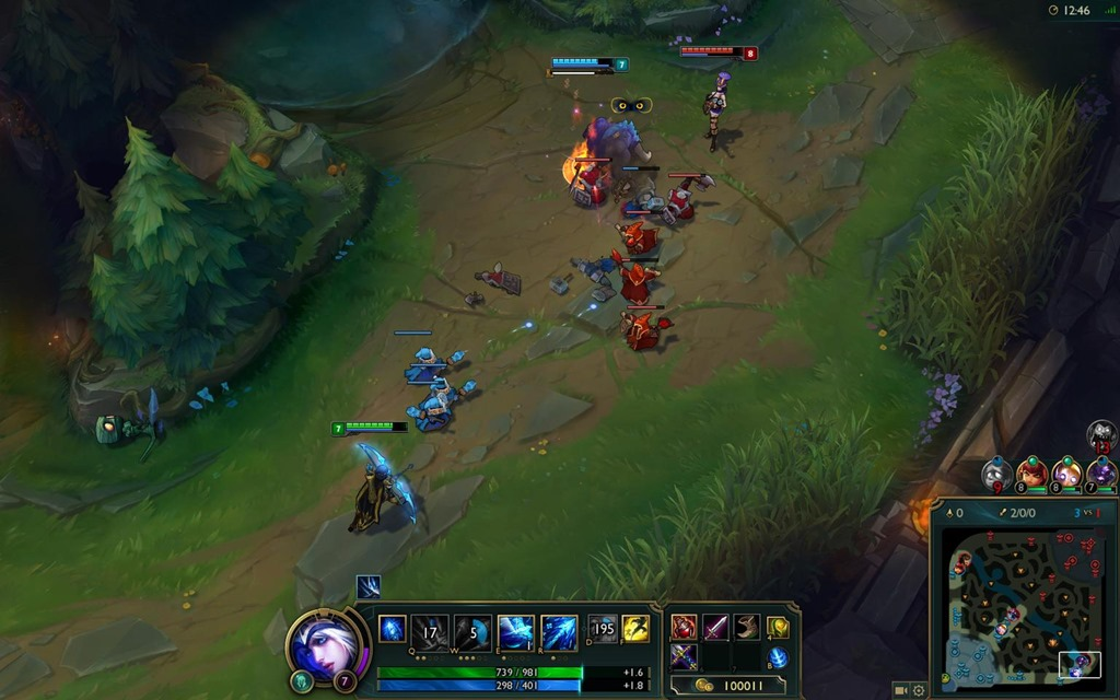
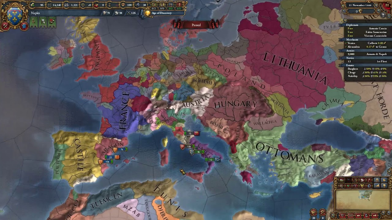
Here are some examples that I've played of very popular strategy games that have it in the bottom right:
Age of Empires 2
Civilization 5
League of Legends
EU4
Most games I've played have moved towards the following:
- Info panel along the top (resources, etc)
- Actions along bottom or right
- Additional info pull outs and pop ups on the left
- Minimap in the bottom right anchoring the actions which appear either along the right side or the bottom
I mostly wanted to start a conversation and it seems there isn't a strong consensus to move it which I'm fine with leaving it in the top right then and instead just focus on improvements like some buttons.
-
@redrum I dislike when games cut partial sections of the board view, as I don't feel I'm really getting that view in the moment I have to wonder if there is something I should see under this or that display. I definitely much prefer having just straight bars covering a whole border of the screen, with constant wideness, so that the board view is perfectly rectangular (like currently in TripleA). All those games might look cooler, but I'd pick the TripleA display over any of them.
-
@Cernel I think you would be in the minority as most of the examples that both myself and @Frostion posted don't have a completely straight bar and mostly the ones that do are older games. The idea is to make the UI more dynamic and only take up the space it needs based on the information currently presenting so its more almost dashboard/widget like than pure bars/panels. As well as try to concentrate it more into the corners which act as sort of anchors so you have more visible screen area from a circular standpoint.
-
This post is deleted!
Hello! It looks like you're interested in this conversation, but you don't have an account yet.
Getting fed up of having to scroll through the same posts each visit? When you register for an account, you'll always come back to exactly where you were before, and choose to be notified of new replies (either via email, or push notification). You'll also be able to save bookmarks and upvote posts to show your appreciation to other community members.
With your input, this post could be even better 💗
Register Login