Navigation

    TripleA Logo

    TripleA Forum

    • Register
    • Login
    • Search
    • TripleA Website
    • Categories
    • Recent
    • Popular
    • Users
    • Groups
    • Tags

    Main Screen Logo Needed

    Development
    12
    93
    25670
    Loading More Posts
    • Oldest to Newest
    • Newest to Oldest
    • Most Votes
    Reply
    • Reply as topic
    Log in to reply
    This topic has been deleted. Only users with topic management privileges can see it.
    • LaFayette
      LaFayette Admin last edited by

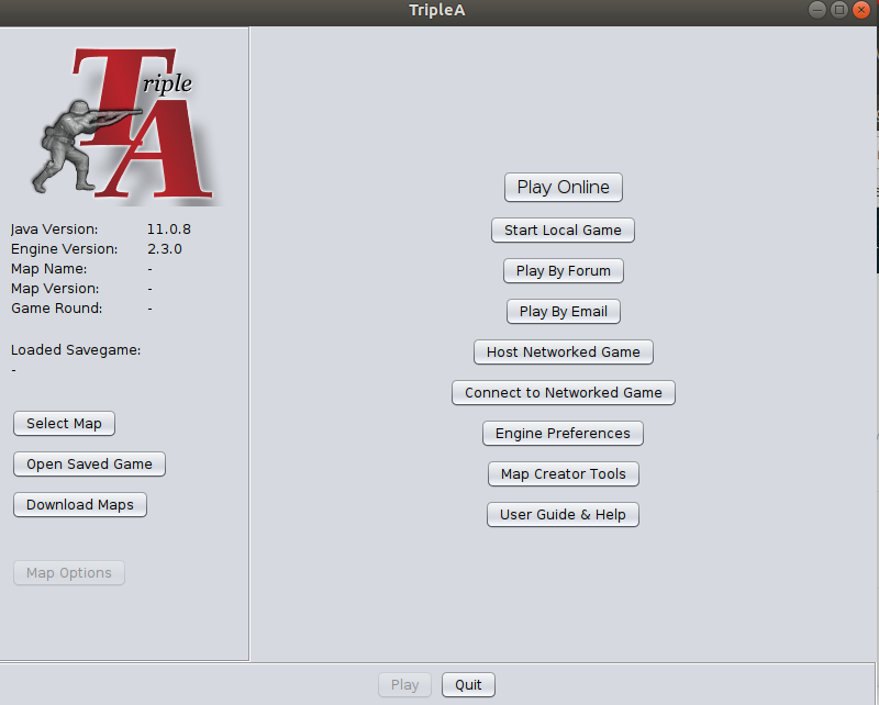
      2.3 looks like this for now:

      Screenshot from 2020-09-30 16-47-41.png

      We could use volunteers to clean up & improve the upper left logo.

      Anyone?

      cc; @ubernaut

      ubernaut 3 Replies Last reply Reply Quote 1
      • ubernaut
        ubernaut Moderators @LaFayette last edited by

        @LaFayette on my list gonna try to do the entire home screen also. 🙂

        1 Reply Last reply Reply Quote 1
        • ubernaut
          ubernaut Moderators last edited by

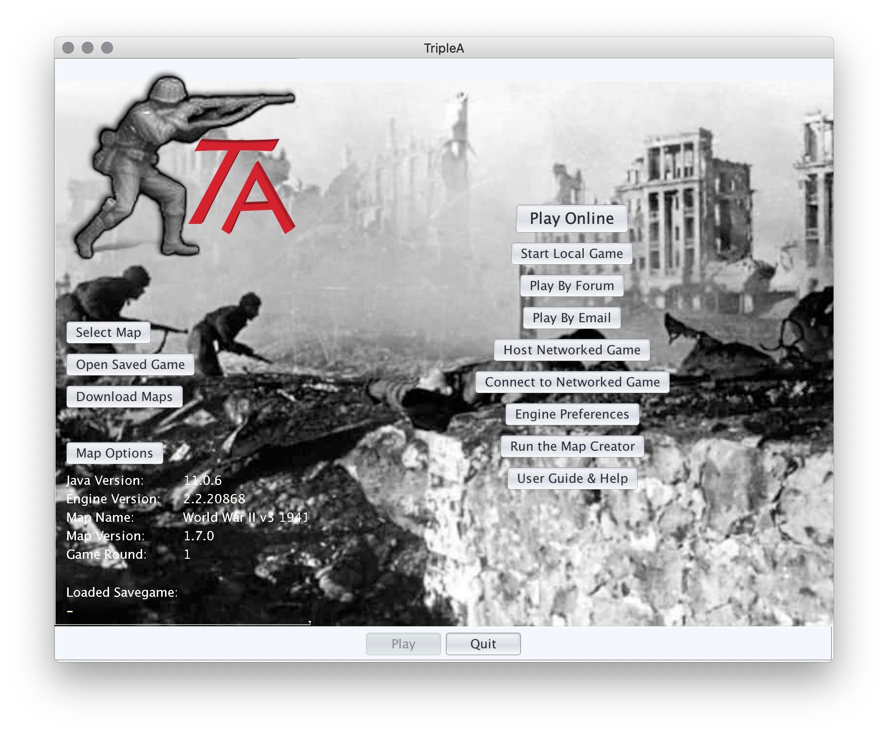
          so here is a rough idea using standard UI elements in this mockup we can def go fancier (custom buttons, fanciers fonts, foreground elements, etc.) if you want but figured we probably didn't want to slow things down at this point. please me know if that's an incorrect assumption. 🙂start.jpg

          ubernaut F MirkoBruner 3 Replies Last reply Reply Quote 3
          • ubernaut
            ubernaut Moderators @ubernaut last edited by

            @LaFayette spaced on mentioning you 😛

            1 Reply Last reply Reply Quote 1
            • F
              ff03k64 @ubernaut last edited by

              @ubernaut My thoughts are purely from personal opinion, and have no bearing on how hard they are to do, so if they are difficult or just not worth the time, feel free to ignore them!

              I would change the color of some of the text in the bottom left so it is easier to read. Could be cool if the buttons have a transparent background. Probably with a light outline to see where the buttons actually are though. They would probably have to have different colored text as well then.

              ubernaut 1 Reply Last reply Reply Quote 1
              • ubernaut
                ubernaut Moderators @ff03k64 last edited by

                @ff03k64 yeah definitely this was just a quick mockup to get the basic idea across i actually just copypasta'ed that stuff and inverted it probably would fine tune the image and recommend drop shadow text effect if we decide we like this thing, make a few other tweaks as well. 🙂

                1 Reply Last reply Reply Quote 2
                • B
                  beelee last edited by beelee

                  @ubernaut sorry if I am a buzzkikll but the photo makes it to realistic for me. Just my initial impression : )

                  Appreciate your work and time

                  ubernaut 1 Reply Last reply Reply Quote 1
                  • ubernaut
                    ubernaut Moderators @beelee last edited by

                    @beelee noted, just throwing a simple idea that was easy to implement out there. i do have a few other ideas we could try but i'm not sure anything that would be as easy as putting an image in there. 🙂

                    B prastle 2 Replies Last reply Reply Quote 2
                    • B
                      beelee @ubernaut last edited by

                      @ubernaut 🙂 all good brother

                      Thanks again 👍

                      1 Reply Last reply Reply Quote 2
                      • prastle
                        prastle Moderators Admin @ubernaut last edited by

                        @ubernaut Well done bro!

                        1 Reply Last reply Reply Quote 2
                        • ubernaut
                          ubernaut Moderators @LaFayette last edited by

                          @LaFayette how we doing on this? did you want me to try to put together some assets for you on this?

                          1 Reply Last reply Reply Quote 1
                          • S
                            SilverBullet last edited by

                            it looks fine to me.

                            1 Reply Last reply Reply Quote 1
                            • ubernaut
                              ubernaut Moderators @LaFayette last edited by

                              @LaFayette what happeend to my version?

                              1 Reply Last reply Reply Quote 0
                              • LaFayette
                                LaFayette Admin last edited by

                                How do you mean @ubernaut ?

                                I haven't had much time over the last few weeks to do TripleA work, so 2.3 is mostly where it was from a month ago. I'm still interested in incorporating the background image idea you've pitched with updated logo.

                                I'll need those two images separately as their own files. Then it'll be a matter or re-arranging the buttons.

                                ubernaut 1 Reply Last reply Reply Quote 0
                                • ubernaut
                                  ubernaut Moderators @LaFayette last edited by

                                  @LaFayette should i try to finalize that layout then? I'm guessing it will be easier if I do it without the need for a layer to protect the info at the bottom I'm doing in white?

                                  1 Reply Last reply Reply Quote 0
                                  • LaFayette
                                    LaFayette Admin last edited by

                                    Up to you @ubernaut
                                    I suspect the migration to having a background image won't be all at once, but having a more final vision of where we are heading will be useful.

                                    ubernaut 1 Reply Last reply Reply Quote 0
                                    • ubernaut
                                      ubernaut Moderators @LaFayette last edited by ubernaut

                                      @LaFayette what size you need for the logo I can probably send you that right now.

                                      1 Reply Last reply Reply Quote 0
                                      • LaFayette
                                        LaFayette Admin last edited by

                                        It does not matter too much, similar size to the existing one in 2.3 should be fine.

                                        ubernaut 3 Replies Last reply Reply Quote 0
                                        • ubernaut
                                          ubernaut Moderators @LaFayette last edited by

                                          @LaFayette not sure really what size that is exactly. 🙂

                                          1 Reply Last reply Reply Quote 0
                                          • ubernaut
                                            ubernaut Moderators @LaFayette last edited by

                                            @LaFayette here is the version i used in my mockup let me know if it works or you need something else. 🙂

                                            logo.png

                                            1 Reply Last reply Reply Quote 0
                                            • 1
                                            • 2
                                            • 3
                                            • 4
                                            • 5
                                            • 1 / 5
                                            • First post
                                              Last post
                                            Copyright © 2016-2018 TripleA-Devs | Powered by NodeBB Forums