Main Screen Logo Needed
-
@lafayette aren't more or less finished with the logo part tho? the current one we can all agree is not as good as and dilutes our existing branding right?
-
It is very hard (for me at least) even to understand, at this point, what is the full set of proposed changes each of which is either decided or pending. Can someone make a full but concise summary of the current state of everything on topic here, listing the new and old items for every decided or pending change?
-
@cernel I would Think that the issue is mostly just to get rid of the current horrible amateurish looking Trible A logo at the main screen, the one with cropped shadow. And proposals are just solutions to that problem. Wether this means finding/changing the TripleA logo completely or just "fixing" a single image is obviously a debate.
Personally I would say that changing the basic logo of TripleA is a bigger deal and should wait for a time when/if the game gets a real facelift, aka UI or engine upgrade.
But I also think that the current image is unprofessional looking and screams "this is an amateurish game" rigth in the face of newcomers. Thats why I yet again throw my proposal back in the hat. That is to just use @ubernaut old image in an outlined version:
Here are files to toy around with: TripleA-New-Logo.zip The above has shadows added.
-
@mirkobruner Whereas I conceptually prefer the version that is now in use, so I just suggest polishing it (as it clearly needs to be), I'm thinking the second version you made is certainly not bad and can make use of the icon provided by @ubernaut.
I mean something like this:

-
@cernel That would look strange on a grey or dark coloured background. Also, a 2D version would provably fit far most of all the uses for the logo. If a 3D logo is chosen, several different size versions would have to supplement it. Most 3D affects get lost when shrunken down.
-
@frostion That is why I said "something" like this. We'd need @MirkoBruner to provide the original version (with no white background).
-
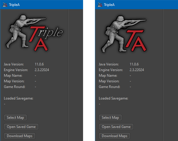
@cernel @Frostion yes, i am simply suggesting we swap out the current thing with our existing logo (your second example is what I'm suggesting, as it is our existing branding). if we want to re-open the discussion about the rebranding i think that should not be a blocker for simply swapping out the image in the meantime.
-
@frostion need left hand logo image on its own with transparent background.
-
@lafayette what size do you need?
-
@lafayette There is a zip file in my previous post. Does the link work? I think all the images are there. Otherwise ... i have no access to my PC for a couple days

-
@ubernaut said in Main Screen Logo Needed:
@lafayette aren't more or less finished with the logo part tho? the current one we can all agree is not as good as and dilutes our existing branding right?
As I said, I conceptually prefer the current one (which you are showing here) over what proposed at this topic so far. My suggestion (to anyone) is remaking it in a polished manner (not too pixellated, the main body of the figurine being neither blurred nor transparent and with no shadows cut). Also, I think it would be better for the figurine to be a bit bigger relatively to the rest: enlarging it by about 25%.
-
@frostion Sorry But I don't Understand what is needed here. I have all the files and I can provide anything you might be needing. Just state any request precisely. Too many posts, too many voices.. there is a big noise here. Just tell me what to do and I will gladly help.
Regards, to all. -
@mirkobruner @Frostion both of these are under the umbrella of rebranding which needs further discussion if any further action would be taken in this direction current consensus here is to replace the current start screen logo with the previous thing (current logo/icon)and discuss any branding changes for future releases.