Proposed Map: Domination 1941
-
Overview
Players who want a large map generally gravitate towards either World at War (WAW) or Domination 1914 No Man's Land (NML). Of those, NML has by far the better tech system. In addition, NML has multiple viable strategies. Whereas, the default Axis strategy for WAW is kill the USSR first, and the default Allied strategy is kill Japan first. Therefore NML has far more replay value than WAW. However, in NML the Pacific is a sideshow, whereas in WAW it's a central focus. WAW does a better job than NML of providing a naval theater of conflict.
Proposed Map
The proposed map is a 1941 version of NML.- Keep the overall tech system the same.
- Change some of the techs to reflect the WWII theme.
- Add nation-specific techs to be researched.
- Make the Pacific much larger. Add some islands.
- Change some of the units to better reflect WWII.
- Change the nations to reflect WWII.
- Use the same Anniversary Edition rules as NML.
What is needed
Someone who knows how to design maps, who wants to turn this proposed map into reality.Nations
Axis: Germany, Italy, Japan
Allies: USSR, UK, China, USUnits
Land
- Infantry: 1/2, cost 3, move 1, receives support. Size 2.
- Conscript: 0/1, cost 2, move 1, receives support. USSR and China only. Size 2.
- Elite infantry: 2/3, cost 5, move 1, receives support. Size 2.
- Field gun: 2/2. cost 4, move 1, provides support. Size 3.
- Heavy gun: 2/4, cost 5, move 1, provides support. Size 5.
- Scout car: 1/1, cost 3, move 2, provides support. Size 2.
- Tank: 3/3, cost 5, move 2. Size 3.
- Heavy tank: 5/5, cost 8, move 2, provides support. Two hit. Germany and USSR only. Must research appropriate tech first. Size 5.
- Mobile infantry: 1/2, cost 4, move 2, receives support. Size 3.
- Mechanized infantry: 2/2, cost 6, move 3, provides support. Size 3. Must research appropriate tech.
- Katyusha: 3/1, cost 6, move 3, provides support. USSR only, must research appropriate tech. Size 3.
- Trench: defend on a 0. Move 0. Cost 3. Takes 2 hits to kill. You can place 2 trenches per territory per turn. You must own the territory at the start of your turn to place. Does not require a factory to place, and does not count against factory placement limits.
- Industrial complex. Cost 20. Allows you to place units up to the territory value.
- Antiaircraft gun. Cost 5, movement 1. Size 3.
Naval
- Transport: does not participate in combat. Cost 7, move 2, transport capacity of 5.
- Destroyer: 2/2, cost 9, move 2. Anti-sub. Receives support.
- Cruiser: 3/3, cost 11, move 2. Receives support.
- Battleship: 4/4, cost 22, move 2. Provides support. 2 hit. Bombard.
- Iowa batttleship: 5/5, cost 26, move 2. Provides support. 2 hit. Bombard. U.S. only.
- Yamato battleship. 5/5, cost 28, move 2. Provides support. 3 hit. Bombard. Japan only.
- Aircraft carrier: 1/3. cost 14, move 2. Receives support. Can land 2 planes.
- Fleet carrier: 2/4, cost 20, move 2. Receives support. Can land 3 planes. 2 hit. U.S. only, must research appropriate tech first.
- Sub: 2/2, cost 8, move 2. Is sub.
Aircraft
- Early fighter: 2/3, cost 9, move 3. Can land on carriers.
- Fighter: 3/4, cost 10, move 4. Can land on carriers. Must research appropriate tech.
- Bomber: 4/1, cost 16, move 6. Can strategically bomb.
- Super Fortress: 5/1, cost 22, move 8. When strategically bombing add +2 to the roll for damage. U.S. only, must research appropriate tech first.
- P-51 Mustang. 3/4. Cost 12, move 6. U.S. only. Must research appropriate tech first.
- Jet: 4/5, cost 16, move 4. 2 hit. Germany only. Must research appropriate tech first.
Technologies
Economy
- Science: provides a free tech token each turn
- War bonds: each turn, roll two dice. The sum of the rolls gets added to your income.
- Working women. Your field guns now cost 3.5 each. (7 PUs for 2.) Your heavy guns now cost 4.5 each. Your early fighters now cost 8, and your late fighters now cost 9.
Innovation
- Mechanized infantry. Allows you to build the mechanized infantry unit.
- Industry. Adds +2 to the unit placement capacity of your factories. The underlying territory must be worth at least 2 to receive this bonus.
- Late fighter. Allows you to build late fighters.
Land offense
- Creeping barrage. Your field guns now attack on a 3.
- Mobile warfare. Your mobile infantry now move 3.
- Combined arms. All your aircraft now provide support to land units.
Land defense
- Bunkers. Your trenches now defend on a 1.
- Propaganda. You receive 3 free infantry each turn on your capital. You must own your capital to receive the bonus.
- Rail guns. Your heavy guns now defend on a 5.
Naval
- Convoys. Your destroyers now defend on a 3, and your cruisers defend on a 4.
- Merchant marine. Your destroyers and cruisers now move 3.
- Dockyards. Reduces the cost of transports, subs, destroyers, cruisers, and aircraft carriers by 1 PU. Reduces the cost of battleships and fleet carriers by 2 PUs. Reduces the cost of Iowa and Yamato battleships by 3 PUs.
Nation-specific techs
Germany
- Heavy tank. Allows Germany to build heavy tanks.
- Jet. Allows Germany to build jets.
- Assault rifle. German elite infantry now attack on a 3 and defend on a 4.
U.S.S.R.
- Heavy tank. Allows the U.S.S.R. to build heavy tanks.
- Katyusha. Allows the U.S.S.R. to build Katyusha units.
- T-34-85. Soviet tanks now attack on a 4.
Japan
- Long lance torpedoes. Japanese submarines now attack on a 3. Japanese cruisers attack on a 4.
- Fanatical defense. Japan's trenches now cost 2.5 PUs each.
- Kate. Japanese fighters attack on a 4.
UK
- Firefly. Britain's tanks attack on a 4.
- Spitfire. Britain's early fighters defend on a 4.
- Advanced radar and sonar. Britain's destroyers attack on a 3.
China
Chinese disadvantage: all Chinese units cost double the usual price, to account for the internal division China faced.
- Infantry cost reduction. Chinese infantry are each reduced by 1 PU in cost.
- Conscript cost reduction. Chinese conscripts are reduced by 1 PU in cost.
- Trench cost reduction. Chinese trenches are reduced by 1 PU in cost.
U.S.
- Fleet carrier. Allows the U.S. to build fleet carriers.
- Super Fortress. Allows the U.S. to build Super Fortresses.
- P-51 Mustang. Allows the U.S. to build P-51 Mustangs.
-
There's also TWW for larger maps, which has just as good a tech system as NML. As well as Arda. So adding another larger map wouldn't necessarily help things if it doesn't get played much. It's not easy for a new map to get played alot.
Tech is a double-edged sword; while it can spice up a game, it can also make for pigeon-holing in much the same way you describe WaW strats. The tech in nml tends to not be well-balanced, with some very strong trends pushing it in certain ways. Tech systems often have a problem of pushing towards excess focus on specific units.
If you want more strategic variety in waw, it'd seem to make more sense to fix the balance problems in it that make certain strats too effective compared to others.
-
As zlefin said above, probably easier to adjust WaW. I think @Black_Elk originally drew Domination but not entirely certain. Either way, making the Pacific bigger probably be an entire redraw. Idk. I can't draw maps.
Cool ideas though
@kurtgodel7 said in Proposed Map: Domination 1941:
Make the Pacific much larger. Add some islands.
-
Sounds cool!
The big prob with Domination is that I didn't really know what kind of game I wanted to make when I drew it lol. I just knew that I didn't like how the Revised world map was so warped and cartoonish and that I didn't dig how the Mercator projection worked in A&A games. Originally it was meant for a game themed on the Taiping and Boxer Rebellions and set for a 1850-1900 timeline. US-Mexico War or US Civil War to Spanish-American or Philippines Wars maybe to like 1901-1911, eve of WW1 late 19th century Colonial Period say. That one had only 3 "ground" units in the roster: Infantry, Cavalry and Generals, which meant that unit overflow wasn't much of a consideration. I think ships were the same with fewer unit types there. I thought it might play a bit more like Risk than A&A, basically a more complex map, but a much simpler unit roster.
I took my V3 map and just started carving it up. But at some point it was repurposed for WW1 and the baseline was doubled or maybe tripled in scale (why there are so many 2 pixel borders instead of 1 I think hehe.)
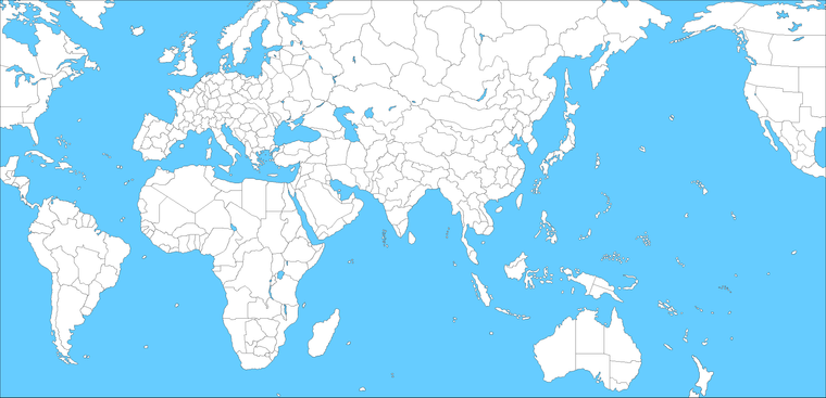
Here is an early baseline for it, you can see the scale is essentially the same as I did for v3 at that point, which was already almost too small, even for that game lol.
The best version of the map I've seen is Hepster's redrafting for his Power of Politics 1914 idea, but I'm not sure if he's still working on it. I have a screen saved at a low res of one of his wips. Looked badass to me! I really liked the direction. Hopefully he's still got it somewhere.
Basically he used a relief method and reworked the geography to remove the extraneous city circles and such, to be more accurate/universal. I think he redrew basically everything for the baseline and it's pretty impressive. Here are some teasers that he threw together, I think like almost 4 years ago? but you can get an idea for where he was aiming there. It was very specific to the 1914 timeline/theme, with map features and graphical elements that might not suit 1941 so well, though I think the same principles could work for something more bare bones, that could maybe be more adaptive for anything 20th century.
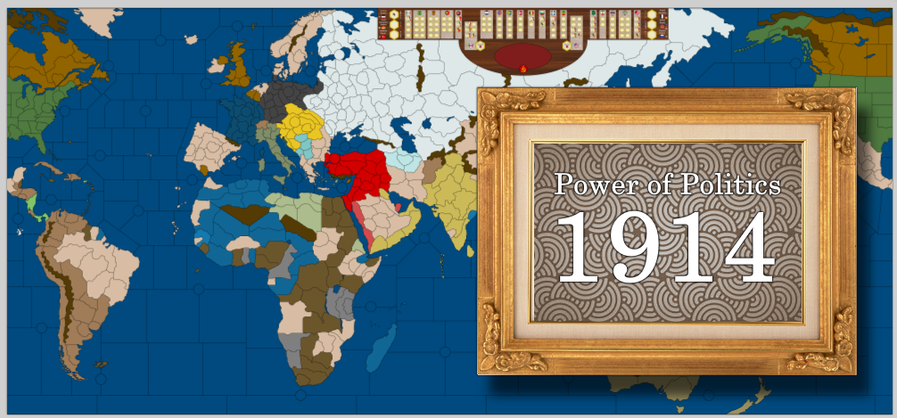
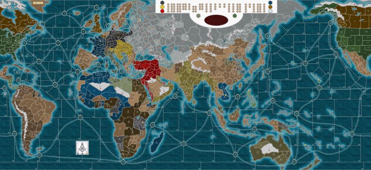
I think that map would be great for WW1 to WW2 or even early cold war series of games. I liked his idea to put that large arctic area to work. In WW1 it shows a Russian revolution them, but I'd imagine that section could maybe be repurposed in a different way for WW2 theme. I lot of the Southern Antarctic is kinda the same I feel. Like it's just a lot of board space that doesn't get much use and could maybe house a feature more like that. Or just a cool compass rose and flag flourishes, those sorts of design elements.
Originally the Domination idea was to create a more generic tripleA world map that might support A&A style world theater games with wildly different timelines. You know, like where the same baseline could service 18th or 19th century conflicts as well as WW1, WW2, or Cold War timelines, but it never really materialized hehe.
I still think it's a good idea though.
The trick was trying to create regions/TT tiles that would still make sense, even as the national borders tended to shift rather dramatically over time, which is why they were carved up into much smaller discrete pieces.
Initially I thought those would just be guides, and that they would basically be erased where it made sense, to create new maps with new TTs, to house a more normal unit roster or playscale, just using the same essential map projection. So the TT borders might change game to game or timeline to timeline say, but not the basic shape of the world itself, if that makes sense.
When you start with a fuzzier world projection, you basically needed some guides in there, for where the political/national boundaries might be, just so the map maker could tell, like 'oh OK that's where Germany is' or where such and such a river is. Cause otherwise it's very warped. I mean Europe and the Pacific are wildly out of scale in A&A for example. Or particularly in central Asia or South Asia or the Med/Africa, because that's where most of the stretch/compression is happening, although I tried to do my best for something reasonable.
There's a bit of jingoism going on there I think, especially in A&A, where people are just less familiar with the political boundaries of say central Asia than they are of those in Western Europe, so a weird stretch is less noticeable in Kazakhstan than it would be in France, but I still tried to give the map maker something to work with. Even for the distortions where those occur, so at least they could say "ok well if that's Kazakhstan, and that's the Aral sea, then I can sort of guess where the Oxus river might flow" to split neighboring Uzbekistan in two, or whatever. It was easier in Europe, cause peeps remember those TTs and shapes from Highschool history, so I had a clearer feel for what might be useful there hehe. Making WW1 Germany look right, relative to WW2 Germany, knowing which lines to erase to get the different shape, without having to guess to much I suppose lol. I still think it's better overall than say Global, which still looks much more cartoonish or Classic A&A style to me - you know where the world is highly distorted in scale/shape and morphed to suit the gameplay. But people seemed to like the idea of a really carved up and very large world map with a ton of units I guess, so it just sort of took on a life of its own there lol.
It's been a while, but I could probably work a new baseline if you got a lot of ideas. That's relatively straight forward. Carving it up with the utilities and center pickers and whatnot to make the baseline into a playable map is that part I'm less familiar with. Usually someone else would step up for that part lol.
I think if you know what you want it to do in advance, it's easier to shape/scale the map in a bespoke way, to deal with stuff like unit crowding or teammates co-locating in the same territory or sz. Unit co-location can get pretty messy if the map is tight. I feel like that might be addressed with rules somehow, prohibiting "friendly" units from camping out in territories under friendly control, but A&A is kind of built around that concept, so it's tricky. In the past tripleA baselines had to be drawn to scale, so an upscale of the entire world to enlarge it 200% you'd have to redraw it at 1 pixel borders again. But I think around that time the utilities were improved maybe to fill in some gaps there? I don't know, I didn't think it would work, but Surtur figured it out hehe. Probably easier to get what you want if you redraw it specifically for what you're after. I mean for something like NML I'd have probably started with a much larger baseline, but then who knew right haha. Anyhow, I'm kinda unreliable to be honest. I drift in and out these days and my enthusiasm comes and goes in waves, but I always did love the maps, so if you really got the fire stoked a 1941 game is always cool to drum up the old school flavor. AA50 was my fav.
Making a new map is pretty ambitious though and kind of a grind. If doing the legwork, I'd want to make something that we could also use as the basis for a Global 1940 baseline revamp, you know, get the same projection going for the main A&A games v3, v5, Global, maybe with Frostion's units. Then it would feel like it was worth the effort and I might be more likely to see it through, instead of burning out like I tend to do heheh
Best
Elk -
@black_elk said in Proposed Map: Domination 1941:
Making a new map is pretty ambitious though and kind of a grind. If doing the legwork, I'd want to make something that we could also use as the basis for a Global 1940 baseline revamp, you know, get the same projection going for the main A&A games v3, v5, Global, maybe with Frostion's units. Then it would feel like it was worth the effort and I might be more likely to see it through, instead of burning out like I tend to do heheh
Go Elk Go !!!

-
I think NML has more strategic options than WAW but not because NML is better drawn. It is because WW1 scenarios have more potential to have more viable strategic options than WW2 scenarios due to this reasons.
-
WWII default Axis strategy will be almost always taking out the Soviets first if it starts after the Barbarossa. WaW is IMHO somewhat more successful to diversify the default Axis strategy by making cannon fodders very cheap and splitting Japan. Whereas WWI CP doesn't have a definitive default strategy.
-
WWII USA is somewhat very railroaded. If it is closer to Japan than Germany, KJF becomes the default USA strategy. I think USA in NML is more interesting.
I also think having Manchukuo as separate country is better idea if China does exist.
I am also working on a new map (albeit very slowly). I could maybe borrow these ideas. It is just sketch.
-
-
Very good post!
The best version of the map I've seen is Hepster's redrafting for his Power of Politics 1914 idea, but I'm not sure if he's still working on it.
I agree that does look like a very good map. If you're comparing it with the map used for NML, I'd say the Hepster version is considerably closer to being usable for a WWII map.
I noticed what appear to be trade routes depicted on the sea zones. Do you know if he had rules in mind for those? One idea which comes to mind is to have each of those trade route things produce income. They could be subject to capture, in which case they would produce no income until being retaken.
One thing I look at is the number of spaces which separate San Francisco from Tokyo. In NML those territories are 3 sea zones apart. That's fine for a WWI map, but unsuitable for WWII. In Hepster's redrawing, those territories are six spaces away. My ideal is around 8 or 9 spaces, but 6 would still work.
The other thing one looks for in a Pacific theater is more islands to fight over. The islands in NML are fine for a WWI map, but you'd want more than those for WWII. Hepster has gone a little in that direction, for example by dividing Sumatra into two pieces. My hope would be to have 8 - 10 more Pacific island type territories to fight over than in NML. Also, converting some of the 0 PU islands to 1 PU islands would make sense from a game play perspective. Ahistorical, granted.
Another thing I look at is Belarus and Don. In NML, Russia successfully defending Belarus usually means Russia successfully defends its entire Western front. Failing that, Russia will often defend Don, on the theory that Don is a sort of poor man's Belarus. All that seems just right for a WWI map, but for WWII you want something different. Hepster has altered the Russian front, and I think his alterations are just what a WWII map would need.
It's been a while, but I could probably work a new baseline if you got a lot of ideas. That's relatively straight forward. Carving it up with the utilities and center pickers and whatnot to make the baseline into a playable map is that part I'm less familiar with. Usually someone else would step up for that part lol.
That sounds good. I've provided some thoughts thus far. If you want me to provide additional input or ideas definitely ask!

I feel like that might be addressed with rules somehow, prohibiting "friendly" units from camping out in territories under friendly control, but A&A is kind of built around that concept, so it's tricky.
I envision the Axis consisting of Germany, Italy, and Japan; and the Allies of the U.S.S.R., the U.K., the U.S.A., and China. Hopefully that lessens the above concern. In WAW, for example, Japan is divided into 3 pieces, you have Finnland, Romania, ANZAC, the Dutch, and France.
If doing the legwork, I'd want to make something that we could also use as the basis for a Global 1940 baseline revamp, you know, get the same projection going for the main A&A games v3, v5, Global, maybe with Frostion's units.
In what ways would this be the same as the existing Global, v3, v5, etc.? In what ways would it be different?
-
@kurtgodel7 Yeah he had a lot of cool ideas about convoy lanes and the politics and the revolution stuff. It's one of the more elaborate maps I've seen for tripleA, but I only have the wip.
So my thought would be to take that world projection, and basically do a contour of it for G40. That way we'd have a version for the 1940 game which is consistent with the v3 shape, but just much larger, since it'd be modelled on the same basic world projection I used for v3, but like 3 times as large. Hepps has a lot of detailing in coastlines that I dig too, and mountains and stuff like that. Just the shape of everything is cleaner, he went over the entire world with the finer toothed comb hehe. Some stuff is definitely 1914 and he took it pretty far along that direction, like the way the tiles are divided up and such. I'd think for a 1940s WW2 style map probably some detailing would be extraneous, but it seems like what might be desirable is just Domination draft style map that is more interwar era in the territory divisions and kinda stripped down. So for that stuff I'd just aim for something where the map maker could remove borders rather than drawing them in, if that makes sense. Or with sea zones to create whatever divisions make sense for their idea. So you start super detailed out to the Nth degree on land, like Hepps has, but then could collapse some stuff into single tiles just with the eraser rather than the pencil, or divide other TTs up into whatever the map maker has in mind, with those draft guides to go off of. You know like having North Borneo too, or splitting an island chain or whatever, it's easier when you have the surrounding info as a guide.
His map at scale is slightly larger than the current Global at 7944x3646. The one I did for Dom was 7556 on the long side, but I made it with a lot of ocean compression esp in the Atlantic, like as narrow as I could possibly manage for that one lol. So basically the stretch is just kinda moving the continents further apart if you want more ocean, and respacing the islands, which is easier to do than morphing the shape of the continents. Hepps cleaned it up quite a bit, all the border lines are smoothed out and a lot less jagged than Domination, so I'd want to follow his contours. Once it's drawn I mean, it's easier to move stuff than it is to reshape stuff, if that makes sense. Anyway that would be my thought, just to do something consistent for G40, like legacy style.
Basically the world looks like this... and then we divide it up again. For G40, and then whatever other idea that's more like Domination flavor, super divided etc up but WW2 theme.
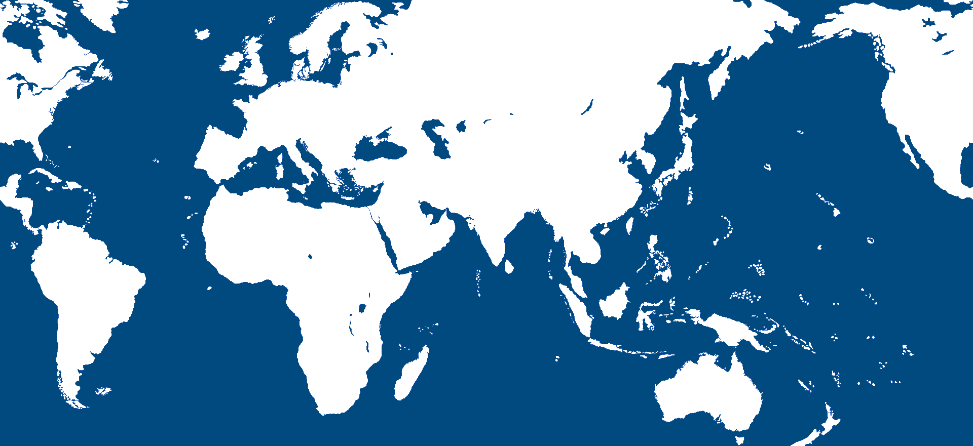
Here it is at scale... which is too large to attach on the boards, but I mean the for essential shape of the continents. The shape of the world basically, so it's more like that (and still closer to OOB G40) than Mercator, just with a somewhat more realistic look to the contours than we have currently for the 1940 game.
https://www.dropbox.com/s/le1ijw4qtq457v1/triplea_world_projection_elk_and_hepps.png?dl=0
I'd actually want to upscale it again probably. Like here it is 9999x4588 just to get some more room... So there the Baltic and the Med would be about the same scale as current Global, but with the surrounding land TTs a bit larger (with more room for units, or maybe to house larger unit sculpts more like Frostion's set). Or we could probably push it even larger if there are areas that are too tight still, or on the current G40 map, to try and make it more play friendly like that.
https://www.dropbox.com/s/k706nnhyglmpl0c/triplea_world_projection_elk_and_hepps_x9999.png?dl=0
Basically you'd want to figure out what the standard size/scale of the board is going to be and then retrace everything at 1 pixel, for at that size, like for all the black lines, all the TT/SZ divisions etc. The contour is easy, cause you can just isolate the blue or the white and then add in the black at 1 pixel. It's the TT divisions that take longer, but once you have a guide it's simpler. The trick with G40 is more the labelling of the TTs, cause even with the warp it's still hard to make Archangel touch Belarus or whatever sometimes hehe. For that stuff you probably just blob it, but it's easier to make the blobs once you know vaguely where stuff is relative to the other stuff. You can always move lake Bakail a bit north or shift the Caspian further to the right or whatever, and kind of subtly reshape the whole slant of Eurasia that way, if you need china bigger say (basically the current G40 approach). But I like the way Hepps had it dialed and split up, with all the cool mountain ranges and such added in. I feel like those could go into G40 for flavor in some spots, even if they don't really effect the gameplay, or like same deal grouping smaller islands into larger island TT 'zones' where that makes sense, for the simpler map I mean.
For WAW you can basically get the baseline from the PolygonsImage
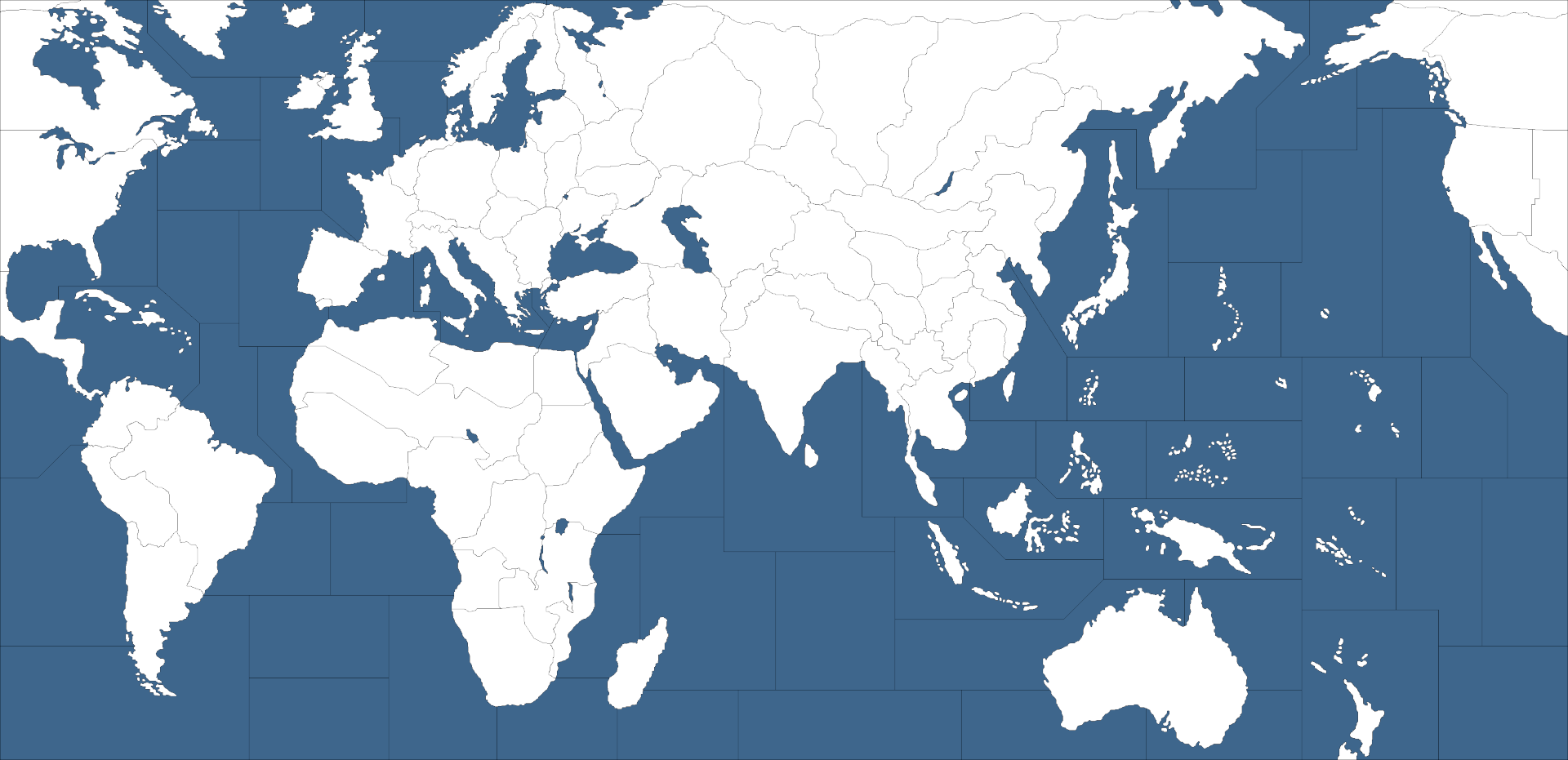
It's 9921x3815 there, so around the same height at scale, but a fair bit wider. Here it is rescaled to x1920 on the long side so you can compare.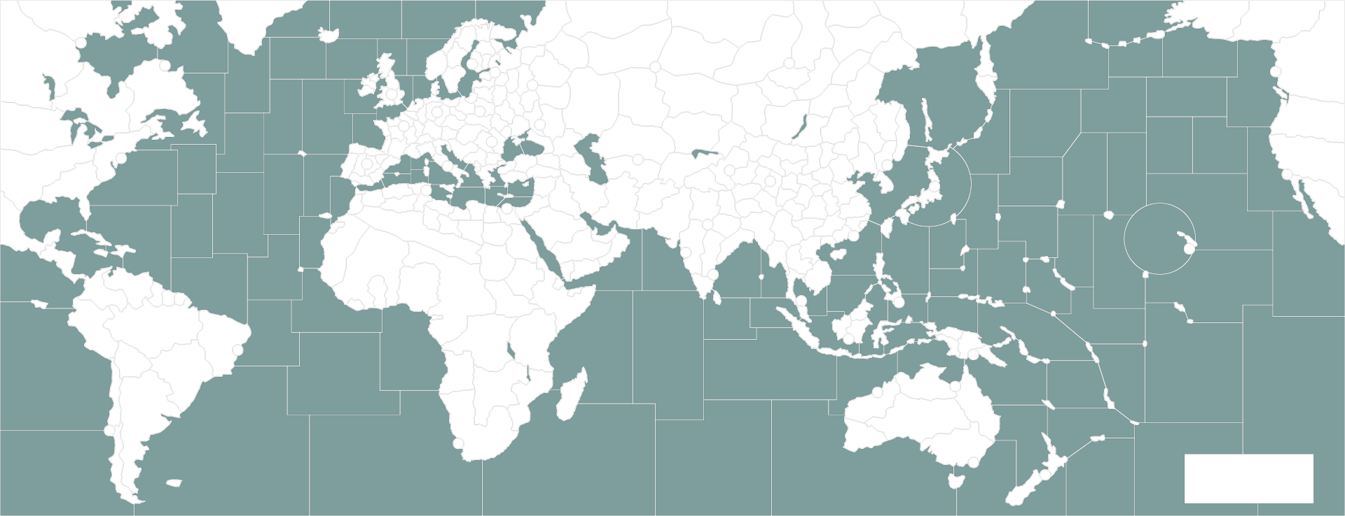
current V3 at x1920
current G40 at x1920
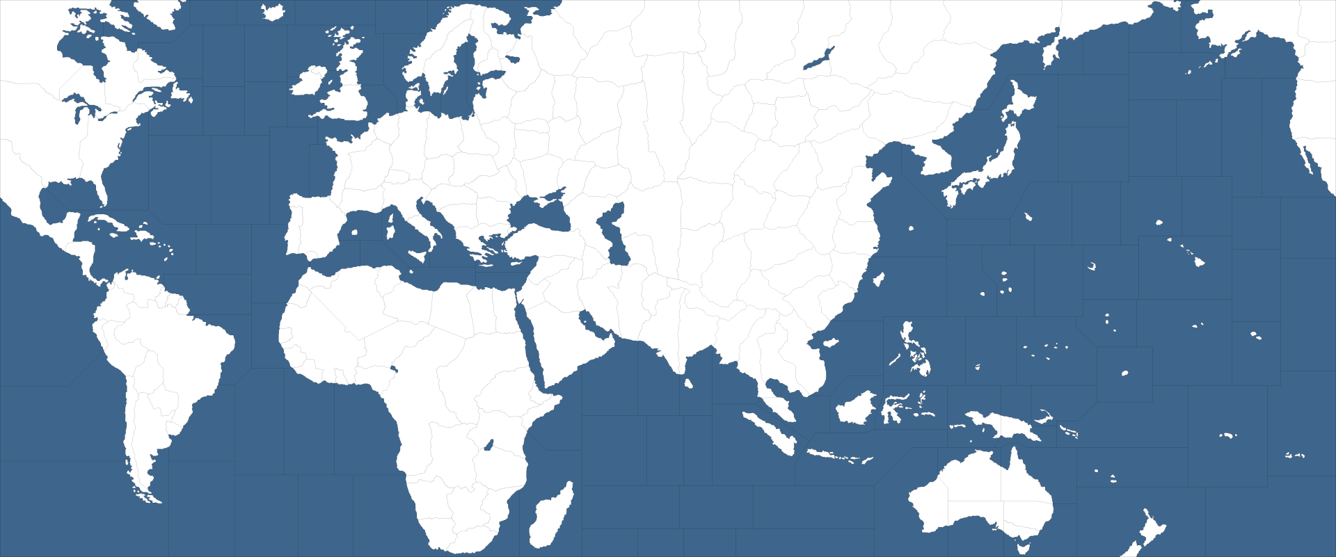
Kinda just depends how large you want Europe and the Pacific relative to the rest of the globe, or what you're willing to trade in relative scale vs accuracy lol.
-
@black_elk and others
The Shogun Advanced map works well with 11264x6290=71million px and
Frostions Warcraft War Heroes is 9500x8500=81million pxI would go for a world map of 13000x6500=85million px or similar and use a units.scale=1 of 1.25. This will be helpful if a player has a 4K screen.
Check this out, a new way to make a map.
https://forums.triplea-game.org/topic/3318/easier-map-making-with-inkscape-reusable-art-assets -
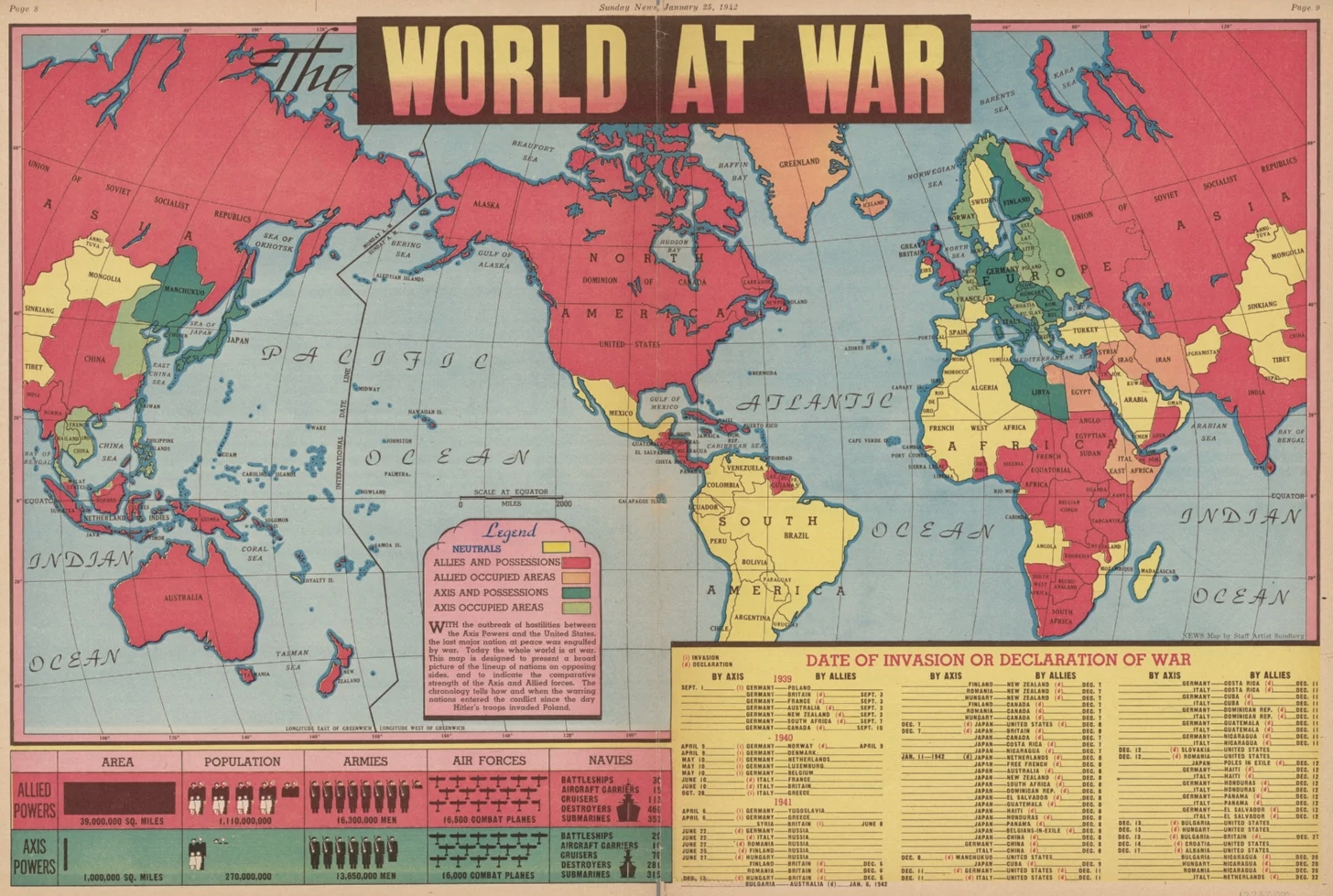
@thedog Yeah that's such a better idea!!! Let's make it like that! I think the original I did in like MSpaint lol, but it seems like using inkwell to create a vector and then some kinda system that's more user friendly like you laid out to modify would be the ticket. The world projection is kinda tricky, cause some of that is personal preference. My only beef with mercator is that for A&A you really have a situation where the gameplay recommends heavy distortion, and just cause the A&A map that's the basis is so abstracted. You get the idea that Larry was looking at those same two page spreads in the history book where you see the European theater and the Pacific Theater at a zoomed in scale and just kinda wanted to stitch them together hehe.
I think the way that the world is split on the gameboard also lends itself to some wonkiness. Like the real split should probably be in the middle of the Atlantic, you know with Europe/Africa on the far left of the gameboard and the Americas on the far right. Cause that sorta disguises the distortions. I liked how Hepps included that curved inset element at the top, because that's kinda how I made the initial warp. Basically I tilted and blew out Europe and kinda wrapped the Siberian arctic zone around almost like an ISO view or something, but it seemed to work hehe. Anyhow I just liked how it carried that suggestion through, since it was kinda deadspace and seems like maybe a good area for graphics or illustrationy stuff.
For unit crowding some of those north Atlantic tiles could probably be raised, since Allies tend to stack there. Basically getting the Baltic and some of the E. Front territories to be as large as possible without making it look goofy, is sorta the aim lol.
Anyhow, just reading through that other thread, and I like that approach. Basically something that is easier for others to come along and still work with, without having to go back from the ground up to make the indexed raster base.
I have inkscape, I used it once for some illustration stuff. I hadn't considered it for the maps, but that makes total sense! Good call
ps. I always thought the og Classic projection was basically a riff on this one. But where the map was split down the center, and the two sides of Eurasia just kinda slid into one another. Then the Americas were scaled down and Europe was scaled way up to give basically a theater map there, and that's essentially the look of the classic board lol. Like even some of the TT divisions and the labelling seemed to follow. Sorta like a playable version of that one haha.
-
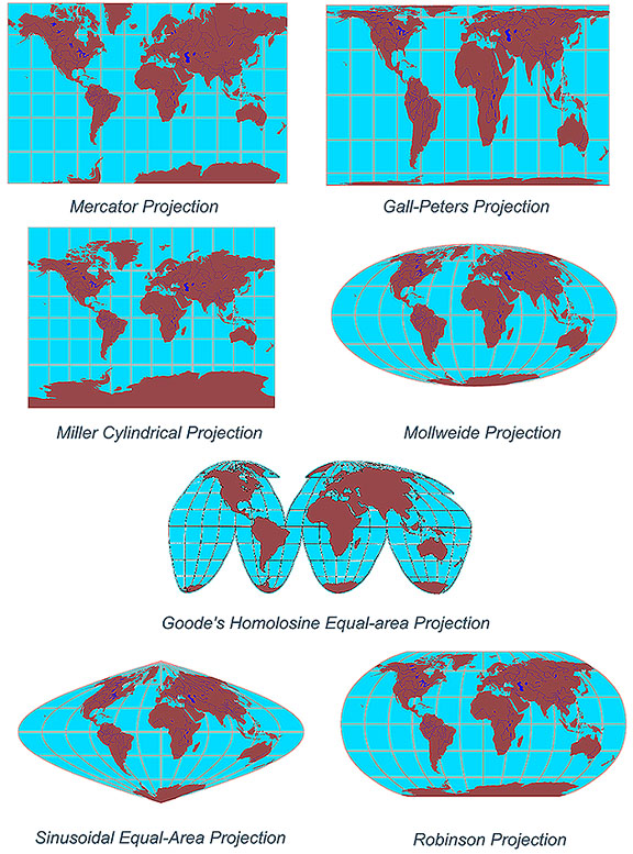
What about using Goode's Homolosine Equal area Projection and use the sea zones to correct the distances between land masses?
or
Robinson Projection and use the zea sones to fix the Pacific distances?
No tracing of this map required
https://commons.wikimedia.org/wiki/File:Blank_map_of_the_world_(Robinson_projection)_(10E).svg.
-
@thedog Yeah I've always been partial to that one as well. I think I used Robinson for the earliest ballparks, before warping it out like a madman lol.
Couple things have changed since then though, in the intervening decade, the biggest one probably being the center mouse zoom we got going in the pre-release now. Once you have a smooth and convenient zoom I think it makes some of the scaling distortions less of an issue. Or similarly, like when a map is fucking gigantic, but the gameplay is organized around a more theater/zoomed-in view anyway, some of the issues you get in A&A seem less pronounced, cause you're not really needing the survey view at a glance when the gameplay focus is tighter on the area view throughout.
In Classic or Revised or AA50 etc, at the time I felt that scrolling/drag-to-view was the enemy, and that what many people wanted was the max zoom distance, or at least as zoomed out as one could get while still being able to see what's going on (ie legible the font, and still being able to distinguish the units at a glance.) And it seemed like a bit of a bummer that most people would just be playing the games at like 75%-50% map view, even though that crushes the graphics and makes everything worse, just because 100% was so inconveniently large that it was almost unplayable. That's why v3 was relatively tiny, cause I was shooting for something players wouldn't have to reduce in view. Screens were smaller then too, with many still using the 4:3 aspect ratio on desktop, whereas now 16:9 is undeniably the norm for everything hehe. But just that idea that people didn't want to drag around a bunch of deadspace, having Africa or the Americas be all realistically massive or Europe realistically tiny, seemed ill advised cause none of the official A&A maps actually looked like that lol.
I recall being impressed around that same time with the approach taken by Empire Total War, you know where you had basically 3 theater maps that were integrated into a pseudo world view. I was disappointed that Napoleon Total War reversed course and didn't expand on the Empire connected theater idea to give views for Africa or the Far East, or the rest of S. America etc, but just went back to a Europe map like MTW. Shogun was probably my favorite game for ages, another reason that post caught my eye! haha
Anyhow, I think when it comes to original TripleA games, using the latest features, it'd be a lot easier to create a world map that works well without massive distortion. But then you still got the issue with the legacy tripleA games based on A&A, which are still probably the reason most people end up discovering tripleA in the first place. I always get nervous anytime the franchise is sold. They just sold it again, like yesterday, right? Hasbro farmed it out to Renegade for the table top stuff. Hopefully they keep it cool. It was so demoralizing when AH pulled the rug out from under TripleA when AA50 dropped. I wasn't around when Veq and the gang relaunched TripleA and created Global, otherwise I'd probably have worked on the baseline there, but I was so bitter about AA50 getting the can that I didn't come around again for a while after that lol.
-
I think Mercator is the best projection but everything above Leningrad definitely should be cut to preserve realism. Because Mercator enlarges Europe to fit more units plus it preserve the original shapes of land masses and north-south direction.
Without any cut, I'd go with Robinson.
-
@schulz yeah Mercator is the best you're going to get for the standard map projections if what you want is just a larger Europe. The Classic A&A board projection is sorta like Mercator, except that you have two very large theater insets basically, but they're handled as like invisible telescoping distortions, just grafted on. Also on the first classic board, you had a few insets at the top that kinda hammered the impression home further. But the handling on the main board was to sort of just pretend I guess lol. Europe is easily like 3 times the size that it should be on the Global A&A board compared to even Mercator hehe. But then they didn't have any rescaling option for units or the map. I can't remember but I think tripleA didn't have them either for a long while at the start.
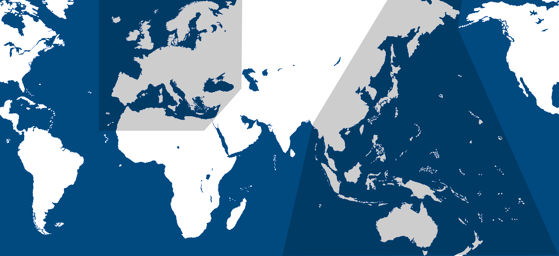
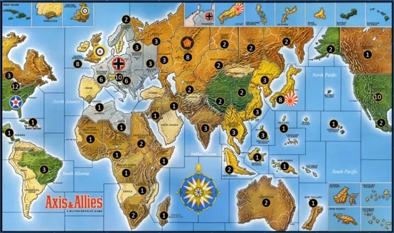
It's funny to look at now, just how mappy that map is. I mean since it's gone in a bit of a different direction since then.
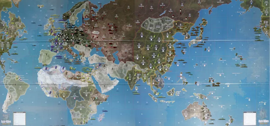
just snagged those right quick from boardgamegeek for the glancing comparison.
-
If we are talking map projections consider, equirectangular
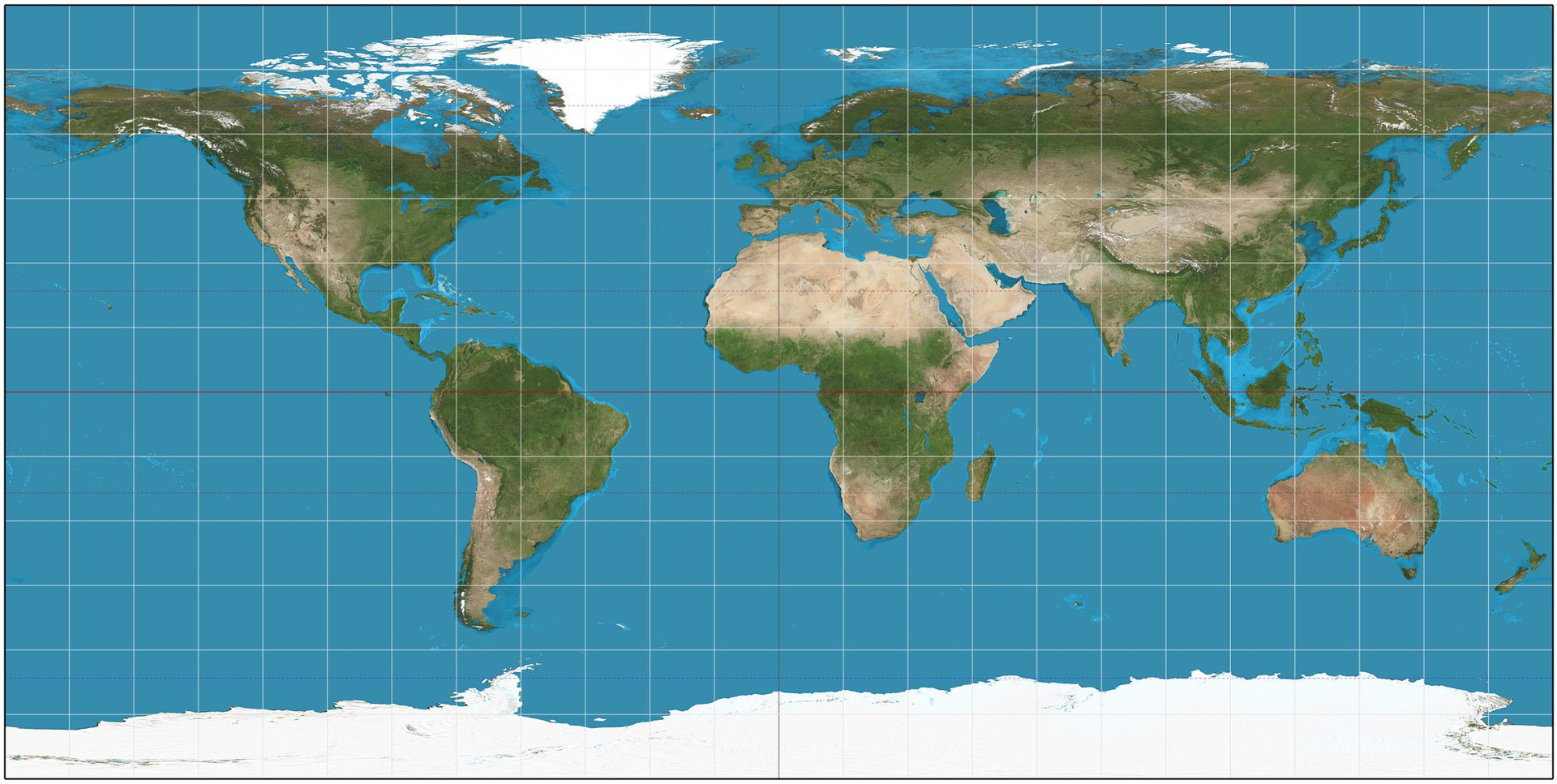
No problem with infinite polar regions.
-
@rogercooper yeah that one's got charm too. I think it probably comes down to whether or not the mouse scaling is smooth enough in gameplay to overcome the shift to view on Europe and the South Pacific. Like I don't know about others, but I'd prefer to zoom in/out to hop around the map rather than drag-and-pull in most situations, like unless I'm in the middle of the movement phase and issuing orders. I mean more for the glancing view. I guess it's also a trade off between fidelity to the gameboards and the desire for something that has more realistic contours.
Here's another map that essentially has the approach of G40, with that kind of warp. Its pretty large, I'd say a good 5 ft or more across. Like it's basically taking up the whole folding table lol, but here it is just laid out on the floor. At that scale, you can just about get it working with official sculpts/hbg expansion unit stuff, but even then, it can still be pretty tight.
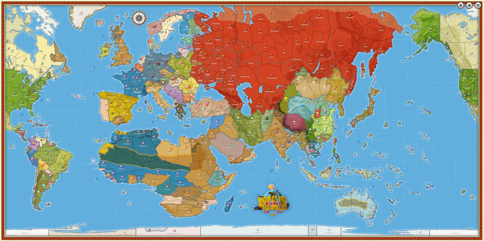
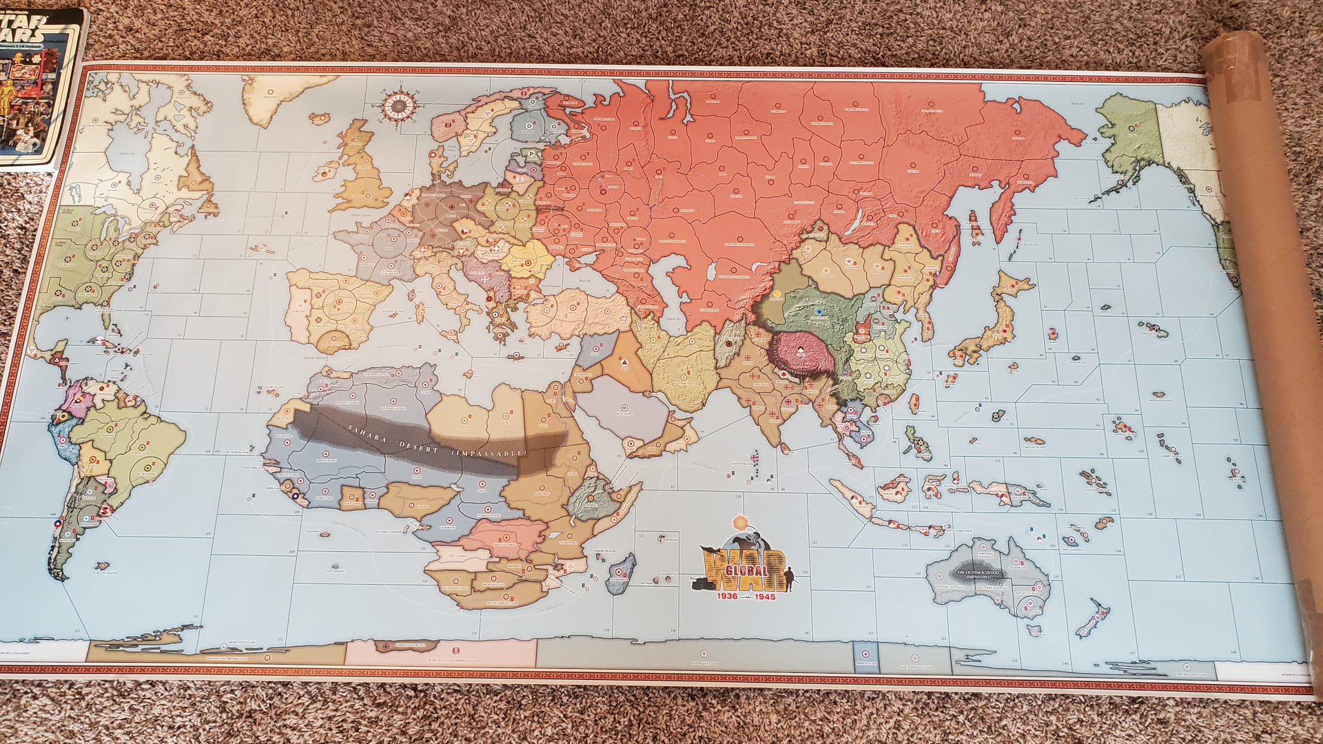
I think a lot of the WW2 themed games are shooting for a playscale with a lot more TT and SZ divisions, a bit more like that, or even more carved up. Doing something like domination on a standard projection would mean a pretty big jump to scale from the play view to the survey view, like going from a Europe/Med view to the Global view. Not being able to play at max zoom-out is a definite downside I'd think. Like you kinda want to be able to issue commands while zoomed way out too, but the font and icons and such start getting pretty tiny.
-
This XKCD cartoon is worth looking at. What your favorite map projection says about you.
-
haha! That's a good one!
I mean this works for me provided the scaling is smooth...
It's already in svg format, so like the Dog mentioned we could upscale that to 13000 or whatever for the high def. I'd probably crop at the Antarctic just for a tighter zoom at whatever height. Then isolate by color to add in the basic borders from there. That one shows modern political boundaries, so you'd still have to decide how to divide stuff up in Europe for the 1941 theme or for the larger TTs like USSR, USA, India, China etc. Prob on a separate layer with the SZ stuff (pacific would be quite large there), or terrain features like mountains or deserts etc done the same way so it could be revisited or revised later.
-
@KurtGodel7 @Black_Elk
bad ass! Agree the Pacific theatre in WAW/Rising Sun is one of the most dynamic and interesting theatres in all of TripleA! The island chains being connected by 'canals' is a key ingredient.@KurtGodel7
Elite infantry at 5PU? Needs amphibious +1 modifier and/or 1PU reduction.
I almost never buy 14PU bombers. 16 is too high. Am I missing something?
otherwise, kudos on tech and PU balancing. I started to complain about some of the other choices until I read through it all.country-specific units look fun! My nephew loves stuff like that. Assault rifle and jets and megaships

Tangent - can someone make a fix so that 1 destroyer does not negate infinite subs? A tech scale would be cool, like the battle of the atlantic, in september Germany gets n+1 tech, subs are much more effective, in october the allies get n+1 tech, sink 30 subs
-
@luhhlz said in Proposed Map: Domination 1941:
Tangent - can someone make a fix so that 1 destroyer does not negate infinite subs?
This been a Feature request for many years. Maybe you can persuade one of the ISU kids to take it on
