TripleA Logo TripleA Forum
    • TripleA Website
    • Categories
    • Recent
    • Popular
    • Users
    • Groups
    • Tags
    • Register
    • Login

    Taking your suggestions for a new UI

    Scheduled Pinned Locked Moved Development
    183 Posts 18 Posters 167.1k Views 19 Watching
    Loading More Posts
    • Oldest to Newest
    • Newest to Oldest
    • Most Votes
    Reply
    • Reply as topic
    Log in to reply
    This topic has been deleted. Only users with topic management privileges can see it.
    • prastleP Offline
      prastle Moderators Admin @Hepps
      last edited by

      @hepps and you didn't release it to the map repo why? evil artist withholding gorgeous maps ?

      k i wont mention why

      If we open a quarrel between past and present, we shall find that we have lost the future! Sir Winston Churchill

      HeppsH 1 Reply Last reply Reply Quote 0
      • HeppsH Offline
        Hepps Moderators @prastle
        last edited by

        @prastle Well I never released it because it still has an issue with the SZs in the Aegean.

        While the map is playable, the change of the 2 SZ creates an issue with the original balance.

        "A joyous heart sours with the burden of expectation"
        Hepster

        1 Reply Last reply Reply Quote 0
        • HeppsH Offline
          Hepps Moderators @General_Zod
          last edited by

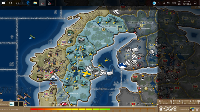
          @general_zod So here is a sample of what I think would make a good in-game U.I. up-grade.

          0_1516812950936_Proposed interface changes Draft 2 jpeg.jpg

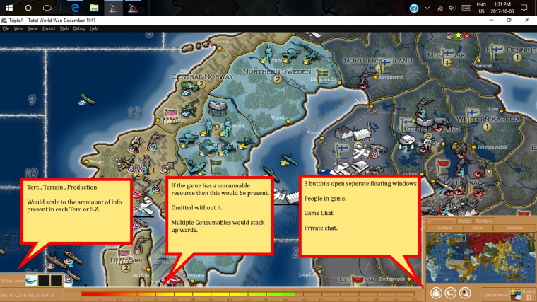
          Now the colours and design of the frames and borders could also get far more attention and improvement. For this example I just made them bright so that the area is distinctive.

          the other thing to note is that the tabs above the mini map would slide upwards if you want to view them.

          "A joyous heart sours with the burden of expectation"
          Hepster

          redrumR General_ZodG 3 Replies Last reply Reply Quote 1
          • redrumR Offline
            redrum Admin @Hepps
            last edited by

            @hepps Can I have your children?

            I totally agree with the general layout (aligns with most modern TBS games). Not sure on the whole consumable bar concept though and I hate the color 🙂 I'd also like to consider redoing the top bar and push that primarily into a pop-up menu. We could consider putting resources and such along the top then.

            TripleA Developer with a Passion for AI: https://forums.triplea-game.org/topic/105/ai-development-discussion-and-feedback

            HeppsH 2 Replies Last reply Reply Quote 0
            • HeppsH Offline
              Hepps Moderators @redrum
              last edited by

              @redrum Tell you what... 2 things need to happen.... First science needs to allow us to meld the DNA from 2 males.... second you need to get me Jessica Biel to carry our child.... I reserve the right to be the one who inseminates here the old fashion way.... and I want a clause that requires at minimum 100 attempts.

              "A joyous heart sours with the burden of expectation"
              Hepster

              1 Reply Last reply Reply Quote 1
              • General_ZodG Offline
                General_Zod Moderators @Hepps
                last edited by General_Zod

                @hepps

                I like the direction your taking it in this example. The main thing on my wish list would be a highly functional efficient territory tab. Many including myself like to play mostly from a zoomed out perspective, thus highly relying on scanning the map details/units via use of the territory tab.

                The scrolling of territory tab is the most bothersome component of playing with this perspective. So I wonder if the panel could expand to the left across the bottom of display if the territory tab is selected. As well as expand up for the other tabs.This would allow plenty of room to see all units in a territory. Maybe even sorted into 2 ,3 or even 4 rows.

                Row A: all infrastructure
                Row B: all territory owners combat/non infrastructure units
                Row 😄 all allied units
                Row 😧 if room all enemy units

                All the usual pertinent territory details can also be displayed here, just more efficiently. And with no scrolling required.

                Maybe a fast battle calculator can even be worked into this panel just displaying the main figures here.

                Then I envision a more detailed battle calculator for more manipulation of units and saving results of multiple calculations, and changing terrain, etc..

                1 Reply Last reply Reply Quote 0
                • General_ZodG Offline
                  General_Zod Moderators @Hepps
                  last edited by General_Zod

                  @hepps

                  Even the area were you placed the resource meter, can be used for display of territory units and using minimal space. And place resource meter on a vertical axis along left or right.

                  I can imagine a row of units in that space, and multiple rows if needed. Just I think this row would require the whole bottom width, bumping up the other items on top of it.

                  1 Reply Last reply Reply Quote 0
                  • General_ZodG Offline
                    General_Zod Moderators
                    last edited by General_Zod

                    @Hepps
                    However, all that being said, it can be done on the left/right as well if in multi columns.

                    Or a frame around all sides, with a very small footprint, right, left, top, and bottom. Each displaying dedicated details.

                    Each side of the display frame should be capable of minimizing though, so a player can gain more room if desired.

                    1 Reply Last reply Reply Quote 0
                    • General_ZodG Offline
                      General_Zod Moderators
                      last edited by

                      @Hepps

                      Expanding on the display frame concept, how about if the entire frame changed.

                      So, if the territory tab was selected the whole frame was dedicated to displaying the units and other pertinent territory details. Then if you click on the stats tab button the whole frame displays all info pertaining to stats and economy. If click on actions tab the whole frame displays all pertinent action buttons, information etc..

                      If this concept was accepted, I would propose one frame be called the "Map Survey" frame, with zoom buttons, mini map, and all territory tab info.

                      1 Reply Last reply Reply Quote 0
                      • HeppsH Offline
                        Hepps Moderators
                        last edited by Hepps

                        0_1516818370834_Proposed interface changes Draft 3.jpg

                        Ideally you could have all the expandable tabs set to either expand vertically or horizontally based on their design parameters.... then each time you open one it closes the other.

                        ie a territory tab would expand in place of the Consumable (fuel) bar...

                        Furthermore you could make each tab/window capable of being a pop up or simply expandable to a preset spot and dimension.

                        Or some combination there-in.

                        Oh and I added a fourth button.... as a way to pull the main menu of options within the game.

                        @redrum Is that colour more palatable?

                        "A joyous heart sours with the burden of expectation"
                        Hepster

                        prastleP 1 Reply Last reply Reply Quote 1
                        • prastleP Offline
                          prastle Moderators Admin @Hepps
                          last edited by

                          @hepps I just want to know about the children Biel thing 🙂 Great stuff !

                          If we open a quarrel between past and present, we shall find that we have lost the future! Sir Winston Churchill

                          HeppsH 1 Reply Last reply Reply Quote 0
                          • HeppsH Offline
                            Hepps Moderators @prastle
                            last edited by

                            @prastle Well truthfully it is less about the children for me and more about getting Biel to honk on my bobo. 😃

                            "A joyous heart sours with the burden of expectation"
                            Hepster

                            prastleP General_ZodG 2 Replies Last reply Reply Quote 0
                            • prastleP Offline
                              prastle Moderators Admin @Hepps
                              last edited by

                              @hepps and here I thought it was your love of TripleA and Red 🙂

                              If we open a quarrel between past and present, we shall find that we have lost the future! Sir Winston Churchill

                              1 Reply Last reply Reply Quote 0
                              • General_ZodG Offline
                                General_Zod Moderators @Hepps
                                last edited by General_Zod

                                @hepps Nice, This is already a huge improvement on existing in-game interface.

                                I propose even the mini-map be collapsible, and the command tabs be their own section.

                                The customizable aspect would be a big hit with players for sure. Players can decide for themselves, what is important in any particular phase of the game.

                                prastleP HeppsH 2 Replies Last reply Reply Quote 0
                                • prastleP Offline
                                  prastle Moderators Admin @General_Zod
                                  last edited by

                                  @general_zod yup brilliant minds all of yas!

                                  If we open a quarrel between past and present, we shall find that we have lost the future! Sir Winston Churchill

                                  1 Reply Last reply Reply Quote 0
                                  • HeppsH Offline
                                    Hepps Moderators @General_Zod
                                    last edited by Hepps

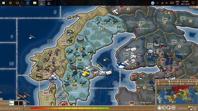
                                    @general_zod This was how I was seeing it...

                                    0_1516821264674_Proposed interface changes Draft 4.jpg

                                    0_1516821288005_Proposed interface changes Draft 5.jpg

                                    And as a comparison... the black shaded area is what is currently obscured.

                                    0_1516821648077_Proposed interface changes Draft 6 comparative.jpg

                                    "A joyous heart sours with the burden of expectation"
                                    Hepster

                                    1 Reply Last reply Reply Quote 2
                                    • HeppsH Offline
                                      Hepps Moderators @redrum
                                      last edited by Hepps

                                      @redrum said in Taking your suggestions for a new UI:

                                      @hepps Can I have your children?

                                      Not sure on the whole consumable bar concept though...

                                      I realize that the consume bar is not a widely conceptualized idea at this point.... simply because resource consumption as part of the movement process is in so few games currently. But this is, at least in part, due to a series of inter-related factors...

                                      1. Few games have it within the game because...

                                      2. the few games which include it have not been worked on/refined to improve its implementation within the game because...

                                      3. The lack of an easy way to track (visually) what you are "burning" through during moves... makes the games that have it included frustrating from a resource management perspective.... making it an undesirable feature (self fulfilling prophecy) which will all but guarantee...

                                      4. Without developing a mechanism (Which under how I have proposed it, would create no additional clutter for games that do not have it) there is little to absolutely no chance of creating a game with fuel/consumption/maintenance integrated successfully.

                                      "A joyous heart sours with the burden of expectation"
                                      Hepster

                                      1 Reply Last reply Reply Quote 1
                                      • HeppsH Offline
                                        Hepps Moderators @General_Zod
                                        last edited by Hepps

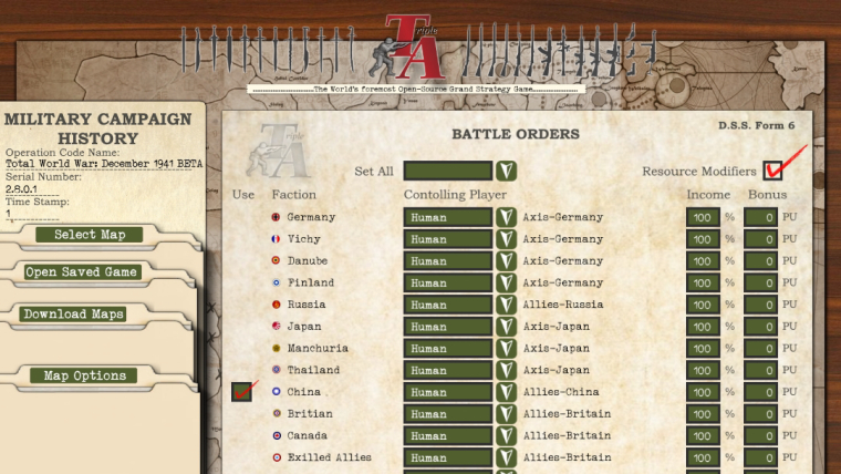
                                        @general_zod said in Taking your suggestions for a new UI:

                                        @Hepps

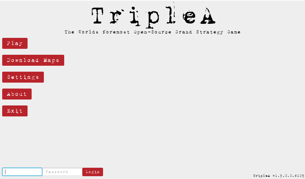
                                        Also wondering, if the "Select Map", "Open Saved Game", "Download Maps" and "Map Options" buttons will be located somewhere else?

                                        Actually all the information on that window is useful, would like to see the info in top left remain somewhere.

                                        Sorry Zod I think I missed a bit of your comment here. Yes since this game launch screen is such a huge part of the game interface.... I am striving to change as little as possible other than the appearance.

                                        Here is a mock up of the entire screen...
                                        0_1516833547845_Game Launch full page view.jpg

                                        "A joyous heart sours with the burden of expectation"
                                        Hepster

                                        General_ZodG alkexrA 2 Replies Last reply Reply Quote 0
                                        • General_ZodG Offline
                                          General_Zod Moderators @Hepps
                                          last edited by

                                          @hepps

                                          Cool, yeah as the menu goes. I agree, we should keep all the functionality and information that the current version has, intact.

                                          It's coming together nicely.

                                          I must admit the in-game interface is much more exciting. Hopefully that project comes to fruition as well.

                                          HeppsH 1 Reply Last reply Reply Quote 1
                                          • HeppsH Offline
                                            Hepps Moderators @General_Zod
                                            last edited by

                                            @general_zod Agree the prospect of finally giving the in-game interface a face lift really puts a cucumber in my pants...

                                            Is it obvious I might have had some materials ready to go for that at the mere mention of it? 😃

                                            "A joyous heart sours with the burden of expectation"
                                            Hepster

                                            General_ZodG redrumR 2 Replies Last reply Reply Quote 0

                                            Hello! It looks like you're interested in this conversation, but you don't have an account yet.

                                            Getting fed up of having to scroll through the same posts each visit? When you register for an account, you'll always come back to exactly where you were before, and choose to be notified of new replies (either via email, or push notification). You'll also be able to save bookmarks and upvote posts to show your appreciation to other community members.

                                            With your input, this post could be even better 💗

                                            Register Login
                                            • 1
                                            • 2
                                            • 6
                                            • 7
                                            • 8
                                            • 9
                                            • 10
                                            • 9 / 10
                                            • First post
                                              Last post
                                            Copyright © 2016-2018 TripleA-Devs | Powered by NodeBB Forums