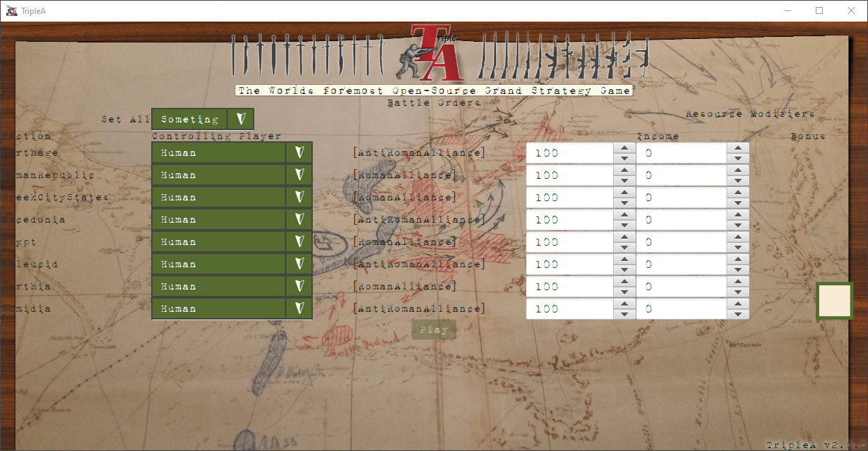
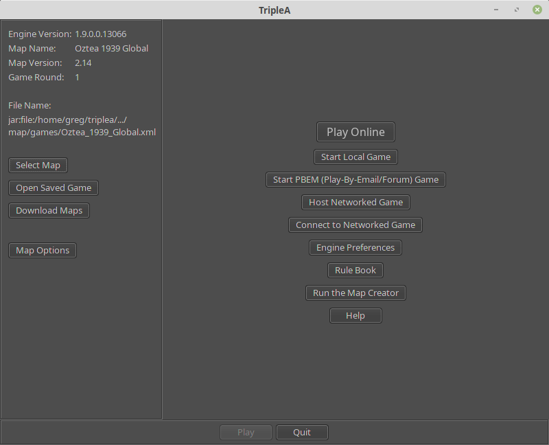
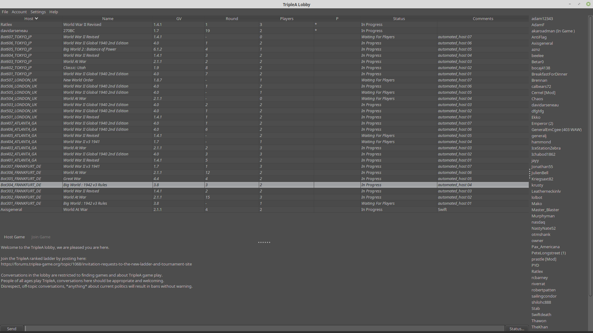
Taking your suggestions for a new UI
-
WIP

-
@RoiEX
The black print is very hard to read, and is impossible where it bleeds over into the brown border. You said you were using a WYSIWYG? Which one and is it a free download?Design is not my forte, but I could give it a try.
Cheers...
-
@wc_sumpton The Text colour etc. are obviously not final, just wanted to let you know that I started working on it again.
Also alignments are not correct yet, that needs to be fixed as well.However I'd appreciate if someone would try their skills to create a template: https://gluonhq.com/products/scene-builder/#download
It's not 100% WYSIWYG because styling is done via CSS, but almost everything else is.
If you want to give it a try, I can PM you the details on how to set yourself up. -
@RoiEX Yeah, of course, in the moment you give an artistic look, it is hard to keep it generic. I question the point of having swords on the left, in the moment the look is totally XX century, otherwise (contemporary style map and typewriting).
-
@RoiEX Maybe having the TripleA version on bottom right as "TripleA v2.0 (0)" instead of "TripleA v2.0.0", since the last digit is actually not really part of the version, but jus the development number (like, now it would be 17343, right?), that is not zeroed when the previous ones are increased (as it should happen with proper versioning)?
So, practically, I think it would make more sense as "2.0 (17343)" instead of "2.0.17343". -
@Cernel The version string is just pasted there, it's the same like everywhere else.
I mean we could change that, but it really would make stuff more confusing -
This is Awesome ! I remember when Roi said he was gonna start on it. Must be 2 years ago by now. I can only imagine all the work you've put in on this. Thanks for going Big

Having triplea look all bad ass with colors and stuff is probably 90% important at this point. Imo. That and advertising, which go hand in hand.
 Always gotta keep cranking on the code and stuff obviously, but it's a visual world for most. The new 1942 game on steam is still in development and I wish them well, their stuff looks way cool. Triplea got the rules better but they got the looks : )
Oh yea, bigger font in w/e is decided would be way cool. It all seems a bit small to me
 The Homepage could use a boost too
Thanks again Roi
-
-
I can only imagine all the work you've put in on this.
Unfortunately not that much, because this kind of work is really time consuming. It's mainly the christmas holidays that allowed me to work on this. A lot of "trying if this works" is involved.
However I think I found a way to keep me motivated to work on this for an hour a day, so I should be able to continue on this slowly but steadily after the holidays.
Maybe we'll be able to launch a local game using the "new" UI in a month already. Of course then we'd still need Lobby, Network Games, PbF, PbEM etc. but it's a start.
If you want you can check out the "new" map selection screen, just go into your engine preferences, enable the JavaFX UI in the testing section and navigate to "local game". Note that you'll have to restart your game for those changes to take effect.
In order to get back do the same thing, but inside the JavaFX client.
This is obviously still a prototype, but I think it looks better than the current one already. -
@beelee Also stuff like font and colours is probably the easiest thing to change there.
Thanks to the CSS support, we can just create a single rule that would apply to all text everywhere if we think something is too small or too big. -
@Cernel Note that the "general background" had been there for quite some time now.
Most stuff is based off @Hepps' design and concept art, so if you think some icon or image should be something different discuss it with the community.
Once the basics work for once, it's easy to change individual layouts.
I hope that it'll get to a point where the wiring in the background is done in such a way that for most changes we don't even need to touch the real code.
This way I could create a guide for everyone interested in enhancing the layout without coding knowledge, so they can play around with the design and propose changes themselves -
In terms of creative, we may wish to work on a few things:
- what color palettes will the game use?
- which fonts will be used and where?
- what should the general them of the UI be?
My 2 cents:
- the current fonts seem overly difficult to read. The title font on webpage is used in one place, IMO we can get away with that, but using the same (and arguably not easy to read) font on all landing screens seems sub-optimal.
- the general UI them IMO should be more "board game" and less "WWII". I'd rather see for example 3d looking unit pieces (tank/bomber/inf) in places of the swords and guns. For one, TripleA is not just a WWII game, second, and whenever I mention TripleA to others, I say one of the best things it has done is to recreate a true-to-board-game feel. IMO the board-game feel, multiplayer and variety of maps are the strengths of TripleA.
Second consideration, as we do not yet plan to convert the game-play UI itself to use the same styling, we should probably also think how to make the launch screens styling blend somewhat well to the game itself. A highly stylized UI and then landing to a swing UI could possibly be too much contrast and make both look out of place (and maybe would be just too jarring of a transition)
-
A highly stylized UI and then landing to a swing UI could possibly be too much contrast and make both look out of place (and maybe would be just too jarring of a transition)
It's funny you say that at work we had to re-do the login mechanism for an important web app used by "customers" because of security and other considerations.
So we got a new HTML template from marketing, but the "real" website behind the login mask still looks like it was made more than a decade ago (which it probably is).
So users get this shiny new login page, and then time travel back 10 years after clicking login ^^
It's funny, but it really isn't a big deal, you get used to it really fast.I'm concerned that if we don't try to get to a point of "dual UI", we'll continue to develop new UIs using swing potentially faster than we can migrate everything which will inevitably slow down this process even further.
what color palettes will the game use?
Good question. I think we had a discussion like this before. For now I've settled on a tan/olivegreen look as suggested by @Hepps
So far I've managed to keep colour definitions in the CSS IIRC, so changing colour palettes is a simple find and replace if we want to change style (I mean we could potentially even allow custom themes, but as of now I wouldn't recommend it given the weirdness of current LookAndFeels)which fonts will be used and where?
I took a "course" in visual design a while back and I now feel a little bit more confident judging font styles. We can use any font in the
.ttfformat and change the default size, it's a little bit more complicated than changing colours but it's still a matter of less than 1 hour to change this.what should the general them of the UI be?
I think this question is hard to impossible to answer. I think a lot of people have different opinions regarding this topic and I don't think theres one theme to make everyone happy.
So I thnk the primary goal should be to get a "good looking" modern UI going and discuss the details once we have a working prototype. As mentioned by me many times now, once the general template is there I can probably teach everyone in this forum on how to play around with the values so they can try out their own designs and suggest them to the general community. This way I can spend my time writing code and the jury aka the community can discuss details over the UI. -
I am willing to design anything, but I will only do so if some kind of consensus is reached before starting work again from scratch.
The initial designs were done based on conversations that Triple A was designed primarily as a WWII game platform based on the 99.9% of games designed and played. Therefore the primary design theme was done to create a look & feel that pays homage to that heritage. It is also the same reason the redesigned logo was kept as a stylized upgrade of the original.
Do we have other types of games? Yes.
Can we design ONE UI that caters to everything? Sure.
Will that design end up being very generic and not reflective of the community spirit? Most certainly. It can be pretty... but not much more than that.I don't really care at this point as each time something is suggested everyone wants something different and the initiative just stalls and goes by the wayside. We have been having this discussion for 3 years or more and are right back to the starting point once again.
Find a direction and I will be happy to help.
-
@RoiEX I'm less concerned about how easy it is to change styles/fonts vs setting a guide and defining specific color pallettes to use. We do not want dev's to be deciding on each screen/component which colors/fonts to use. The colors of green, etc should probably be fairly well defined (even if just temporary and changed later).
IE: create a style guide, eg:
- https://www.toptal.com/designers/ui/ui-styleguide-better-ux
- https://bashooka.com/inspiration/40-great-examples-of-ui-style-guides/
As part of that style guide, IMO we would do well to bake in and define a 'board game' theme, so we have cohesive game elements. To that extent, eg: I'd want to see 3d game pieces on the launching screen to give the feel that I'm about to play a board game (in contrast to a RTS).
we'll continue to develop new UIs using swing potentially faster than we can migrate everything which will inevitably slow down this process even further.
I suspect we'll want to create a project issues/discussion to refine the strategy. I'm okay with the launch screen migrating to JavaFX. For all UI's, I've some concerns:
-
how feasible is this? We have years of technical debt, let alone splitting all logic from swing. This could be a 2-5 year project. Is it worth it? Is there a larger migration strategy? Arguably the loading screens a much smaller lift then the rest of the game.
-
what is the proof of concept for dynamic JavaFX UI components? Being able to create UI components programmatically is important. I don't think we'd want much to any FXML for the game proper.
I think this question is hard to impossible to answer. I think a lot of people have different opinions regarding this topic and I don't think theres one theme to make everyone happy.
That is part of the point I think. The alternative is a hodge and the game will not feel or look consistent. Right now I feel like we are moving more towards a RTS game-style theme than a grand-strategy board game. Beyond "good looking", we probably should define the goal of the UI. I'd suggest we should emphasive the board-game aspect of TripleA, as noted, IMO the board-game feel is one of the strongest value propositions of TripleA.
@Hepps: "Find a direction and I will be happy to help."
I think it's time we finally formalized and defined the UI direction, which essentially is coming up with some high level UX guidelines that will guide how we build the UI.
-
how feasible is this? We have years of technical debt, let alone splitting all logic from swing. This could be a 2-5 year project. Is it worth it? Is there a larger migration strategy? Arguably the loading screens a much smaller lift then the rest of the game.
The general launch and other "utility"/navigation screens are probably the easiest things to migrate because they can easily get rebuilt from scratch in comparison to the other stuff.
The main game rendering is going to be a challenge though. We can't easily re-use existing logic, because JavaFX requires an approach, that's a little bit more object-oriented. I have a high-level concept that makes use of this really nicely by turning all of the elements on the screen into literal objects with on click listeners so that we don't need to implement this logic on our own anymore.
what is the proof of concept for dynamic JavaFX UI components? Being able to create UI components programmatically is important. I don't think we'd want much to any FXML for the game proper.
Currently working on the launch screen, which is mostly dynamic. Using FXMLs only expresses java code in a different format and keeps the code shorter, so you can view an FXML as a more complex Node where only the assigned controller can access the inner nodes directly. Like any other Node you can embed it somewhere, or embed other nodes in it.
The only thing to keep in mind is that the current system is only prepared for singleton-like nodes, so if we wanted to use a node multiple times, we'd have to extend the current loading mechanism a bit. -
can't find the UI Roi is working on so, anyway...can we have the army guy be a little cleaner on his outside lines ? They're kinda blurry. Also it's been mentioned before that the font needs to be larger on the Home page. The reply is always it's real easy to do but it's never happened.
This is probably a nodebb thingy but it'd be nice if you could search topics by date. Maybe you can ? I couldn't figure it out if so.
Thanks -
@beelee I moved this post to the pertinent thread.
Probably you couldn't find it because it was in Announcements, while you were searching for it in Feature Requests & Ideas.
Whether or not this subsection is the best one for this thread, I guess it is for @RoiEX to decide.
I'd personally have in Announcements things once they are relatively soon to come in the next stable only.
-
This post is deleted! -
Any interest in playing not on a flat square but on a three dimensional sphere?

