Fuel Enhancements


-
So on to fuel flat costs... Here is an example of what I'm proposing for the new XML parameter (fuelFlatCost):
	<attachment name="unitAttachment" attachTo="fighter" javaClass="games.strategy.triplea.attatchments.UnitAttachment" type="unitType">
		<option name="movement" value="4"/>
		<option name="carrierCost" value="1"/>
		<option name="isAir" value="true"/>
		<option name="attack" value="3"/>
		<option name="defense" value="4"/>
                <option name="fuelcost" value="oil" count="1"/>
		<option name="fuelFlatCost" value="oil" count="2"/>
                <option name="fuelFlatCost" value="pilots" count="1"/>
	</attachment>
This would mean a fighter pays 2 oil & 1 pilot if it moves at all plus 1 oil per each move. So if it moved a total of 3 then it would pay 5 oil and 1 pilot. The goal is to have both the existing per move fuel cost (fuelCost) and the new fuel flat cost (fuelFlatCost) work for all unit types and be able to be used in any combination.
TripleA Developer with a Passion for AI: https://forums.triplea-game.org/topic/105/ai-development-discussion-and-feedback
-
@redrum are oil reserves being added for future maps
")
If we open a quarrel between past and present, we shall find that we have lost the future! Sir Winston Churchill
-
@redrum storage tanks that can be bombed?
smells a Heppster in this scenario -
@prastle I sure hope so. Otherwise I'm adding features just for the fun of it
Actually I believe you could probably do some kind of bombing where when a structure is destroyed, you trigger loss of resources.
-
@redrum your both evil bastards
-
@redrum Looks great! Adding all these features just for the fun of it. What a champ!
")
-
-
@hepps its almost like you want all to ignore unless Tylenol scripts
-
@prastle Did you just volunteer to update POS2 XML?
-
@redrum NOPE! but with all your additions I really hope you did
-
Here is the PR adding the "fuelFlatCost" unit option: https://github.com/triplea-game/triplea/pull/3244
XML
    <attachment name="unitAttachment" attachTo="elite_cavalry" javaClass="games.strategy.triplea.attachments.UnitAttachment" type="unitType">
      <option name="consumesUnits" value="1:cavalry"/>
      <option name="movement" value="2"/>
      <option name="transportCost" value="3"/>
      <option name="canBlitz" value="true"/>
      <option name="requiresUnits" value="parade_ground"/>
      <option name="requiresUnits" value="general"/>
      <option name="createsResourcesList" value="-4:Supplies"/>
      <option name="fuelCost" value="Supplies" count="1"/>
      <option name="fuelFlatCost" value="Supplies" count="2"/>
      <option name="fuelFlatCost" value="Industry" count="1"/>
      <option name="canInvadeOnlyFrom" value="transport:train"/>
      <option name="createsResourcesList" value="-1:Manpower"/>
      <option name="attack" value="4"/>
      <option name="defense" value="3"/>
    </attachment>
Before
After
-
@redrum and you questioned why I said you were brilliant?
-
Nice update. I still hope that you would reconsider removing the ( and the ) signs. They just make the movement bar unnecessarily long, and not having them would be more consistent with how icons and numbers are displayed elsewhere.
I think that I will have to start work on Iron War and Iron War Europe movement fuel versions. Hopefully balanced versions of these can be ready alongside a new engine release
 Jubii! And they can make use of the hide resources from players feature!
 -
@frostion Yeah, I think you already saw but I updated the route message in the other forum thread already
And yeah, I definitely think Iron War can benefit from a lot of the recently added features. And could be the first map to ever implement fuel in a balanced and user friendly way!
-
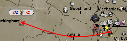
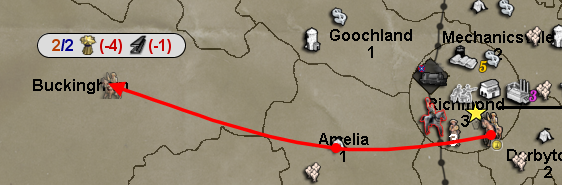
Thoughts on how carriers and fighters fuel costs should work? I think I see 2 options:
- Simple - If carriers and fighters are moved together during combat or non-combat move then only the carrier is charged fuel. This would include moving into combat and so a fighter moved with a carrier into combat wouldn't be charged fuelCost or fuelFlatCost.
- Noncombat Only - If carriers and fighters are moved together during non-combat move then only the carrier is charged fuel. Any moves during combat move are considered that the fighter has taken off from the initial carrier position so is always charged fuel during all combat moves.
There are other more complex variations of these that meet somewhere in the middle but I'm pretty hesitant to go there. Open to suggestions and ideas but want to pick something we feel works well across all maps and is fun/intuitive to use.
TripleA Developer with a Passion for AI: https://forums.triplea-game.org/topic/105/ai-development-discussion-and-feedback
-
- Simple has my vote. It seems logical and during game it would make sense if fuel was consumed on these terms. People would also see the carrier actually carrying fighters, not just acting as a landing strip at sea.
-
Choice 2 seems better to me. Choice 1 would only be logical if your making air units true cargo on the acc. But then you need handle issue where air units are being carried 2 sea zones while cargo during CM or NCM. Then the air units fly their full normal movement during CM or NC, in addition to the moves as cargo. Or maybe you have a solution already.
-
@redrum I tend to agree with @General_Zod here. Choice 2.
If you have a loaded transport, you only need to click on the transport to move it an its cargo. Moving the ac and fighter requires that both items are clicked on to move. I can see the point of not charging for a NCM where both ac and fighter start and end in the same territory. But any move during CM, which implies that both are going into battle, should charge both their movement resources. -
Deuce has my vote as well.
-
Well, given that I'd vote for option 2 as well, I'm going to move forward with that. In the future, if we get lots of maps that implement fuel adding different options around consumption should be fairly easy. Now the fun part, implementing it and making sure it works properly with both fuelCost and flatFuelCost.
Hello! It looks like you're interested in this conversation, but you don't have an account yet.
Getting fed up of having to scroll through the same posts each visit? When you register for an account, you'll always come back to exactly where you were before, and choose to be notified of new replies (either via email, or push notification). You'll also be able to save bookmarks and upvote posts to show your appreciation to other community members.
With your input, this post could be even better 💗
Register Login