Main Screen Logo Needed
-
@lafayette my suggestion is that we provide a poll regardless of the amount of time available since the swapping of that graphical element is a rather minor change technically.
there was a discussion on the merits of altering our brand but the discussion ended after i made my case.
even if we only get 5 votes on a 24-hour poll, which i would assume the low end of the expected range, it would better represent a community decision than one person at the top imposing their authority. the folks that did vote would obviously represent those most involved.
i suggest that we just make a post with the two alternatives @MirkoBruner and i can restate our cases there as concise replies and let the community decide whatever time limit you feel fits with your schedule. i do appreciate the fact that you represent our entire development resource pool at the moment.
")
also still not sure what "the updated website title" is in reference to exactly i'm not sure i ever expressed any opinion on that one.
-
@ubernaut open a thread, make it so.
-
@lafayette ok so start the post with just the start screen with both my and @MirkoBruner submissions then present my case first as a reply unless you prefer to go first @MirkoBruner .
i hope you understand this is not personal for me @MirkoBruner you obviously are a skilled designer, i do like your style i just don't agree that your treatment is an improvement over the existing thing.
-
@ubernaut Let the community decide isn't always the best choice to do.
If you want to make a poll, you must add all the alternative I have submitted and not only the two posted here. -
@ubernaut It is not personal but seems really personal. So many words wasted but mostly so much time wasted.
If my designs (again all of them, not only those two) don't improve anything over the existing things, yours take it back in time.You criticise without reason (i told you this already many months ago), it is just your personal taste. Should not be working like that. You should be able to state the whys the hows and what to do. Otherwise anyone can say anything about everything and this platform is useless.
Again, it doesn't work like that, the equation my design opinion weighs the same as the one of a plumber (on a logo matter) is a no no.You simply don't like that nobody mentioned your designs. That's it.
And please, stop adding the smiley faces at the end of every critic you do. It is really not necessary.Regards,
-
@mirkobruner said in Main Screen Logo Needed:
You criticise without reason (i told you this already many months ago), it is just your personal taste. Should not be working like that. You should be able to state the whys the hows and what to do.
um i stated my case after you made these statements before and gave my reasons you never responded here:
https://forums.triplea-game.org/post/44365
at no point do i reference my taste there but did refute the issues you raised in earlier posts to this thread
Again, it doesn't work like that, the equation my design opinion weighs the same as the one of a plumber (on a logo matter) is a no no.
talk about getting personal without reason, i have made a living a designer for over 20 years now but please go on about how things should work.

You simply don't like that nobody mentioned your designs. That's it.
so far the only ones expressing their opinions on this subject are you, me, Lafayette and @butterw who has expressed the exact sentiments i had and also received no counterargument here:
https://forums.triplea-game.org/post/50399
again this is not personal i add smilies because tone are often difficult to express in a text-only format.
If my designs (again all of them, not only those two)
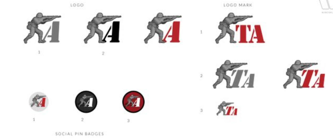
your logo treatments are all basically the same the only difference i see is that you are providing an option with and without a separate 't' and then with and without the circle backing even though i disagree that all of these should be considered rather than picking one you think is the best of your designs i will include your entire set of logo alternatives in my post.
Let the community decide isn't always the best choice to do.
this is how open source projects work there is no better way to decide when there are differing opinions. i will accept the verdict of the community i hope you would as well.
-
this is my proposed post. currently, i cant create a poll tho:
Post Title: Proposed Branding Change for TipleA Your Vote is Needed!
Post Content: there has been a discussion here about the home screen getting a visual upgrade:
https://forums.triplea-game.org/topic/2312/main-screen-logo-needed/
the discussion has turned into a discussion about the logo/icon for this app. the question is if we should change to one of several alternatives provided by @MirkoBruner :
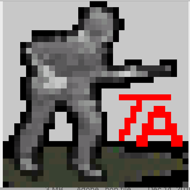
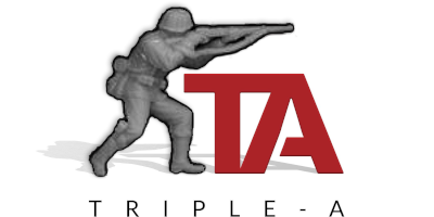
or stick with the version i did a number of years ago based on our original low res icon/logo

for reference and the folks that haven't been around long enough to remember the original it is this:
since we need a consensus here to move forward we would appreciate all of your replies and votes here.
Tanks!
-
This post is deleted! -
@ubernaut said in Main Screen Logo Needed:
since
So far consensus (organised by you the moderator) has been? 4 votes? Oh no 3 if we exclude yours. Is this serious?
-
@mirkobruner your paranoid conspiracy theory is baseless i have not organized anything and you're suggesting i should not get a vote?
i have tried to be welcoming and positive and stick strictly to the facts in our discussions about this topic as i know that people can be touchy when it comes to critique but honestly dude the way you keep trying to drag this discussion into the mud you are basically on my last nerve personally.
to borrow a phrase from you, maybe…
You simply don't like that nobody mentioned your designs. That's it.
-
@MirkoBruner , @ubernaut , please start working together and stop reading negative tone into everything the other says. Ya'll have built a house of cards here from a faulty basis. If you re-read from the start what the others have said, it's a bit clear that ya'll have been touchy and it got out of control from there. You both please need to be able to deliver more moderated constructive criticism and productive conversation for this to be net constructive. I don't want two talented designers fighting with each other and impeding your efforts and the efforts of others - it's not good for you, it's not good for the project.
-
I am put off from voting because of the agro, also Im not sure what the vote is.
I would like another thread with say images 1 to 5 numbered 1 to 5 for voting, so we vote for the one we like the best.
Please don't tell who's is who's as I don't want to know, as I have not followed this thread closely.
If we are voting for two images, then another thread please with numbered options.
-
Just gonna leave this here for @ubernaut and @MirkoBruner
https://www.youtube.com/watch?v=naleynXS7yo
Key & Peele - Text Message Confusion -
@lafayette @TheDog agreed, upon a return review of the entire thread it is clear to me at least, that there has been some unintended obfuscation and misunderstanding on both sides.
i think we are all looking for the same ultimate goal here so if we have to burn the existing vote and start over in a more agreeable fashion i have no objection. again i thought we were under the gun so that might have been a bit rushed.
-
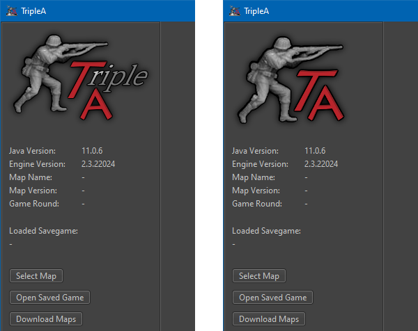
@lafayette what is the status of this are we going to fix the logo/start screen for 2.6? it still looks the same in the latest prerelease.
-
@ubernaut At this rate it's looking more like a 2.7 project.
-
@lafayette aren't more or less finished with the logo part tho? the current one we can all agree is not as good as and dilutes our existing branding right?
-
It is very hard (for me at least) even to understand, at this point, what is the full set of proposed changes each of which is either decided or pending. Can someone make a full but concise summary of the current state of everything on topic here, listing the new and old items for every decided or pending change?
-
@cernel I would Think that the issue is mostly just to get rid of the current horrible amateurish looking Trible A logo at the main screen, the one with cropped shadow. And proposals are just solutions to that problem. Wether this means finding/changing the TripleA logo completely or just "fixing" a single image is obviously a debate.
Personally I would say that changing the basic logo of TripleA is a bigger deal and should wait for a time when/if the game gets a real facelift, aka UI or engine upgrade.
But I also think that the current image is unprofessional looking and screams "this is an amateurish game" rigth in the face of newcomers. Thats why I yet again throw my proposal back in the hat. That is to just use @ubernaut old image in an outlined version:
Here are files to toy around with: TripleA-New-Logo.zip The above has shadows added.
Map maker of: Star Wars: Galactic War + Star Wars: Tatooine War + Caribbean Trade War + Dragon War + Age of Tribes + Star Trek: Dilithium War + Iron War + Iron War: Europe + Warcraft: War Heroes
-
@mirkobruner Whereas I conceptually prefer the version that is now in use, so I just suggest polishing it (as it clearly needs to be), I'm thinking the second version you made is certainly not bad and can make use of the icon provided by @ubernaut.
I mean something like this:
Hello! It looks like you're interested in this conversation, but you don't have an account yet.
Getting fed up of having to scroll through the same posts each visit? When you register for an account, you'll always come back to exactly where you were before, and choose to be notified of new replies (either via email, or push notification). You'll also be able to save bookmarks and upvote posts to show your appreciation to other community members.
With your input, this post could be even better 💗
Register Login