Color issue with Politics Panel aka Politics Screen
-
Hi Storhm
yea the new setup is kinda harsh. I think it's tied to the "Look and Feel" UI thing though, so can't tweak it like you can map colors.
@victoryfirst I guess going back to graphite the only solution ?
@lafayette Is there a negative to switching back to the old Look and Feel ? I do know the font had gotten quite smaller, which definitely would be one.
-
I remember this was already discussed anywhere, but I can't remember when and where....
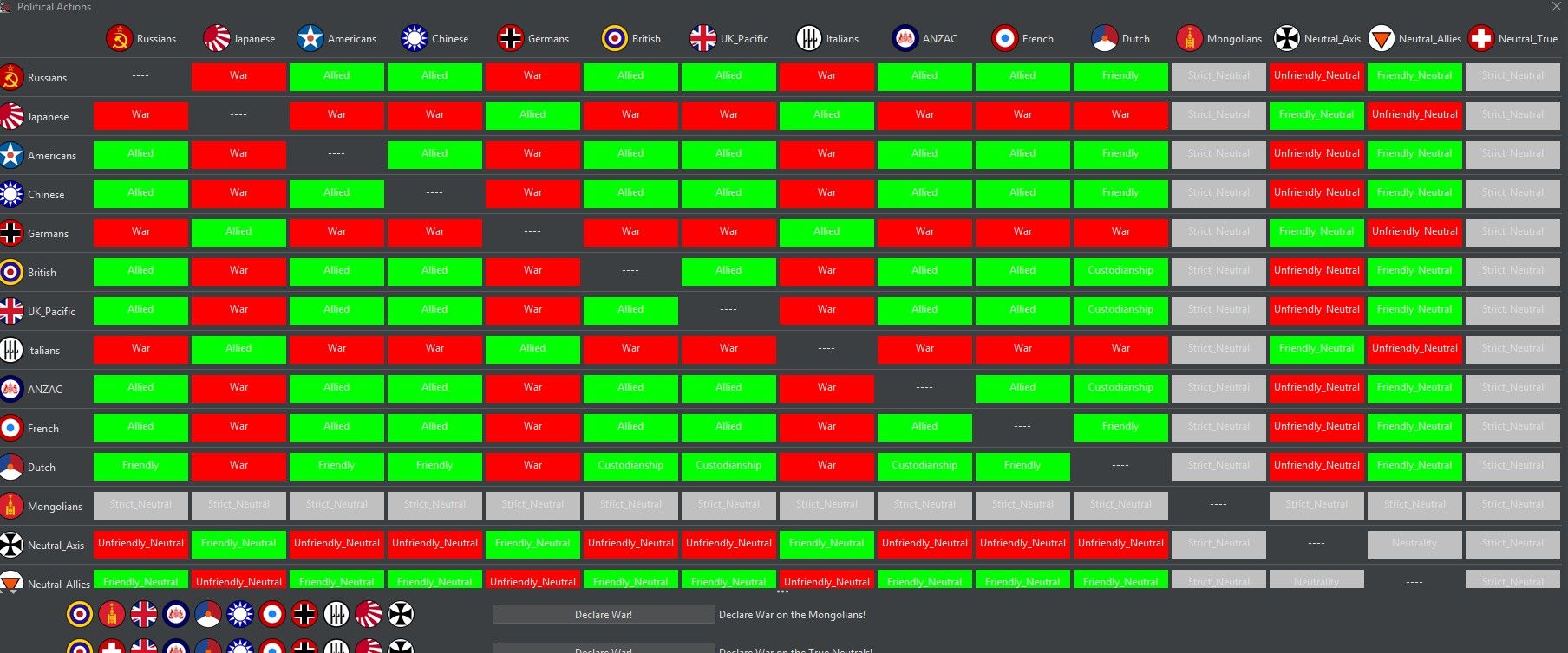
So, yes - these colors are "difficult".
-
yea I don't remember where but I do remember when . Right after the change

-
Just pick a darker Green and gray or change thetext to black or a dark shade of gray

-
or just use the update 15861
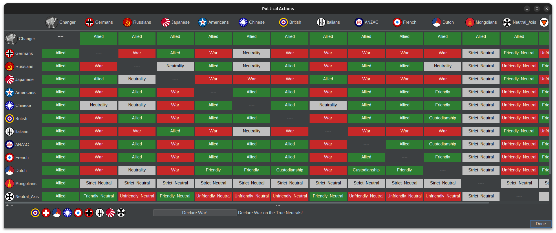
But yea I think they got it solved. One of the new guys. Can't remember which one
-
@beelee it was me

-
-
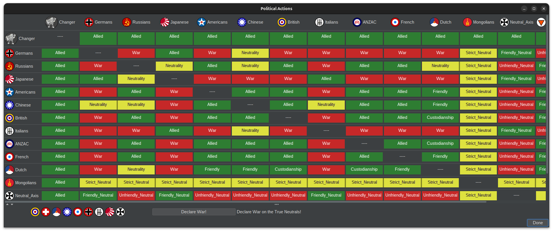
How about something like this instead (I'm not a developer.)?
-
You know my opinion on this
-
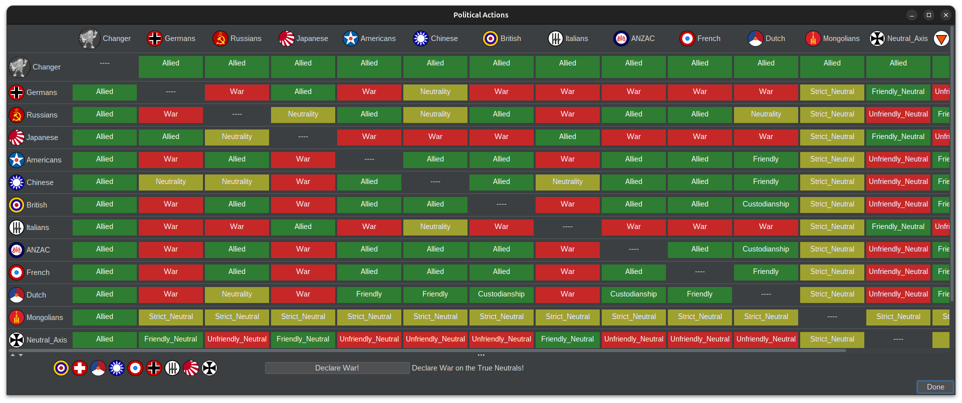
@xxXEddieXxx Actually, no. My previous proposal was more like this:
-
Thats perfect imo . I was thinking of what color to use for neutrality and I honestly couldnt think of a better one. Gray is better, but white text doesnt work for it unless very dark and the dark default color for TripleA is already dark gray. Changingit to blackbreakst the theme a bit.
-
Still not a fan of the yellow though. My main issue is that it grabs way too much attention. Neutral is basically the "nothing's happening here" state, but right now those cells are the loudest thing on the screen. When I open the panel I want to see who's at war and who's allied at a glance, and the yellow kind of drowns that out, especially since there are so many neutral cells.
-
@Ondis
The contrast is way below the minimum recommended for normal text (WCAG asks for 4.5:1, white on yellow doesn't come close).white on the yellow is about 2.8:1 (and 1.4:1 on the brighter one)
-
@xxXEddieXxx I dont know if we are doing accessibility based design here
My thought was to use dark blue but it just wont look good enough.
For color blind people this design choice will be just as bad/good as we've all had it for 10 + years which means workable.But it would always be nice if there was a button for colorblindness that flips what ever colorsare necessary to something with more contrast.
If we want it accessible we should go with belees option though, black on yellow with small text just doesnt look good. But black on light gray can work.



Hello! It looks like you're interested in this conversation, but you don't have an account yet.
Getting fed up of having to scroll through the same posts each visit? When you register for an account, you'll always come back to exactly where you were before, and choose to be notified of new replies (either via email, or push notification). You'll also be able to save bookmarks and upvote posts to show your appreciation to other community members.
With your input, this post could be even better 💗
Register Login