Darken Moved Units
-
@Hepps said in Darken Moved Units:
@Ondis Yup there are definitely a couple ways to go.
All I was doing was providing some input on what I had already dreamt up as it is along the same lines but from a different perspective. I recognize that my suggestions are not really the same idea as darkening moved units... but rather accentuating unmoved units or units with remaining movement.
As stated, just food for thought.
Hepps you're wonderful. I'm just direct due to some time restraints and to get a point across. Keep on the good work.
edit: My idea is the same. I Love your circles. Im just saying that we wouldn't need more than one circle in one color if we can't somehow make the colors adapt to the background and nearly solid black would probably be the best, if not nearly solid white then. Or an option to switch between the two.
-
I think this thread has been on the right track. The point of 'darkening' moved units is to accentuate visually which units can be moved. It is 'better' to highlight units that can be moved and then remove or change that highlight for moved units. Not only does that tell you which units you have moved, but which you can move as well.
I'm not sure how many remember the first time opening various new maps like Middle Earth or 270BC and then wondering "okay, it's my turn, where are my units??" It's fine once you learn the map, but for non-WWII it's not automatic to know where your country/territories are when starting.
-
@Ondis Not to worry... I wasn't offended in anyway. I was simply conveying what I had envisioned once upon a time.
I rarely have absolute beliefs that any one idea is the the only solution... and with an idea like this one... experimentation is often required to find the best solution.
-
This post is deleted! -
I was wondering, why can people see when a message has been deleted? i thought deleted messages would just disappear.
-
Just how nodeBB works I suppose. There's a "purge message" option to hard delete
-
-
@Captain-Crunch still dont know what you are talking about.

-
how do we mute posters
-
@Captain-Crunch said in Darken Moved Units:
(oops made troll Laugheyyette mad so he makes up a reason to delete my post since he hasto abuse and delete 4 or 5 times a day
Captain, you're dragging this thread off-topic. Trolling. I think 'laugheyyette' is kinda funny, but I don't know if you're joking. You're also making things up, your post is the first I've deleted in some time.
I'm afraid you're probably going to be banned soon as you can't seem to stop trolling. I'm banning you for one day here to think about it. If you come back and continue to troll, the ban will be permanent.
-
I just wanted to note that from what I have seen the moderators and admins of the TripleA forum are very tolerant. I have been in communities where poking fun at a staff member's username once is grounds for a temporary ban.
So congrats to the entire TripleA Forum staff for being patient.
Now I think it is time to get the conversation back on topic. I really like the halos Hepps created and I think they would be very useful in-game. I had major problems with the Total World War map because I was playing a game with twice the normal units and I was getting lost with movements.
-
@Greg-Anderson First, thanks for the compliment to the team. We really do try to be fair while maintaining a healthy environment.
But, and more importantly, I am already working on some new high-light graphics as time permits.
Stay tuned.
-
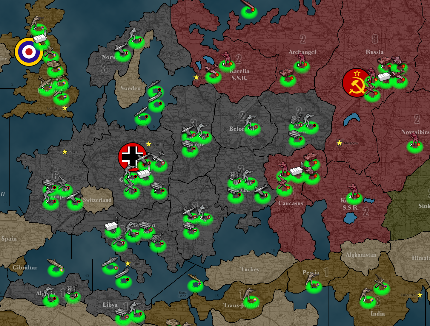
A really quick and dirty addition of the auro's looks like this:

It's a bit sad to see that the coordinates for units is not super consistent. The auro is nicely placed for most of the russian units, but really get skewed in the UK and for some of the navel. It might be something for the code to try and improve on, I think there might be a limit to how good it can get in terms of positioning. It's also noteworthy that a typical unit image is something like 42x42, but the actual unit image might be drawn at different locations or to different sizes within that box.
I might be able to get this too look better by trying to get the aura to be drawn at the exact center of the unit image box. We'll see how that works..
-
this is off-topic but I've never seen so dark of a map before hah!
Looks a lil bit in your face but could still be good for massive maps with too many units to keep track of.
How about slightly smaller glow?
And if you could be bothered, can you post it with a screenie of either black or white circles, the one of the two you liked the most.
-
@Ondis Yes. The size and intensity of the marker is a little over powering.
The spacing of the marker relative to the units should be ok with a slight re-design.
I will produce a new marker asap.
-
@Hepps @LaFayette maybe there needs to be a less highlighted version with the full highlight being reserved for a hover effect or something.

-
@ubernaut I am currently redesigning the highlight to be significantly less "in your face".
-
@LaFayette Question before I go too far in the design...
Is the GIF possible? Or should it just be a fixed image?
-
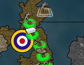
Here is a version 2 prototype...

I think if we were to have the marker matched to the center of the vertical axis of the unit image... and the top of the marker image aligned to the center of the Horizontal axis of the unit image... it would be near perfect for almost every unit.
-
@Hepps Since GIF allows only 0 or 1 on alpha, I think it would not be fit for the job, so it would be needed to support things like WebP or APNG (which would be great).
I still suggest not having a hue based system and, in this case, I would prefer if the aura have always the same hue defined for the player in map properties (the same hue as territory ownership) (kind of like Baldur's Gate Enhanced Edition).