Implementing UI Visual
-
Hello a Designer here, is there any way to collaborate and make a better platform UI speaking? I am available for anything.
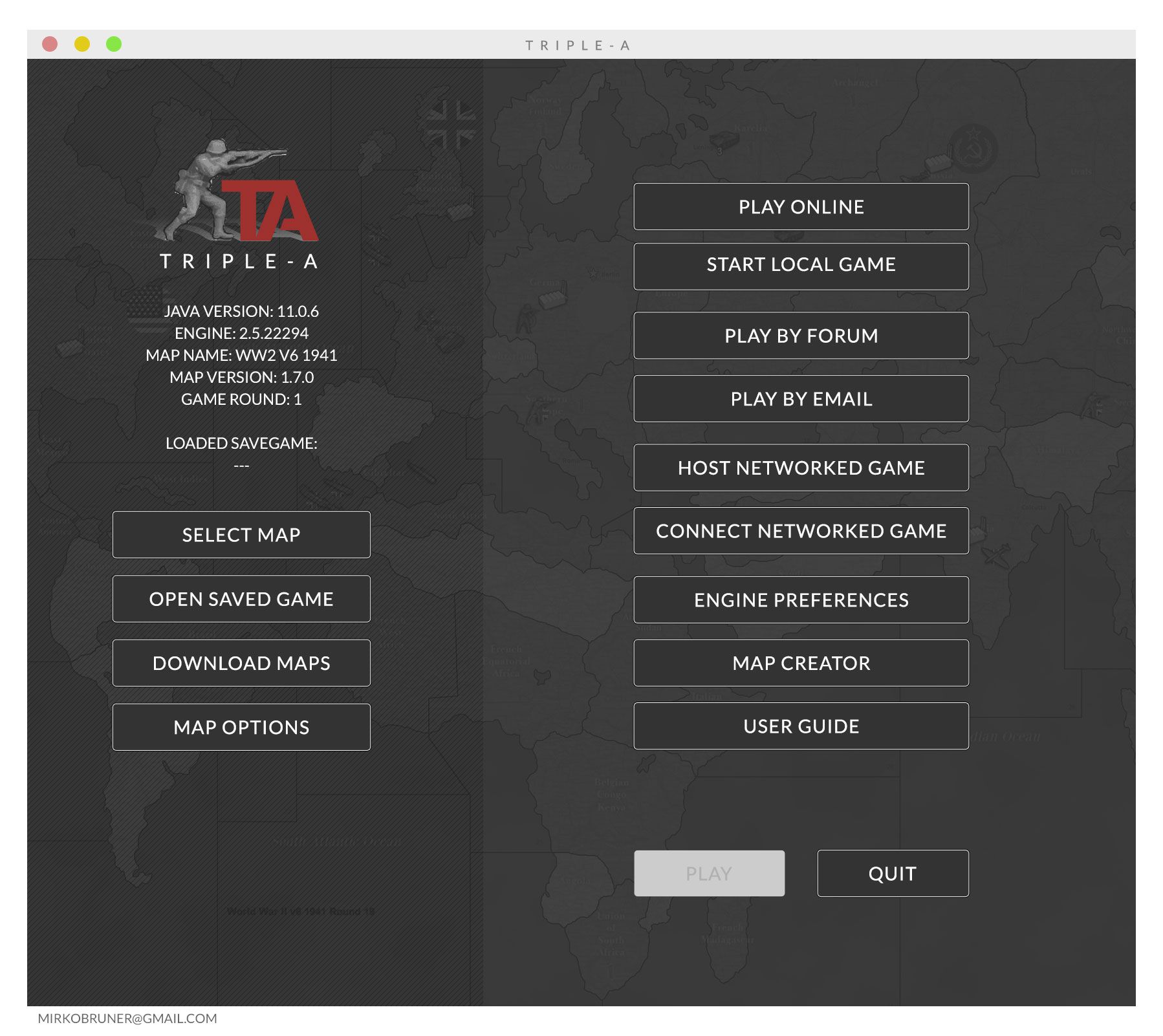
Regards!As an example I have quickly re-made the first screen of the platform.
Cheers.M.
-
Hi @MirkoBruner Welcome to the site. I think there's a couple people working on it. @ubernaut and @Zjelcop I think, maybe

I think @RoiEX was doing some stuff too but only from a functionality standpoint.
Then again, I could be wrong on all accounts
 I'd like to see some color added personally. Here's hoping you can make something happen.
 -
@MirkoBruner yeah the swastika is no bueno either.

-
@ubernaut I agree, but why it is not in a WW2 game? Bear in mind I am no Nazi, no Far Right no QAnon nothing. But playing a WW2 Game without Nazi Germany is like having a chocolate brownie with no chocolate.
Apart from that lets do some stuff if I can be of any help. I'd like to.
-
@MirkoBruner swaistika was not the roundel of german forces and there is no benefit to adding to it to a game only turns people off aside from any legal problems.
but yeah happy to collab.

-
@ubernaut said in Implementing UI Visual:
@MirkoBruner yeah the swastika is no bueno either.

yea I didn't even notice it. Looks like he was trying to slide it in. If you're gonna do it, do it in red and black instead of some subliminal bs
-
@MirkoBruner said in Implementing UI Visual:
... and make a better platform UI
Welcome to the forum.
What is wrong with the current one?
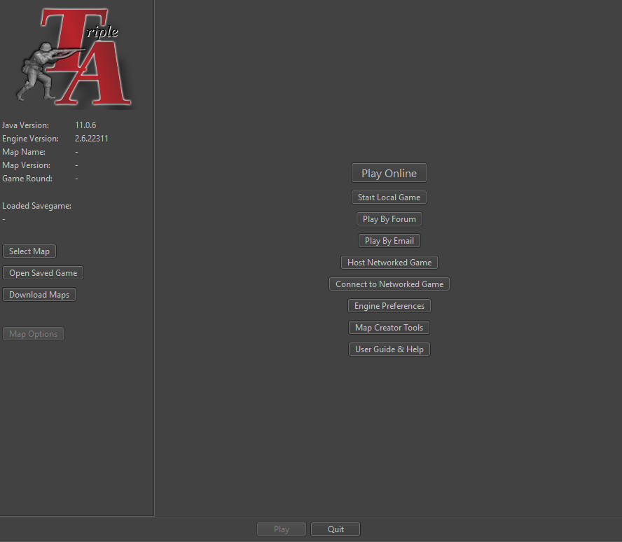
What do you consider being better?Personally I like the clear and straightforward look of the current one.
Actually I prefer it much over the overloaded bling-bling UIs that comparable games offer.
@MirkoBruner said in Implementing UI Visual:
I agree, but why it is not in a WW2 game? ... But playing a WW2 Game without Nazi Germany is like having a chocolate brownie with no chocolate.
Symbols like this are a clear "no" within this project (see https://forums.triplea-game.org/post/44113). Apart from the fact that it is forbidden in some countries.
-
@Panther nothing wrong but as a designer buttons could be implemented. The platform is good. The game is good. If you ask me about unity of design and UI i Say It could be implemented. If you look at the image I have linked I haven't done anything. Just put evenly buttons.
Regards.
-
@Panther just wondering why using hammer and sickle has never been issue in TripleA lik swastika when its also forbidden in some countries?
-
@Schulz Feel free to make it an issue.
-
@panther look at this, come on. I like the logo red. I don't want to disrupt anything here just to put some order. anyway I will do this project regardless because i have to study a new software and this is a good exercise for me and give me motivation. If anyone is intrigued we can have a conversation and improve the interface of the platform. There is some work to do. I Love Triple A.
https://ibb.co/HgQKFWm -
@Schulz My Observation is Purely Historical. The symbol was a representation of Nazi Germany. As the other flags represented the other countries.
Regards, -
@Panther said in Implementing UI Visual:
What do you consider being better?
Look how the same width of the buttons gives a bit of more of unity to the main screen: https://ibb.co/gy4HZWL
Just little fixes. -
@MirkoBruner Whatever. You know what that means
-
@MirkoBruner said in Implementing UI Visual:
@Panther said in Implementing UI Visual:
What do you consider being better?
Look how the same width of the buttons gives a bit of more of unity to the main screen: https://ibb.co/gy4HZWL
Just little fixes.I appreciate your efforts. However it is all a question of personal taste.
PersonallyI prefer dark colours and less contrast. I use a different scheme, that is ideal for my eyes:

... but I am sure you would have solutions for that, too.

-
@Panther you a developer? If so I trust you completely. But don't tell me that it is personal taste.

-
@Panther said in Implementing UI Visual:
u would have solutions for t
There you go Bud.
Readable very good. Regards.

-
Moving this thread to 'development' category
@MirkoBruner welcome!
Please have a look at this thread: https://forums.triplea-game.org/topic/2312/main-screen-logo-needed/23
-
@LaFayette @Panther @MirkoBruner i think if we arent not going to use the image style background we were talking about before the issue of light/dark mode should be a system call to use the OS preference some people like dark some people like light and some people like auto. calling the system setting is the only easy way to achieve auto.
-
@ubernaut Rightly so, it is not a matter of colours, as said colours are decided by the engine in the preferences. But an image in the background is too heavy and would render the text of the button unreadable. Stick to a solid colour!
Hello! It looks like you're interested in this conversation, but you don't have an account yet.
Getting fed up of having to scroll through the same posts each visit? When you register for an account, you'll always come back to exactly where you were before, and choose to be notified of new replies (either via email, or push notification). You'll also be able to save bookmarks and upvote posts to show your appreciation to other community members.
With your input, this post could be even better 💗
Register Login