Proposed Map: Domination 1941
-
@cernel Here is my not quite complete list of maps https://axisandallies.fandom.com/wiki/Category:TripleA_Maps.
TerraFirma is currently the largest playable map. It has some interesting ideas, but needs a lot of work to make it a good game.
-
@rogercooper said in Proposed Map: Domination 1941:
@cernel Here is my not quite complete list of maps https://axisandallies.fandom.com/wiki/Category:TripleA_Maps.
TerraFirma is currently the largest playable map. It has some interesting ideas, but needs a lot of work to make it a good game.
Great table! How have you collected all that data? Have you actually opened every single XML file and counted land and sea zones separately?
By the way, as I said, I believe you can correct two things in that list regarding Terra Firma.
- The zones are 1515, not 1155 (which is what your table says).
- Despite the fact that the folder name is "TerraFirma1939", the map is certainly not set in 1939. Albeit the fact that Albania is Italian implies a 1939 or later date (but I assume this is merely a mistake like the British Rhodes), the much more important fact that all of Czechoslovakia is not German implies a 1938 or before starting date and the Chinese ownerships imply a 1937 or before starting date. Also on the account that Ethiopia is fully Italian controlled, I'd say I'm almost sure this is a 1937 game.
Why a 1937 game has a folder called "TerraFirma1939"? Maybe it was initially intended to be 1939 and the map-maker never corrected the name of the folder.
-
Wow I'm having a hard time coming down from this. Super Impressive

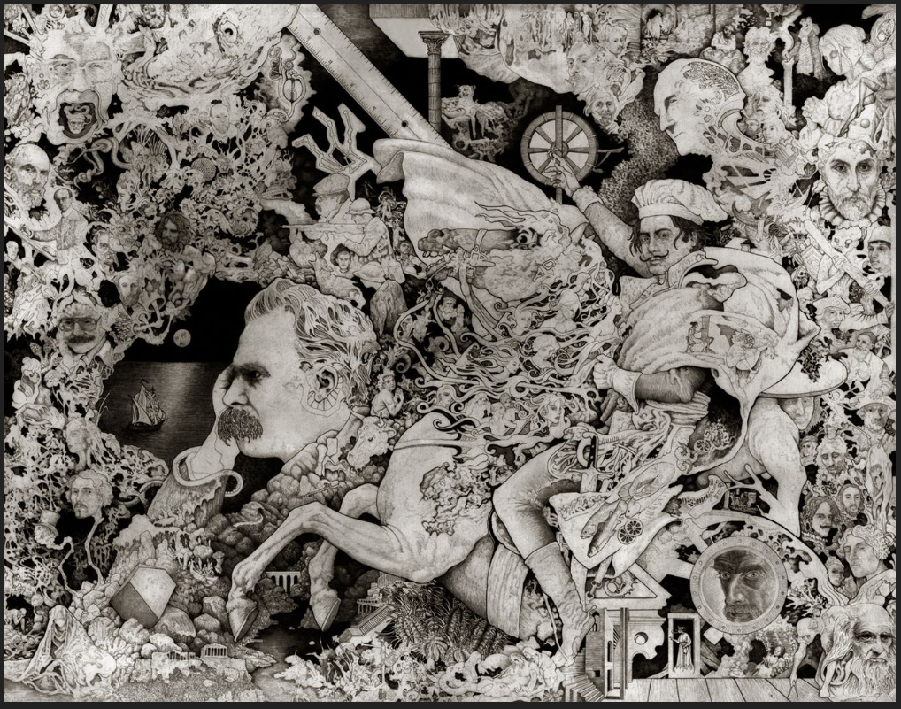
-
@Black_Elk
Is the dude riding the horse with a chefs hat, you?
-
@thedog said in Proposed Map: Domination 1941:
@Black_Elk
Is the dude riding the horse with a chefs hat, you?
ha hah good one ! I thought it was napolean or davinci lol


-
@beelee heheh it's Salvador Dali, riding David's Nightmare (from the famous painting of Napoleon). He's wearing the chefs hat, cause of that opening line in his memoir "The Secret Life" : "At age 6 I wanted to be a chef. At age 7 I wanted to be Napoleon!" hehe. Every face is master, they're all painters and draftsman, except for Nietzsche lol. I was pretty young, so it's a little sophomoric, but I still think it might be the best thing I ever drew hahah
OK so I just ponied up and posted my draft map design at A&A org...
https://www.axisandallies.org/forums/topic/39386/working-on-a-new-map-1940-41
I figure the gang there will probably hammer me with little to no mercy -on all the various points of accuracy and historical realism - so it seemed like a good stage for that, and to gather some constructive criticism.
I was a little reluctant to show it in this half complete state, since it's a WIP, but on the other hand, it's easier to fix stuff now, than if I wait until it's all totally dialed only to find out I goofed something major.
Fingers crossed! Hopefully they don't hate it with a burning passion lol. We'll see what they say, and then I'll bang it out next week, after it's had a few days to marinate. We'll gather sufficient critiques to move forward into the home stretch and then just dive headlong towards the finish line lol.
Best
Elk -
@cernel said in Proposed Map: Domination 1941:
@rogercooper said in Proposed Map: Domination 1941:
@cernel Here is my not quite complete list of maps https://axisandallies.fandom.com/wiki/Category:TripleA_Maps.
TerraFirma is currently the largest playable map. It has some interesting ideas, but needs a lot of work to make it a good game.
Great table! How have you collected all that data? Have you actually opened every single XML file and counted land and sea zones separately?
By the way, as I said, I believe you can correct two things in that list regarding Terra Firma.
- The zones are 1515, not 1155 (which is what your table says).
- Despite the fact that the folder name is "TerraFirma1939", the map is certainly not set in 1939. Albeit the fact that Albania is Italian implies a 1939 or later date (but I assume this is merely a mistake like the British Rhodes), the much more important fact that all of Czechoslovakia is not German implies a 1938 or before starting date and the Chinese ownerships imply a 1937 or before starting date. Also on the account that Ethiopia is fully Italian controlled, I'd say I'm almost sure this is a 1937 game.
Why a 1937 game has a folder called "TerraFirma1939"? Maybe it was initially intended to be 1939 and the map-maker never corrected the name of the folder.
Yes, I identified each unique map, opened the XML and counted the territories. I will fix the counts on TerraFirma.
-
OK so I think I found a solution I like for Eastern Europe...
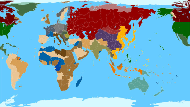
https://www.dropbox.com/s/yp6ulpzggsvnphw/TripleA_4k_baseline_G40_example.png?dl=0
Rather than shifting Moscow any further East, which I really didn't want to do, I instead I did a more vertical warp for this area. It runs a little counter to what's going on with Western Europe on the bend, but I think it still works.
Basically I got enough space from doing that for another dozen naval units in the Baltic SZ and a little more space for Norway, Baltic States and Leningrad too. I tried to make the area for sz 113 as large as I thought I could get away with too, before Scandinavia started looking too goofy. The space for sz 113 should be about 3 times as large as the current Global map now.
For the Belo to Arch conundrum, I got it set up so that the TT called Archangel OOB is essentially everything from Arch to include Tver and everything between, and then Belo includes the southern portion of Pskov, just to get the connection to land right. It's a little stretchy, but I think it works alright with the surrounding tiles reshaped a bit. Also shifted Romania a little was well and the pripet marshes zone, to bring it all back in relative alignment. Let me know if that works alright for you guys! hehe
Best Elk
-
@black_elk said in Proposed Map: Domination 1941:
The space for sz 113 should be about 3 times as large as the current Global map now.


-
Here is the all black lines view again for the subdivisions, with the new adjustments, just to see how it might read.
https://www.dropbox.com/s/cfbiii4lb6ql261/TripleA_4k_baseline_G40_example_flags.png?dl=0
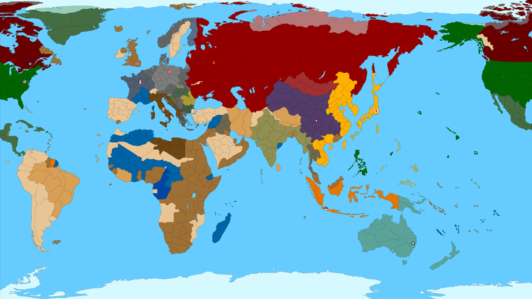
ps. And below is the 16000px map showing only the standard G40 divisions in a 3 color bitmap. Arctic ice sheet blanked back to blue there, just for the quick read, since it kinda needs to be in full color for the ice thing to look alright, in white it just makes Greenland and Canada etc look kinda funny heheh. Navy blue made that arctic line somewhat less noticeable. I'm a light blue Classic man myself, (I wish we could control the sz color preference in the mapview tab, or in the map properties to edit that as Hex like everything else, though that color choice is still kinda hardcoded into the baseline for Sea Zones I think right?) but anyhow, just for variety, thought I'd do it like that in dark blue for a sec. We'd just paintbucket back to white up there in the arctic when the time comes to run it through the utilities.
https://www.dropbox.com/s/dcrluqe7axymdm7/TripleA_4k_baseline_G40_example_navy.png?dl=0
Preview
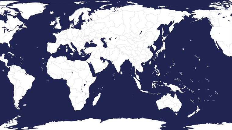
Here's a quick vector pull
https://www.dropbox.com/s/ehcnfkr28llq8gg/TripleA_4k_G40_vector.svg?dl=0
I'll let it ride for a few nights before giving it another pass. Catch ya in a few
-
@black_elk
This might help, in Inkscape with your map loaded
File> Document Properties> Click the Resize to content: button
This will put a white paper background under your map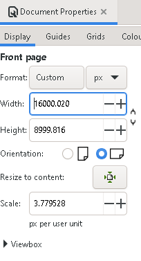
-
@thedog Haha thanks dude! I was wondering what the hell was going on there lol. Here I updated the save in the dropbox file.
https://www.dropbox.com/s/ehcnfkr28llq8gg/TripleA_4k_G40_vector.svg?dl=0
Does that look right?
Then just trace bitmap from that right, at the desired width px? I had it clicked for anti-aliasing off, but like if one wanted something upscaled or downscaled, they could just have it draw the border at 1 px from here right, using some curves to punch it up after? Feel free to play around if you got ideas for sprucing it up svg. This is glorious! I'm stoked off playing around with it!
You guys think the TT borders are working for the G40 divisions, enough room going down for standard play I'd think right? Or do we need to beef anything else up there?
Right now I'm just chasing down some rogue floating pixels from where I redrew the borders. I'll show you guys where I'm at for the working one. Basically I got the land Gray in that one. Made it easier for me to see where the line slipped to 2 pixels in a couple spots. But I think it's basically dialed for G40 here, unless I missed something, or you guys want to change the TT shapes further.
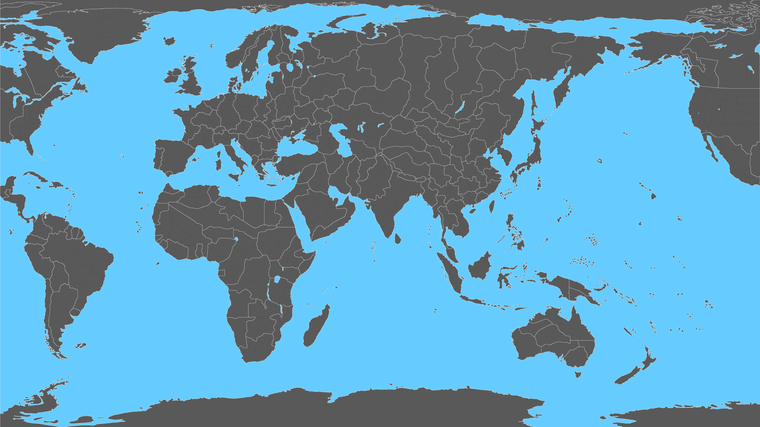
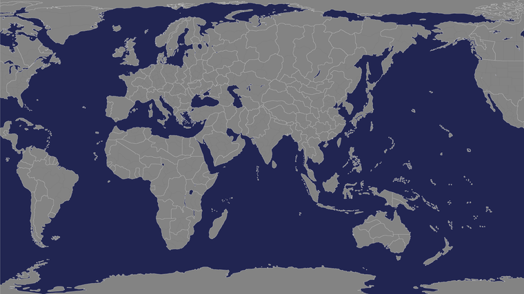
I posted those at A&A org to try and drum up some interest in the whole idea. Now would prob be a good time to start thinking about sea zones I guess, since we're just about there I think right?
For SZ I was thinking maybe we start with G40 and then just start splitting the tiles in 2. Like there are some areas, like the Baltic where it'd be better not to cut it too close in coastal zones, whereas in the large areas we could try to get something going for convoys and the more cat and mouse chase maybe? Not sure I haven't really put a ton of thought into how the Global naval game be dialed into high gear with the map design there, or at least not as much thought as the ground game. But I bet it would help to figure out how we want to do with the land divisions to start blocking in the sz.
-
OK so I want to make a shot call here on the Sea Zone geometry, but I want to explain the rationale too.
First I think we should try to design the G40 sz divisions in a way that avoids angles, at least wherever possible. The reason is two-fold, because angles tend up/downscale poorly in tripleA (they'll be the first lines to disappear), but also because of the unit housing aspect. If unit's have to break across a 45% angle for example, there is more likely to be clipping in the centers. So that's my thought there. If we can get away with it, to try and avoid any angles, and simply use boxes, like rectangles, L, and Gamma for the tiles.
In some respects this perhaps not as interesting graphically/design-wise as a map with SZ tiles that uses angles, but functionally we'll be better off probably the way the game works.
I think we can still try to achieve something cool looking though. With some scale and splitting in thirds or things like that.
Or an alternative would be to have one side of the board Atlantic be more straight angles, and the Pacific side including some right angles, since that's more traditional on the Pacific side of the map. Also almost necessary there, with spaces like Malaya/Sumatra and whatnot. So when we get over there we can revaluate. I tried to confine it just to that one spot that really seemed to benefit which was the Baltic corresponding to sz 114. Also just like circles on land, angles and circles can be added later pretty easily once stuff is blocked in.
So anyway, that's what I'm thinking, but wanted to see if others would sign off on the gameplan before I get too far along.
https://www.dropbox.com/s/6wdj4i1rcka8y99/TripleA_4k_baseline_G40_subdivisions_sz.png?dl=0

-
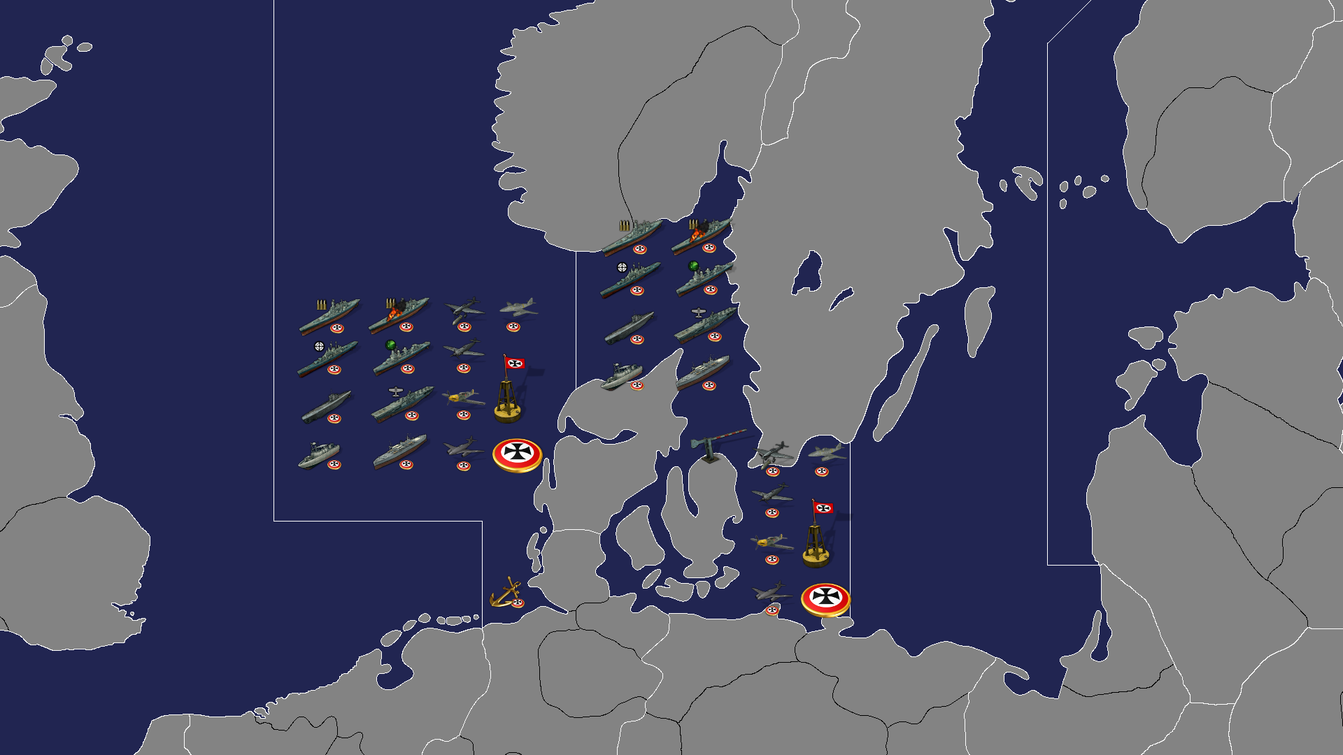
Here is a quick detail with some example units, just give a sense of the scale.
I think we could easily develop a more advanced naval game with extra convoys or more sz divisions at the subdivided level. Perhaps not for sz 113 hehe, but you know, some of the other spots around the gameboard. You could fit some pretty large fleets I'd think at 16000.
-
@black_elk like the frontier crossing lol That Frostion ?
-
Yeah he's got some cool different angles on it too! I just got your note, I'm rethinking the angles now for sure. I think if I follow just a couple smaller ones like you mentioned for sz110 and 95 more traditional. Then up in the top of the baltic, we run the line into Sweden and maybe that would be a zone were one could fit a smaller division, if they wanted to add another sz subdivision or convoy lane or whatever. I think as long as the angles arent' too severe it looks ok, like if I can keep it at 45 degrees and not too long it should work in most spots. I think as long as we get enough space for units should be gravy hopefully. This is kinda coming along. Maybe we'll have it done by Xmas if not Turkey day lol. All those ships are at like 72 px wide I think.
I wasn't sure about the Convoy or Anchor or that hockey puck roundel, as maybe working for sz related stuff, but I think we got space. I forgot the damaged carrier lol, but you can see we can surely fit him in there too and prob some Italian fighters without having to break too much of a sweat haha. The invading Allies might spill into the Sweden or adjacent tiles if they're piling on with units, but even there we got a good amount of space to work with I think.
Puzzling out the Domination stuff could take longer, but at least for the standard or expansion G40 type scale, off to a pretty good start I'd say.
-
The Allies weren't about to let that German naval grandstanding go unanswered! lol
And we won't go home - till it's over - over there!
Anyhow, just to give a quickie impression haha. Catch ya next round
lol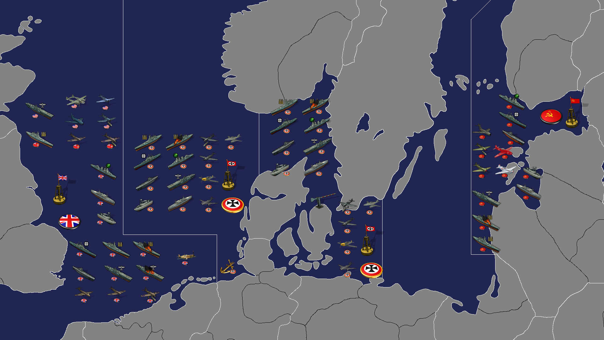
-
Ok so how do you feel about something like this for the North Atlantic/Med?
I tried to prioritize the zones where units end up, or where they stack together, so basically larger sz tiles at the starts and the endpoints, and not so much in the transits. You know like for sz 109, 119, 111, 105 etc. Even if all the sea zones are pretty sufficient in scale, I think it's gotta be better that way for the fleets right?
https://www.dropbox.com/s/6wdj4i1rcka8y99/TripleA_4k_baseline_G40_subdivisions_sz.png?dl=0
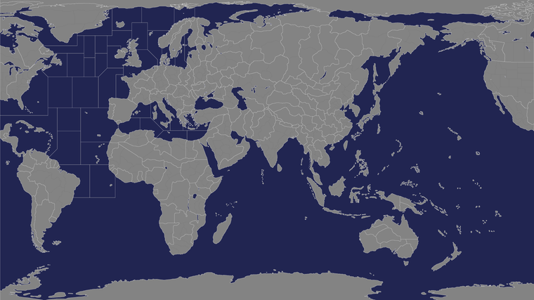
Anyhow we got the basic blocking I think. I reconsidered the angle thing. Fidelity to the board is board is probably better for those tiles, just so it's a bit more familiar. If the sz are given some subdivisions like the land TTs, then those could probably be made more consistent once the G40 tiles are laid down.
Here's a detail showing the naval units, just to give a sense of how many can comfortably fit around England and in the Channel.
Even with the angled sz border, they fit with room to spare, so I'm not too worried. As long as the angles are 45 degree the rescale from 3 pixels will still look good.
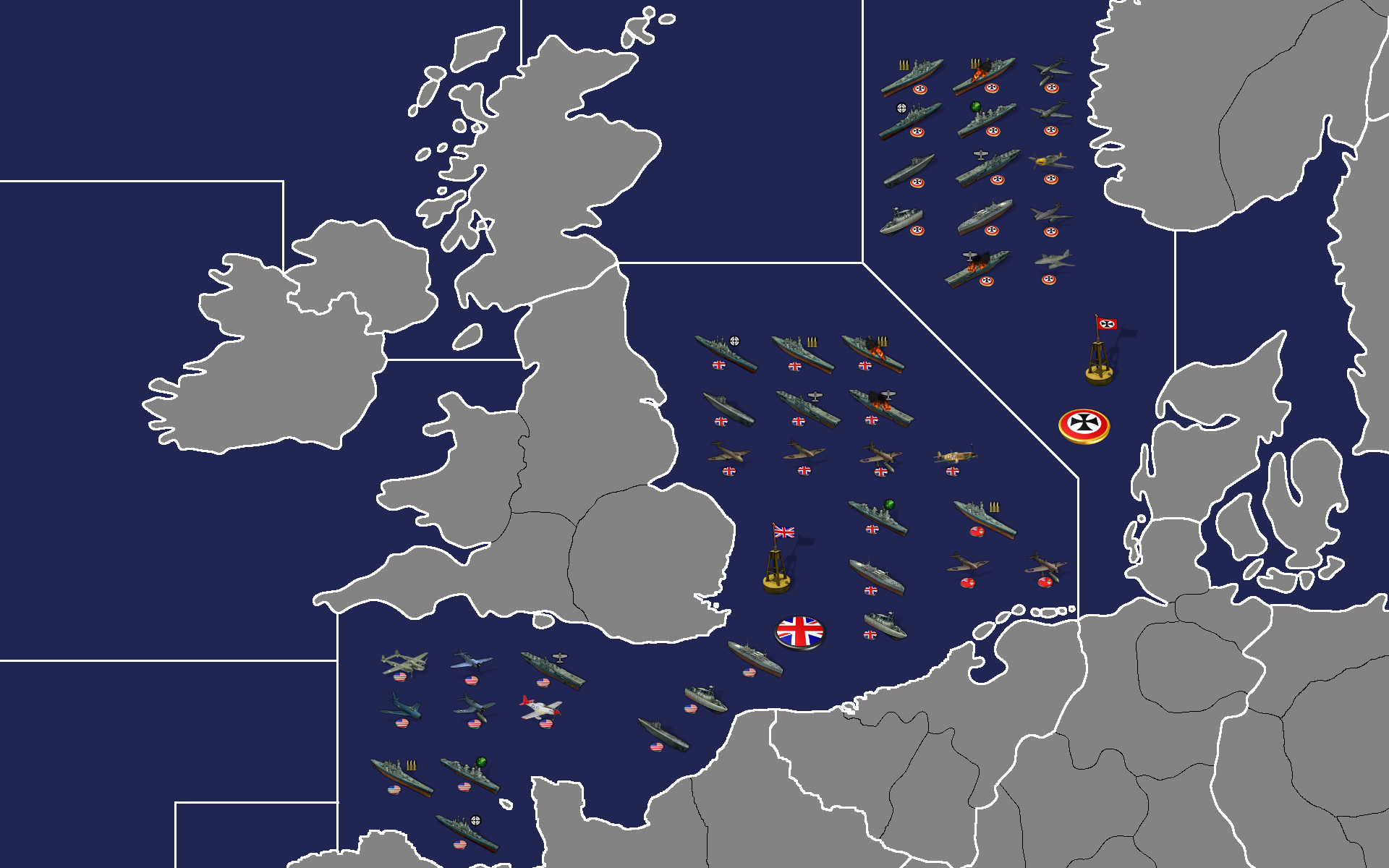
The forums will rescale the detail a bit, but if you click in you can get it at 100%. I think a likely playscale is Map view 80%, kinda where I usually play. Then bounce out 25% to scan, but usually like 65-85% something in that range. I mean like when you're getting into it heheh. I'd probably upscale these units to 110% myself since there's room for that and still plenty of space before you start spilling into adjacent tiles. I think this scale at G40 we could do 72 px units no prob.
I think that would be cool cause it's similar to 1:72 models, which is kinda the standard issue in the physical realm, so our digital Infantry would be more legit that way lol. That'd have some charm probably!
-
-
I think northwestern Germany should be widened. Also it feels like Germany is slighly rotated to South-East in this map. I would prefer not distorting the directions as much as possible.
-
The connection between England and this Northwestern Sea Zone is game changer. Because this connection ensures that Germany cannot cover all sea zones around Britain by placing fighters to the Western front.
-
Is there any idea about the representation of the Battle of Atlantic? This idea can really affect the drawings.
-
-
@schulz Yeah I'm really not certain about any of the subdivisions displayed. I think we can get something a little more accurate with less of a shifty shift, if knock down to just a couple subdivisions. I just wasn't sure which would be cool. For sz I'm just trying to follow the G40 map for all the connections and such, as far as I can, so if I goofed something there, it's just a goof rather than my grand design lol. I've been tinkering and coming back and tinkering again, so I might have let a connection slip somewhere here or there. I prob just drew the wrong line coming off Ireland right?
It should look like the Global map in terms of the connections, but the OOB board is kinda distorted so sometimes I think I got the money line, but then it accidentally lands on the wrong TT. You're right, that would be a game changer big time. Just an error, I'll correct it tomorrow

For the Battle of the Atlantic, I feel like we need some intermediate tiles so there's room to maneuver. And maybe use the islands like Bermuda Bahama and come on pretty momma Azores and such. I mean they're drawn might was well try to come up with something that has fighter transits there. Or same for the route to out of Canada to Greenland Iceland. Also intermediate zones for convoys worth more than the regular might be another approach. The numbers could be determined after the playbalance needs eventually, but just the idea that we could have spots at the ready might be good.
At this phase I almost just want to do the entire global map with all the sz and tt laid out so it works for that game. Then decide how to break up the more nuanced/advanced playscale. Cause just laying into the sz stuff here, I was already shift a few things around. Usually just trying to get another column or row that could fit units at 54 or 72 px wide.
Yeah G has a bit of tilt down there, we can fix that up on the next pass for sure. Good suggestion! Let me know if anything else looks super weird. I cleaned up Syria and Transjordan area a bit while fixing up the Med sz stuff. Hopefully that looks a bit better now, and Iraq Iran etc. The earlier map was based on the Ottoman provinces I think that Hepps had in place, we needed something more partition-y and angular to make it look like the 1940s heheh.