Darken Moved Units
-
@LaFayette Of course.


-
While my initial design was meant to be based on the 3 colours meaning; Green-full movement, Yellow-movement remaining, Red-movement exhausted.
What I had settled on in my mind was to eliminate the Red-movement exhausted, as with the green and yellow there was more than enough emphasis without having to define the third parameter. Having the spent units have no marker was more than obvious enough.
As you can see I had also experimented with gray scales... and the Black and White worked well if you went to a 2 icon system. But with a gray nation... the gray ring was all but useless.
-
@Hepps that looks awesome what map is that?
-
@ubernaut Snap shots from Global Dominance.
-
@Hepps is that a new one?
-
@ubernaut Still just a dream at this point. There is the thread for it.
https://forums.triplea-game.org/topic/95/global-dominance/510
-
I was just going back through that folder and came across what I had finally settled on...
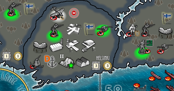
I chose the neon green as full movement. (I had settled on this because no nation should be designed with this robust fluorescent green as a national colour, otherwise it would be obnoxious to look at all game.)
White for movement remaining as white would also stand out on all territorial colours.
-
I like your idea Hepps, and I think it would be very useful in-game.
-
@Greg-Anderson and @LaFayette I will not tell a lie... in my dreams at night these markers also pulsate.
")
-
@Hepps ROFL
-

Sorry all this talk caused me to learn how to make a gif. Here's a more refined example.

-
The pulsating probably makes sense for units being actively moved. If all mobile units are pulsating, I suspect that might be too much :grinning_squinting_face:
-
@Hepps A yellow pulsing would make sense if we mark partially moved as yellow, would you be able to color shift the pulsing gif to yellow?
-
@LaFayette Well I just did that quickly to see if I could.
The entire thing would need to be redone properly.
-
@LaFayette FYI, I tried in past using animated gif as unit images or decorations but they didn't work (only show the starting image statically). If it is possible to support this, I would rather suggest to supporting WebP images, if feasible.
https://en.wikipedia.org/wiki/WebP -
@Hepps said in Darken Moved Units:
While my initial design was meant to be based on the 3 colours meaning; Green-full movement, Yellow-movement remaining, Red-movement exhausted.
What I had settled on in my mind was to eliminate the Red-movement exhausted, as with the green and yellow there was more than enough emphasis without having to define the third parameter. Having the spent units have no marker was more than obvious enough.
As you can see I had also experimented with gray scales... and the Black and White worked well if you went to a 2 icon system. But with a gray nation... the gray ring was all but useless.
Again, youre overthinking it. You dont need a circle for the second state of the two. You need only one circle. And the one color never used is black, so it should be black (or possibly white, nearly as unused). Black circle in state 1, nothing in state 2 (for example black when it has moved, nothing when it hasn't or vice versa).
If two different states have to be manifested by circles then most likely the two colors to work most of the time would be black and white.
If it could be partially transparent black or white it would probably look a bit better.
Please note the different between transparent (holes in) and translucent (see through). So still use very dark black or very bright white, just with more holes in the fabric.
-
Ubernaut best post so far *high five
@Hepps hey so I clicked both those old links and you came up with the idea for this map in 2011 and 9 years later it still isn't finished??
Thats my question! Lafeyyette please don't ban me for asking it
-
@Ondis Yup there are definitely a couple ways to go.
All I was doing was providing some input on what I had already dreamt up as it is along the same lines but from a different perspective. I recognize that my suggestions are not really the same idea as darkening moved units... but rather accentuating unmoved units or units with remaining movement.
As stated, just food for thought.
-
@Captain-Crunch As always, your contribution to the conversation is immensely valuable. I just hope pointing out my short-comings as a map maker brings you some level of satisfaction that you otherwise do not seem to get from celebrating your own achievements.
-
@Hepps Wonders how he can multiple upvote a post?
") Nice new byline btw
Nice new byline btw
Hello! It looks like you're interested in this conversation, but you don't have an account yet.
Getting fed up of having to scroll through the same posts each visit? When you register for an account, you'll always come back to exactly where you were before, and choose to be notified of new replies (either via email, or push notification). You'll also be able to save bookmarks and upvote posts to show your appreciation to other community members.
With your input, this post could be even better 💗
Register Login