Darken Moved Units
-
Another idea to help players move units:
- units that have moved but have movement left and can still move are darkened slightly
- units that have been moved and can no longer move are darkened even more.
EG:
- move a fighter one tile, the fighter appears a little darker.
- load and offload a transport (without moving the transport), the transport can no longer move and is darkened
- move an infantry one tile, it can no longer move and is darkened
- move a tank one space into combat, it can no longer move and is darkened
- move a tank onto a territory where it can blitz or otherwise move again, it is made slightly darker.
Thoughts?
-
@LaFayette i like the idea.
") we should test if the whole image darkening is better or lightening the outlines.
we should test if the whole image darkening is better or lightening the outlines. -
@ubernaut "Lighten the outlines", that would create a sort of outline highlight on the unit? Would we do that for unmoved units or moved units? Would you mind clarifying, I don't think I can yet fully picture the suggestion.
-
@LaFayette lightened would indicate already moved it should give the units a subtle but noticeable greyed out appearance.
-
I think things like this won't work well in all cases and shouldn't be default, at least initially (eventually, they can be turned default, if it seems advisable). TripleA has many different style of maps there's no way it can be optimized for all of them, and only a minority of them uses the program's assets, so it will have to be seen how many of them are improved.
Anyways, about the proposal, I think there is no need to differentiate between partially moved and fully moved units. You are not really supposed to partially move a unit and then go back to it, after moving something else, within the same phase (and only air units across phases), while loaded units always have the ability to offload (regardless if moved to load or already on board at the start of the phase), unless they can't. So, as far as being able to move goes, there is no need to differentiate between loaded units that already moved to load and loaded units that were already there (moving as cargo only is not a movement for the cargo).
Also, on this matter, I want to remember that a missing feature of TripleA is showing the movement made by each air units, on the board. So, I suppose this could be the way, although this might be confusing with stack numbers and other numbers, the units already display. In this case, it might be advisable doing it with roman numerals, maybe.
A last thing to clarify is whether this should create multiple stacks of the same unit type, in case some are moved and some are not, within the same zone. If so, this would be an additional reason to limit the feature to a dualism between moved (partially or fully) and unmoved.
-
We can darken units without needing new unit images.
IMO the 'moved' units would appear as a new stack. I think this is particularly useful for transports. Being able to see which transports are fully moved, which ones have one movement left, and those with all remaining would be useful. Namely you could select them properly. That is probably the biggest reason for creating a visual distinction between partially and fully moved units.
Secondarily, the 'fully darkened' might be misleading if a unit can actually still move. It's a UX principle that you should be able to infer state from looking at something, ie: just by looking at something you should be able to figure out how it works. In this case, with the shading, you can tell which units you can and cannot move, and which units you have not moved at all and which you have moved but can still move further. In the case of tanks for example that would probably be beneficial as you get better indication of blitzing, perhaps the same for paratroop bombers.
-
@LaFayette Personally, if starting with no maps, I would do this only on a dualism between moved (partially or fully) and unmoved units and would show the moved ones as being completely desaturated (pure grey). However, this cannot be done on most TripleA maps, comprising the ones using the assets, as there are already two players with already fully desaturated units (namely Germans and Neutral).
-
@Cernel it's not necessarily a saturation change. In the "HSB" scale, we'd be changing the 'brightness'.
My concern with darkening partially and fully moved units is that it might get confusing. IMO we would want players to learn that fully darkened units cannot be moved unless you undo a move, that would not be true for some units. Noting the exception, I think it becomes less meaningful, the darkening means "Maybe you can move these units". I think that creates some inconsistency, mainly would want it so that you know if a unit is fully darkened you can basically ignore it when looking for more units that need to be moved.
-
@LaFayette To be clear, I would desaturate (make grey) (only feasible if the map doesn't already have grey, black or white units) any units that moved of 1 or more spaces (no matter their max movement) except those that loaded onto units of the same power without offloading (yet) and those that were moved as cargo (or both).
However, instead of only desaturated, to be consistent with the assets, they could become "white". After all, "white" is already the colour of the immobile units (factory units and all Neutral ones). But, in this case, it is definitely mandatory an opt-out ability per map on this feature (as it might give very bad results in some of them).
-
Darken is not an ideal situation Better have a small aura around or below (or a shadow) the unit that changes. Or maybe there could be a shadow for all units that have moved and those that have not do not have it.
-
@Cernel I don't think it makes sense to do per map. Maps should not really be in control of basic game mechanics/play, but instead more able to opt out of rules. Regardless, an item like this would be configurable per play, some players may like it, others not.
@Ondis I think it depends on how some units look when darked, how much detail is lost. I suspect it might make units hard to tell apart in some cases.
The unit outline perhaps make sense to try. all units available to move get an outline, a bright drop-shadow, when moved but not exhausted the shadow is grayed, and when moved completely the outline is removed (or changed to black).
At some point we may need some screenshots to demo how some of these treatments might look to really get a feel of what would work and not. Before then, curious if there are more ideas where we can visually signal which units have movement left and others not.
-
@LaFayette I like your idea. I think it would be very helpful, especially in maps with many units.
-
"A joyous heart sours with the burden of expectation"
Hepster -
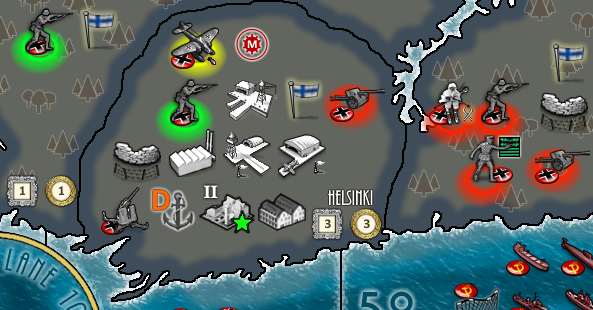
@Hepps Cool rendering, is red enemy units and 'green' is friendly and yellow for air? Just curious for clarification on the color scheme. Second, do you think "aura" colors like that would look good in general (EG: WWII maps?)
-
@Hepps I don't like the idea of linking this to a hue (green-yellow-red). I think the hue is already the main element for differentiating ownerships, so I wouldn't use it for this too (talking in general; no problem if it would be a feature off as default that can be enabled per map, since your image itself looks good).
-
@LaFayette I think the rendering that Hepps proposed was green for units that have not moved yet, yellow for those with remaining movements, and red for those that have no more movements.
-
I kinda feel like red should mean 'in-combat'.
Green + yellow seem good, perhaps gray (?) for units that are not in combat and have finished moving. -
@LaFayette Was really just something I had in my archives... I am purely a visual person and I thought it might spark the creative juices for everyone as to new ideas.
-
@Hepps any chance, do you have those 'aura' shadings as transparent gif's?
-
Looks good hepps. Kinda the thing I was aiming for.
I don't think it should be overcomplicated. The two states are color/shadow on or off. They correspond to Has movement points left/has not movement points left.And ofcs it should be something you can toggle off and on.
I would rather it be a shadow than a color so as not to be invisible on a background of the same color.
Hello! It looks like you're interested in this conversation, but you don't have an account yet.
Getting fed up of having to scroll through the same posts each visit? When you register for an account, you'll always come back to exactly where you were before, and choose to be notified of new replies (either via email, or push notification). You'll also be able to save bookmarks and upvote posts to show your appreciation to other community members.
With your input, this post could be even better 💗
Register Login