World War II v3 update to master?
-
I would like to vote in favor of keeping the current relief and unit arts as default.
-
The national colours are just too dark for my taste. I even think it would be better if the current national colours were based on pastel tones.
-
I like the idea of nations using their historical war posessions but not coloring the units is just reduce the clarity. Yes, the flag icons help but they are just unneeded distractions for me when coloured units are more simpler and easier to distinguish.
-
I would prefer unit images that points their gun to a clear direction.
-
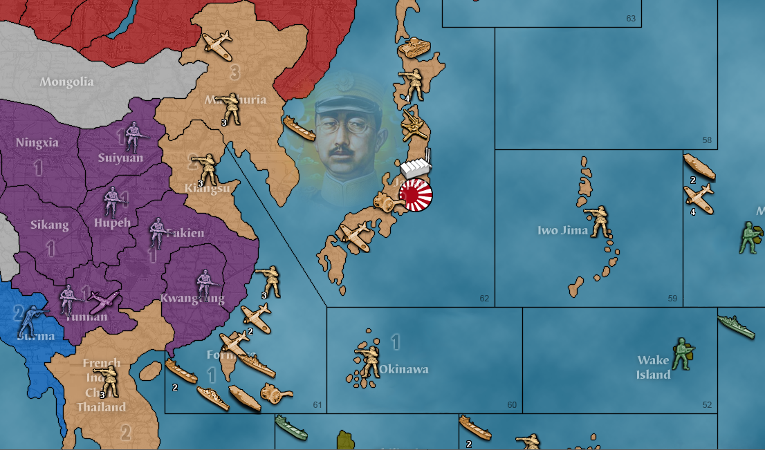
I would also prefer the Japanese color as either brownish yellow or a darker yellow and the Rising Sun as a national flag. For example;
-
-
@schulz Yeah I see an advantage to retaining the default units as well. I'm less partial to the relief, though there is a charm and simplicity to the color coordinated aesthetic, which is why it was adopted originally I'm sure. It's relatively simple to alter the national colors by changing the associated Hex color in the map files, though getting the units to match can be more involved. Using the default relief for v3 it is also possible to get a more pastel vibe by selecting "view" tab, then "show map blends" which knocks the saturation way back. It's pretty extreme with the default though, and you can't isolate it to just one nation say Japan, since it's sorta universal. My preference would be to have a default set that includes both options, for reliefs and the units. One map that is more topographical and one map like the current, then a unit set to match for each. That way all the preferences are covered. It'd be nice if one could switch on the fly from the view tab. I suppose I don't care much which is the actual default, so long as the material is all in there, but I definitely like the idea of showing off something that looks cool for v3, since it hasn't been updated in ages hehe.
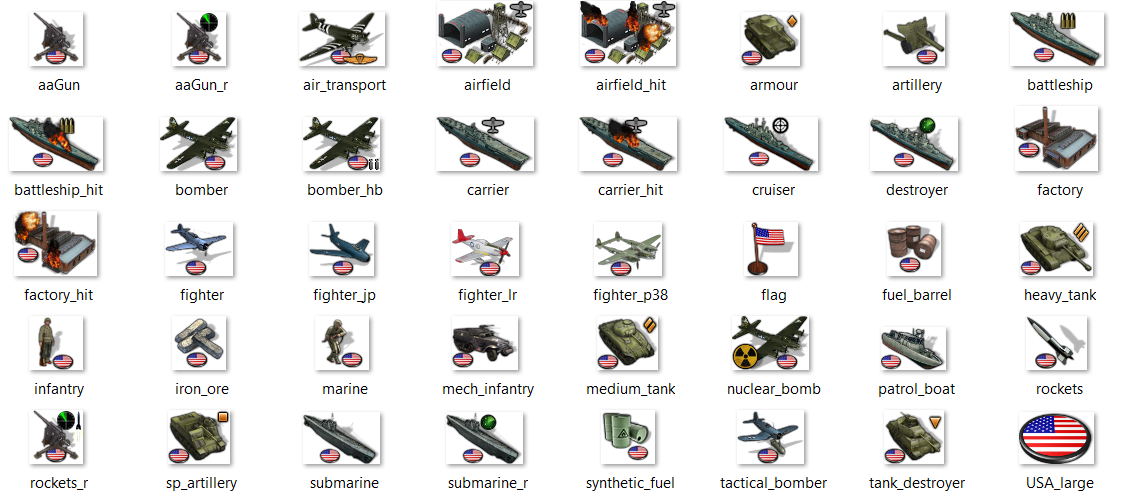
ps. here's a quick example of a national set based off Frostion's units. There's more stuff here than would be necessary for v3, but it could work I think for a scale up to global or to support some variant rules that it'd be cool to have imagery for in the back catalog. I tried a quick hack to do some tech advances just to show how it might look. My thought would be to keep with the traditional, like using a pair of bombs for HB, or radar on an aaGun. Or could do stuff like switch to a rocket if the tech is rolled, or from regular artillery to self propelled art or something like that for the ground advance, maybe cruiser gets a BB clib or whatever. Super subs and LR could do like a color change, or a wing stripe. Or here maybe just add in a long range mustang in this case lol. Maybe do a p38 just to have one? stuff like that. Anyhow, just to give a quick impression. I think it would be rad to have something like a next level Cyanight Magneto board done up to the nines hehe, but I like the old school look too. It'd be nice to have both on offer.
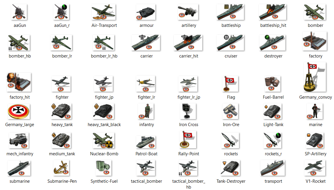
Similar example using his set for Germany. Again more stuff than would really be needed for v3, but just to give a sense of the larger spread that might go for the global scale. Still working through the labelling, but almost done. I tossed in a few tech advance types just to have something there. Most would rarely be seen I'd figure, but I liked the idea of a visual change to accompany a breakthrough where it makes sense. Anyhow gives a gist for a quickie. I'll work up a folder for each to see how far I can get, but should be enough in there to get the job done for anyone who likes that sort of look for World War II.
pps. Also before I get too far along, here is a copy of WOPR's master from that 2017 post, just in case the mediafire link goes down or something.... That one is pretty self contained, so one could load it up as is to get things going for a topographical relief vibe. The units there are mostly in the 54x pixel size boxes. To me the art style definitely evokes Iron Blitz and a mid 90s pc game, which is something I kinda dig on its own merits cause I love the era.
https://www.dropbox.com/s/etcmt3ulo65xzzb/world_war_ii_v3-master (WOPR).zip?dl=0
My thought was to do that again with the Iron War units since Frostion was game, for an art vibe that's sorta more painted sculpt/cartoon realism. Something that harkens to a physical gameboard type look I guess. Then just expand the unit roster where needed to cover the tech and a scale up to global. I know there are a few variants that use stuff like marines or alt units even some added nations like Vichy so I was trying to dig up some extra stuff where it made sense. I'll tool around for a few and put together a unit folder to see if it gets the nod hehe.
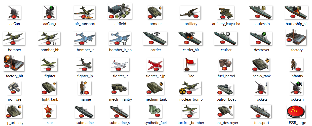
quick example of a Soviet set... For artillery advance could do like Katyushas or something. I think for tech a different paint job could work well like for super subs, or to fill in the gaps with a couple different planes for lr and the like just to add a little more drama when that happens lol. Anyhow, gives an idea...
Catch ya in a few
-
I'm thinking more broadly than just v3, as v3 is using almost entirely default units that apply to all maps.
@schulz Good point about the national colors. If the unit images were blanched out, we could colorize them automatically to fit the nation colors. I agree that the ownership of a unit is ideally determined by more than a flag roundel
-
I hope that the default units will be preserved. Not everybody is a fan of whatever details and different looks of specific units, that often are hard to distinguish or to identify (at least for non-weapon/unit-experts).
For gameplay reasons and clarity the default units come in handy.
However I admit all of this looks awesome! But - at least IMHO - it distracts from the game itself.
-
@panther I agree and would not want to remove the current default units for that reason. The idea of using National units as the default imagery was debated probably a dozen times in the past and on the various tripleA boards that preceded this one, and each time I was definitely in the tinted units camp. In part for clarity, in part just cause the national art wasn't really there in my view.
When v2 was created, there was a question of whether tripleA might be made to look more like Iron Blitz and I wasn't really into it at all back then. There was always somebody in favor of national units, but it was never me lol. I argued against a topographical look for the map as the default for similar reasons. Then latter with v3, and pretty much every time it came up, I always argued in favor of tinted units. So I take some responsibility for the existence of blue Italians and whatnot to begin with regrettably hehe. I don't paint my physical sculpts either, for similar reasons of uniformity and ease of recognition on the actual board, and also because I'm not a weapons expert I often find that details get lost in the crowd too.
I felt at the time and still do, that having National units for ships is particularly confusing, which may be part of the reason that any national flare for the default tinted units was usually confined to just aircraft or ground like say the infantry unit. I also thought it was important that the tinted units have a clear orientation too, which is why we typically have 'Sinister' (left facing units) for the Axis, and 'Dexter' (right facing units) for Allies. At one point we had that stuff all consistent by faction, Axis vs Allies, though someone probably flipped some stuff around to make certain nations appear to be facing each other on the map. On the physical gameboard people will just turn their tanks around so one doesn't appear to be running away from the enemy, though on the digital map that's harder to make consistent at all times hehe. That could be a reason to go with the 3/4 view when possible rather than a side profile view, so the facing issue is somewhat less pronounced.
I think all those things enhance general playability and make the units simpler to parse at a glance.
That said, I have warmed to the idea of having at least some kind of national unit set available for people who like that look, especially since I think Frostion executed the concept pretty well. It just creates a rather different all around visual vibe. In my view tinted units create an overall look that is rather video gamey, with some pros and cons to that, but generally more pros than cons hehe. People who like the tinted look are pretty well served by the current defaults, which are graphically bold and easy to tell apart, without recourse to roundels or whatnot. I think people do tend to have pretty strong preferences when it comes to colors, but changing the exact hue of a tinted set is also relatively straightforward.
Just as a very crude example, here is that same set of soviet units above, desaturated and then adjusted for hue. I don't know that much is really gained from backtinting Frostion's set over the current defaults, since you end up with a visual effect that is largely similar to what we have right now (unless one just wants slightly larger units?), but just to demonstrate that it's fairly simple to remove color information and change the tint once you have a national unit set going, but much harder to national-ify the blanched out generic stuff when that's the starting point.
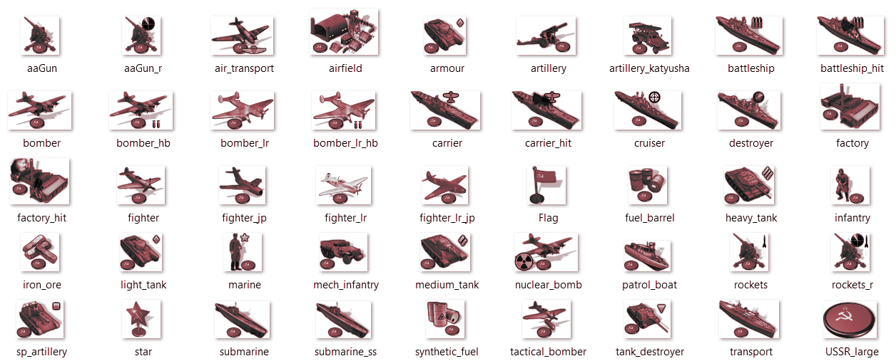
You can sort of see what I mean when comparing the stripped and tinted unit art above, to something like this taken from the current defaults.... A lot of the detailing just becomes less necessary/useful at that point, since color tends to override the visual impression.

Also when the color 'hue' is made uniform, then color 'value' and the amount of saturation becomes the most important aspect, basically how bright or dark the image is. You can see quite a bit of variation there, even within the default unit set, as subtle differences in color 'value' contribute to certain unit types having slightly different tints despite sharing the same base hue. Different design elements become more important, shape is more important, and simple blocking of values, like a white stripe on a super sub or things that are easy to spot. I think often people prefer smaller units (like scale down to 75-80% or whatnot). Though for people who do enjoy the larger scale it and vibe on that sort of impression, it would be fun to have something available that could service that look. Or could just do a tinted and painted scheme both for a matching set. Like something that could toggle on the fly? I like the default set though, it has it's own charm and the basis for a lot of variants so gotta keep all that stuff probably just for compatibility anyway
Or this is a random idea, that might require some tweaks on the engine that I wouldn't know how to make but what if the player could flip units on the map, in game? You know, so that they would "face" the opponent, with graphics for a left or right facing orientation? That might be cool, I can kinda picture visually how it might work, though executing it would be another thing haha. Drawn on roundels with the perspective built in are a little harder to flip. Basically they have to be stripped of the roundel and then add the roundel back in after the flip. Not too hard, just kinda tedious. Anyhow, I'm sure left or right can be dialed once it's all assembled. I'm working through it at sort of a rambling pace
ps. here are the national style AA50 units and as far as I got for G40/tech
https://www.dropbox.com/s/3mk54gjgvua1rba/Units for G40.7z?dl=0 -
Having a nicer set of default units seems like a win. Having a toggle to go back to the 'old' units seemingly is a good move for those nostalgic users who do not want any change (though, honestly it's probably better to have nicer units and no toggle, than to leave the current units - the look of the screenshots is far better. Though that is not to say there shouldn't be a reasonable effort to allow for a toggle to use legacy units).
Having generic units as part of the engine default would be a goal, ideally with a neutral color that can be colorized and there is already code to flip units east/west orientation automatically based on faction.
Very few maps truly use the engine defaults and most unnecessarily duplicate the default unit images as part of the maps. It is a small project therefore to remove these unnecessary images so that the engine defaults would be used. There is pay-off to do that exercise alone as it would reduce download size would and reduce the number of unique (but duplicated) unit images, helping reduce unit image maintenance costs & complexity.
-
That is all to say, if updating the default images with the engine, it's likely better to avoid faction specific unit images so we have one set that are colorized and east/west flipped automatically.
-
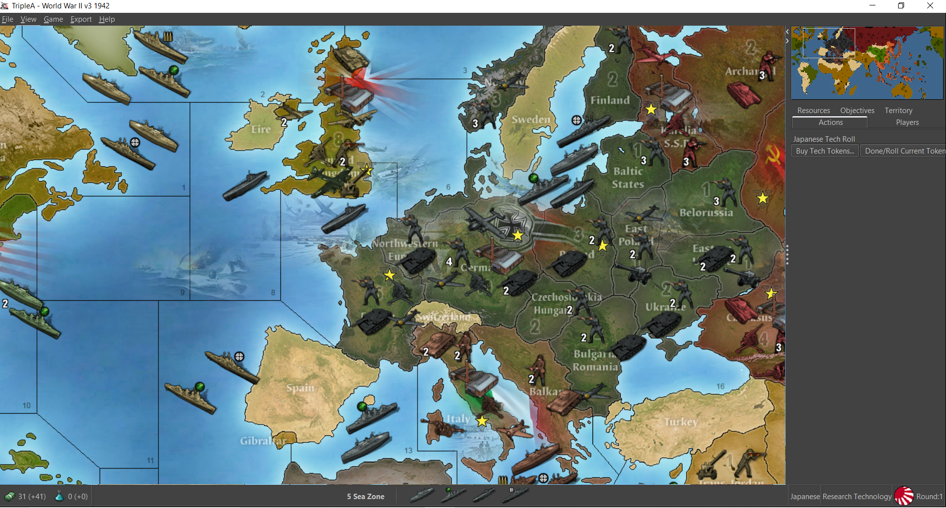
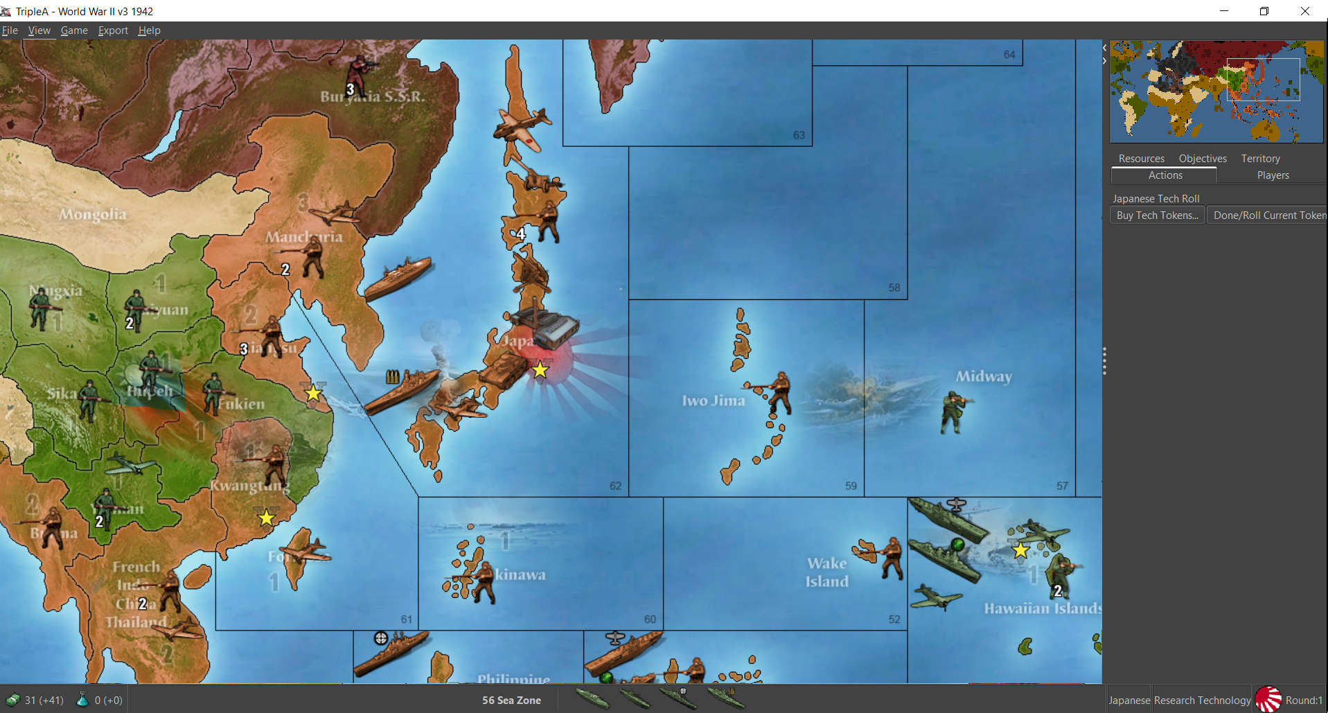
Here's a map file for v3 with WOPR's relief and the tinted Frostion units at 54px
https://www.dropbox.com/s/bw7ulqhsq5vvt2u/world_war_ii_v3.7z?dl=0
If anyone gets a chance to have a look. I think it holds up pretty nicely
ps. I put WOPRs 48px units in a subfolder in case people like to revert to the smaller size for the more iron blitz style pixel art. I think it looks pretty slick with the 54px units though. Like all I had to tweak to make it work for that v3 relief was to tint the Chinese inf, artillery and fighter units back to a greenish hue. Same set of units should work for v5 and such as well. In this one the aaguns are tinted, cause it seemed simpler to have the labels being consistent. In v3 aaguns are capturable so they just change to national tint of whichever power controls them. Overall I think the relief is pretty nice. I like the background illustrations and the terrain. Basically when I did the Japanese unit set I was kinda aiming for that orange haha.
Anyhow, to me it feels cleaner than the current, and has some better soundwork. Plus it's ready to go, so at least it'd be sweet to get that one up if we can? Maybe someone could redo the unit place so they're set a bit wider, which would be nice esp. for ships in the sz tiles. To me the units look pretty killer at 100% but they display a bit tight and clip into each other on occasion. Even then though it still looks pretty good to me for units at 100% on this one. Like just a nicer presentation all around I think.
-
-
@black_elk You're just Kickin Ass wherever you go lol

-
Haha thanks dude! Let me know if everything is working aces. Like I think I got all the tech units handled in there, but you never know lol. I was quite fond of what WOPR did for it. The relief has some nices touches and those 48px units look pretty cool too, but this one displayed pretty nicely with the new 54px units I thought. Like they look pretty slick with flags on as well. It'd be cool if we could get flags at the bottom center rather than bottom right, but least it works hehe.
V3 holds up pretty well with the HardAI too. It kinda stumbles on objectives, but not too bad. I think the HardAI's performance on this one is pretty comparable to v5. Like it has it's weaknesses, but still manages to brut force the occasional challenge hehe. Anyhow, I think it's a fun map. A good one to have in the grab bag.
Io Saturnalia!
-
@black_elk said in World War II v3 update to master?:
Io Saturnalia!
Lol I'd never heard of it. Party On !

-
Hehe raised by wolves!
Oh also, I noticed that the aa radar unit was missing from a couple nations so I added that just now as well. Hopefully it should stand up. I was playing against the hardAI earlier and didn't catch any kinks. Fingers crossed
-
I think having giant portraits of the political leadership displayed on the map relief for v3 is in poor taste and also just looks jank. Meaning that even if I thought those portraits were fine, the placement and the way the blur is applied makes it look wonky, but I also find the portraits problematic. I'm not sure when that was all added, the original map didn't include a relief of any sort cause it was just that old, but the relief ultimately supplied for it in the repo is basically the ww2 Revised background patterning with the repeating rail design, and some smaller illustration type graphics built in. I think WOPR's relief is in every way better, and could be used even with the older units standard units.
https://www.dropbox.com/s/etcmt3ulo65xzzb/world_war_ii_v3-master (WOPR).zip?dl=0
Using map blends we can make it color modular, by using a couple different baselines (different blues for the blend) and the HEX color assignments from the current defaults, with the current v2-6 default 48px units. I think that would give a pretty similar look to the current default map, just needs different hex assignments or the end user could change all that.
WOPRs would be fairly straight forward cause the relief is already done, but I know some people prefer that basic rail pattern. Not sure I guess I could just isolate the tiles and create a new relief pattern as a stopgap? It seems like the sort of thing that wouldn't be worth the effort really unless also upscaling the map, but that takes a lot of work lol. Any thoughts?
ps. ok I think I'll just do that actually, since it's more likely to get replaced that way, which I would prefer. It'll take me a couple days to figure out how to sort it with the opacity to match the patterns. Basically just to get a replacement relief for the current baseline scale on it. So it matches Revised I guess, although we do have a different standard presentation between Classic and v2-6, so having a different one for v3 might be interesting anyway just for variety. I like WOPRs because it reminds me of 1999 hehe. But whatever, I just don't like seeing the portraits in the current default. If it was generals or just regular soldiers sure, and probably nobody will balk at seeing Churchill or FDR I'd imagine, but the others I think they just intrude on the game and make it weird from an RP standpoint. Anyhow, just some thoughts there. I know it's an old ass thread, but it'd be nice to get this sorted. I'll give the old college try I guess.
Ok there is the older WOPR folder for safe keeping. What I'd have to do I think is knock the opacity on the entire relief image so it works with Map Blends more cleanly (all that edgework around the inserted graphics needs to be knocked way back) then I can maybe layer over another fill that just knocks the topo or put the rail stuff into it to make the patterning more abstract. Reassign the HEX colors to match the standard current games v2-6 and use the standard units from those games. Should look very similar except then players would have more control over the ocean blue and the fill colors to spec it to their tastes when using map blends.
For any sort of upscale I'd have to redraw the base, but that would take a long time to sort. I'd have to use the larger global map projection for it and then rework all the sz and tt boundaries. This seems more expedient for now, to just kinda hack the WOPR relief. If that makes sense?
here is the display on that with just the old school units he had in the folder, at scale in the 1600p display the lines hold to make zoom. It's works alright in 1440 still, little fuzz. Units would have to be replaced for the standard 48pxer's and color matched in the HEX, with the other stuff in the relief blending out. Currently the blend on that one will jank out, but with blends off shows like this just using all his presets. Here's the view on it, reduced to display.
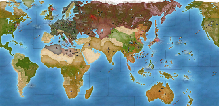
So that blue we can control via the map blends if I set it up correctly. The other colors can be changed via HEX re-assignment. The color from the topographical thing we can desaturate to smooth it out, or add a little gaussian blur to make it glassier for upscaling.
Here is an example with the HEXs and such redone
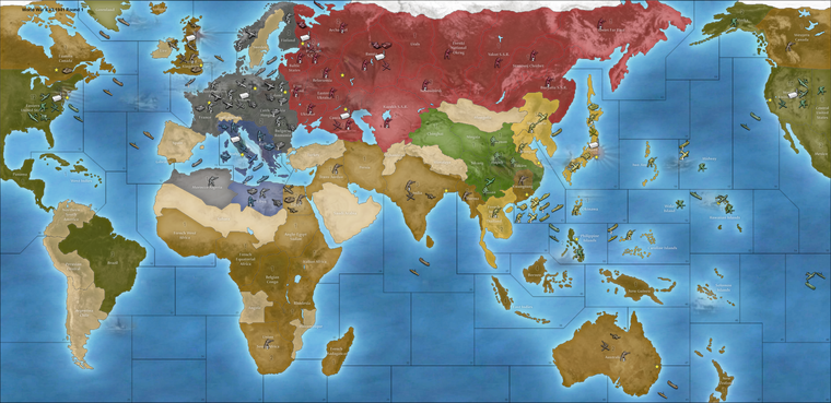
Italy/China switched to match the other games (just needs to use those standard units instead if you want it be consistent across all those boards)
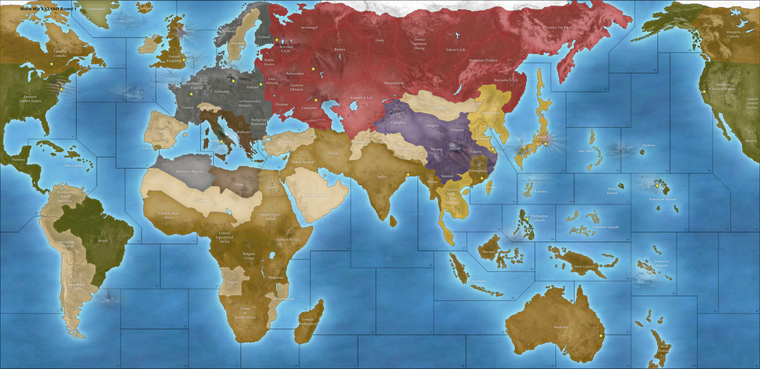
Here is a relief WIP that can be used. End user can just rework the national HEXs or the ocean color in the baseline to suite their tastes. Should work fine with the current I think. Let me know if something like that seems decent. This example has a lot of blur added over the entire image which I desaturated by like 75%, went a bit heavy with the blur, too heavy probably, cause I was just working it out to see, but something along those lines for an approach to the fill on the land TTs. The ocean blue we can make modular via the baseline. I'll just keep experimenting with the tile-reconstructed relief and seeing what looks passing fair.
-
@LaFayette we should put these in the master they are great
-
Ok I fixed that weirdness with the blur, I think it's pretty alright. Just run it through the tilebreaker map creator tool for v3 relief folder and should match the current base in the repo, if anyone wants to double check.
Everything else from there I think could be just fine tuning the HEX colors for each nation right?
I'm not super partial to the way the Italian flag cuts with the value change, I might need to knock that section even further, but seems passing fair for a quickie.
Here's the image (at scale around 1800px tall at 100% view around 12 mb)
reduced to 1080 just to attach a visual here.
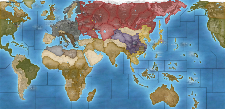
If that seems good, it's just a matter of color matching and picking an ocean blue color. Or the end user can just do that for themselves. It's a single color adjustment to the baseline, or editing HEX colors in the map.props with notepad. Hopefully does the trick for everyone.
ps. I got it down to like 7mb, updated the dropbox. Seemed pretty clean.
Also just to note the unit sprites in WOPR's folder are instantly recognizable to me, and this is because they are the Iron Blitz units from the 1999 game. I enjoy using them, cause I loved that game, but then I've also bought that CD probably half a dozen times hehe. I'm not sure whether they can live in the repo or not given the provenance, but they're kinda cool if only for the nostalgia factor, since it's pretty much abandonware from two decades ago. I think players just tend enjoy whatever they're most used to looking at. Like it's pretty hard to update/upgrade the look on anything cause consensus drifts towards what's already familiar and most will tend to prefer the current thing, whatever it is that everyone is using. The boxed games are like this too, although they didn't really hold a consistent aesthetic across editions until more recently (if the last 10 years or so can still be considered recent hehe). Here Classic has it's own same look which is Logan's style, v2-v6 have uniformity cause Bung did them all. For the most part they use the OOB warps and iconography (air roundels for everything) and the standard 48pxers (national tints) for the units, same pattern fills etc.
'
Among the various things, to me the 48px units are probably enough to make the game immediately recognizable as part of the standard WW2 spread. But it's easy enough to switch out units as the end user. For example the UHD global set at 54px would still work here, the place isn't set up for them so they'll crowd at 100% unit view, but doable. Those old 1999 sprites can be used or the standard 48px etc. To me the goal would be less to enforce a series-wide aesthetic but instead to make the visual presentation as modular as possible. Eg. if you don't like the standard units/colors etc that the end user could just make a quick substitution in their downloaded maps folder. I prefer the newer units I just made, mostly cause I'm running tripleA at a higher resolution, but it's easy enough for me to copy those over into my unit folder from Global, so I'd probably just run with the standard units from Bung's package I guess and key the HEXs off those. Map blends was hard to get working for that one, though we do have some control over the ocean blue via the base, otherwise players who want a different look can edit the map.props for pastel hues or whatever via HEX.Oh also, here are the reconstructed base tiles with the ocean glow. Control for the ocean color by changing the hue/sat/darkness of the blue with this image for the basetiles. That along with a HEX adjustment should allow it to work with whatever choices I think. It also works with the current default, but that one has capital markers set to on in the bung version and much darker ocean. I think the map props HEXs from the WOPR work fine probably, but could be changed to whatever.
Anyhow here's the base
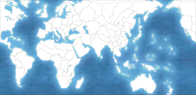
Here are the relief and base tiles folders ready to go in the zip.
Map props there just has the current color designations from Bung's so should just be able to drop it into the current v3 folder.
I turned off the capital markers cause they clashed.
Let me know if that seems cool. Came in at 13 mb altogether, for the map tile folders.
Catch ya next out
-
@black_elk Sweet ! I Dig it !
-
I don't have bandwidth to help here. The updates look good. Replacing the files in the map repository should be do-able with some googling and small determination.
