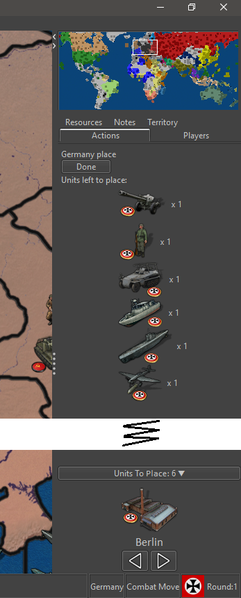
Yes, some maps have a factory in every territory that is hidden and max placement limited to territory value. Maps with factory-units for purchase also have placement limits. And some dont.
Currently, placement requires a CLICK on the territory and a unit placement menu pops-up in the center of the screen. Then a CLICK on MAX button (or other selections), then CLICK on OK. The focus of the selection menu is on the OK button (thus, pressing SPACEBAR selects the OK button and menu goes away).
When dealing with many units and territory placement limits, this is BRUTAL. Instead, have the selection menu's focus be on the MAX button (make it an option). This way dumping MANY units would require a SPACEBAR to select MAX, then a TAB to move the focus onto the OK button, then SPACEBAR to select OK.
It leave one hand on the mouse, while the other SPACE/TAB/SPACEs through the territory CLICKs. Thus no mouse movement and FAST.