Recent Posts
-
@captain0
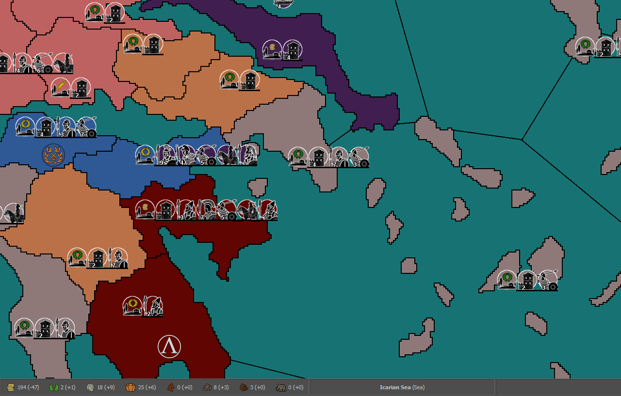
Are you playing with Fast-AI as it is more aggressive than Hard-AI ?The US AI does have enough air power to control 2 SZ distance of its West Coast and has enough PU to dominate the sea, but sadly it does not.
I will look at reinforcing the US west coast, but it will be awhile..
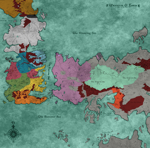
One other issue I have noticed that there are no UK heavy industry in the Indian ocean/ Red Sea, East of Africa.
Whilst I respect this is quite accurate historically.Agreed, it is not going to change. You could replace the South Africa Industry-Med with a Industry-Hvy if you wish.
-
Also n my observation the AI US generally doesn't put up much of a fight in the Pacific v Japan,
Possibly due to confusion and balancing in the Atlantic convoy war and countering subs popping up.The AI at sea is weak and does need help.
Even with USA AI
Turns 4, 8,12,16,20,24,28,32 AI purchases 3x Fighter, 1x Carrier-Fleet, 1x Cruiser and places in 010 B Sea Zone
and
Turn 2-40, USA AI, purchases 2x Destroyer and places in 010 B Sea ZoneIt does not play well, but it does give an OK game for Japan. Maybe it needs more help to be more of a challenge?