@rogercooper
Those are cool!
Yeah that cartoon! total Inception lol
Oh it's this dude's work...
https://en.wikipedia.org/wiki/Richard_Edes_Harrison
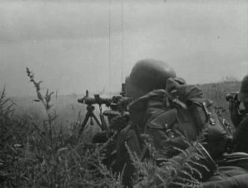
The challenge he faced was that most Americans, like many people at the time I guess and still today, they were so familiar and ingrained with the Mercator from schooldays and the era of the sail/naval navigation going back several centuries, that they really struggled to understand how the advent of aviation had changed the game. Or like why these faraway points were so key to the war effort. So they basically hired on a technical artist (rather than a cartagropher) to reimagine how these distances and war situations could be depicted in popular media. The maps were in mags and periodicals, so I think they're sorta Duckburg style, like fighting the war of ideas, with that sort of jingoism baked in, but it definitely anticipates stuff like GPS Satellite maps or the UI's from video games. Like I can just see it morph from that into Hearts of Iron after a couple more decades floating around.
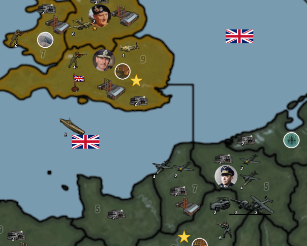
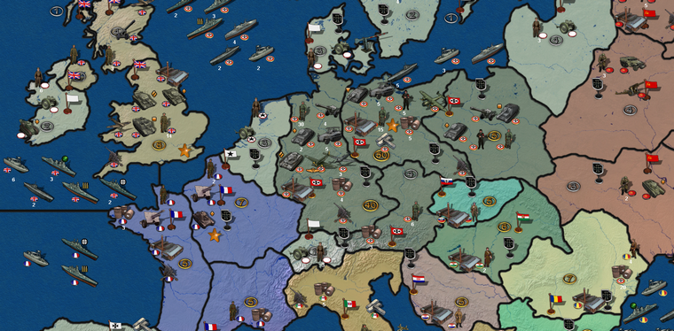
I just think it's cool, since it sorta takes root during that period and comes to define the new look, along with commercial advertisements and pulp illustration (pin ups and such) the fonts and whatever, which is why I think it looks cool for window dressing type thing, but I'm not sure it works so well as a main map campaign view.
It would work maybe for a mini map though, or an endgame stats view thing, or just alternative style view from a hotkey. But then I have no idea how something like that could be translated into tripleA without like a total UI overhaul that can somehow use two baselines at once hehe. Hence the pipe dream.
It's to me interesting cause for Classic, the world projection there was clearly Mercator style, but then every A&A board since Revised and then later War Room, they riff more like some of those Harrison maps from the 1940s to me. Like the way some of the continents are compressed and such, or the crops that were chosen. Almost like it was a crop and swap, where the maps were tilted up from there to hammer home the idea. But then the north pole view sorta doesn't really do the telescoping on Europe and the Pacific the way the dual Theater Atlases usual show the war in the books, like with a double inset with room for many sculpts. To me the G40 is more like those, but then when I think back to Iron Blitz, it totally reminds me of those Harrison map vibes. Almost as if the one is a call back of the other. Even down to the names there, it's like a whole harris thing haha